iOS 26 adds system-level controls to restyle your Home Screen icons and widgets—no shortcuts or themes required. You can switch to Light or Dark icon appearances, add a color tint (with a picker and eyedropper), make icons translucent with Clear, and change icon size. The controls live in the Home Screen editor and apply consistently to both app icons and widgets.
Change the look of your app icons (Light, Dark, Auto, Clear)
Step 1: Enter edit mode. Touch and hold an empty area of the Home Screen until the icons start to jiggle. This reveals layout controls at the top of the screen.
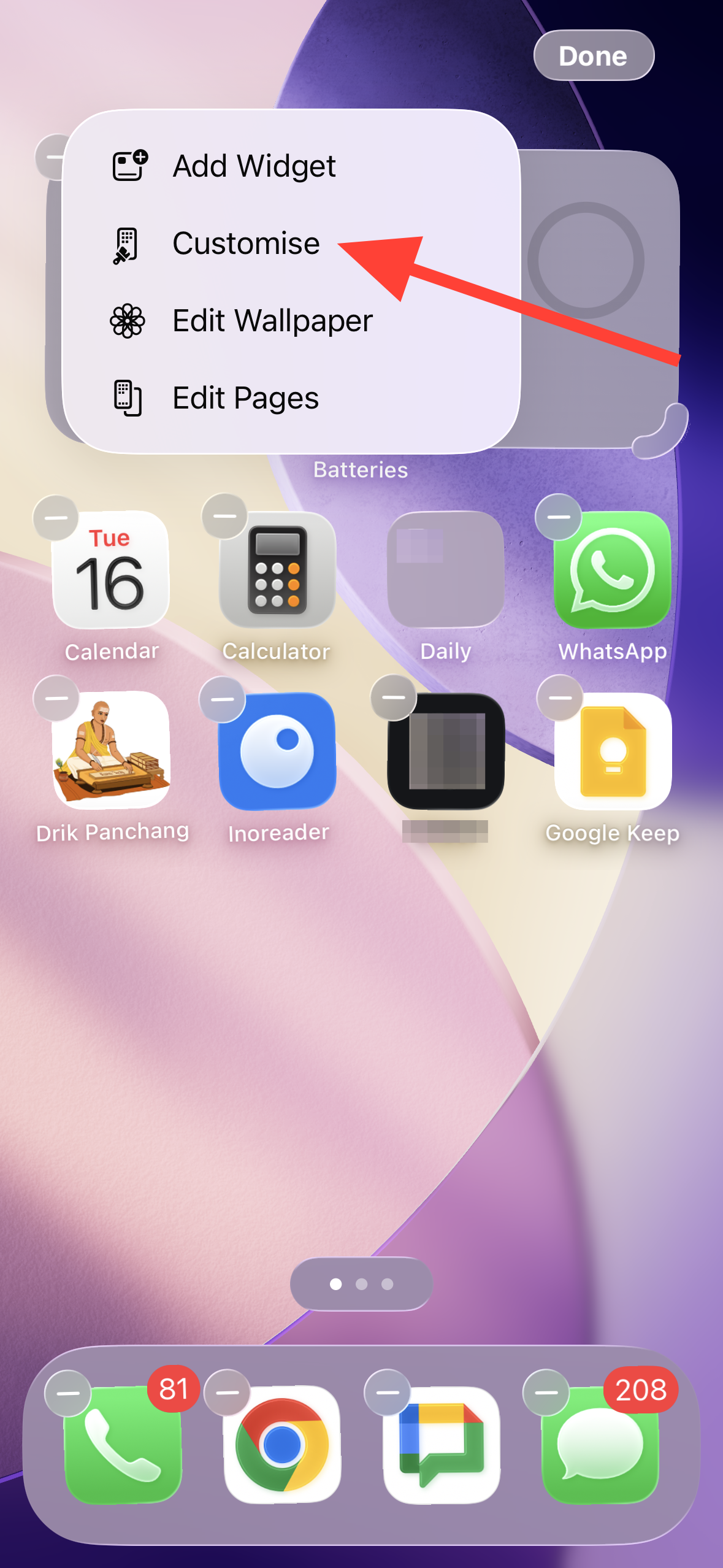
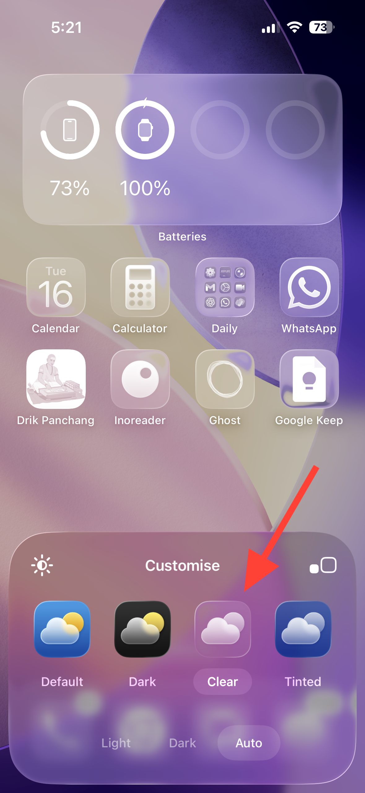
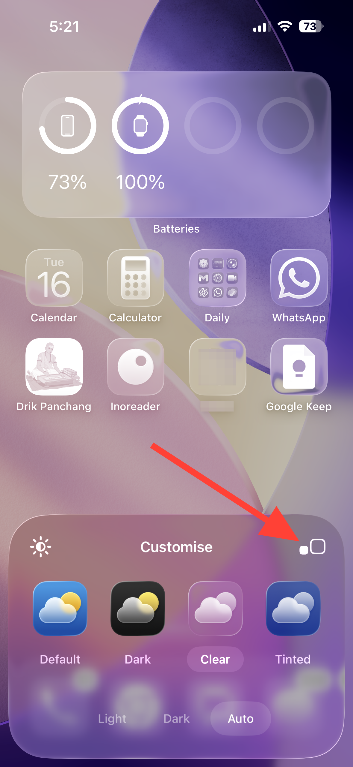
Step 2: Open the appearance panel. Tap Edit at the top, then tap Customize. This brings up the icon and widget appearance options at the bottom.
Step 3: Pick a base style. Choose Light or Dark to apply a solid look, or select Auto to switch between light and dark automatically based on system appearance. Auto reduces manual toggling and keeps icon readability aligned with your overall theme.
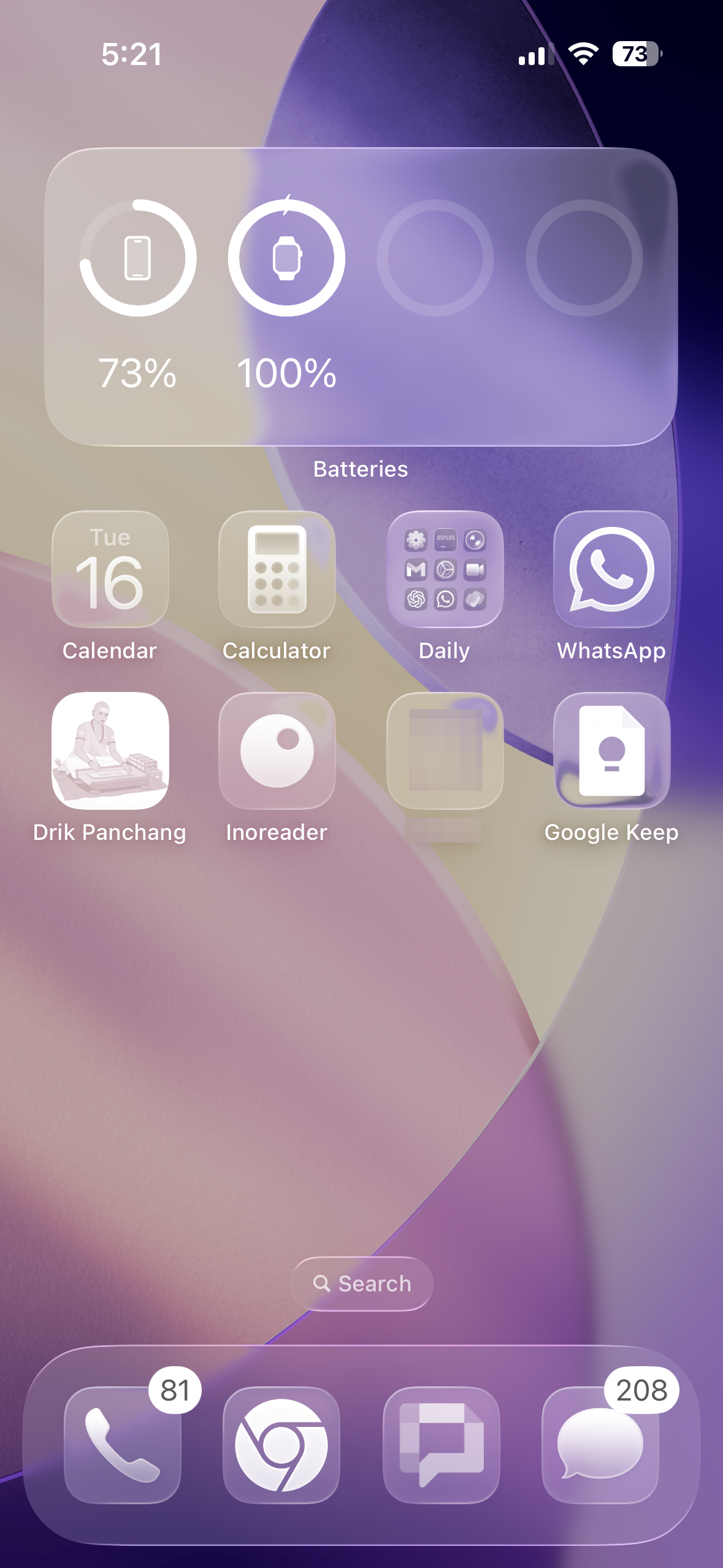
Step 4: Make icons translucent with Clear. Select Clear to give icons and widgets a glass-like, see‑through look. Then choose Light, Dark, or Auto for the Clear style to balance legibility with your wallpaper.
Step 5: Apply the change. Tap anywhere outside the panel to keep the selection. Your icons and widgets update instantly across the current Home Screen.
Add a color tint (with sliders and eyedropper)
Step 1: Enter edit mode again. Touch and hold the Home Screen background until icons jiggle, then tap Edit followed by Customize to open the appearance panel.
Step 2: Choose Tinted. Tap Tinted to enable color controls for icons and widgets. This is useful for creating a unified palette or matching a specific wallpaper color.
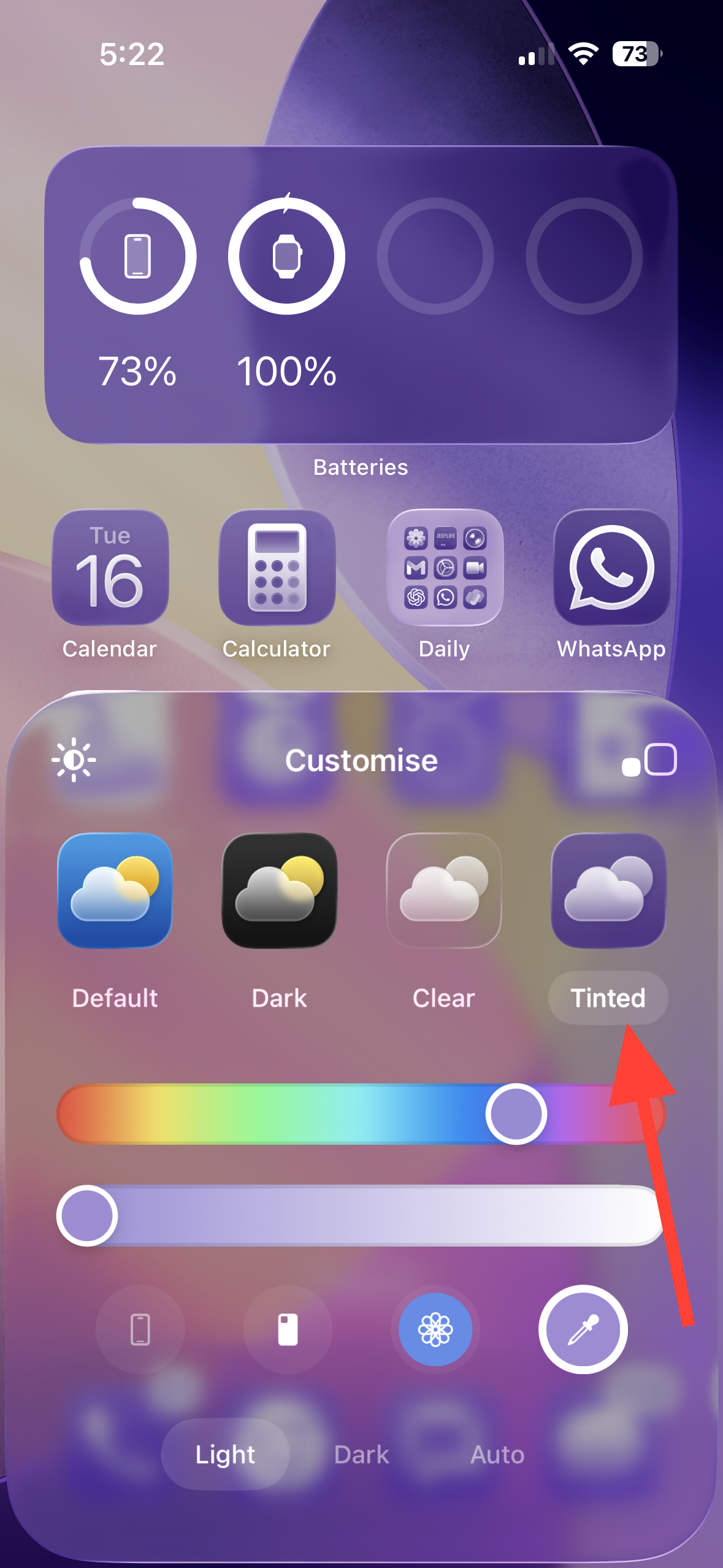
Step 3: Set color and saturation. Adjust the color and saturation sliders to find a tone that keeps app labels readable. You can also use the eyedropper to sample a color directly from your wallpaper for a precise match.
Step 4: Pick Light/Dark/Auto for the tint. Select Light, Dark, or Auto to ensure the tint works in bright and dim environments. Auto saves you from switching manually as lighting changes.
Make icons larger or smaller
Step 1: Enter edit mode. Touch and hold the Home Screen until icons jiggle, then tap Edit and Customize.
Step 2: Change icon size. Tap the Large icon size button to increase icon size for quicker targeting and fewer missed taps. Note that in large size, app names are hidden to reduce clutter.
Step 3: Revert to small if needed. If you rely on app names for recognition, switch back to the smaller size so labels reappear and more apps fit on each page.
Return to default icons
Step 1: Open the appearance panel. Touch and hold the Home Screen, tap Edit, then Customize.
Step 2: Select the default look. Choose Light or Dark without Clear or Tinted, or use Auto for dynamic switching. Tap outside the panel to apply.
Improve readability (optional)
Step 1: Dim a busy wallpaper during editing. In the Customize panel, use the wallpaper dimmer (sun icon) to lower background brightness behind icons. This increases contrast so labels remain legible when using Clear or high-saturation tints.
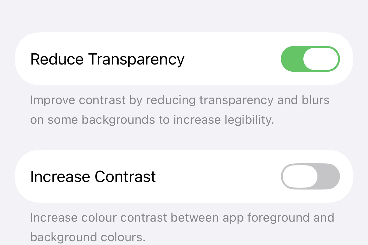
Step 2: Use accessibility contrast controls if text stays hard to read. Go to Settings > Accessibility > Display & Text Size and try Reduce Transparency or Increase Contrast. These settings replace translucent layers with solid panels and boost separation between elements, making icon labels and widget text easier to see.
Things you should know
- Changes apply to both app icons and widgets on the Home Screen.
- Clear and Tinted are visual overlays; extremely bright or complex wallpapers can still reduce label contrast. Use the dimmer or a simpler background for consistent readability.
- Large icon size removes app names by design. If you depend on labels, use the smaller size.
- Auto appearance tracks your system’s Light/Dark mode, keeping icon contrast aligned with your overall theme without manual switching.
- Custom icons created via the Shortcuts app or third‑party launchers may not fully adopt system styling. Use standard app icons for consistent results.
- You can keep different Home Screen looks linked to different Lock Screens if you maintain multiple Lock Screen configurations.
With iOS 26, you can set a look that prioritizes contrast, color, or a clean glass effect—all from the Home Screen editor in seconds.