
iOS 26 adds a new visual system and more flexible personalization across the Lock Screen, Home Screen, and Messages. The update introduces Liquid Glass visuals, a larger adaptive clock, 3D “spatial” wallpapers, and clear or tinted app icons, plus chat backgrounds you can set per conversation.
Customize the Lock Screen (clock size, spatial depth, widgets)
You can now resize the clock, apply a glass style to the time, add a subtle 3D effect to photos, and reorganize widgets.
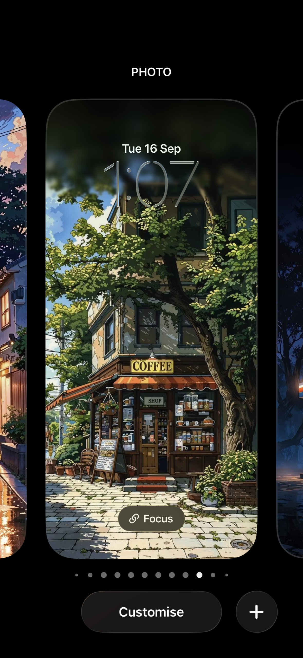
Step 1: Enter edit mode. Wake your iPhone, touch and hold the Lock Screen until the gallery appears, then tap Customize. This opens the Lock Screen editor so you can modify the current setup or create a new one.
Tip: Tap the '+' icon instead of customize if you wish to create a new lock screen with a new wallpaper.
Step 3: Resize the time. Tap the clock once to select it, then drag the handle at the lower-right corner of the clock to increase or decrease its size. Larger layouts can make time glanceable from farther away.
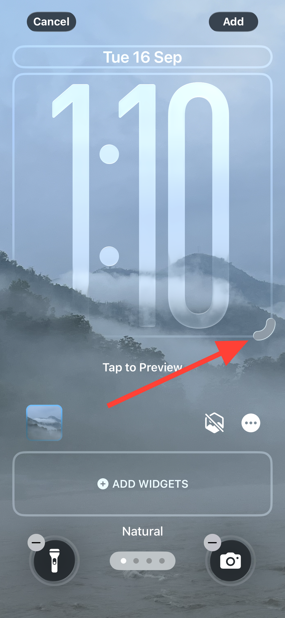
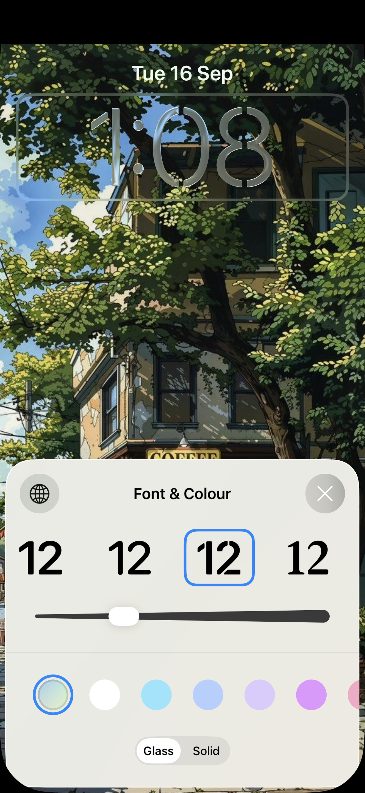
Step 4: Set clock style. With the clock selected, choose Glass or Solid, adjust the font weight, and pick a color. Glass gives the time a translucent, material look; Solid favors legibility on busy images.
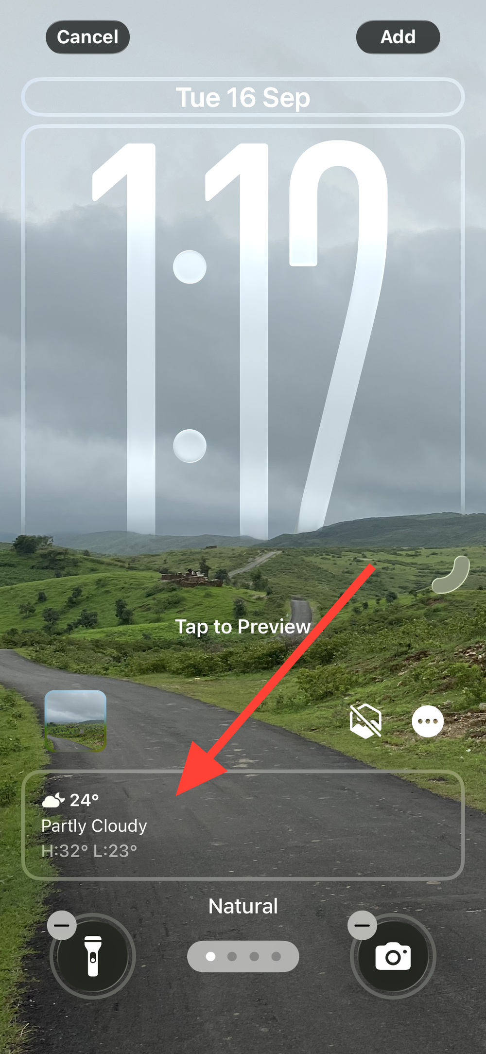
Step 5: Place your widgets. Tap the widget area to add items like Weather, Calendar, or Shortcuts. If your photo has a prominent subject, moving widgets lower can keep the composition clean while still surfacing glanceable info.
Step 6: Reassign the two quick controls. In the editor, remove the default Flashlight/Camera if you prefer, then add controls you use more often (for example, Calculator or a Shortcuts action). This cuts the taps to reach frequent tools from the Lock Screen.
Transform Home Screen icons (clear, tinted, light/dark, size)
Home Screen icons can now be made clear (translucent), tinted to a custom color, shown in light or dark appearances, and resized.
Step 1: Enter jiggle mode. On the Home Screen, touch and hold an empty area until app icons start to jiggle, then tap Edit at the top and choose Customize. This opens the icon appearance controls.
Step 2: Change size. Tap the size control to switch between small and large icons. Large icons remove labels, which reduces visual clutter if you rely on position and icon shape.
Step 3: Make icons clear. Tap Clear, then pick Light, Dark, or Auto. Clear icons take on a frosted-glass look influenced by your wallpaper, which can make backgrounds feel more immersive.
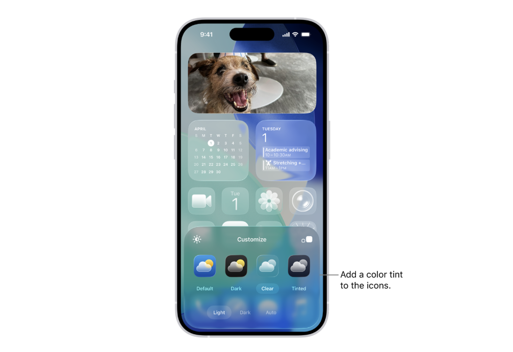
Step 4: Apply a custom tint. Tap Tinted to set a color and saturation for icons and widgets. Use the sliders or the eyedropper to sample a color from your wallpaper so icons feel consistent with your background.
Step 5: Improve legibility. If your wallpaper is bright, try Dark or Auto appearance for clearer icon edges and labels. This reduces washout where light text sits over light imagery.
Change/adjust the Liquid Glass look (optional)
If the new translucent UI makes elements difficult to read, you can increase contrast across the system without changing your wallpaper or layout.
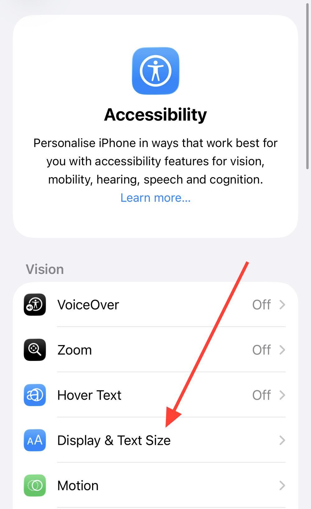
Step 1: Open Settings and tap Accessibility. Accessibility tools provide visual options that prioritize readability.
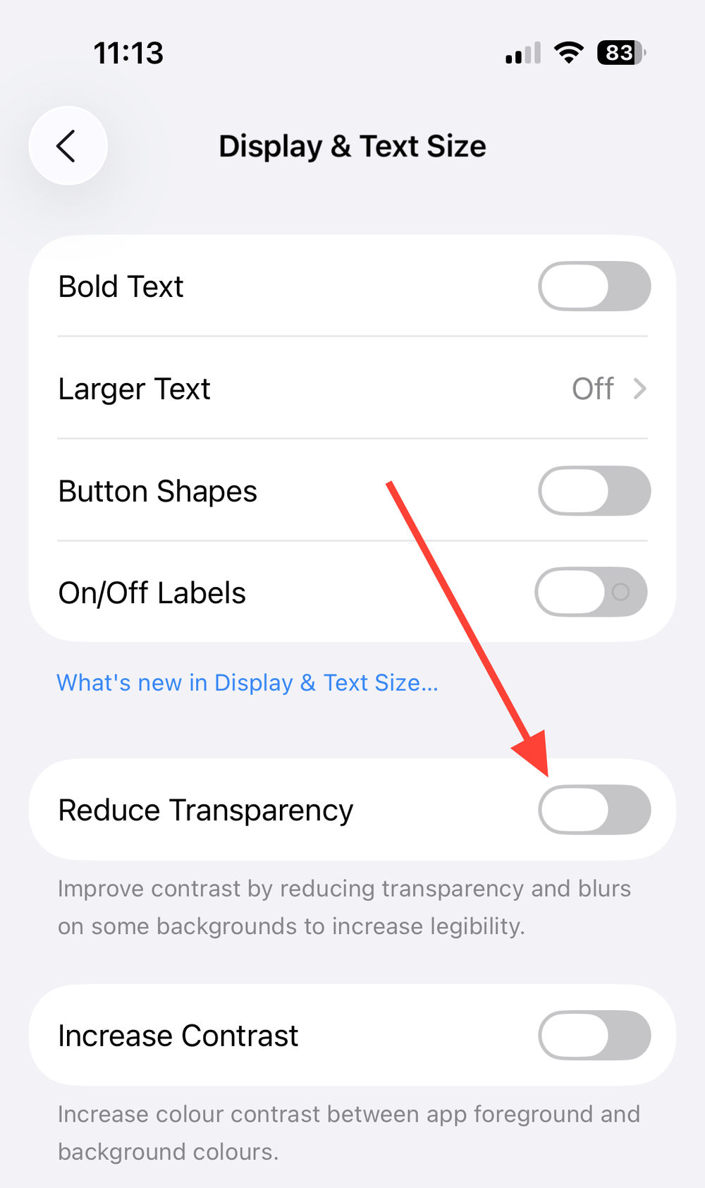
Step 2: Tap Display & Text Size. This screen centralizes visibility controls like contrast, transparency, and motion.
Step 3: Turn on Reduce Transparency. Buttons, panels, and folders switch from translucent to solid backgrounds, which improves text and icon clarity on bright or high-frequency wallpapers.
Step 4: Optional: Adjust other visibility settings. If animations feel busy, consider Reduce Motion. Keep in mind some visual effects will simplify to maintain clarity.
Set conversation backgrounds in Messages
Messages supports dynamic, photo, and solid-color chat backgrounds per conversation, with the option to generate custom backgrounds using Image Playground on supported devices.
Step 1: Open Messages and choose a conversation. Tap the chat’s title near the top to open that conversation’s settings panel.
Step 2: Tap Backgrounds. Pick a preset (e.g., Water, Sky), choose a solid color, select a photo, or generate a background if your device supports Apple Intelligence features.
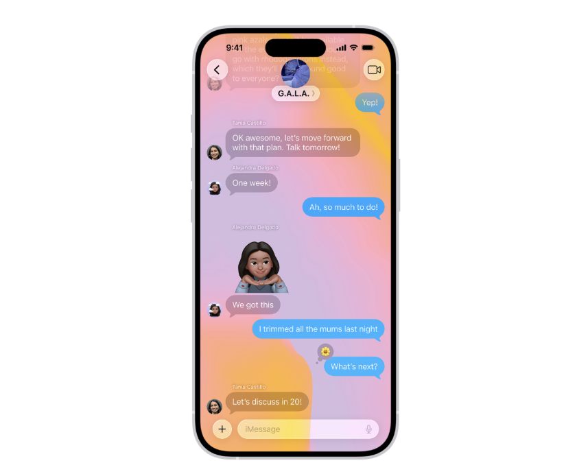
Step 3: Review readability. Ensure bubbles and text remain easy to read against the chosen background. Adjust color or pick a different style if parts of the interface look washed out.
Step 4: Disable globally if needed. To turn conversation backgrounds off for all chats, go to Settings > Messages and toggle off Conversation Backgrounds. This reverts to the default look.
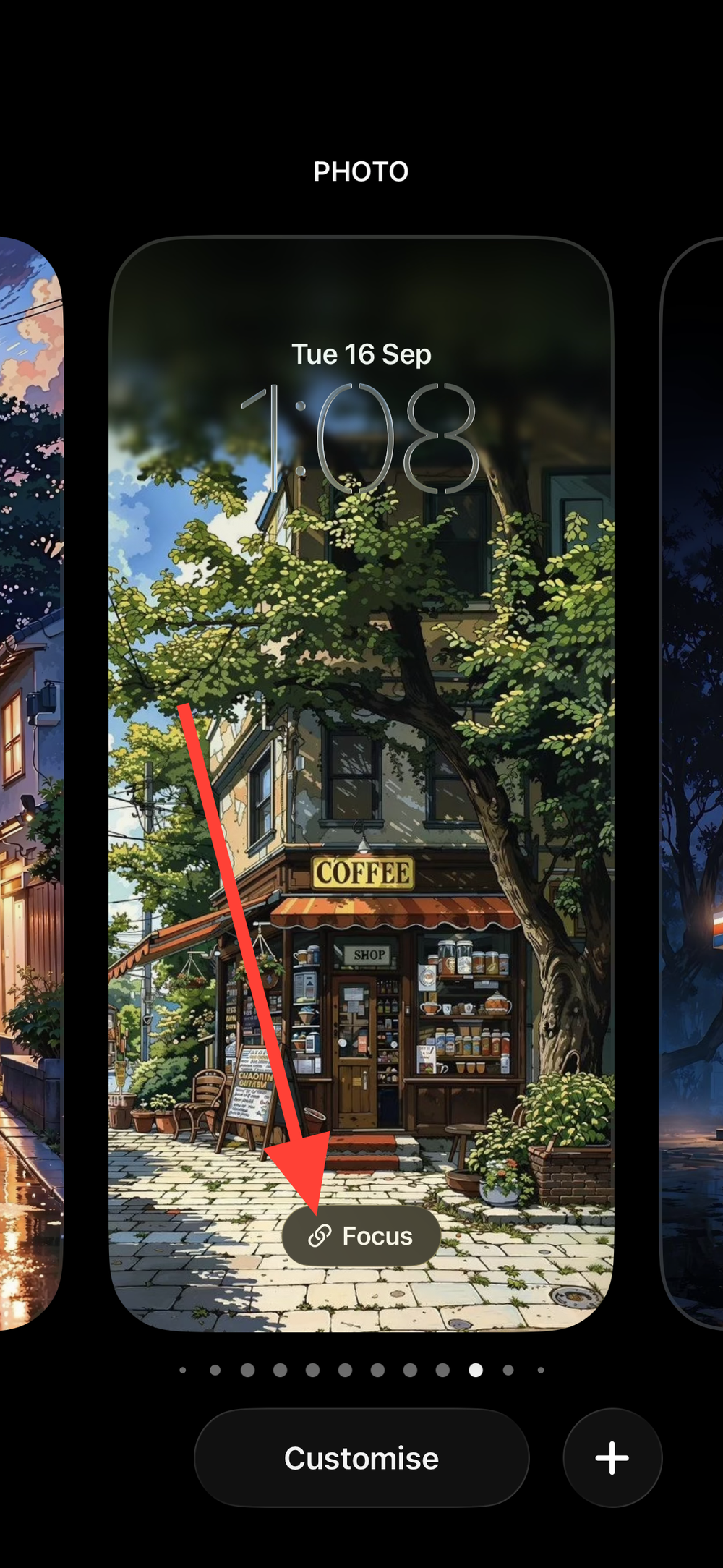
Link a Lock Screen to a Focus (auto-switch based on context)
Pairing Lock Screens with Focus profiles swaps in the clock, widgets, and quick controls you need for work, downtime, commuting, or sleep—no manual switching required.
Step 1: Touch and hold the Lock Screen and tap Focus. This links the current Lock Screen to a specific Focus mode.
Step 2: Choose a Focus (Work, Personal, Sleep, Do Not Disturb, etc.). When that Focus activates, your linked Lock Screen appears, keeping tools aligned with your context.
Step 3: Tap Focus Settings to add schedules or triggers. Time, location, and app triggers can automatically activate the Focus and its paired Lock Screen.
Tips for stronger depth effect and clarity
These quick adjustments make the new visuals more consistent and easier to read.
- Pick photos with clear subject separation for spatial depth. Portraits with a distinct foreground and some space above the subject help the clock flow around the image cleanly.
- Prefer mid-to-dark or softly blurred wallpapers with Clear icons. This keeps icon edges and labels visible without constant tweaking.
- Use Solid time style if the clock blends into the image. You’ll retain the photo while keeping time legible at a glance.
- Keep widgets minimal on photo-heavy Lock Screens. A small, essential set avoids visual competition with the resized clock and spatial effects.
If you try a change and don’t love it, the editors make it simple to revert or create a fresh variant—save versions for work, travel, or weekends and switch as needed.