iOS 26 introduces Apple’s Liquid Glass design with a Clear style for app icons and widgets on the Home Screen. The Clear style removes color and adds a translucent, layered look that can be set to Light, Dark, or Auto appearances.
Turn on Clear icons
You change icon styles from the Home Screen using the system’s built-in customization panel.
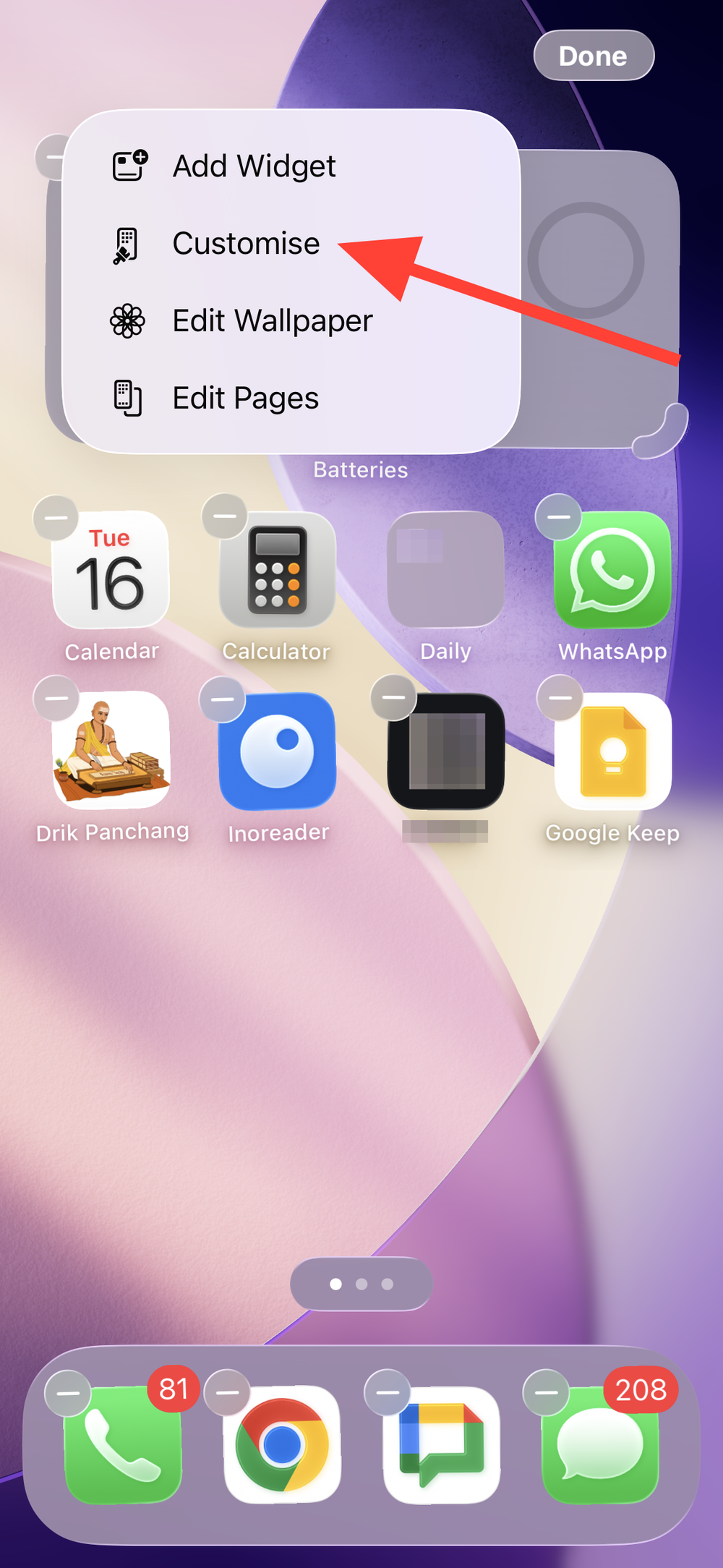
Step 1: Touch and hold an empty area on your Home Screen until the icons start to jiggle. This unlocks layout editing and the appearance controls.
Step 2: Tap Edit at the top of the screen. This opens the Home Screen customization menu.
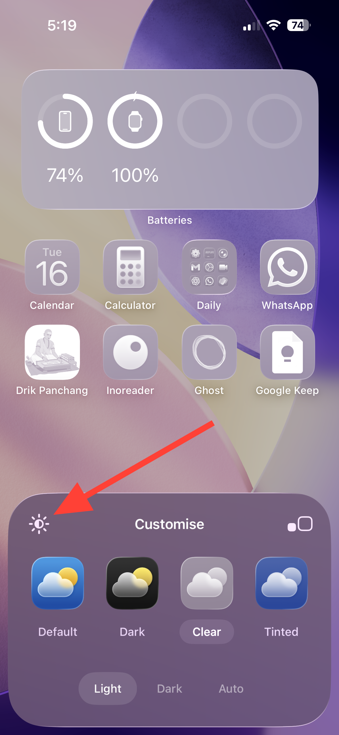
Step 3: Tap Customize. You’ll see icon and widget style options at the bottom.
Step 4: Tap Clear. This switches icons (and widgets) to the transparent, glass-like style.
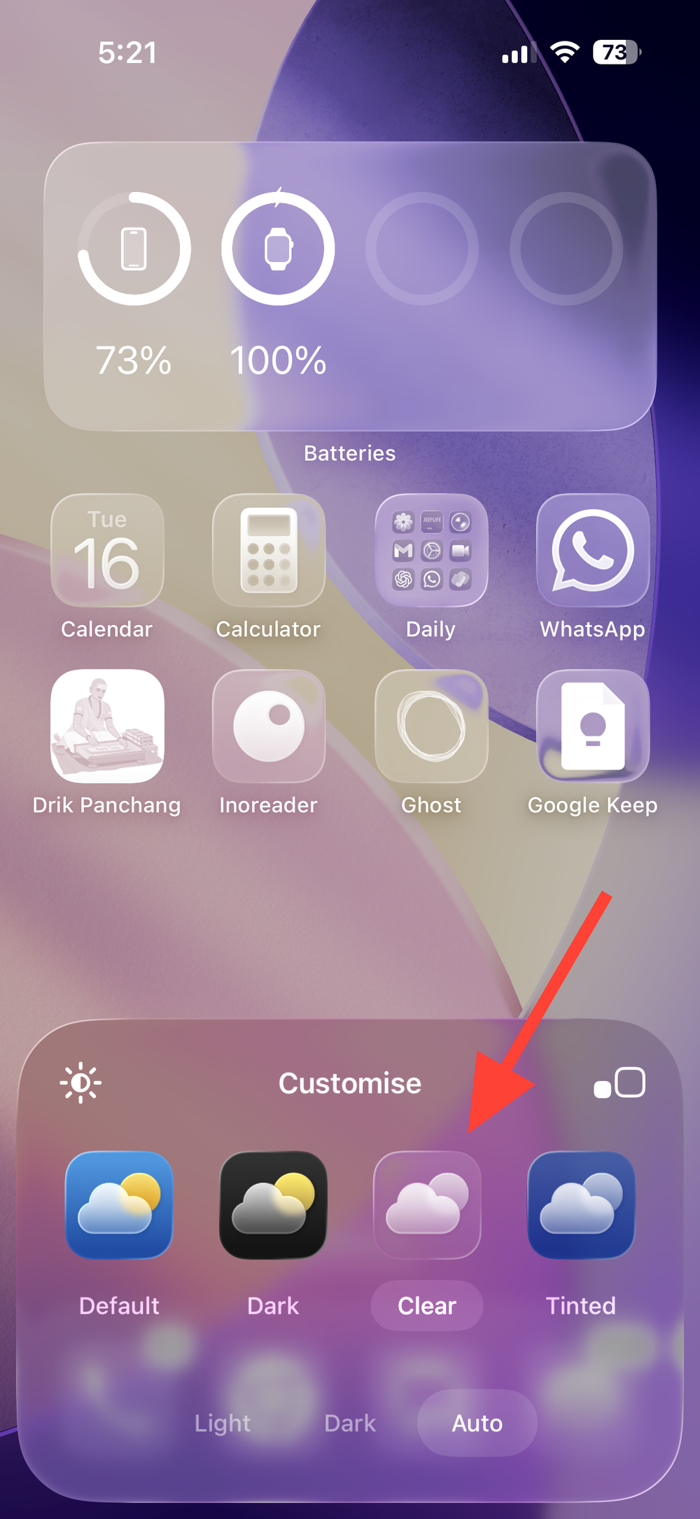
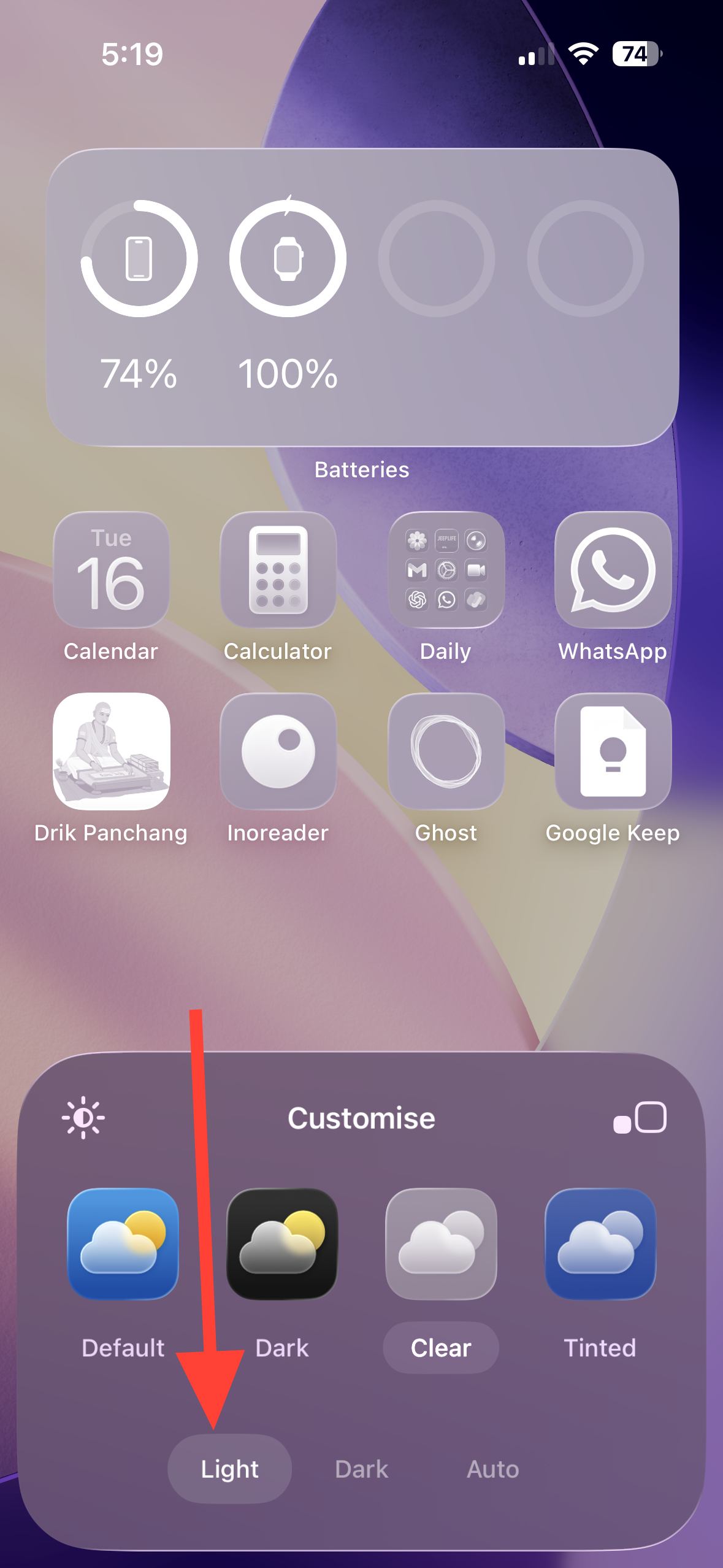
Step 5: Choose Light, Dark, or Auto. Light is the most see-through and subtly shades your wallpaper; Dark keeps some transparency but adds a darker base; Auto follows your iPhone’s appearance setting.
Step 6: Optional: If app names or icons are hard to read, tap the wallpaper dimmer (sun icon) in the Customize panel to lower wallpaper brightness behind icons.
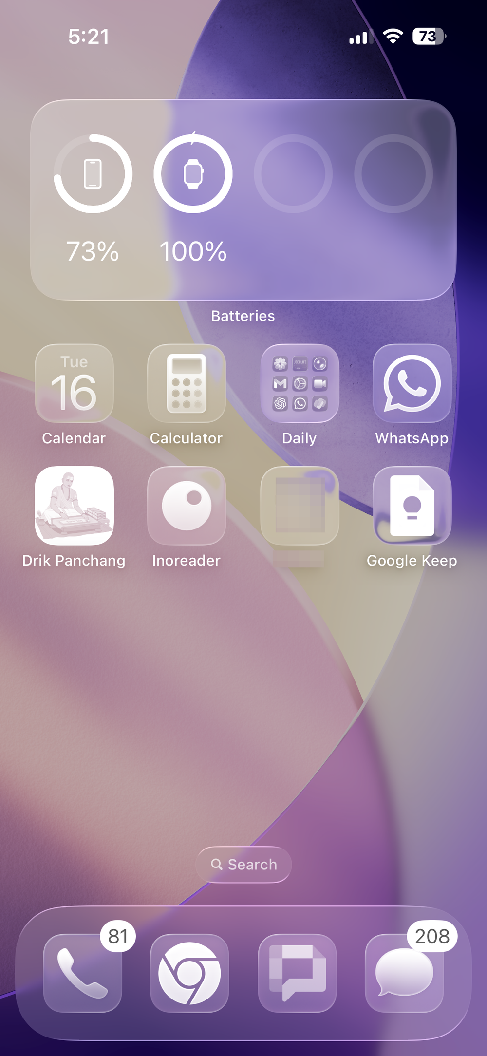
Step 7: Tap an empty area of the screen to apply the change. Your Home Screen will update immediately.
Tip: You can also adjust icon size in the same Customize panel. The large size removes app names for a cleaner look; the standard size keeps labels visible.
Choose the best Clear mode for visibility
Step 1: Pick Light for maximum “glass” effect. This creates semi-transparent tiles that subtly darken the wallpaper beneath.
Step 2: Pick Dark if you want stronger separation from busy wallpapers. You keep the Clear effect, but with a darker base that improves legibility.
Step 3: Pick Auto to switch Light/Dark based on Appearance. Auto tracks your system’s light/dark schedule or manual toggle to maintain contrast throughout the day.
Fixing Clear icons that look opaque or grey
Method 1: Turn off Reduce Transparency
Reduce Transparency replaces translucent system materials with solid layers, which makes Clear icons look grey and flat.
Step 1: Go to Settings > Accessibility > Display & Text Size. This is where system-wide visibility and contrast controls live.
Step 2: Turn off Reduce Transparency. Return to your Home Screen and check that Clear icons now appear translucent.
Method 2: Turn off Increase Contrast (if labels stay dark or visuals feel heavy)
Increase Contrast boosts foreground/background separation and can reduce the Clear effect and force darker labels.
Step 1: Go to Settings > Accessibility > Display & Text Size. These controls adjust system rendering for legibility.
Step 2: Turn off Increase Contrast. This restores the intended Clear look and lets label color adapt to context more naturally.
Note: Using both Reduce Transparency and Increase Contrast together removes most translucency from Clear icons. If you rely on these features for accessibility, prefer Dark Clear and the wallpaper dimmer to maintain legibility.
Method 3: Verify you selected Clear (Light) rather than Dark or Default
Dark Clear and the Default icon style can appear less transparent on certain wallpapers.
Step 1: Touch and hold the Home Screen background until icons jiggle, then tap Edit.
Step 2: Tap Customize, then tap Clear.
Step 3: Select Light. This is the most transparent look. Tap outside the panel to apply.
Method 4: Dim or change your wallpaper
Very bright or high-contrast wallpapers can make Clear icons and labels harder to read.
Step 1: Open the Home Screen Customize panel again. This is where the wallpaper dimmer is available.
Step 2: Tap the sun icon to reduce wallpaper brightness behind icons. If needed, switch to a simpler wallpaper with fewer high-contrast elements.
Useful details and options
Widgets adopt the same style. When you choose Clear, Home Screen widgets follow that appearance, delivering a consistent glass-like layout.
Per-screen customization. If you use multiple Home Screens tied to different Lock Screens, customize each one’s icon style from its corresponding Home Screen so they match your context.
iPad and Mac. iPadOS 26 supports the same Clear icon style from the Home Screen Customize panel. On the Mac (macOS Tahoe), icon and widget style controls appear in System Settings under Appearance.
Clear icons give the Home Screen a modern, layered look; if readability ever dips, switch to Dark Clear and use the wallpaper dimmer for quick improvement.