
If the new Liquid Glass look in iOS 26 made you cringe on day one, you’re not alone. I’ve been running the betas for months, and my first reaction was also “too much glass.” A few weeks in, though, most of it faded into the background—and the parts that remain are either useful or easy to tune. This is the biggest visual refresh in years for iOS, so an adjustment period is normal, but it doesn’t upend how you use your phone. Most workflows are where you left them; the chrome simply looks and moves differently.
What changed (and what didn’t)
Liquid Glass is a system‑wide material and motion language. In practice you’ll notice:
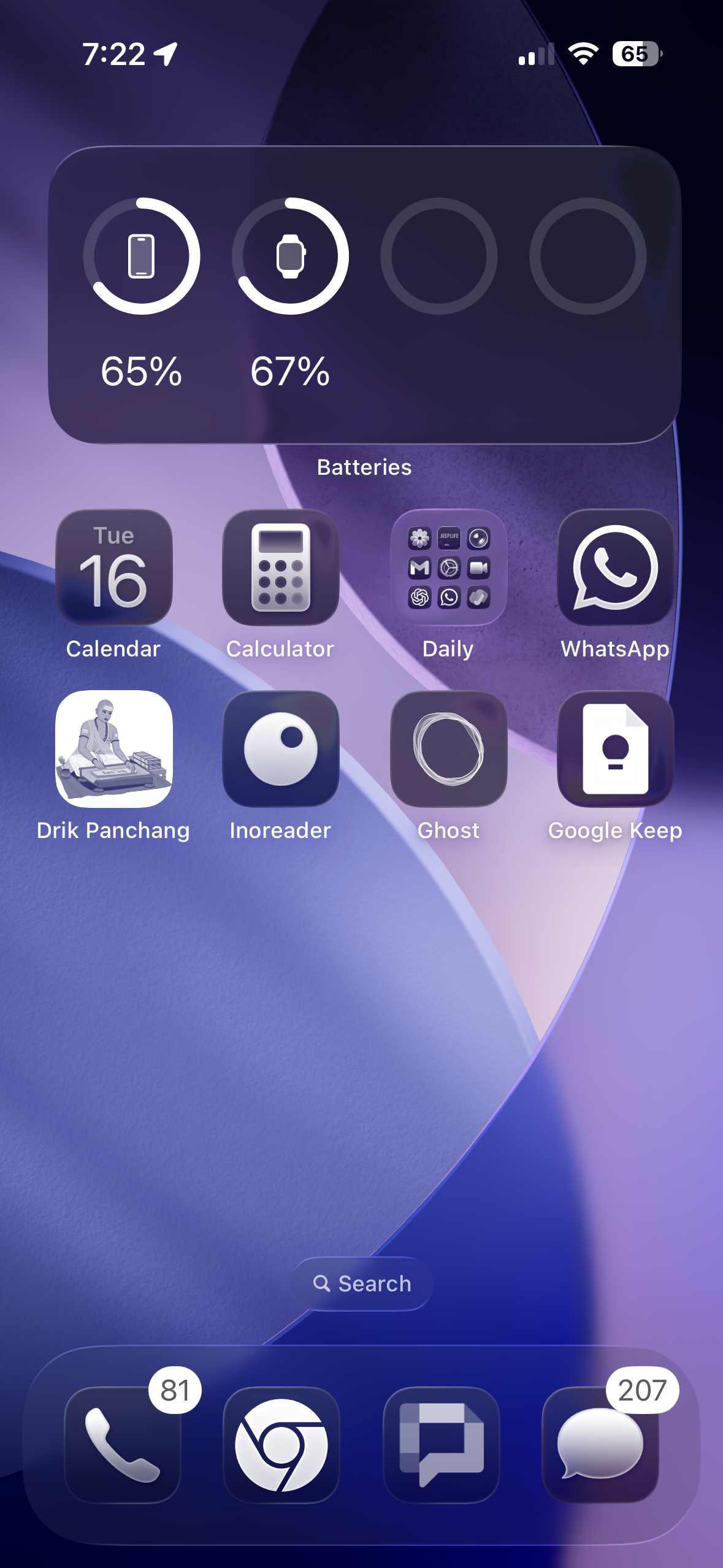
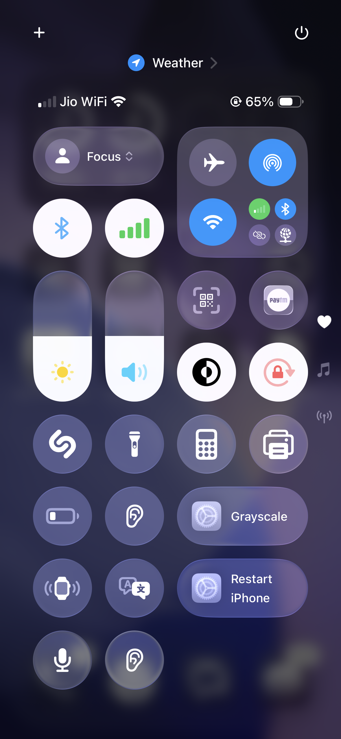
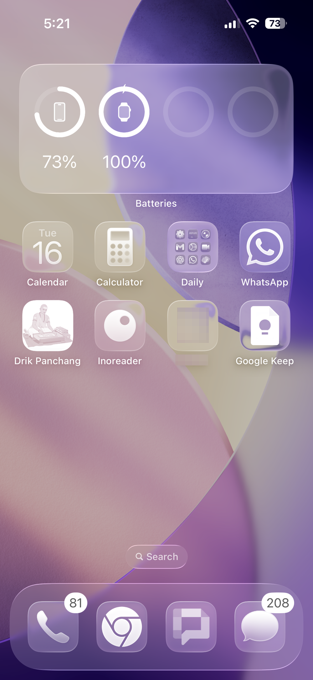
- Controls float over content instead of living in heavy, fixed bars. They’re translucent and can subtly refract colors behind them.
- UI elements morph between states. Buttons and toolbars split, merge, and bounce to indicate context changes—similar in spirit to the Dynamic Island’s motion cues.
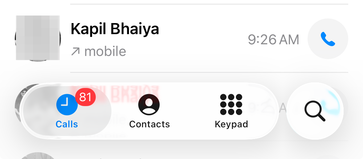
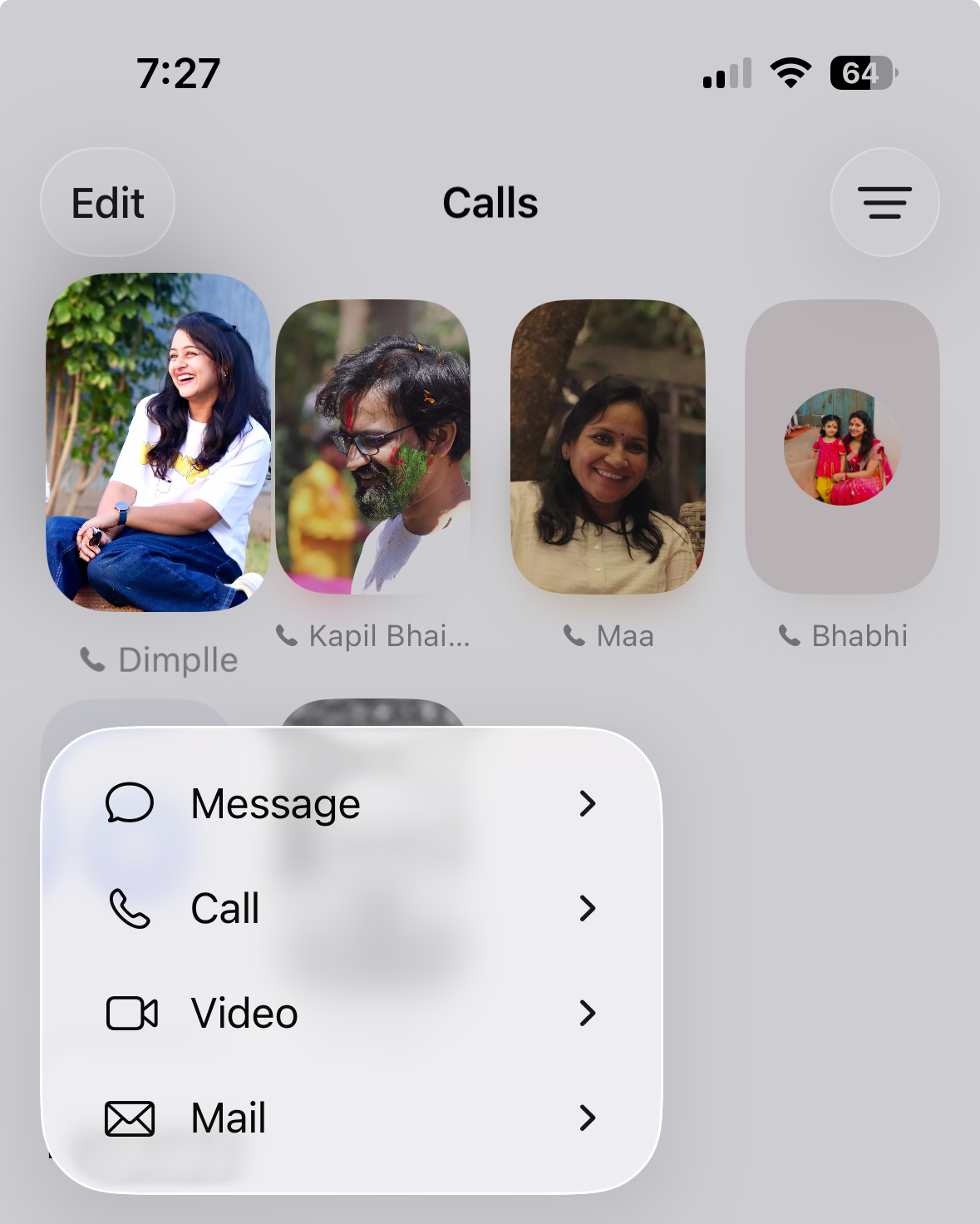
- Menus are less “infinite scroll.” A long‑press often shows a short popover with common actions and a clear “More” panel for the full list.
- Gestures are more consistent. For example, the back gesture works from anywhere on the screen, not just the extreme left edge.
What hasn’t changed: app layouts and core navigation. Mail is still Mail, Photos is still Photos, and your muscle memory largely still works. That’s why, after a few days, it starts to feel familiar again.
Why first impressions skew negative
Three things make Liquid Glass feel “off” at first:
- Legibility varies with background. Because controls are translucent, text and icons can momentarily clash with what’s beneath them, especially over busy photos or light wallpapers.
- Discoverability moves into “More.” Safari, Music, and other apps tuck lesser‑used actions behind a three‑dot menu. It can feel like an extra tap until your habits adjust—or you switch back to a classic layout where available.
- Motion is more expressive. The loupe, morphing buttons, and bouncy panels emphasize state changes. It’s helpful once learned, but draws attention early on simply because it’s new.
Quick adjustments that make it easier to live with
You can take the edge off the glassy look without disabling the redesign entirely:
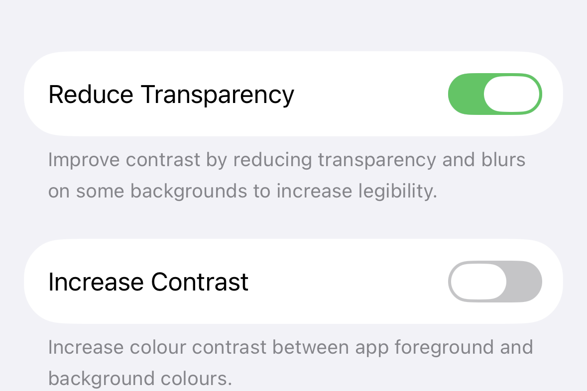
- Reduce transparency when needed. Go to Settings > Accessibility > Display & Text Size and toggle Reduce Transparency. This turns some panels into higher‑contrast surfaces.
- Pick calmer wallpapers. Solid, low‑noise, or darker backgrounds keep overlaid text crisp. Highly patterned photos tend to fight with translucent UI.
- Skip the “clear” icon style. If you try the new ghost‑like icon option and it feels washed out, use the standard tinted/light/dark sets for better contrast.
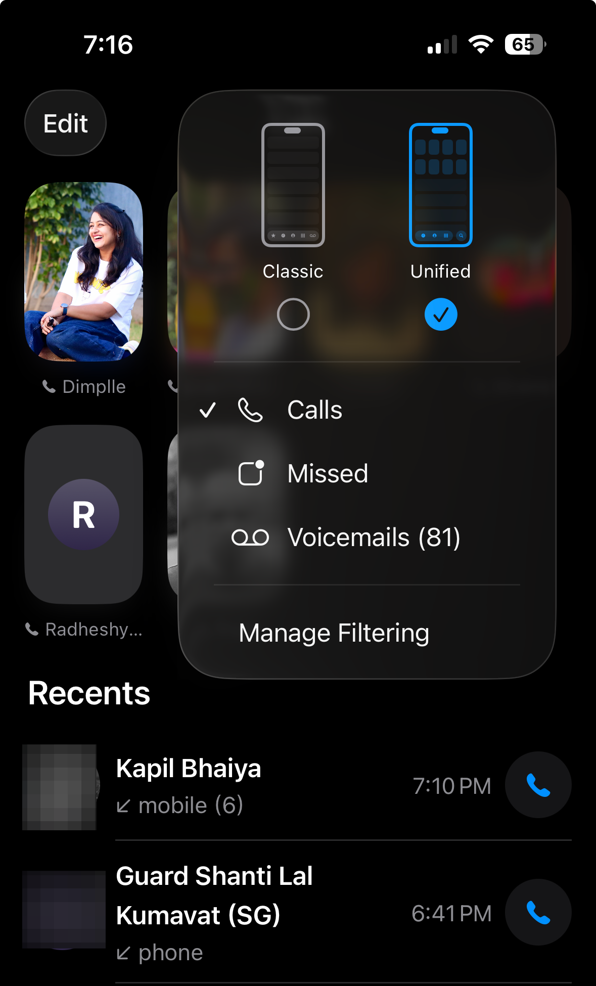
- Use classic layouts where you prefer them. In Safari you can switch from the compact bar to the expanded toolbar (and choose top or bottom). In Phone, you can revert to the classic tab arrangement with Voicemail and Favorites.
- Dial down motion if you’re sensitive to it. Settings > Accessibility > Motion > Reduce Motion softens some of the bouncier transitions.
Tip: If Control Center or notifications look muddy, changing the wallpaper often helps more than any toggle.
Where the new design quietly helps
- Less chrome, more content. Floating, compact bars expose more of what you’re reading or viewing without switching to full‑screen modes.
- State changes are easier to see. When a “Select” button splits into multiple controls or a toolbar morphs, you get a clear, visual explanation of what just changed.
- Menus are faster to use. The two‑stage popover (quick actions, then “More”) reduces the “endlessly scroll a sheet” problem.
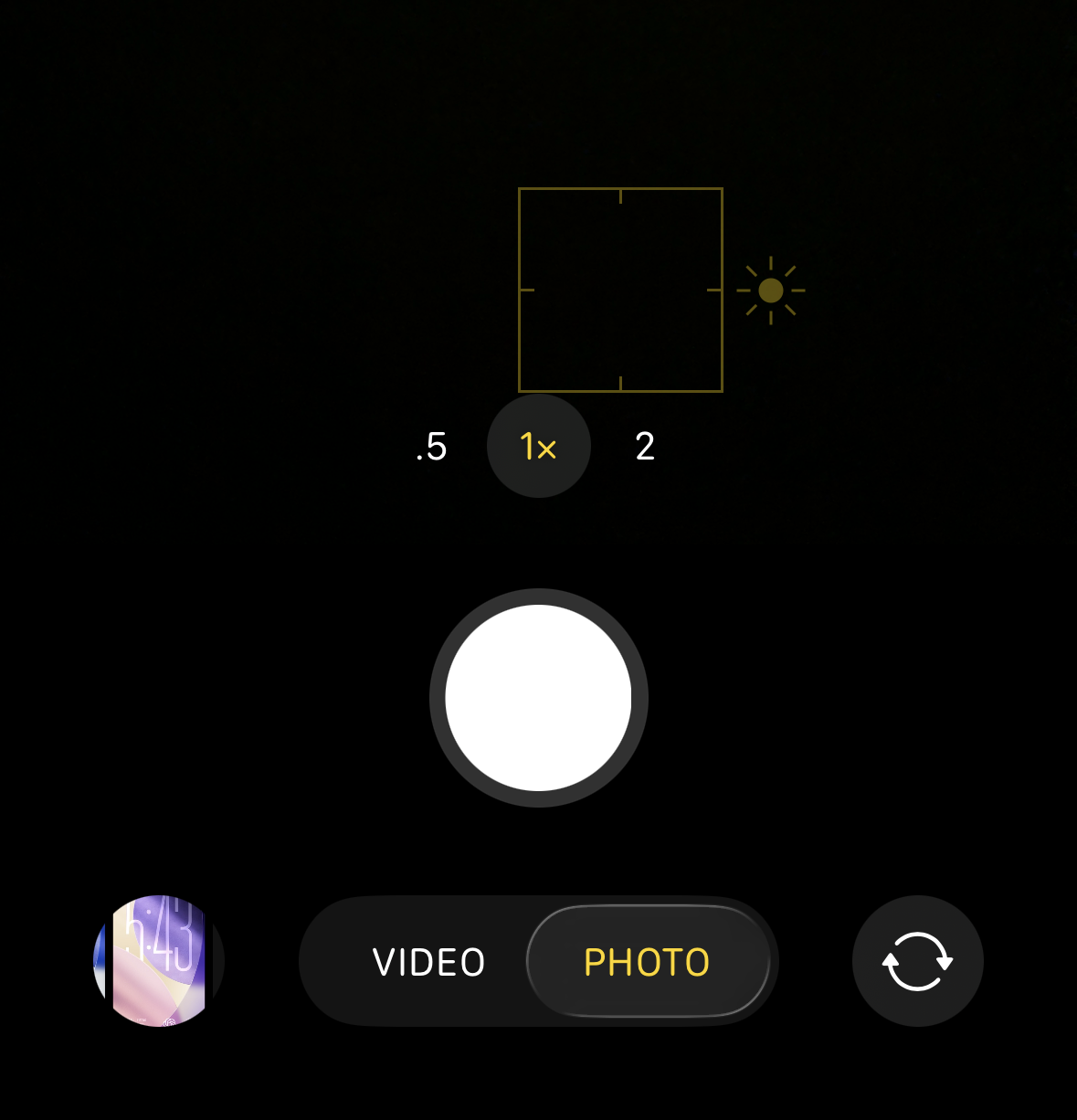
- Camera is easier for quick shots. Photo and Video are front‑and‑center; advanced controls live in a drawer you summon when you actually need them.
- Navigation is simpler. The back gesture now works from anywhere along the edge, which is more forgiving than the old left‑edge target.
Common concerns
- “I can’t always read the UI.” That can happen over certain backgrounds; it’s the trade‑off of translucent glass. Reduce Transparency, darker wallpapers, and standard icon styles materially improve contrast without abandoning the revamp.
- “There are more taps for basic actions.” In some apps, yes—until you switch to their classic layouts. Apple kept those options precisely for people who prefer the old affordances.
- “My phone got hot after updating.” Major releases reindex data and run migrations for a couple of days; performance and battery usually settle. If heavy effects bother you, Reduce Motion and Reduce Transparency help.
- “It’s change for change’s sake.” Under the aesthetics are tangible usability tweaks: more content visible, clearer state transitions, fewer long menus, and consistent gestures. If the visuals don’t appeal, you can still benefit from the interaction changes.
A few places to try first
- Safari: Test both the compact and expanded toolbars. If you like seeing share/bookmark/tab buttons at a glance, keep the expanded version.
- Camera: Shoot for a day with just Photo/Video visible. When you need Portrait or Slo‑Mo, swipe to reveal modes—then tuck them away again.
- Phone: Try the Unified view for a week; if it doesn’t click, switch back to Classic.
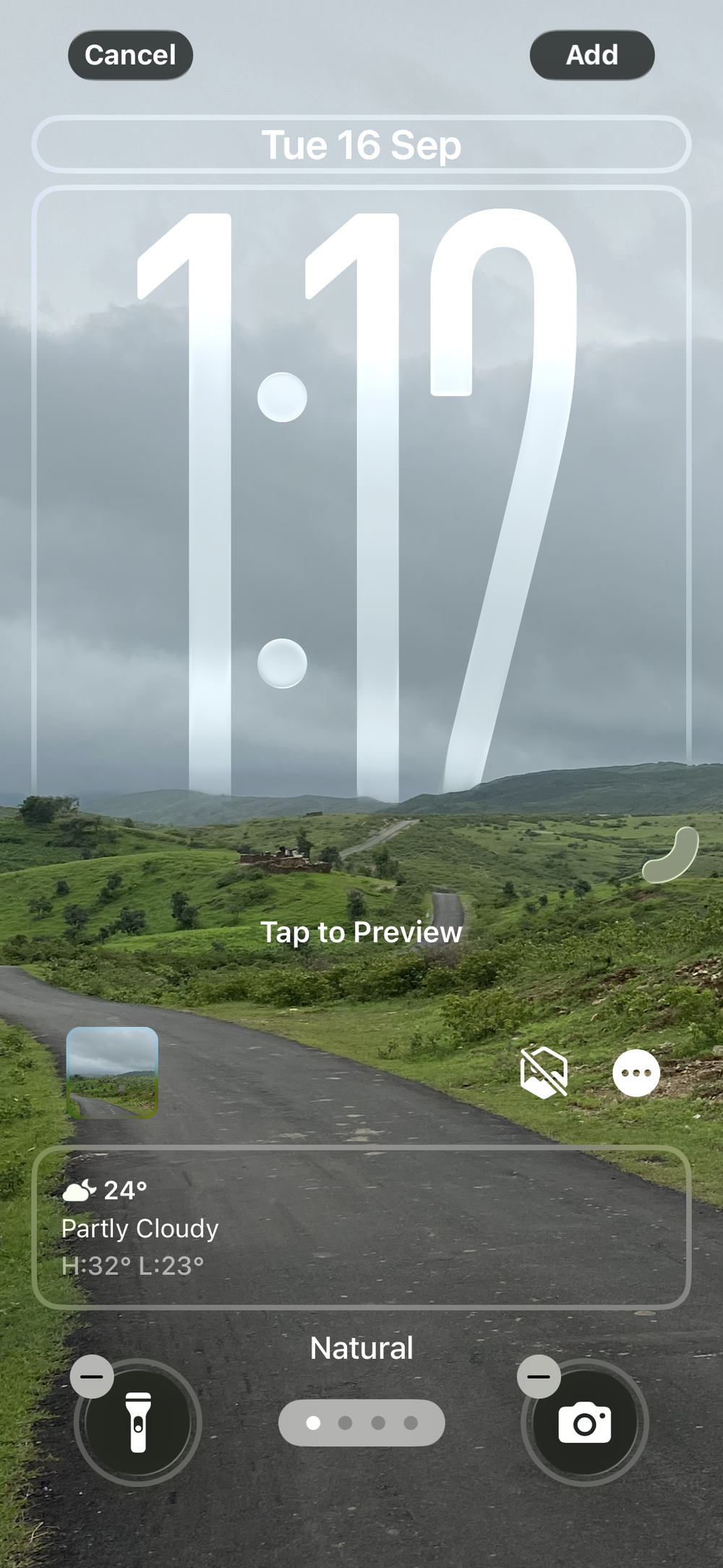
- Lock Screen: Move widgets to the bottom and try the dynamic clock size. Both reduce overlap with your photo subject.
- Menus: Long‑press in Safari, Photos, and Files, then tap the arrow to open the full command panel. It’s faster than hunting through long sheets.
If you still don’t like it
- Keep Reduce Transparency on and use calmer wallpapers—those two changes alone fix most readability complaints.
- Use classic layouts in Safari and Phone where you want persistent buttons.
- Give it a week of normal use. Most people report that the “constant glass” sensation fades once muscle memory reasserts itself.
- Prefer to wait? Sitting out the initial 26.0 and updating to a later 26.x after Apple polishes edge cases is a reasonable choice.
Bottom line: Liquid Glass is a material and motion change, not a functional upheaval. First impressions tend to focus on the sheen; day‑to‑day use depends more on whether you can find what you need quickly and read it clearly. With a few settings tweaks and a short acclimation period, many skeptics end up not only tolerating the new look, but appreciating the practical gains it brings.