Google announced its plans to redesign Gmail last year. The new view for Gmail aligns with the company’s goal to make Gmail an integrated and unified place for other Google apps, specifically Chat, Spaces, and Meet.
What is the New Gmail View?
A less intensive iteration of this integration already exists in Gmail in some form. This integration was rolled out as part of Google Workspace – the rebranding move ushered in partly by the way pandemic changed work. In this old Gmail view, Chat, Meet, and Spaces are available in Gmail’s side panel but the scope is limited.
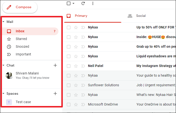
Taking the example of Chat, you can see your most recent chat threads and start chats with new and existing conversations right in Gmail. But the experience is in no way similar to what the Chat app offers. Instead, the Gmail interface only offers a restricted use of the app.
However, the new Gmail view changes that. With the new view for Gmail, you can use all these apps in a single tab. The side panel of Gmail will now look like the bottom toolbars from the iOS or Android apps for Gmail. This navigation rail will essentially serve as the main menu for the app, featuring only the navigation entry points for the four apps.
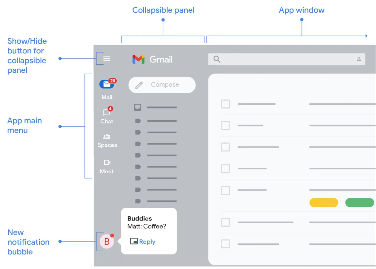
Other components, like folders and labels for Gmail, will now appear on the collapsible panel. These components will vary depending on the app that’s currently open.
You can make this collapsible panel permanent by using the hamburger menu. But if you don’t want it to take up the real estate on the screen, the collapsible panel isn’t the only way to access it. Hovering on the app icon from the main menu will open an overlay menu with the same components.
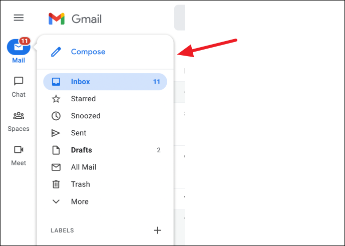
Click the app icon to switch to that app. The app, to its full extent, will open in the right part of the window.
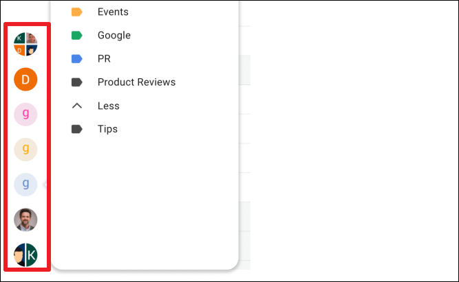
Other changes include the streamlining of chat windows to the bottom of the navigation rail. This declutters the screen instead of the previous approach where minimized chats appeared in the bottom right corner of the screen. New chat notifications will also appear here.
How to Enable or Disable the New Gmail View
This new view for Gmail is still in the rollout phase. So, it’s not available for everyone. If your account is a part of the early rollout, switching to the new experience is as easy as it can be.
Go to gmail.com from your browser and sign in with your account. If the new view is available for your account, you’ll get a notification prompting you to try out the new view in the bottom-right corner of the screen. Click the ‘Try it now’ option. Your Gmail will reload automatically. Chances are that even after reloading, you still might see the old view. Just hit the reload button again and this time the changes should take effect.
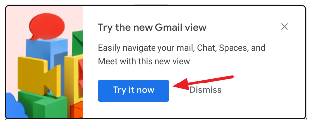
If you dismissed the notification, you can switch to the new view from settings. You can also go to settings if you didn’t get the notification but want to make sure that you didn’t get the update.
In Gmail, click the ‘Settings’ option (gear icon) in the top-right corner of the screen.
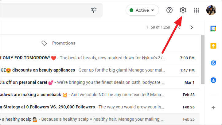
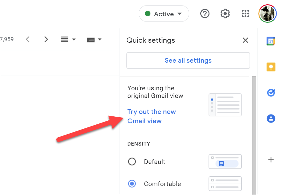
The pane for Quick Settings will open on the right. You’ll see the option for switching to the new view if it’s available for your account. Click the ‘Try out the new Gmail view’ option. Reload Gmail and the new interface will load.
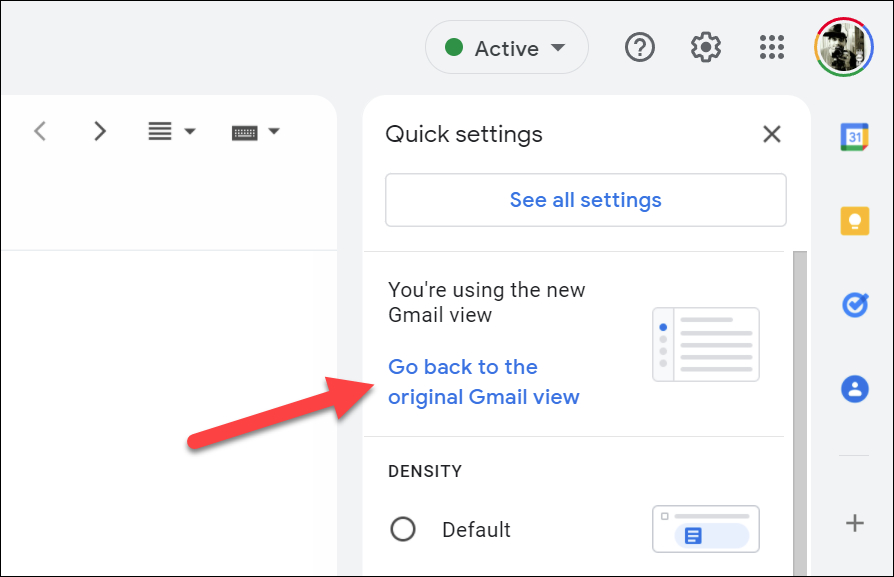
Disabling the new Gmail view. If you find that the new Gmail view is not your cup of tea, you can easily switch back to the original view. Open the Quick Settings pane again and click on the ‘Go back to original Gmail view’ option to disable the new Gmail view.
These changes are just the beginning of the new direction Google wants to take Google Workspace in. The purpose is to make Google Workspace a thriving space for collaboration. And future enhancements will include the introduction of Smart Canvas across Google apps like Docs, Sheets, and Slides, among others.

