
Android’s interface is about to undergo its most significant visual shift in years, as Google prepares to introduce Material 3 Expressive. This isn’t just a fresh coat of paint—it’s a research-backed upgrade focused on making your phone or watch more lively, intuitive, and personal. Arriving with Android 16 on Pixel devices, Material 3 Expressive rethinks motion, color, shape, and typography to make key actions faster to spot, notifications easier to manage, and everyday interactions more memorable.
Why Google Is Changing Android’s Look
Material 3 Expressive builds on the foundation of Material You, Google’s open-source design system first introduced with Android 12. But this update is not a full generational leap—think of it as a bold remix, not a total replacement. The shift comes after Google conducted 46 global studies and gathered feedback from over 18,000 users, uncovering that interfaces with more emotion, personality, and visual clarity consistently outperform flatter, more uniform designs. In testing, users identified important buttons up to four times faster in expressive layouts, and younger users in particular rated these designs as more desirable and modern.
Google’s research also shows that expressive interfaces don’t just look different—they change how people feel about their devices. Study participants described the new look as more energetic, creative, and friendly. The company found a 34% increase in perceived modernity and a 32% boost in “subculture” relevance, meaning users saw the brand as more current and in-the-know. Most importantly, these changes made Android easier to use for people of all ages and abilities, with older adults matching younger users in speed when spotting key UI elements.
What’s Actually New in Material 3 Expressive
Material 3 Expressive introduces several concrete changes to Android’s interface, all aimed at making the system more visually dynamic and functionally direct:
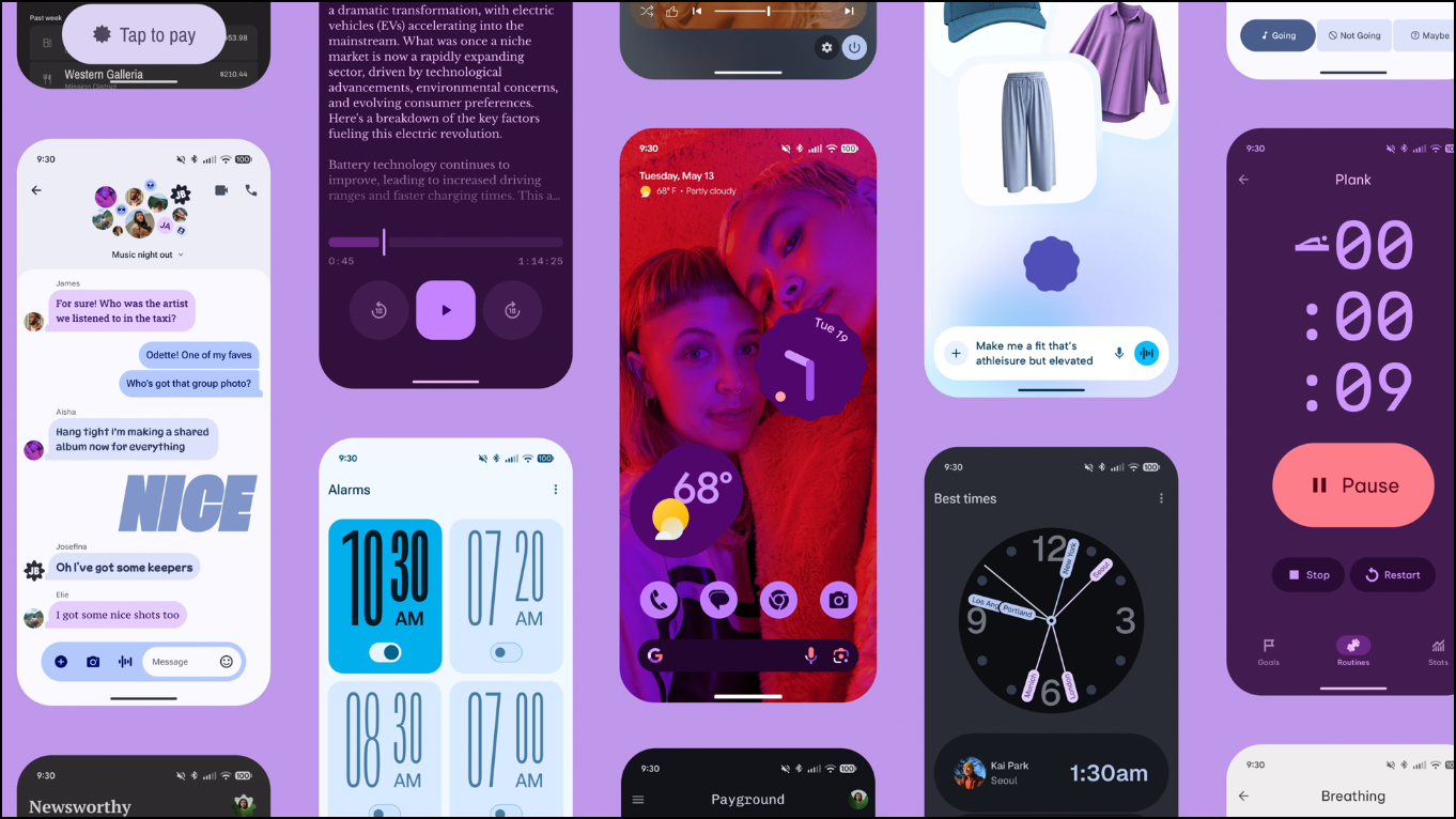
- Spring-based animations and motion: Interactions now feel livelier. Swiping away a notification triggers a smooth detach effect with subtle haptic feedback, and UI elements respond more naturally to touch. These motion upgrades extend to the recent apps screen, volume sliders, and notification shade, giving the entire OS a more responsive feel.
- Refined color theming: The dynamic color engine now produces richer, more distinct palettes. Primary, secondary, and tertiary colors are clearly separated, making it easier to recognize what matters on each screen. These themes still adapt to your wallpaper and preferences, but now provide better visual contrast to avoid blending interface elements together.
- Typography upgrades: Headings and key actions now use larger sizes, bolder weights, and improved hierarchy. This update makes it faster to spot important actions, like sending an email or starting a recording, and will be visible both in system menus and across Google’s own apps.
- Expanded shape library and transitions: Developers can choose from 35 new shape options to build more diverse interfaces. Transitions like morphing a square into a squircle add fluidity, and familiar elements such as app bars and navigation bars have been reworked for better customization and consistency.
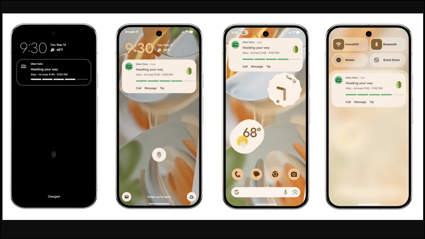
- Blurred backgrounds for depth: The notification shade and quick settings now use a background blur effect, providing a sense of depth and helping users stay oriented while navigating.
- Customizable Quick Settings: Users can now pin more controls (like Flashlight or Do Not Disturb) and resize quick settings tiles, streamlining access to frequent actions.
- Live Updates: Real-time progress from apps (for example, delivery status or rideshare ETAs) appears directly in the notification shade, reducing the need to open separate apps for updates.
Material 3 Expressive on Wear OS and Beyond
The new design language isn’t limited to phones and tablets. Material 3 Expressive is also coming to the Pixel Watch and Wear OS, where it adapts animations to the circular display and brings dynamic color theming to watch faces and system UI. Interactions like entering a PIN or controlling music now feel smoother, and glanceable buttons stretch edge-to-edge for easier tapping. Google promises up to 10% better battery life on Wear OS 6, alongside these design tweaks.
While Material 3 Expressive will debut on Pixel devices running Android 16, other Android manufacturers are expected to adopt elements of the new look—often blending them with their own skins. However, history suggests the full effect will be most visible on Google’s own hardware.
The Research Behind Expressive Design
Google’s approach with Material 3 Expressive was driven by direct observation and measurement. The design team used eye tracking, surveys, and usability tests to refine each component. For example, they tested different button sizes to minimize tap time without cluttering the interface, and measured how quickly users could spot the new, more prominent Send button in an email app—finding a fourfold speedup compared to older layouts.
Importantly, the research team found that expressive design improved usability for everyone, regardless of age or ability. Larger buttons, higher contrast, and better grouping of elements meant people with movement or vision differences also found the interface easier to use. However, Google cautions that expressive design isn’t always appropriate—familiar UI patterns still matter, and visual flair should never sacrifice clarity or core functionality.
How to Prepare for Material 3 Expressive
Pixel users can expect Material 3 Expressive to roll out in a post-Android 16 update later this year, with a possible beta for early adopters. Developers should start experimenting with the updated Material 3 Design Kit for Figma, and review the latest guidelines to ensure apps feel at home in the new system. For those managing accessibility, the updated design exceeds previous standards for color contrast and tap targets, but it’s still important to test for specific user needs.
For users who prefer a calmer or more minimal look, Android’s accessibility settings allow reducing motion and adjusting color intensity. Google’s research found a strong minority of users still want less intense visuals, so expect options to dial down some of the new effects.
Material 3 Expressive marks a major shift in how Android looks and operates, aiming to make daily interactions faster and more enjoyable—without losing sight of what makes the platform flexible and approachable. Keep an eye on Pixel updates to see the new style in action soon.