
Safari’s “Compact” tab layout — the single bar that merged the address field into the active tab — is no longer available in macOS 26 (Tahoe) and iPadOS 26. If you relied on the vertically efficient, one‑row design to save screen space, you won’t find a toggle to bring it back on those platforms as of the current release. On iPhone, meanwhile, the new Compact layout is the default and you can still switch between three tab bar positions.
What compact tabs were (and why people used them)
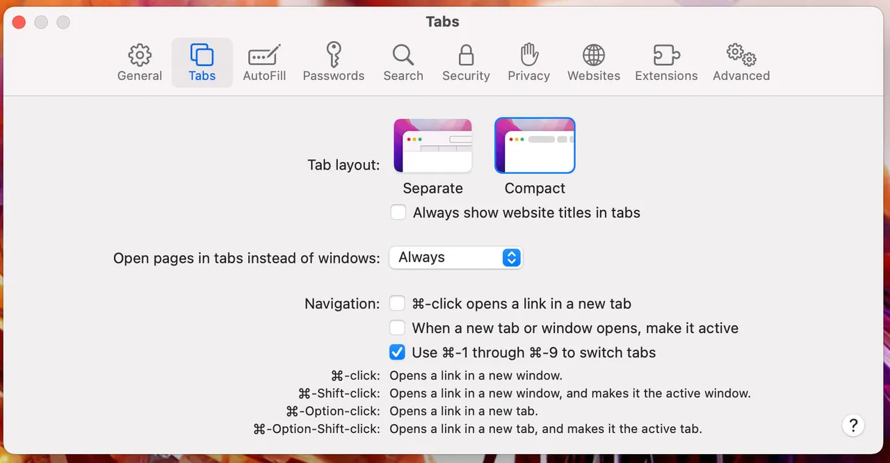
Compact tabs collapsed Safari’s chrome into a single horizontal strip: the URL field lived inside the selected tab, and additional controls tucked into menus. The tradeoff was less persistent UI and more vertical room for web pages — particularly helpful on small displays or when working with multiple windows.
What changed on Mac and iPad
In macOS 26 and iPadOS 26, the Compact layout option has been removed from Safari’s settings. The browser now presents a distinct address/toolbar above a separate tab strip again, with a refreshed look that matches Apple’s system‑wide “Liquid Glass” aesthetic.
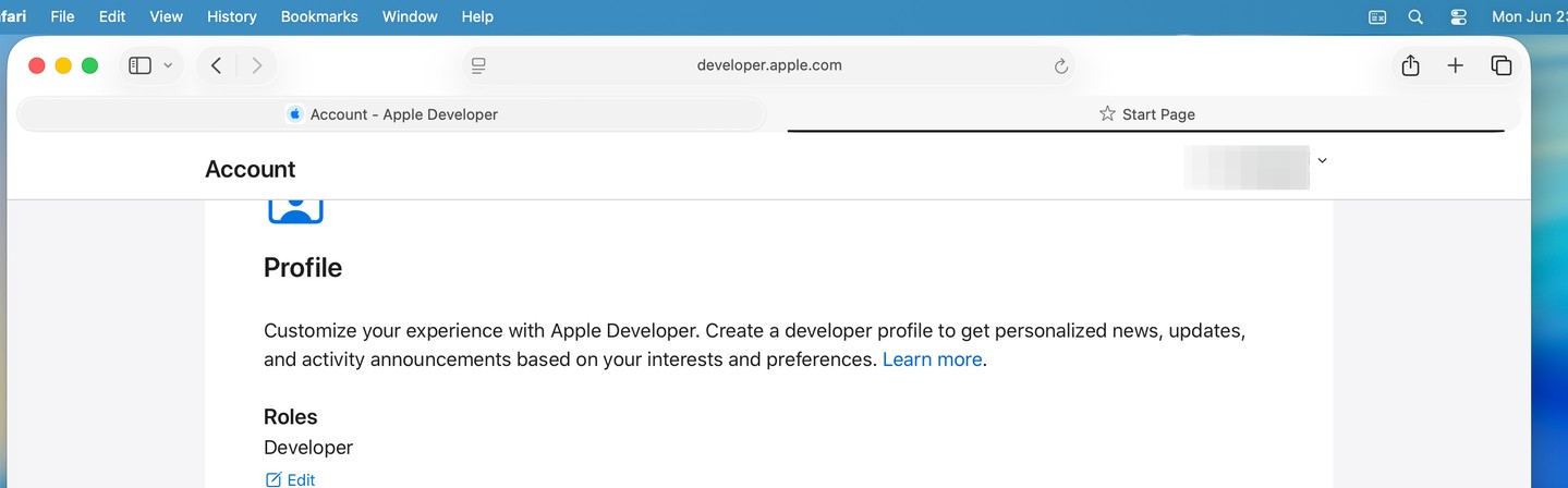
On the desktop, tabs also appear as rounded, separated elements, and the sidebar has been reorganized around features like iCloud Tabs and Saved items. The overall effect is more visual structure, but it consumes more vertical space than the single‑row compact view.
iPhone keeps options — and Compact is the default
Safari on iOS 26 ships with three layouts:
- Compact (default): the floating, condensed toolbar that collapses as you scroll.
- Bottom: the familiar, full‑width bar at the bottom.
- Top: a more traditional, controls‑at‑the‑top arrangement.
You can switch them at Settings > Apps > Safari > Tabs by choosing Compact, Bottom, or Top. All three inherit the Liquid Glass look and collapse behaviors when you scroll.
Ways to claw back vertical space without Compact (today)
If the missing Compact option leaves your pages feeling cramped, a few adjustments can help — especially on iPad:
- iPadOS: Hide the tab bar while scrolling. In
Settings > Apps > Safari > Tabs, enableHide Tab Bar While Scrolling. The bar disappears as you move down a page and reappears when you scroll up. Note: this only kicks in when the page itself scrolls; app‑like sites that pin their own content may not trigger it consistently. - Use fewer persistent toolbars. Consider hiding the Favorites bar and other always‑on UI elements you don’t depend on, so Safari has less to render above your content.
- Go full screen on Mac. Full‑screen windows minimize surrounding chrome and menu bar presence, which can soften the loss of the single‑bar design during focused work.
What this means if you liked Compact on Mac or iPad
The single‑row Compact layout is absent on macOS and iPadOS 26, and there’s no documented way to re‑enable it. Apple has iterated on Safari’s layout choices before after user feedback, but there’s no indication it plans to restore this option. If you depend on minimal chrome, the practical path right now is to trim other visible bars, lean on auto‑hiding behaviors where available, or adjust workflows to macOS’s full‑screen and split‑view modes.
Quick answers
- Where did the Compact toggle go on Mac/iPad? It has been removed from Safari’s settings in macOS 26 and iPadOS 26.
- Can I still choose a different layout on iPhone? Yes. Go to
Settings > Apps > Safari > Tabsand pickCompact,Bottom, orTop. - Is there an alternative to Compact on iPad? Enable
Hide Tab Bar While ScrollingunderSettings > Apps > Safari > Tabsto recapture space while reading.
If the removal disrupts your setup, it’s worth submitting feedback through Apple’s built‑in Feedback Assistant on your devices. Feature decisions can shift over a release cycle, but for now, Safari on Mac and iPad is aligned with the new multi‑row, Liquid Glass design, while iPhone keeps layout choice front and center.