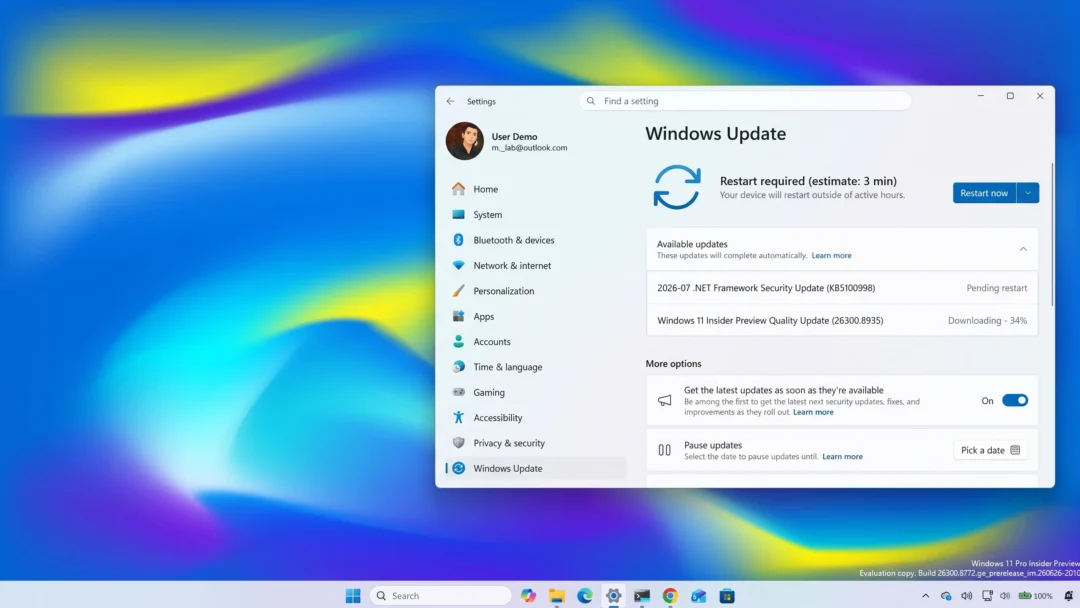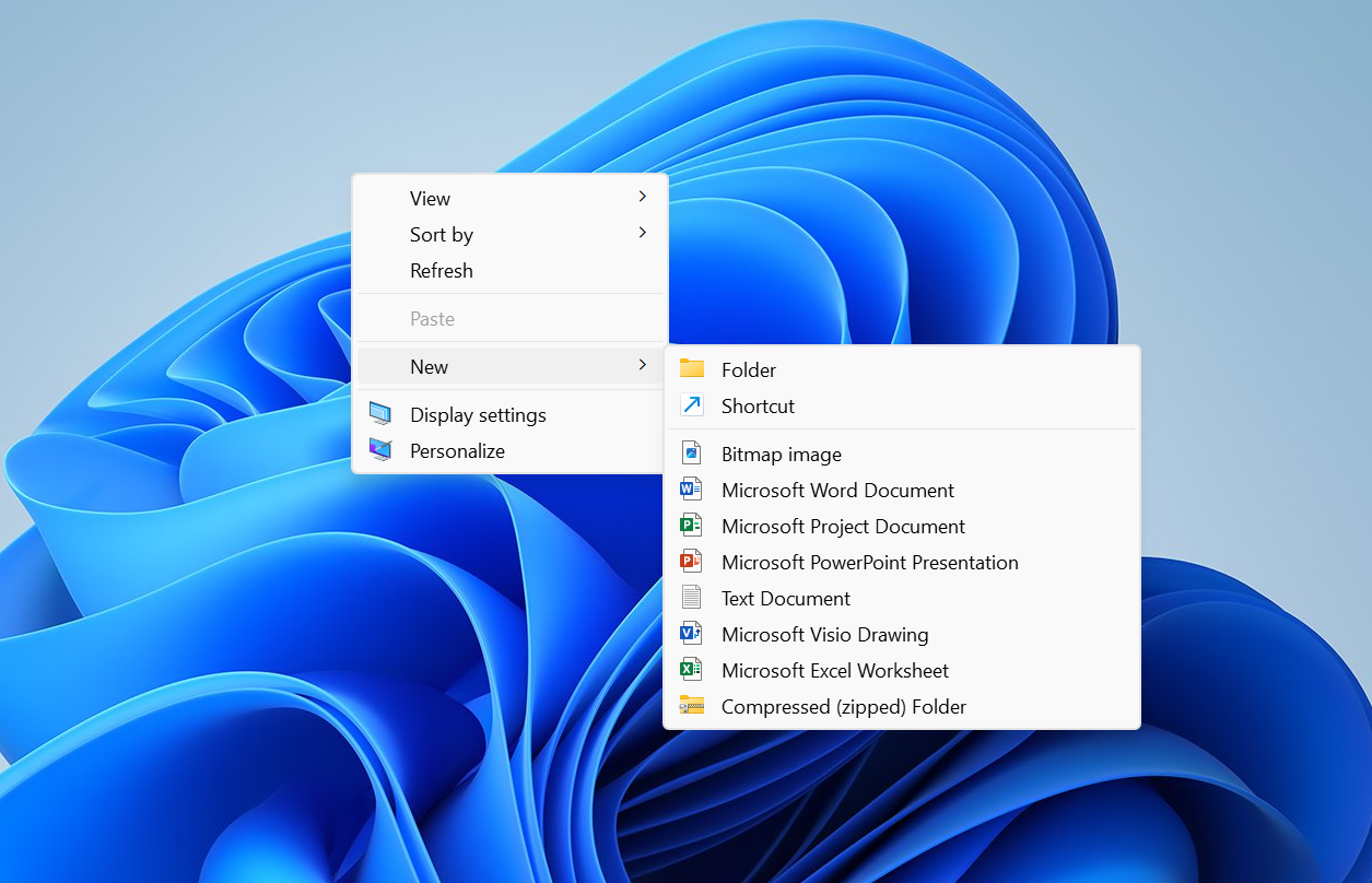
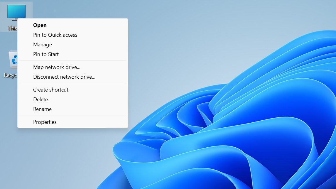
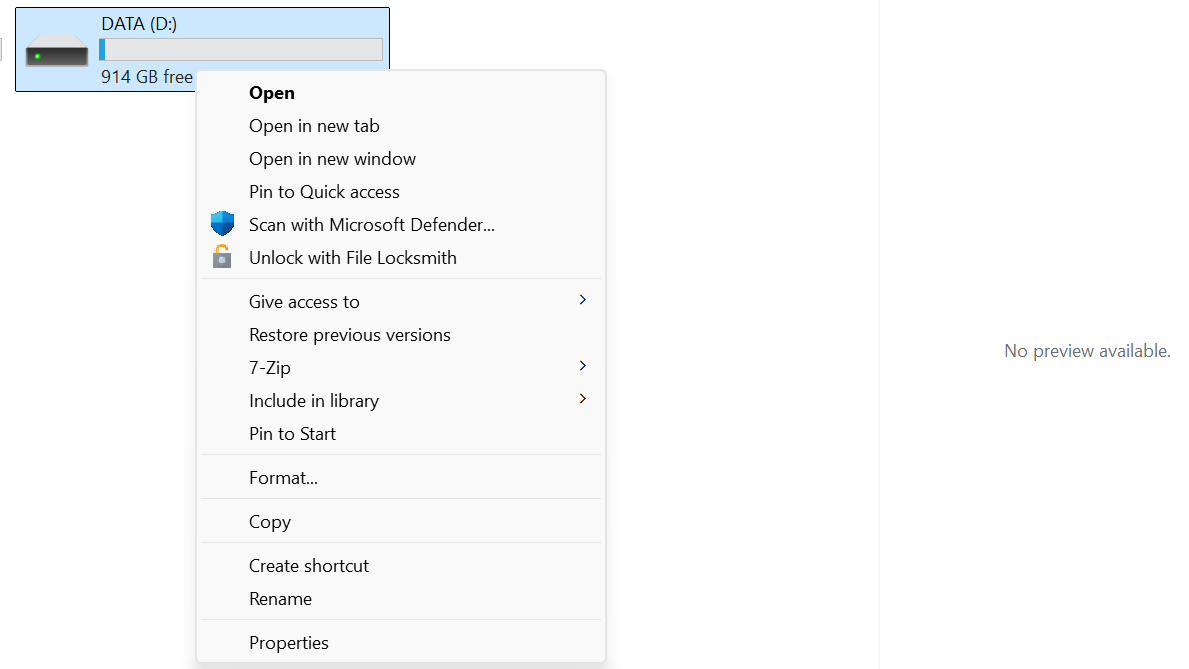
Windows 11 launched with a minimalist right‑click menu, but over the past few years it has ballooned with add‑ons and duplicates. It’s common to see the same app listed multiple times for a single file, long vertical lists, and an extra “Show more options” overflow. Microsoft is now addressing that sprawl with a redesigned pattern called the Split Context Menu, aimed at making menus shorter, more predictable, and genuinely contextual.
What the Split Context Menu changes
The Split Context Menu consolidates similar or related commands into a single line that carries a primary action and a small flyout of secondary options. Hovering that line opens a compact submenu beside it, instead of stacking everything into one tall list.
- Primary vs. secondary: A single, clear default action appears on the main menu line; less‑used tasks sit in a side flyout.
- Context‑aware: Options adapt to the item you right‑click, so image tools don’t crowd menus for text files, and vice versa.
- Less duplication: Repetitive entries like “Open with Photos,” “Edit with Photos,” and “Set as desktop background” are grouped under one Photos entry.
Microsoft’s own measurements show menu height reductions of up to 38% in some cases. Text files see roughly a 30% cut, and folders benefit the most as repeated “Pin” and “Open” variants are consolidated.
How it works (and a few concrete examples)
This design arrives as a new WinUI 3 control named SplitMenuFlyoutItem. It lets a menu entry behave like a hybrid: click for the default action, or hover to access related commands in a compact flyout. Developers can designate the default, and tailor secondary actions based on file type.
| Scenario | Old behavior | New behavior | Result |
|---|---|---|---|
| Right‑click an image | Multiple Photos entries, plus scattered tools like Paint or Snipping Tool | One “Open with Photos” line; hover reveals related tools in a flyout | Fewer duplicates, shorter menu |
| Right‑click a .txt file | Various editors mixed in the main list | “Open with Notepad” as the primary; other editors tucked into the flyout | About 30% height reduction |
| Right‑click a folder | Several “Open” and “Pin” variants listed separately | Consolidated “Open” and “Pin to…” groups | Largest reduction in menu height |
In sharing scenarios, a single Share entry can surface a sensible default (such as “Share to phone”) while keeping alternates one hover away. The idea is to preserve reach to secondary actions without making users scroll through them every time.
Where you’ll see it first
The Split Context Menu is arriving to WinUI 3‑based apps via a new control in the Windows App SDK preview. It is not broadly available to end users yet, and it hasn’t rolled into the Windows shell (File Explorer, desktop) at this stage. Microsoft hasn’t committed to a system‑wide rollout, so expect to see it first where app developers adopt the control.
Early examples shown for WinUI apps omit File Explorer’s quick actions (Cut, Copy, Rename, Share, Delete). Those core commands aren’t going away; the previews focus on demonstrating the split pattern, not removing essentials.
What this means for everyday use
- Shorter menus, fewer repeats: The most common action is on the main line; everything else is grouped and out of the way.
- Predictability: You hover the same spot to find related tools instead of scanning a long list for scattered entries.
- Less visual noise: Consolidation reduces menu height by up to 38% in Microsoft’s tests, with file‑type‑specific gains.
There’s no change to how you right‑click or execute a default action. The difference is how secondary choices are revealed and where they live, which should reduce misclicks as menus stop shifting to accommodate late‑loading items.
What developers can control
- Default action: Choose the primary command promoted to the main line.
- Context rules: Dynamically populate the flyout based on file type or selection.
- Consistency: Present a single entry per app or capability rather than scattering multiple verbs across the main list.
The control is designed to be lightweight: developers define the groups, and Windows can promote sensible defaults per file type. The goal is better organization, not heavier menus.
Open questions and timing
This is still early work. It’s limited to WinUI 3 apps for now, and there is no announced timeline for File Explorer or other shell surfaces. If adopted system‑wide, the split pattern would finally bring consistency to the places where Windows users right‑click most often. Until then, expect a gradual shift as individual apps update to the new control.