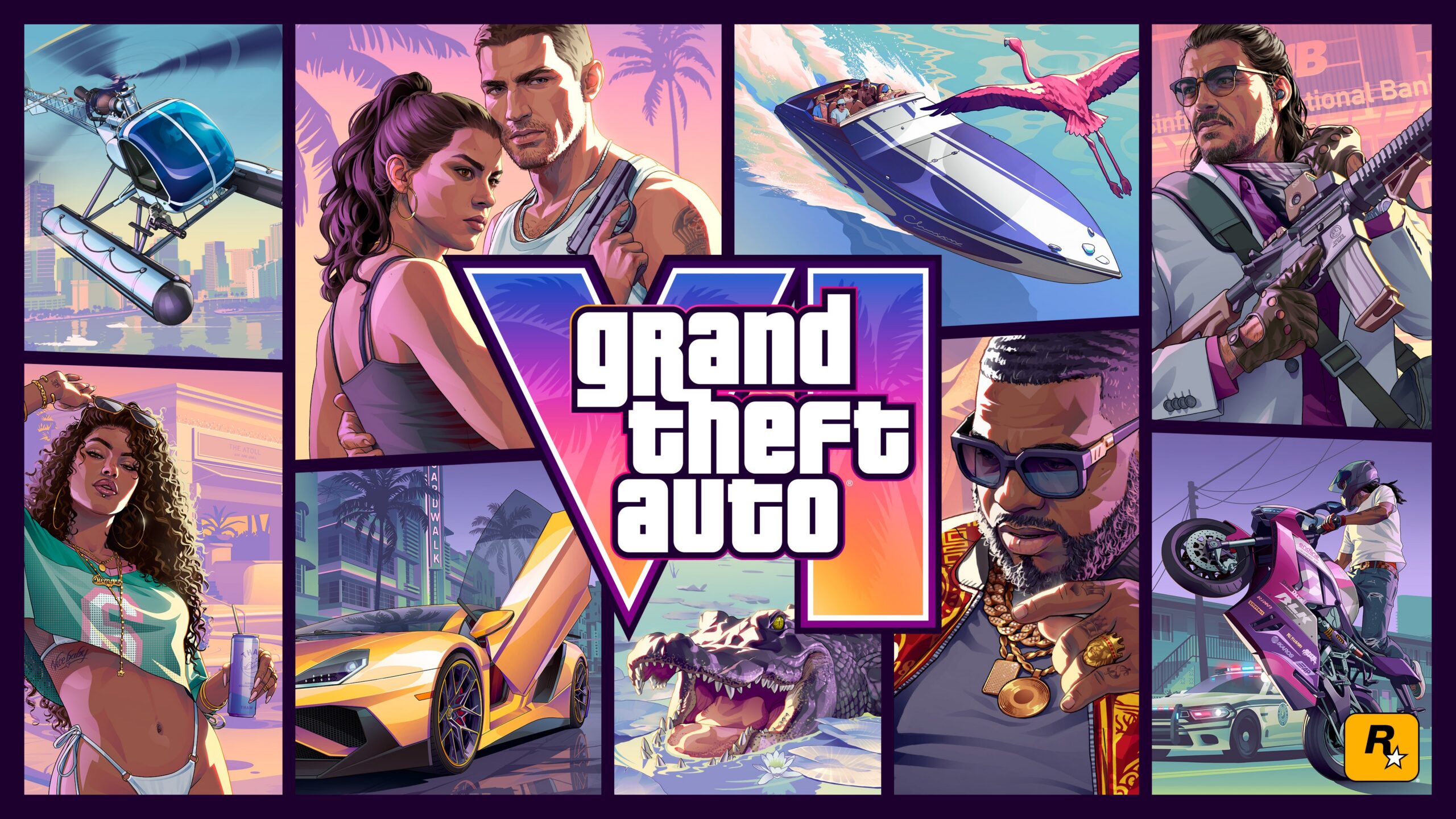
If you’ve run the streets of Liberty City, Los Santos, and the original Vice City, the Grand Theft Auto VI key art tells you something before you read a single word. That pink-and-teal sunset, that grid of bordered vignettes, that oversized roman numeral, it’s all unmistakably a mainline GTA cover, and it points us back to the Miami analogue we last fully played in 2002. Rockstar packs every cell of the collage with signal, and the actual image lines up against a tight set of facts officially confirmed in the December 2023 reveal. The leads are Jason and Lucia. The world is the state of Leonida with Vice City at its heart. Lucia is the series’ first female protagonist of the 3D/HD era. The story is a dual-protagonist, Bonnie-and-Clyde ‘ride or die’ crime saga. Everything beyond that, the archetypes, the biomes, the satire, is interpretation, and it’s labeled as such below, panel by panel, for the player who’s been here since the top-down days.
Quick answer: The cover officially confirms two leads (Jason and Lucia, with Lucia as the series’ first HD-era female protagonist), a dual-protagonist ‘ride or die’ premise, and a Leonida / Vice City setting, every other role, brand, biome, or system you can read off the panels is interpretation.
The Couple at the Center: Lucia and Jason Rewrite the GTA Lead
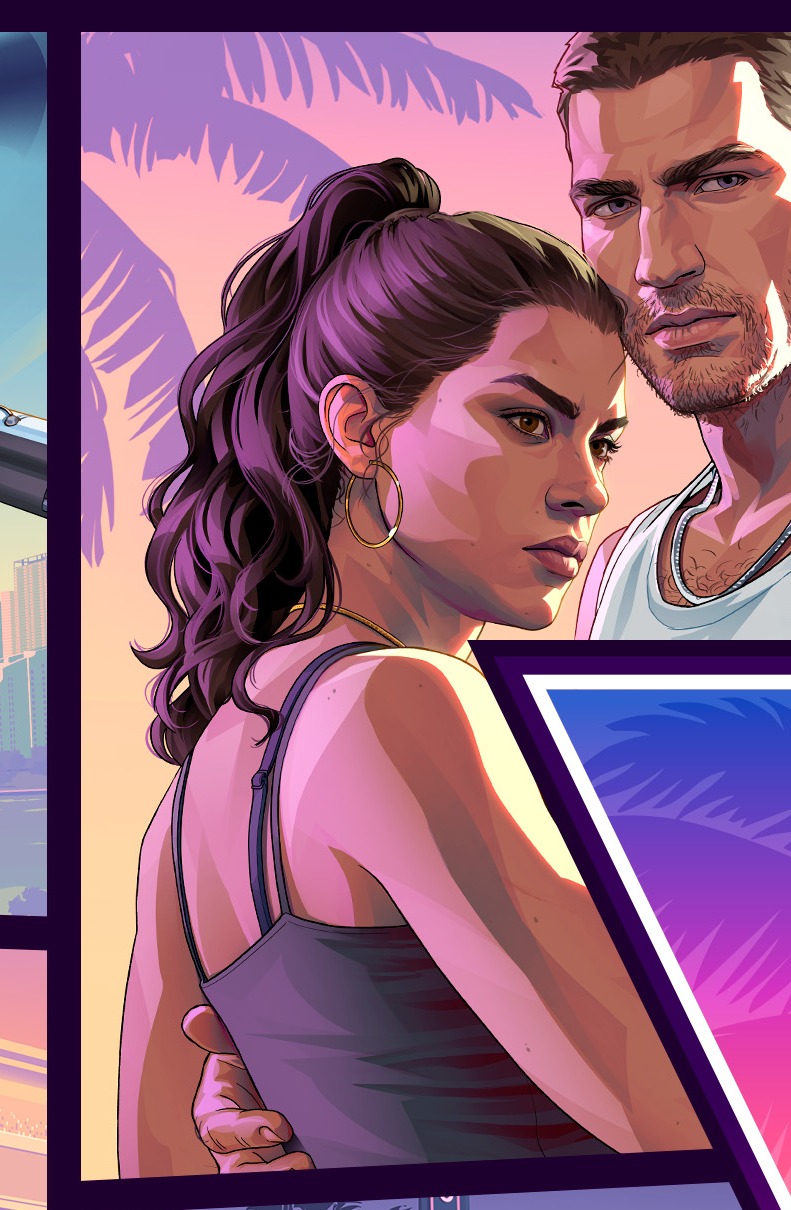
The largest character cell sits top-center-left, directly abutting the wordmark, and it frames a man and a woman tightly together. A dark-haired woman in front wears a grey/lavender tank top and looks to the side over her shoulder. A taller man behind and beside her wears a white ribbed tank top and faces more forward. Neither smiles, and they’re set against a pastel Vice City skyline and palms.
Per the confirmed reveal, this pair is Lucia (front) and Jason (behind). Placing Lucia in front makes the woman the visual anchor of the cover’s hero panel. The tight, interlocked framing reads as the game’s thesis in a single image, two people bound together, criminal-defiant rather than romance-as-decoration. Welding the duo’s panel directly against the ‘VI’ glyph visually fuses the leads to the title.
Every prior cover centered a lone man (Claude, Niko) or an ensemble of uneasy men (Michael, Franklin, Trevor). Here the protagonist unit is an intimate, aligned pair sharing one frame, where V’s trio got three separate vignettes. It’s the strongest direct echo of Tommy Vercetti’s Vice City, the same geography, the same neon, but it trades a solo-kingpin power fantasy for a two-against-the-world duo.
Confirmed: Jason and Lucia are the leads. The story is a dual-protagonist, Bonnie-and-Clyde ‘ride or die’ saga. Lucia is the series’ first female protagonist of the 3D/HD era. The setting is Leonida / Vice City.
Interpretation: That Lucia is the ‘primary’ or co-equal driver of the story appears suggested by the front placement, but the art doesn’t confirm it. Veterans may read the framing as V-style live protagonist switching, though that mechanic isn’t stated anywhere. The pose can be read as either romance or partnership, and any specifics of the couple’s relationship arc or backstory remain unconfirmed.
The Speedboat and the Flamingo: Water Is a Headline Pillar Again
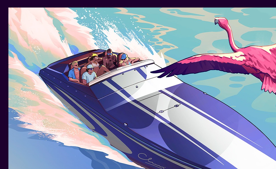
A white speedboat with blue/purple accent striping planes across bright turquoise water, throwing spray. A pink flamingo in flight crosses the same panel, and figures are visible aboard the boat. The composition does as much tone work as anything mechanical, leisure, sun, sea-spray Miami glamour, all in one cell.
A watercraft earning a hero panel likely signals that water traversal is a visible part of the world, not pure set dressing. The figures aboard are visible but not characterised enough to assign any identity. The pink flamingo is practically the Vice City mascot, the lawn-ornament Miami kitsch that ties straight into the cover’s palette. Foregrounding a speedboat evokes Vice City’s water-forward identity, the docks, the islands, the boat missions, that veterans associate with the 2002 game far more than with Liberty City or Los Santos.
Confirmed: The setting is Leonida / Vice City, a modern Miami analogue. A speedboat, a flamingo, and figures aboard the boat are visibly depicted.
Interpretation: Veterans may read this as water/boat traversal being a primary layer, with marinas, keys, and offshore play, but the scope is inferred from a single panel. The boat is white with blue/purple accents (not the red-and-white some early write-ups described). The exact boat model, whether swimming or diving systems return, and the share of the map covered by water are all unconfirmed.
The Alligator: A Hint the World Extends Beyond the Neon City
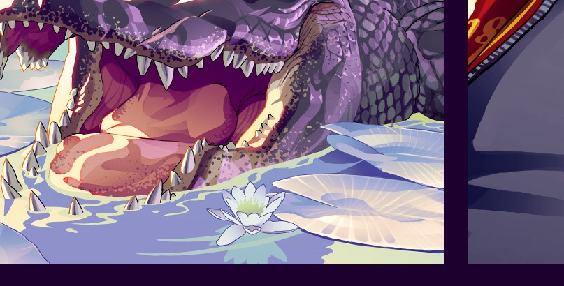
A center-bottom panel shows an alligator (or crocodile) head with jaws open, low to the ground near water, reeds, and palms. It’s the most on-the-nose ‘Florida’ gag on the cover, since gators are shorthand for viral Florida-weirdness.
It likely signals that the map extends beyond the neon city into Everglades-style wetlands and swamp backcountry. The vignette does roughly the job the wildlife and landscape cells did on the San Andreas and V covers, hinting to veterans that there’s a world outside the urban core, the city-plus-countryside structure (Los Santos plus Blaine County). It’s also a soft nod to the living-wildlife direction of GTA V and RDR2; the 2002 Vice City had essentially no roaming fauna.
Confirmed: The setting is the state of Leonida, which includes Vice City. A large alligator/crocodile is visibly depicted on the cover.
Interpretation: The presence of Everglades wetlands, swamp, or a second city appears likely but isn’t stated. Whether wild terrain is freely traversable, whether airboats or off-road vehicles exist, and the map’s biome count or wildlife ecosystem are all unconfirmed.
The Armed Man and the ‘NATIONAL BAN[K]’ Sign: A Heist Breadcrumb
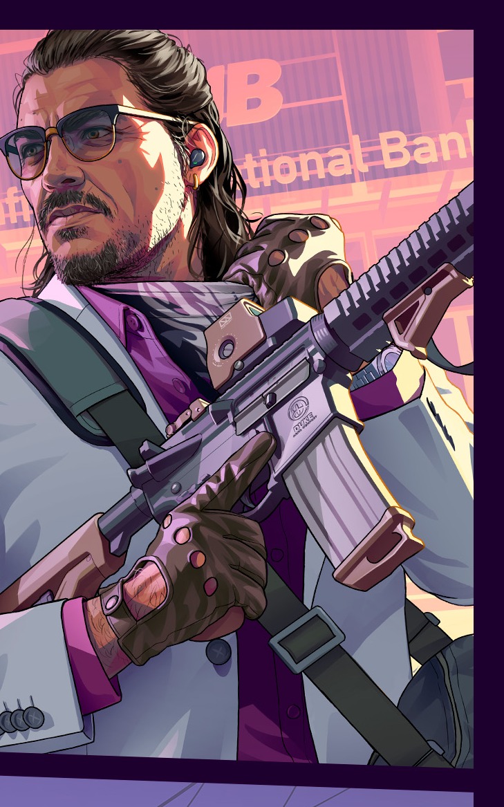
The top-right panel shows a dark-haired, bearded man in sunglasses and a light/cream patterned shirt, holding a rifle across his body with gloves on his hands. Behind him, building signage partly reads ‘national Ban[k]’, and a taller tower behind shows a large letter (a ‘B’) on its facade.
He reads as a stick-up or heister archetype, a crew member, associate, or antagonist. The bank facade and high-rise also flag a downtown or financial-district setting distinct from the beach strip. A bank on the box is a wink at the heist-driven structure veterans cemented in GTA V, and it sits comfortably alongside the leads’ Bonnie-and-Clyde framing. The partial ‘national Ban[k]’ lettering is the kind of storefront-parody gag the series has always run, but the label isn’t cleanly legible enough to claim a specific brand name.
Confirmed: An armed man and partial ‘national Ban[k]’ signage are visibly depicted.
Interpretation: This figure’s identity, and whether he is an ally or antagonist, is unconfirmed. The specific parody brand name on the sign can’t be claimed from the visible letters. Veterans may read heists as a core structural pillar, but that’s an inference from the imagery, not a stated fact.
The Gold-Chained Figure: Conspicuous Consumption, Updated
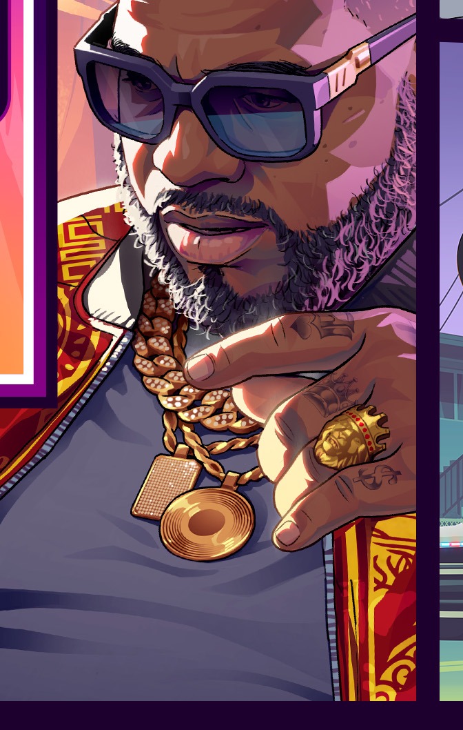
The center-right panel frames a muscular man in a white/grey tank top, dark sunglasses, and a full beard. He’s draped in heavy gold chains with a pendant, wears gold rings, has visible hand tattoos, and holds one hand raised near his face. The deliberate pose and jewelry frame wealth as something performed for an audience, not just possessed.
He occupies the niche Vice City’s drug lords and V’s crime bosses held, the archetypal ‘flash criminal’ panel, a lineage running from VC’s cocaine excess through V’s gangster figures. The styling reads specifically 2020s, jewelry-and-pendant flex staged for a camera.
Confirmed: A heavily-jewelled man is visibly depicted.
Interpretation: His identity, name, or role as an antagonist is unconfirmed. Veterans may read him as a ‘kingpin’ or ‘crew boss,’ but that’s an archetype read, not a stated role. The idea that the game’s satire targets influencer or clout culture is interpretation.
The Yellow Supercar: The Car-Fantasy Anchor Endures
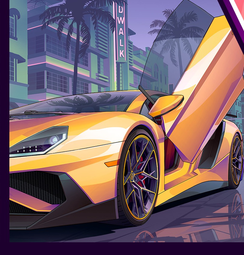
The center-bottom-left panel shows a yellow two-seat sports coupe, low and wide, in a front-three-quarter view with its driver’s door raised up in scissor or butterfly style. It’s set under palms in front of low pastel buildings and a lit marquee-style sign. The raised door gives the shot a flashy, show-off framing rather than a static parked car. The palm-over-low-building backdrop reads as an Ocean Drive / South Beach analogue.
Cars are the franchise’s identity, and a marquee supercar likely says the driving and garage sandbox stays central, the lineage of San Andreas tuning, IV’s car culture, and the V/Online garage-and-mod economy. Pairing a hero supercar in one panel with a stunting bike in another splits the two halves of GTA driving a veteran knows by feel, cruise/collect versus chase/escape.
Confirmed: A yellow sports car with a raised scissor-style door, under palms, is visibly depicted.
Interpretation: Customization depth, handling, and any garage or ownership systems are unconfirmed. The specific car make or model can’t be pinned. The open scissor door makes this a flashy action framing, not the ‘pristine product shot’ some readings have described.
The Woman in the Green Jersey: Street-Level Lifestyle and a Branded Drink
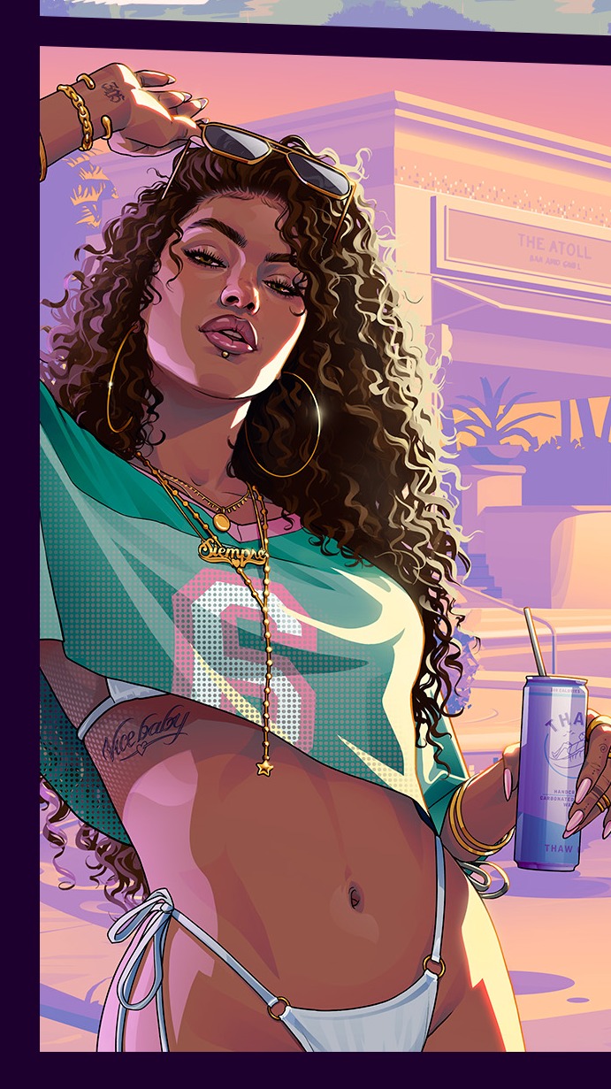
The left-middle panel frames a woman with long curly dark hair, large hoop earrings, and sunglasses pushed up on her head. She wears a cropped teal/green jersey with a number and gold chains, plus white string bikini bottoms, and holds a tall cup/tumbler with a straw against a sunlit street with a curved building behind her. The styled, camera-ready pose plus drink-in-hand evokes a lifestyle-post composition.
She reads as a local or lifestyle associate archetype, the social, street-level texture of the city rather than an obvious antagonist. Her casual posture contrasts with the armed figures, signaling the cover’s range from party culture to crime. The cup slots into Rockstar’s long parody-brand tradition (Sprunk, eCola, Pisswasser), here migrated from background set-dressing into a held prop. The cup carries partial lettering, but it’s not cleanly legible, so no specific brand can be claimed.
Confirmed: A woman in a green jersey holding a tall drink cup with a straw is visibly depicted.
Interpretation: Her identity or role, friend, associate, or wildcard, is unconfirmed. Any specific parody brand on the cup can’t be claimed. The backdrop is a sunlit street/building, with no clearly legible graffiti, so framing it as a distinct ‘inland working-class’ district overstates what the panel actually shows.
The Stunting Sportbike and the Cruiser: The Wanted-Level Loop Looks Intact
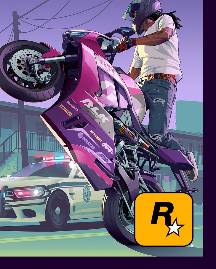
The bottom-right panel shows a purple/pink-liveried sportbike pulled up in a wheelie or stoppie with the rider standing on it, and a white police cruiser with a visible light bar behind on the street. A standard municipal cruiser, not SWAT or military, frames heat first through everyday street-level law enforcement.
The bike-near-a-marked-cruiser tableau likely reads as the cover’s police-pursuit or wanted-level statement. Motorcycles specifically evoke an agile, high-risk escape fantasy, a counterpart to the supercar’s glamour. This is the cat-and-mouse loop that has defined the series since GTA III, rendered here as pure gameplay-DNA shorthand. The bike emphasis recalls San Andreas’s two-wheel handling and the IV/V pursuit feel, and a getaway-versus-cops motif dovetails with the crime-couple-on-the-run premise.
Confirmed: A sportbike, a standing rider, and a police cruiser are visibly depicted. The dual-protagonist ‘ride or die’ premise is confirmed (the chase tie-in is interpretation).
Interpretation: The exact wanted/heat mechanics or escalation tiers are unconfirmed. Whether a specific in-game chase scene is depicted is unconfirmed. The bike is in a wheelie/stunt pose with the rider standing, not ‘leaning hard’ as some readings have described.
The Helicopter and Skyline: Air Travel and the Neon Vice City Return
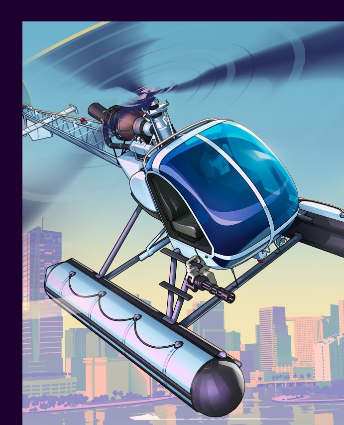
The top-left panel frames a small civilian-style helicopter with a blue/teal cabin and purple tones, fitted with pontoon/float landing gear, against a hazy pastel skyline. The civilian (non-military) styling and floats lean toward everyday, coastal mobility rather than a war-machine fantasy. The pastel skyline behind it is the Miami/Vice City color language, the pink-and-teal that signals ‘Vice City’ before any landmark does.
An aircraft given its own cover cell appears to suggest air traversal is part of the open world. Flyable air has been a 3D-era landmark since Vice City’s helicopter, escalated by San Andreas’s planes and normalized by V’s everyday choppers and heist insertions. Leading the collage with a low-key civilian helicopter fits a coastal, tourist-y geography. Together with the boat and the supercar/bike, the cover stakes out air, sea, and land in one frame, the most complete land/sea/air spread on a GTA cover since GTA V.
Confirmed: A civilian-style helicopter over a pastel skyline is visibly depicted. The setting is Vice City / Leonida, a modern Miami analogue.
Interpretation: Whether air traversal is a first-class pillar available early, or gated behind an unlock, is unconfirmed; scope is inferred. The present-day reading is consistent with the reveal trailer, but the cover art itself doesn’t state an era. The specific air-vehicle roster, and whether this exact chopper is flyable, are unconfirmed.
The Collage, the Wordmark, and the Sunset ‘VI’: Continuity Plus One Big Surprise
The cover is a grid of bordered cells against near-black gutters, with ‘grand theft auto’ set in the signature heavy lowercase stacked wordmark over a large roman numeral ‘VI’, and the R-star logo in the bottom-right cell. The ‘VI’ is filled with a pink-magenta-into-teal/blue sunset gradient with a chrome/metallic bevel, fusing which game this is with the where/when palette it lives in. The painterly, higher-fidelity rendering reads as more realistic than the flatter III/VC-era vector look.
The wordmark and R-star logo stay essentially unchanged while everything colorful around them is new, classic franchise-equity management, stable trademark, era-specific palette. The panel-collage format is the single biggest veteran callback on the whole cover, the mainline box-art signature carried since GTA III and instantly readable as ‘a GTA cover’ before a word is parsed. The numeral-as-hero-glyph continues the bold IV/V logo lineage, and the chrome-edged sunset gradient is a deliberate 1980s-Miami / synthwave cue that says ‘we’re going back to that aesthetic well’ without printing the city’s name.
Confirmed: The collage layout, stacked wordmark, ‘VI’ numeral, and R-star logo are visibly present. The pink/teal/sunset palette is visible, and the Vice City setting is confirmed.
Interpretation: The higher-fidelity art doesn’t imply any specific technical, platform, or ‘next-gen’ detail on its own. Release date, price, and plot aren’t stated anywhere on the art.
| Confirmed by Rockstar | Still unknown / interpretation only |
|---|---|
| Jason and Lucia are the leads | Who is the ‘primary’ lead in gameplay |
| Lucia is the first HD-era female protagonist | Whether V-style live switching returns |
| Dual-protagonist ‘ride or die’ story | Identity / role of every supporting figure |
| Setting is Leonida, with Vice City at its heart | Map size, biome count, second city |
| Modern Miami analogue palette and props | Specific parody brand on signage or the cup |
| Boat, helicopter, supercar, bike depicted | Traversal scope, vehicle roster, customization |
| R-star logo, wordmark, and ‘VI’ glyph are official | Price, plot, era specifics, map size |
The collage grid and pink-teal sunset palette are the cover’s loudest callbacks, they say ‘mainline GTA’ and signal Vice City before you read a word, with the Leonida / Vice City setting officially confirmed. The biggest departure sits dead-center, Lucia placed in front of Jason, the couple sharing one panel welded to the ‘VI’ glyph, announcing the first HD-era female lead and a ‘ride or die’ duo rather than V’s separate-vignette trio, though who ‘leads’ the story is a visual cue and not a stated fact. The supporting panels map onto familiar GTA archetypes, the heister with rifle and ‘national Ban[k]’, the flash criminal in gold chains, the city’s social texture in jersey and drink, and the cops with stunting bike and cruiser, but every one of those role assignments is interpretation; only Jason, Lucia, the setting, and the dual-protagonist framing are confirmed. The cover stakes out all three traversal layers in one frame, helicopter for air, speedboat for sea, supercar and sportbike for land, with the flamingo and alligator reinforcing a coastal, swampy Floridian setting, even though the scope of any traversal system is inferred. The era feels distinct from V (2013) in its props, jewelry flex, lifestyle posing, a branded drink, and a ‘Florida’ alligator gag lean toward a 2020s, meme-literate tone, and reading that as satire of clout culture is interpretation. Hard restraint runs through it all, the art names no antagonist and states no plot, date, price, or map size; the ‘national Ban[k]’ signage and the drink-cup label are too ambiguous to pin to a specific parody brand; the speedboat is white/blue, the supercar’s door is raised, the bike is doing a wheelie, and the woman holds a cup with a straw.