
If your Excel sheets contain a lot of data, you can create an interactive dashboard that lets you manage that data easily. The dashboard summarizes key details so you can get the information you need quickly at a glance. First, you need to decide what information you want your dashboard to display. Go through your data and decide what to include in the dashboard as well as how to display that information. You can choose to depict it as line graphs, pie charts, scatter graphs, or something else.
Once you've decided what data to include and how to show it in the dashboard, it is time to prepare it. Preparing your data for the dashboard will make it easier to set up your dashboard, ensure that it works smoothly, and help save a lot of time. Make sure each sheet in your workbook from which you will use the data to create your dashboard has a separate name.
Step 1: Import the data into Excel
You can start creating a dashboard right away if your data is already present in Excel. If it is not, you will first need to import it into the program. You can do this in various ways, such as copying and pasting it into an Excel workbook, using an API like Open Database Connectivity (ODBC) or Supermetrics, or an add-in like Microsoft Power Query. The easiest way, however, is to simply use the 'Get Data' option.
- Open a blank Excel sheet and click on the 'Data' tab at the top.
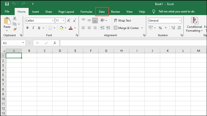
- Once you're on the Data tab, click on the 'Get data' option on the left and then go to 'From File', and then click on 'From Excel Workbook'.
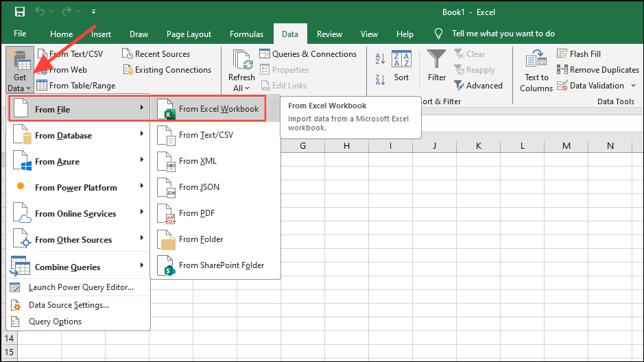
- Then navigate to where the data you want to import is located and select it. Wait until Excel imports the data and makes it ready to use.
Step 2: Set up your workbook
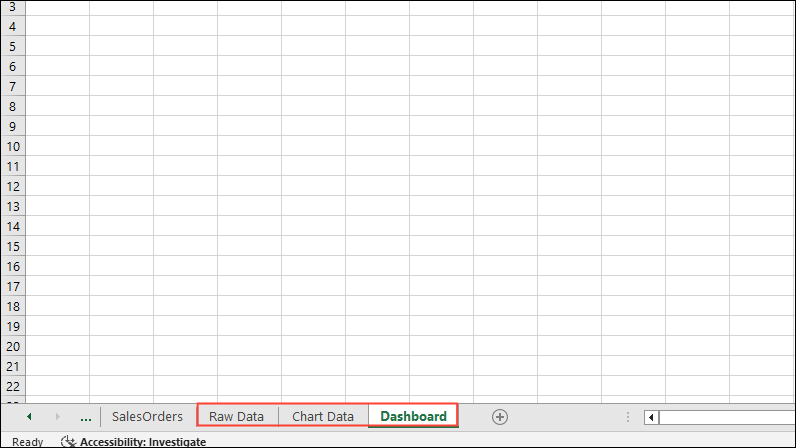
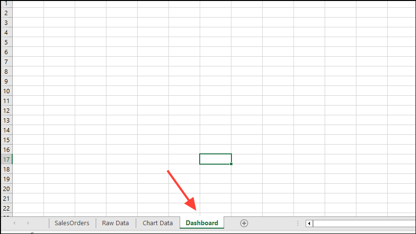
- Open a new Excel workbook and create at least two tabs or worksheets. For instance, create three tabs and name them 'Raw Data', 'Chart Data', and 'Dashboard'.
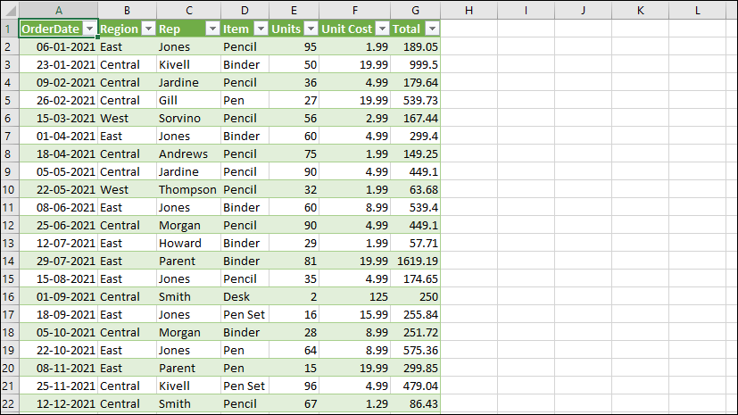
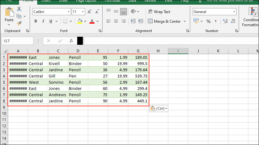
- The raw data in your workbook should be in the form of an Excel table with the various data points in different cells. This process is often known as 'cleaning your data' and you can use this opportunity to find and remove any errors that may be present.
- Once you've cleaned up your data, it is time to analyze it. Study the data and decide what you want to include in the Excel dashboard.
- To add the required data points to your 'Chart Data' worksheet, copy them and paste them into the worksheet.
Step 3: Create your dashboard
Once you have prepared the data in your Excel worksheet and have decided upon the purpose of the dashboard, it is time to create it. By now, you should already have determined how you want the data to be displayed visually, whether as a pie chart, pivot chart, bar graph, etc. Let's start with a clustered column chart.
- Click on the 'dashboard' worksheet at the bottom of the Excel workbook to switch to it.
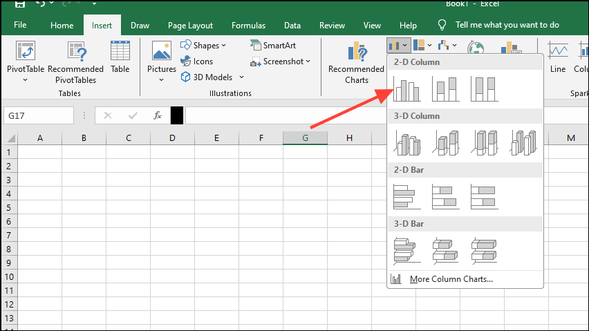
- Once you are on the 'dashboard' worksheet, click on the 'Insert' menu at the top and then click on the dropdown button next to the 'columns' icon.
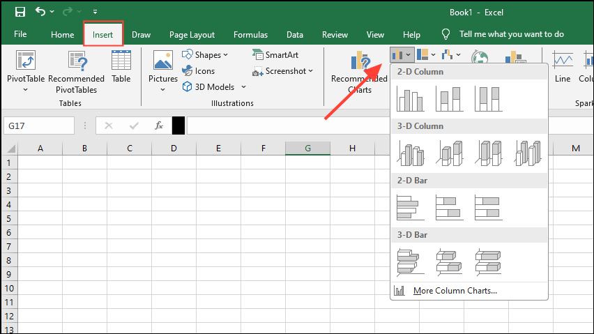
- In the dropdown menu that appears, click on the 'clustered column' icon. The icons may appear differently if you're using an older version of Excel.
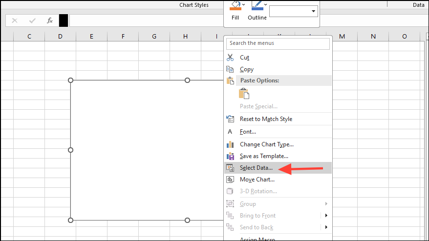
- A blank box should now appear in the dashboard worksheet. Right-click on it and then click on 'Select data'.
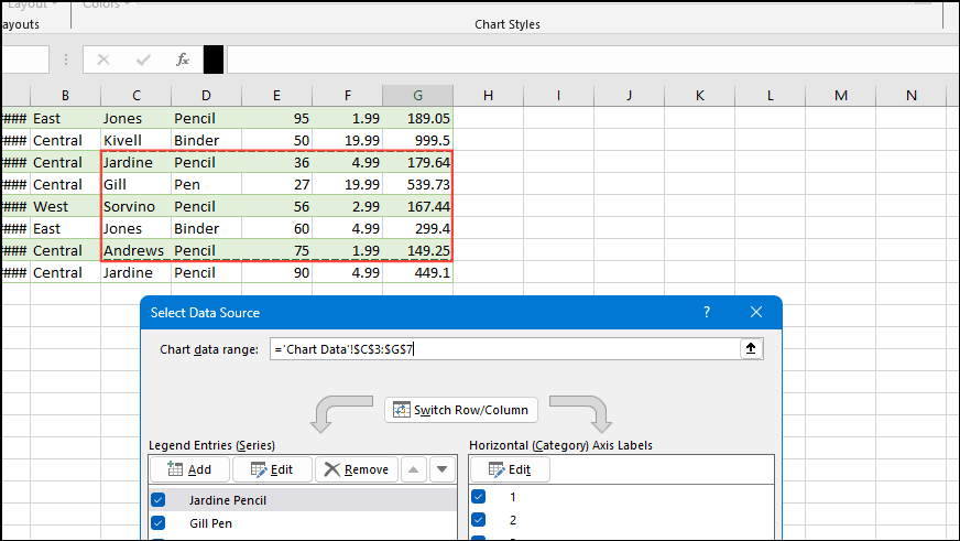
- Next, click on the 'Chart Data' tab at the bottom and select the data you want to be included in the dashboard. Don't select the headers when you select the data to be included in the column chart.
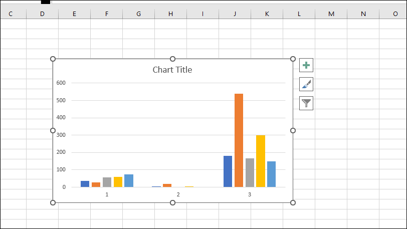
- Press Enter and your clustered column chart dashboard should appear in front of you.
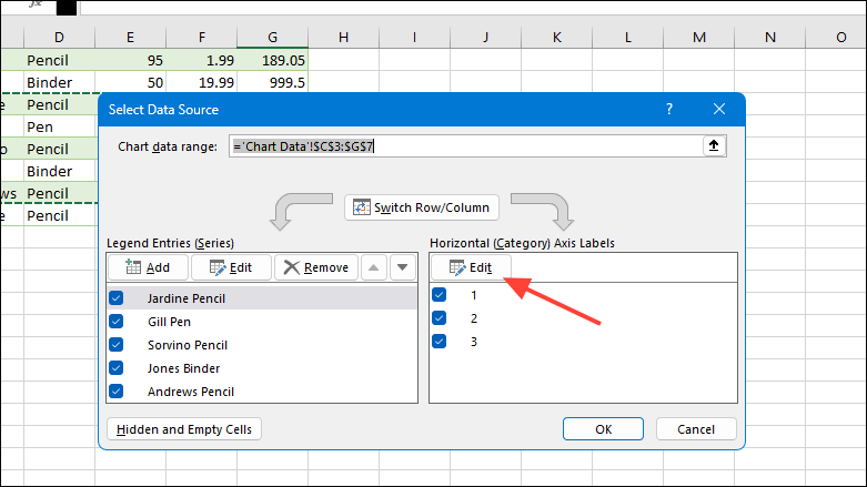
- You can edit the chart by right-clicking on it again and clicking on the 'select data' option as before.
- This will bring up the 'Select Data Source' dialog box. Click on the Edit button under 'Horizontal (Category) Axis Labels' before selecting the data you want to display.
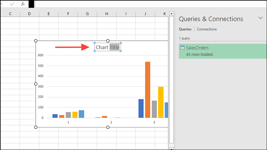
- You can also give your chart a title. Simply double-click at the top of the chart where it says 'chart title' and enter the name you want to use.
Things to know
- Depending on which version of Microsoft Office you are using, various options like those controlling the chart design may be present under different menus and tabs.
- For your dashboard to be most effective, make sure to use consistent color schemes, font styles, and formatting.
- If you want your dashboard to reflect changes in your data automatically, you can choose the dynamic chart when creating your dashboard.
- Once the dashboard is created, add labels and annotations to different elements so it is easy to convey information to the viewers.
- You can also add elements like buttons, filters, and dropdown menus to make your dashboard interactive and customizable.