A line graph (also known as a line chart or XY graph) is a two-dimensional diagram that visualizes trends in data over time. In other words, a Line chart is used to track changes over periods of time (over months, days, years, etc.). The line chart is one of the most commonly used chart types in Google Sheets.
Line graphs are mostly used to display changes in values for one variable over time or multiple variables that change over the same period of time relative to each other. For example, Line charts can be used to track sales growth of each year or boys and girl births over a period of time in a state, etc.
In this tutorial, we will give you step-by-step instructions on how to make and customize a line chart in Google Sheets
Steps to Create a Line Chart in Google Sheets
Line graphs have line segments that are drawn on intersecting points (data points) on the x and y-axis to demonstrate changes in value. The data points represent the data and the line segments show the overall direction of the data.
In a line graph, the categorical variable is plotted along the y-axis (or vertical axis) and the time variable is plotted along the x-axis (or horizontal axis). Then the Data points (Markers) are plotted on the intersecting points of these two variables and these markers are joined by the line segments.
To make a line chart in Google Sheets, you need to set up your data in a spreadsheet, insert a chart with that data and then customize your chart.
Prepare Your Data for Line Graph
First, enter your data in Google Sheets. Enter your data by typing it manually or by importing it from another file.
Your dataset should have at least two columns, one for each variable. You should have one column for time units and one or more columns for categorical values (e.g., dollars, weights). The first columns should always be time units (hours, months, years, etc.) which is the independent value and the corresponding columns should have the dependent values (dollars, sales, population, etc.).
There is not much difference between creating a single line chart and a multiple line chart, the only difference is how many columns you have in your dataset to create one.
When your dataset has only one dependent value and an independent value (i.e. two columns), your graph would a single line graph. If you have more than one dependent value and an independent value (i.e. more than two columns), your graph would have multiple lines.
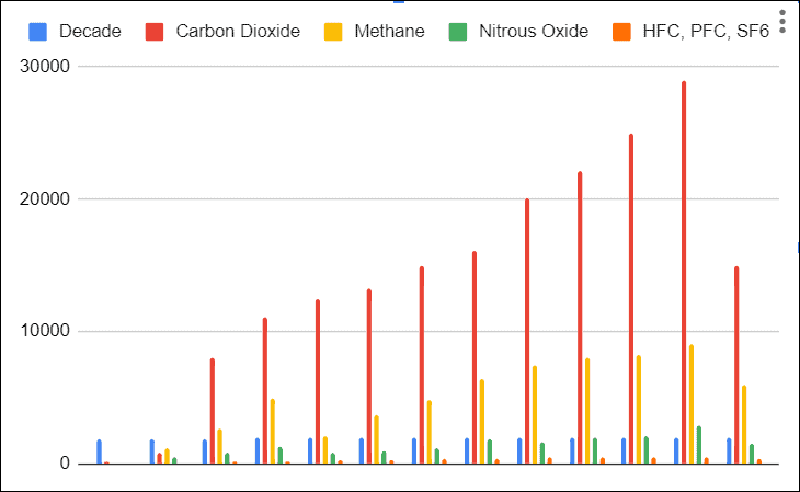
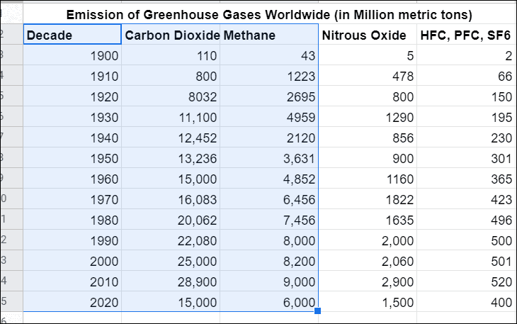
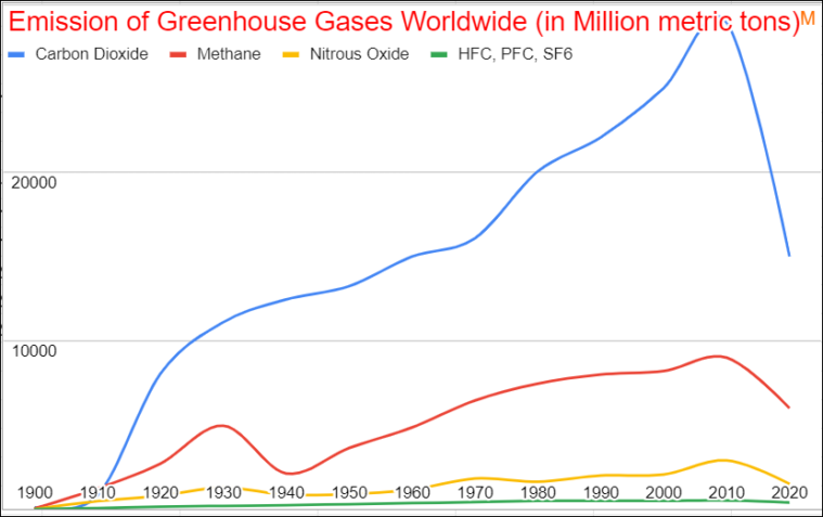
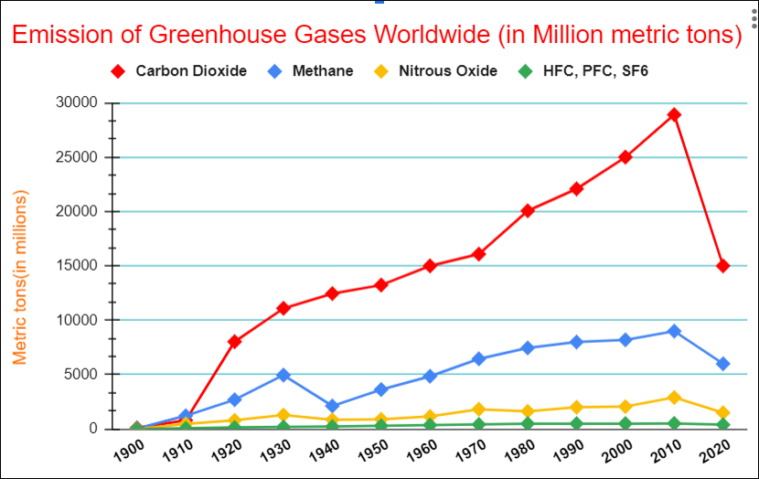
We will use this sample dataset to create a line graph in Google Sheets:
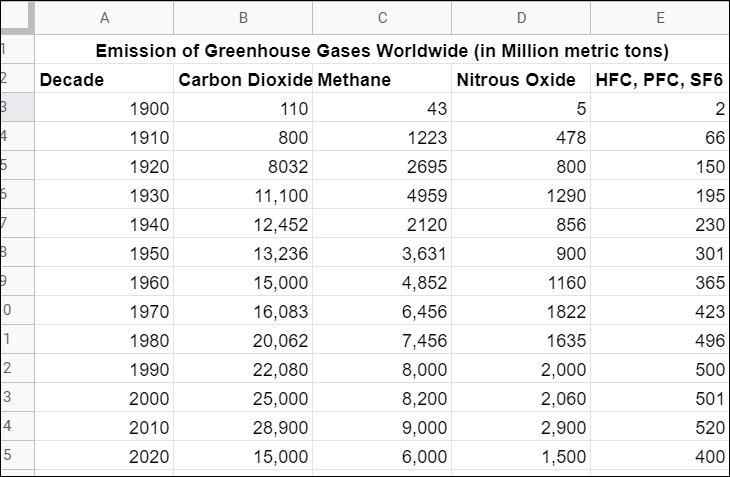
As you can see above, the time intervals are in the left-most columns and their dependent values are in the adjacent columns. The above table has five columns, so we are going to make a multi-line line chart.
Insert a Line Graph
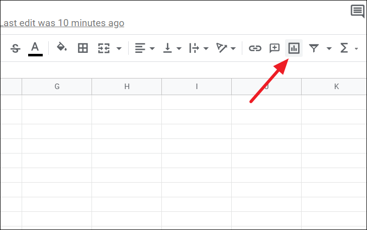
Once you entered your data into the spreadsheet, as shown above, you can insert your line chart. Select the entire dataset and then, click on the ‘Insert chart’ icon in the toolbar.
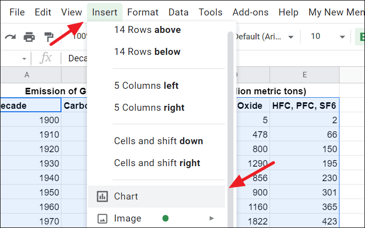
Or click on the ‘Insert’ tab in the menu bar and then select the ‘Chart’ option.
By default, Google will automatically create a default chart based on your data. Google will try to find an appropriate chart for your data and will automatically create one.
If it doesn’t generate a line chart automatically, you can easily change it to a line graph.
To do that, click on the ‘three dots (vertical ellipsis)’ at the top-right corner of the chart and select the ‘Edit chart’ option or just double-click on the chart.
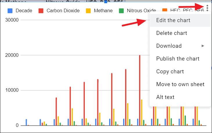
This will open up the ‘Chart editor’ pane on the right side of the screen, where you can customize almost every part of your chart.
Change the Chart Type
To change the chart type, go to the ‘Setup’ tab in the Chart editor pane, click on the ‘Chart type’ drop-down menu and select one of the three-line chart types. This would change the existing chart into a line chart.
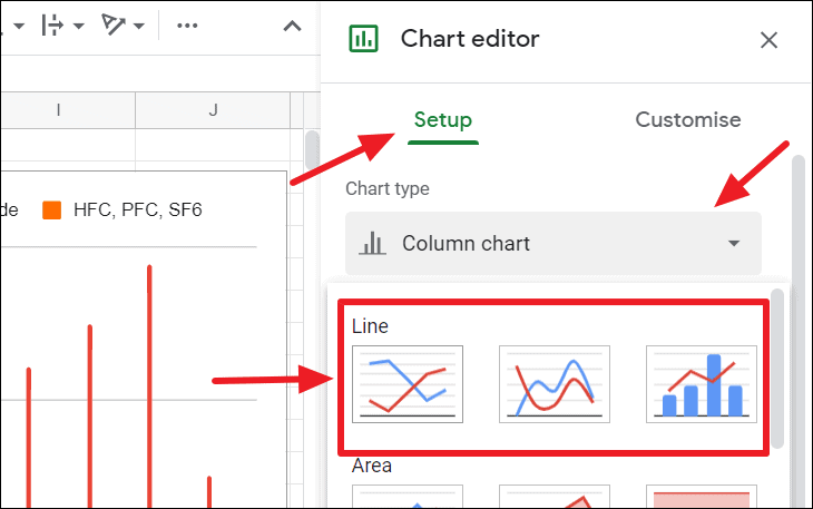
You have 3 line chart types in Google Sheets:
- Regular Line chart
- Smooth line chart
- Combo line chart
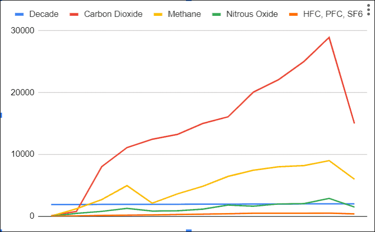
Regular Line chart
The regular line graph will have jagged line segments. This is the most commonly used line chart type because it shows data more accurately and straightforward.
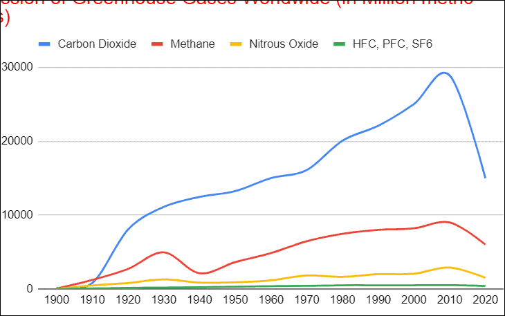
Smooth line chart
This chart type will have flowing smooth lines and will give your chart a different look.
Combo line chart
A combo line chart is a combination of column and line chart types on the same chart.
A combo chart doesn’t work well with more two than two series of data or one series of data. If your data set has only two columns or more than three columns, then your chart will look something like this:
The combo chart works only with two series of data (i.e. three columns: One independent variable and two dependent variables). The combo line chart can be really helpful when comparing different categories of values.
For instance, instead of using the entire dataset, if we use only the first three columns of the dataset to insert the line chart, then we can change it into a combo line chart.
Our chart would look like this:
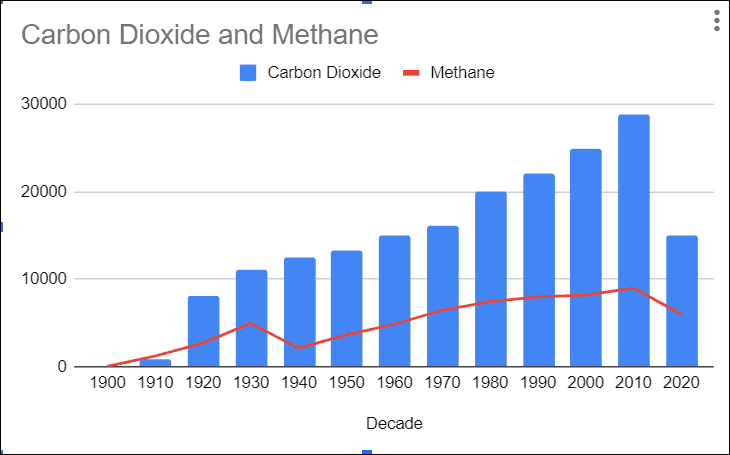
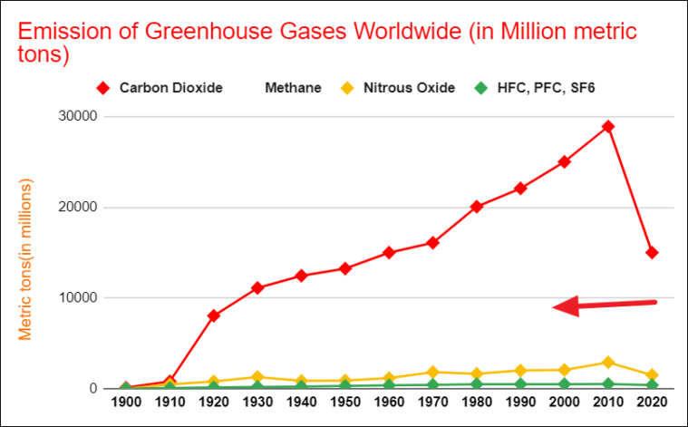
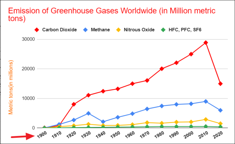
As you can see Category Carbon Dioxide is compared against Methane over time, which gives you a clear view of which category is higher and lower.
For our example, we are going to choose ‘regular line chart’ type.
But still, the line chart doesn’t make a whole lot of sense, so you may need to edit and customize it as per your preferences using the editing options available in the Chart editor.
The Chart editor has two sections where you can edit and customize the elements of the chart:
- Setup
- Customise
Let’s see how we can edit and customize your to make it look better.
Editing Line Chart using the Chart editor
Change X-axis
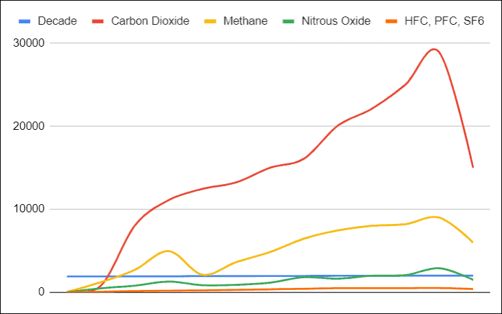
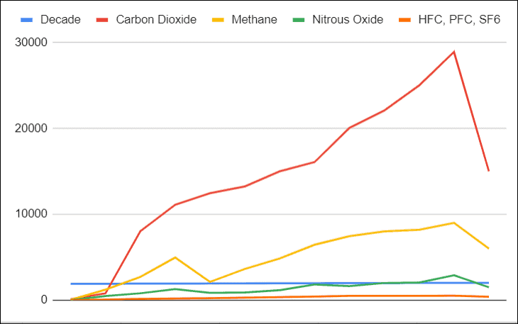
You may have noticed the Decade column is not plotted on the x-axis, instead, it is drawn as one of the lines (Blue line) in the plot area. The chart considers the decade values as one of the data series and plots it on the plot area. This is because the time units we entered are not consecutive years, they are decades (periods of 10 years). So the chart determines they are just random numbers and draws them as a line.
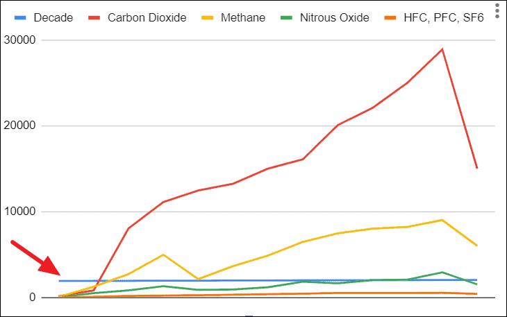
If this happens, don’t worry, we can easily fix this.
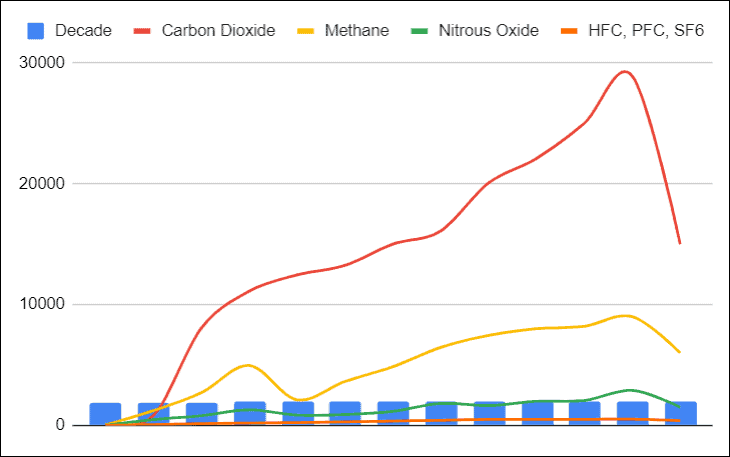
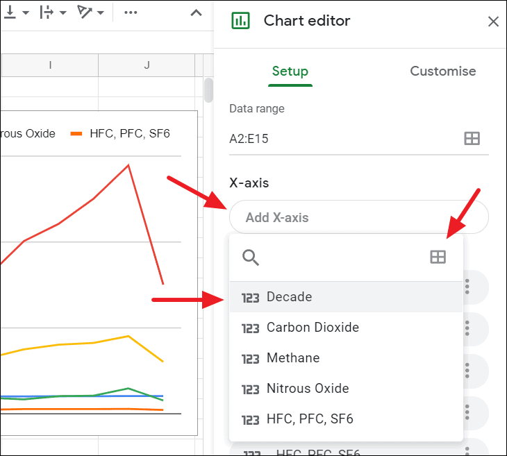
Go to the ‘Setup’ in the Chart editor, click on the X-axis field and choose ‘Decade’. Or if you want to add a column directly from a table, click on the ‘Select a data range’ icon and select the range.
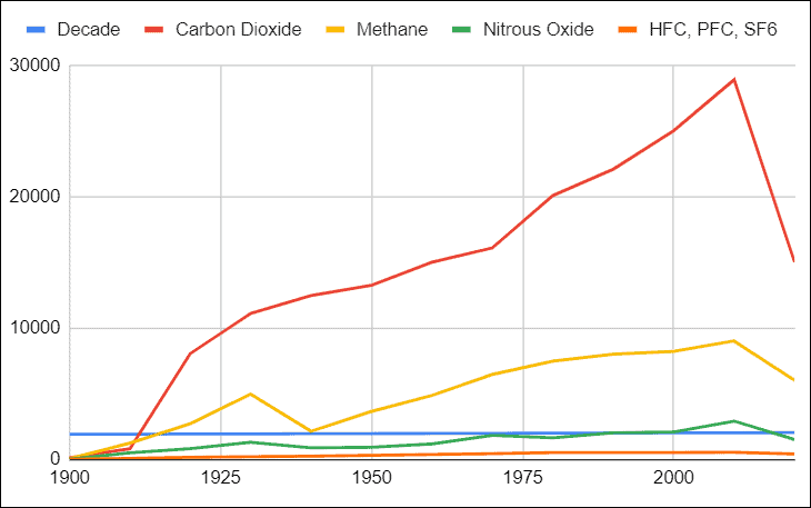
Now, the decades are plotted on the x-axis.
Now, we need to remove Decade from the data series. To do that, click on the ‘three-dot icon’ on the ‘Decade’ option under the Series section and select ‘Remove’.
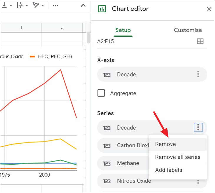
With this Series option you can also change the existing series or add new series.
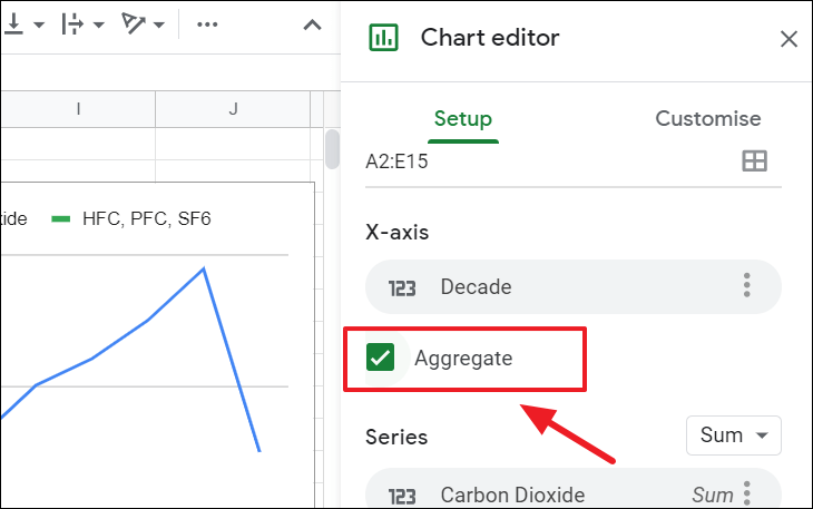
But now the time scale on the x-axis only shows every 25 years. To change that, select the ‘Aggregate’ option under the X-axis section in the Chart ‘Setup’.
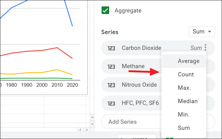
When you select the Aggregate option, it will give you options on how you want to display your Series data. Click on the aggregate type next to the three-dot icon on each series and choose one of the aggregate types.
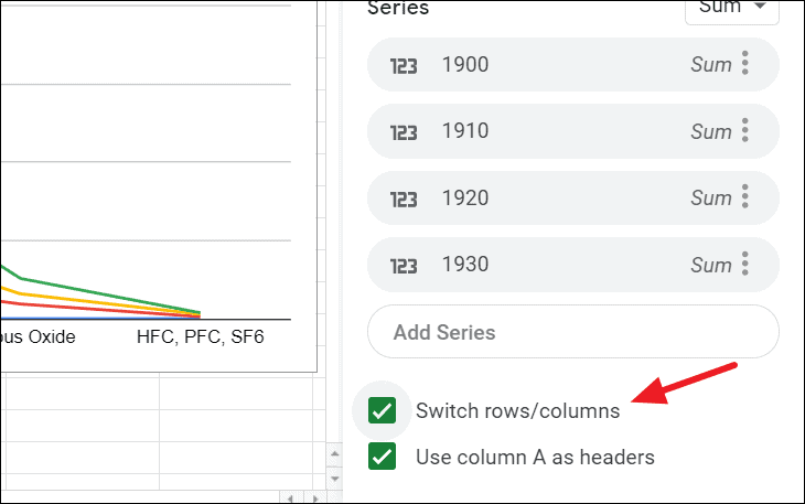
When you check the ‘Switch Rows/Columns’ box in the Setup, it will switch your X-Axis data to the Y-Axis, and vice versa.
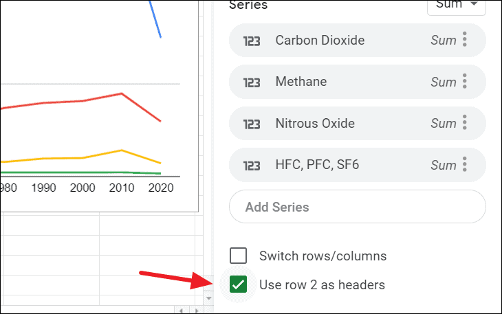
Use row 2 as Headers: This setting lets you choose whether the first row of the selected dataset should be used as the header (legend) of the chart or not. In our dataset, the data starts at row 2.
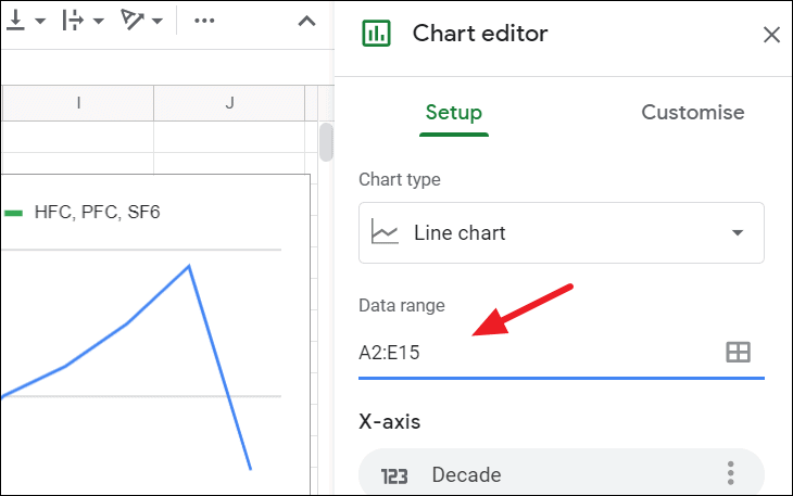
If you want to change source data for your line chart, you can do that by clicking on the ‘Data range’ option in the Chart setup.
Customizing Line Chart in Google Sheets
Lets see some of the customizations you can do your line chart.
Sometimes, chart size won’t be big enough to show all your chart legends, axis labels, plot area, and title, etc. It easy to change your chart size by clicking on it and then dragging its corners.
Chart and Axis Title
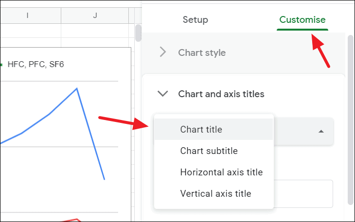
You can add and customize the chart title, axis title, and subtitle in the ‘Customize’ tab of the Chart editor.
Open ‘Chart and axis title section’ under the ‘Customize’ tab, click the drop-down menu that says ‘Chart title’, and choose which title you want to add.
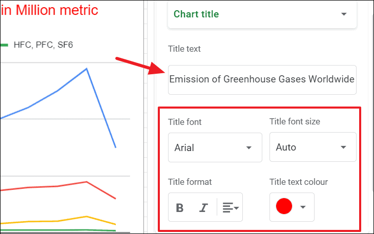
Type your title in the ‘Title text’ textbox and then change title font, font size, text color, and the format of the text if you want with the below options.
You can also add horizonal and vertical axis titles this way.
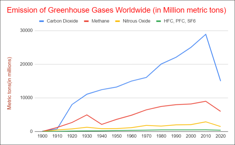
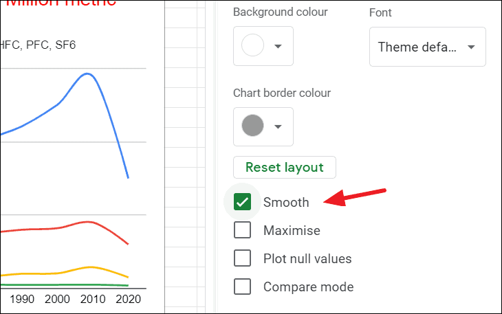
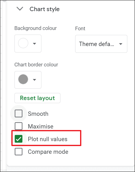
Chart Style
The chart Style section of the Customise tab provides you different layout options to change the chart’s border color, fonts, background color as well as different layout styles.
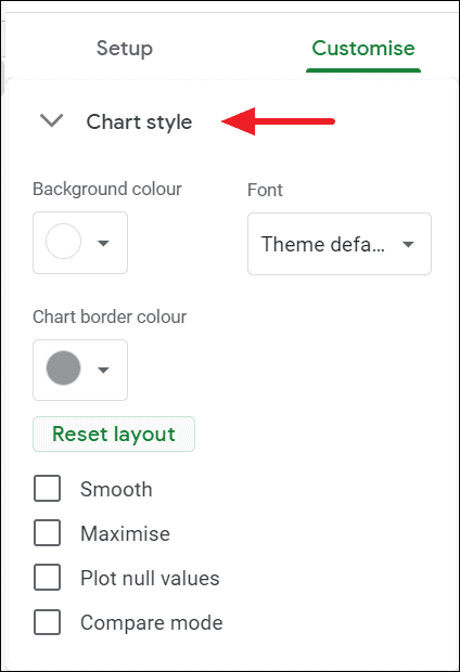
Smooth. When you check this option, it makes the line segments smooth, instead of the jagged edges.
Maximize. This option expands the chart to fit inside most of the chart area and it reduces margins, paddings, and extra space your the chart.
Plot null values. If there are any blank cells (null values) in your source dataset, usually you would see breaks in the line. But checking this option will plot them and you will see not see any breaks in the line.
Compare mode. If this option is enabled, the chart will show comparison data when you hover over the line.
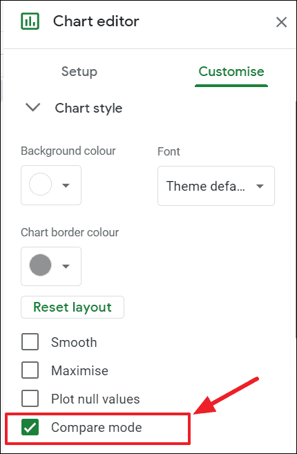
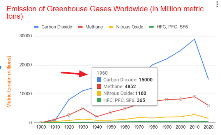
This is how you make a comparison mode line chart in Google Sheets.
Series
This is where you can format Series (lines) in your chart. Here you can adjust, line’s thickness, color, opacity, line dash type, maker point shape, as well as y-axis position (left or right). This section lets you choose what type of aggregate you want your chart to show.
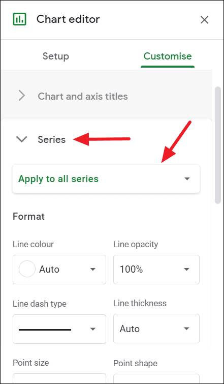
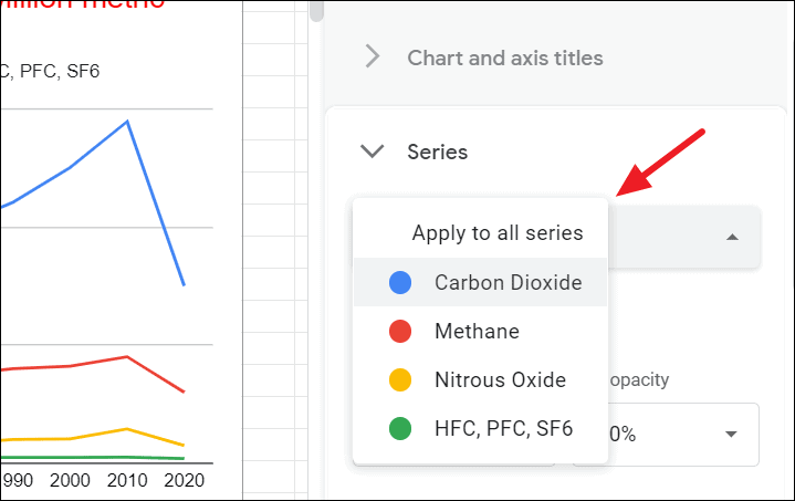
Click on the ‘Apply to all series’ drop-down under the Series section to choose whether you want the format all the series at once or a specific series. You can select each individual series and format them separately.
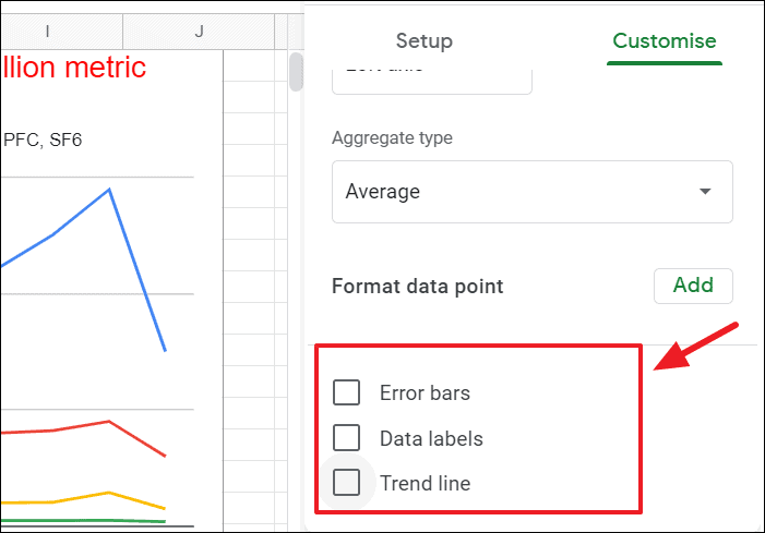
This section also allows you to add error bars, data labels, and trend lines to your line chart. You can even customize individual data points by clicking on the ‘Add’ button next to ‘Format data point’.
If you don’t want display any and all lines in your chart, you can easily do that.
To turn a line invisible, first, choose which line you want to turn invisible in the Series drop-down menu. Then, click on the ‘Line opacity’ drop-down and select ‘0%’.
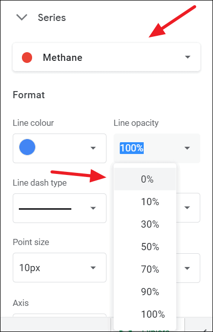
As you can see here, blue is disappeared (Methane).
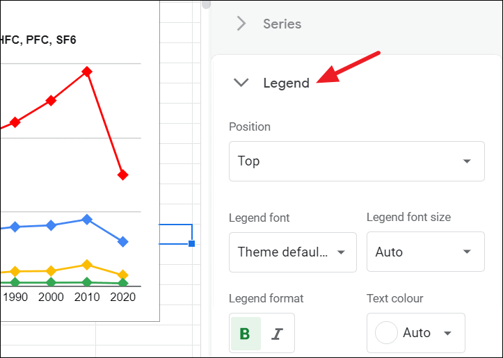
Legend
Under the Legend section, you can customize the legend’s font, size, format, text color as well as position of the legend.
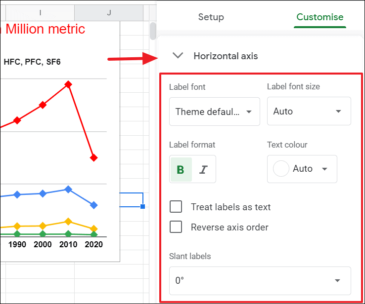
Horizontal Axis
The next section is the horizontal axis, which provides you options to change the label’s font, size, format as well as text color of the label on the X-axis. You can also create labels as text by ticking the ‘Treat label as text’ option and reverse the axis order by checking the ‘Reverse axis order’ box.
Another useful option you have here is ‘Slant labels’, which makes your horizontal labels slant at a specific angle. To do that, click on the ‘Slant labels’ drop-down and choose an angle.
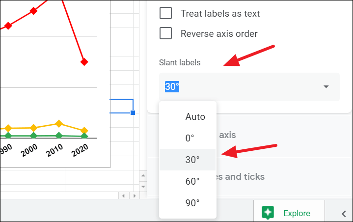
This option can be helpful when you have many labels or big labels on your X-axis.
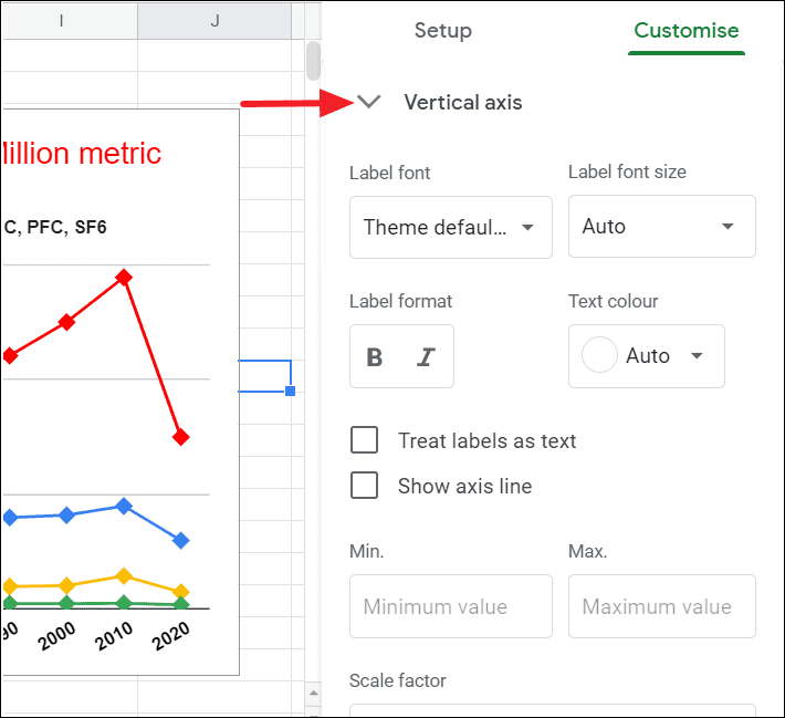
Vertical Axis
Like the Horizontal axis above, the Vertical axis menu gives you options to change the font, font size, format, and color. You also have options to treat labels as text and to show axis lines and apply a logarithmic scale to the chart. Check the ‘Show axis line’ box to show the vertical axis line.
You can set maximum and minimum bounds for the y-axis with the ‘Min.’ and ‘Max.’ fields. If you have large-scale values like in millions or billions, you can change those values into decimals with the ‘Scale factor’ drop-down.
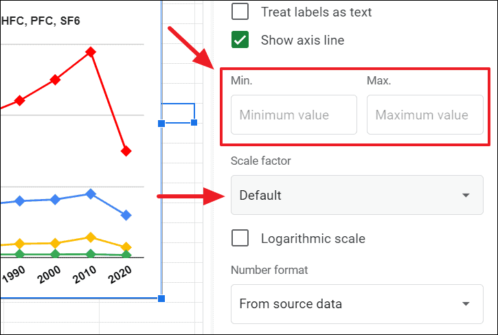
And the ‘Number format’ option lets you choose your desired number formatting for the vertical axis labels.
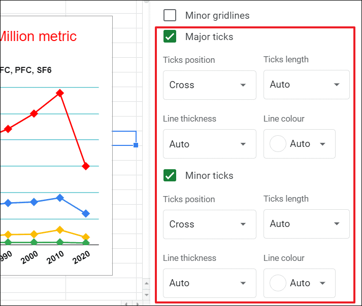
Gridlines and Ticks
Gridlines in the chart are the lines that extend from any horizontal and vertical axes across the plot area to show axis divisions. They also help make the chart data more readable and detailed. And ticks are the short lines that mark the axes with labels.
Google Sheets allows you to add major and minor gridlines and ticks to your chart.
In the Gridlines and ticks section of Chart Editor, you can format the gridlines and ticks in the line chart. You can change the number and color of major and minor gridlines in the graph.
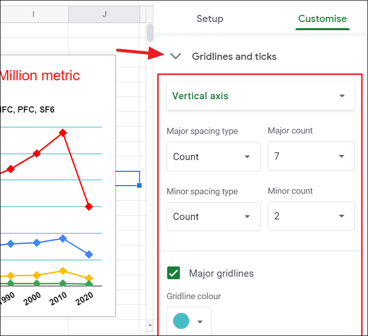
You can also change the position, length, thickness, and line color of the major and minor ticks in the line chart.
This is how our final customized chart looks like :
We hope this tutorial helps you create a line chart in Google Sheets.