
Apple’s macOS 26 Tahoe introduces the Liquid Glass design, a visually striking interface that uses extensive translucency across the desktop, Dock, menu bar, and app toolbars. While this look allows content and backgrounds to show through interface elements, many users with vision concerns or those who prefer clearer separation between controls and content may find the default transparency impacts readability. The most effective way to address this is by adjusting the system’s transparency settings, which directly influence how transparent interface elements appear.
Adjusting Transparency with Accessibility Settings
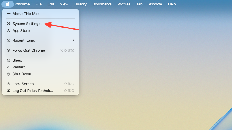
Step 1: Open the System Settings app on your Mac. You can do this by clicking on the Apple menu in the top-left corner and selecting System Settings, or by searching for it using Spotlight with Command + Space.
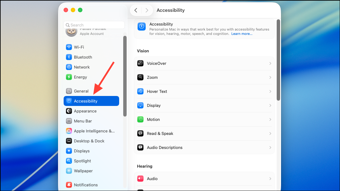
Step 2: In the sidebar, scroll down and select Accessibility. This section contains options specifically designed to improve usability for users with different visual needs.
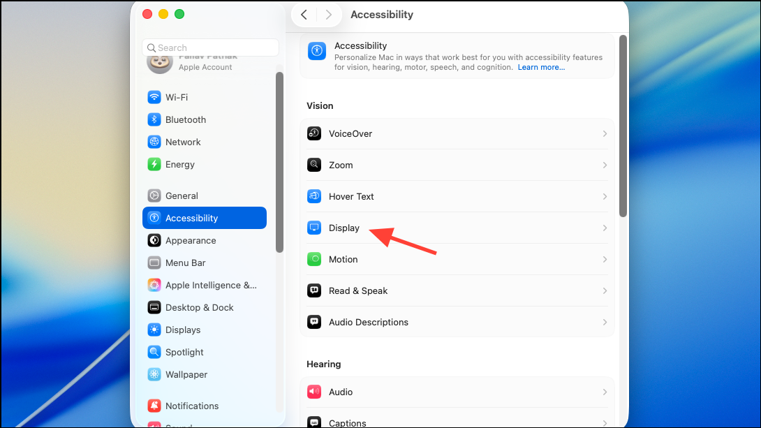
Step 3: Under Accessibility, choose Display or Display and Text Size (the exact label may vary depending on your system build).
Step 4: Locate the Reduce Transparency toggle and switch it on. Once enabled, this setting replaces many translucent interface backgrounds—such as those found in the Dock, menu bar, sidebars, and some app windows—with more opaque or solid backgrounds. This adjustment increases contrast, making text and icons stand out more clearly against the background and improving overall readability.
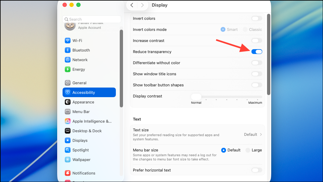
Turning on Reduce Transparency does not fully eliminate all translucent effects, but it significantly minimizes them. The system will apply a darker or more solid background to key UI components, which can be especially helpful if you find it difficult to distinguish controls, read text, or identify icons when using colorful or busy wallpapers. This change is systemwide and takes effect immediately, so you can quickly assess if the new appearance suits your needs.
Step 5 (Optional): For quick access, you can add Reduce Transparency to your Accessibility Shortcuts. Return to the Accessibility section, scroll to the bottom, and select Accessibility Shortcuts. Add Reduce Transparency to your shortcut list, allowing you to toggle it on or off directly from the menu bar or by using a customizable keyboard shortcut.
Additional Display Adjustments for Improved Readability
While Reduce Transparency is the primary method to address readability issues in macOS Tahoe, you can further improve visual clarity by adjusting related display settings:
- Increase Contrast: In the same Accessibility > Display section, enable
Increase Contrast. This option strengthens the border and separation between interface elements, making buttons, sliders, and other controls easier to see. - Change Wallpaper: If certain wallpapers make controls harder to read, consider switching to a less busy or darker background. The Liquid Glass effect pulls color and brightness from your wallpaper, so a simpler background can improve the visibility of transparent elements.
- Customize Folder and App Icon Colors: macOS Tahoe allows you to assign custom colors or emojis to folders and app icons. This can help you quickly identify important items, even if transparency remains in place.
These adjustments can be combined with Reduce Transparency for a more tailored and readable interface. However, note that some interface elements—like the menu bar in macOS Tahoe—remain highly transparent by design and may not be fully affected by these settings.
Considerations and Limitations
macOS Tahoe’s Liquid Glass design is a significant shift from previous versions, and some users may need time to adjust. While Reduce Transparency provides immediate relief for most readability concerns, there are a few caveats:
- Some apps may not fully support the new transparency settings until they receive updates.
- Certain UI elements, such as the menu bar, may remain transparent regardless of settings, as this is a core part of the new design direction.
- Using Reduce Transparency may affect the overall look and feel of the system, making it appear less visually dynamic but much easier to navigate for those prioritizing clarity.
Feedback from early testers and accessibility advocates suggests that Apple may continue refining transparency and contrast options before the final release. If you rely heavily on visual clarity, monitor updates during the public beta period and provide feedback using Apple’s Feedback Assistant.
Fine-tuning transparency settings in macOS 26 Tahoe can dramatically improve on-screen readability, especially with the new Liquid Glass interface. These adjustments let you prioritize usability without sacrificing the updated design’s core features.