Whenever a new iOS update comes out, there's always some feature that causes controversy. This year, that mantle easily goes to the Photos app. Who would've thought, right? Mostly, after a new iOS update, things generally stay the same with the Photos app, even with the addition of the new features.
But the overhaul that the Photos app has received this year has easily compensated for that and steeped the app in broiling furor. The redesign of the Photos app is quite intensive, there's no two ways about it. Let's dive deep into it.
A unified design
The biggest change with the Photos app – the one that will break or make it for most people – is that the tech giant has ditched the tabbed design for the app in favor of a more unified interface.
There are no more separate tabs for 'Library', 'Albums', 'For You', and 'Search'. All of it is available in a single view where you scroll up and down to access different categories.
As soon as you open the Photos app, your screen is divided into two parts – the upper half shows the photo grid, and the lower half houses albums and collections.
If you scroll up, you'll end up with the classic 'Library' view options that gives separate buttons for viewing all photos or categorizing them by months and years. The option for 'Days' is no longer available and instead, there's a new 'Recent Days' category available in Collections.
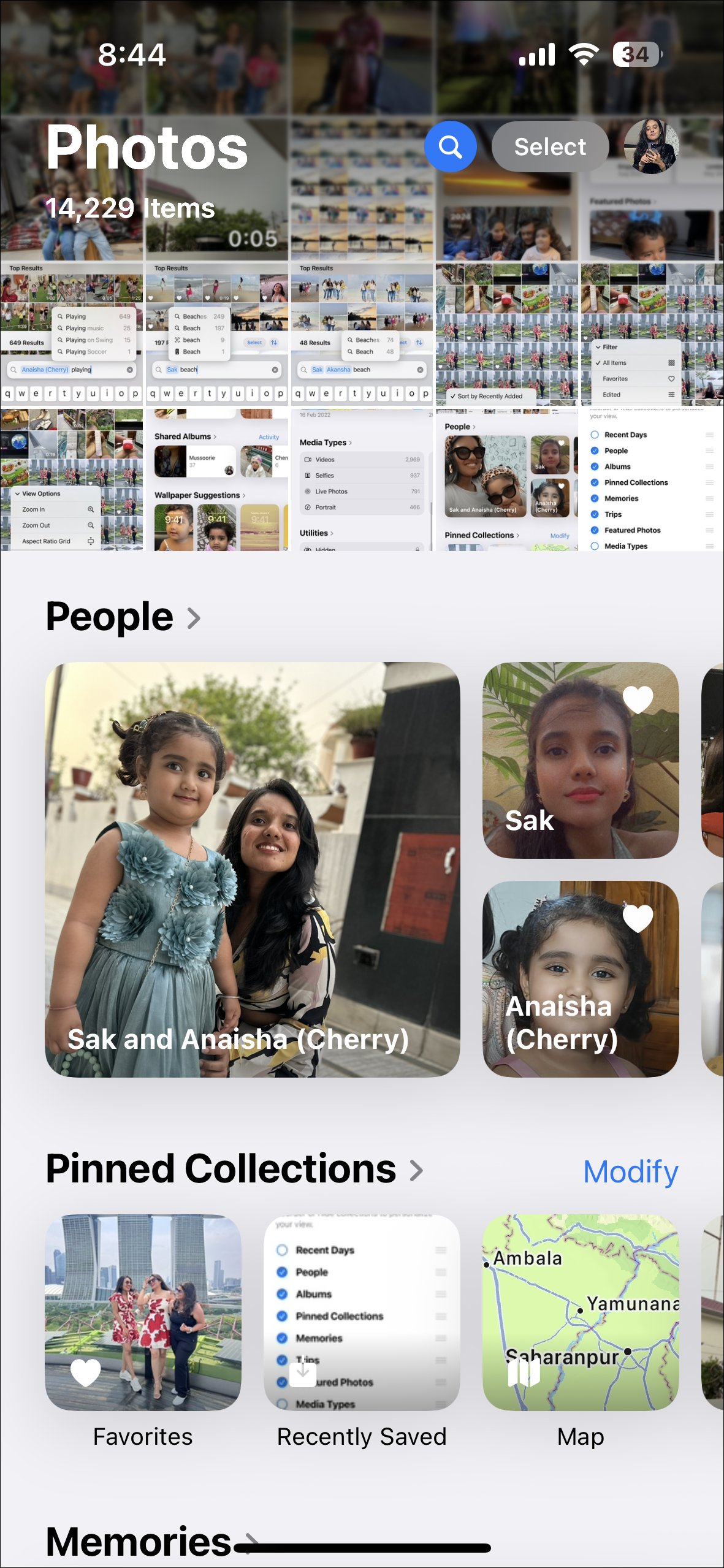
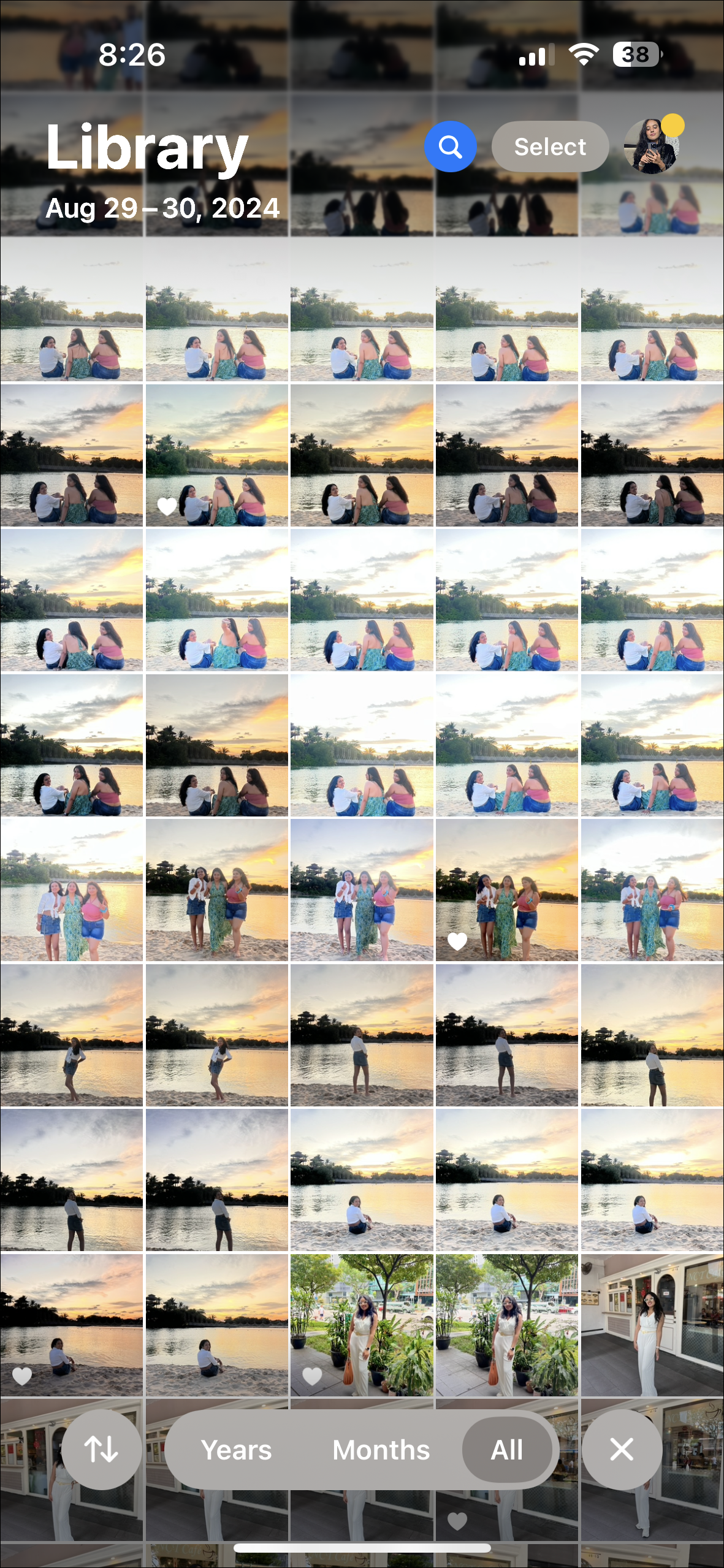
For me, it's easier to scroll through my photos this way. It's more organic since I rarely reached for the different Library tab anyway and one of the reasons was the separation of the tabs made me forget about its existence sometimes. I had been using the Photos app with the Recents Albums before the Library was introduced and it had remained stuck with me. The only time I switched to the Library was when I really needed to find a photo and I remembered the month or the year the photo was taken. And I quickly switched back to my preferred view.
With the integration of both, where the Library view doesn't really intrude on the All Photos view, it's seamless to find photos from a particular year or month and then get back to the All Photos in a jiffy. And there are quite a few people who would agree with me.
But there are also many who won't. And for good reason. If you're someone who repeatedly found themselves switching between the different tabs, especially to use them to find separate photos, the new redesign would feel like a personalized nightmare. When the Recent Photos and Library tabs were separate, you could have scrolled significantly in one tab, remembered another photo you wanted to view, and went to find it in the other tab without losing your place in the first one, but that simply isn't possible with the new design. All of that significant scrolling you might've done to view the first photo would be lost as soon as you went to find the second photo. If that seems like a nuisance to you, you should better steer clear of the iOS 18 update.
Now, I do miss the carousel that Apple introduced in the initial iOS 18 betas. It made it easier to discover photos, but it probably didn't sit well with most users since the company removed it. I still hope they reintroduce it once everyone has had enough time to get acclimatized with the new Photos app. But that's a discussion for another time.
New place for Search Icon and Improved search
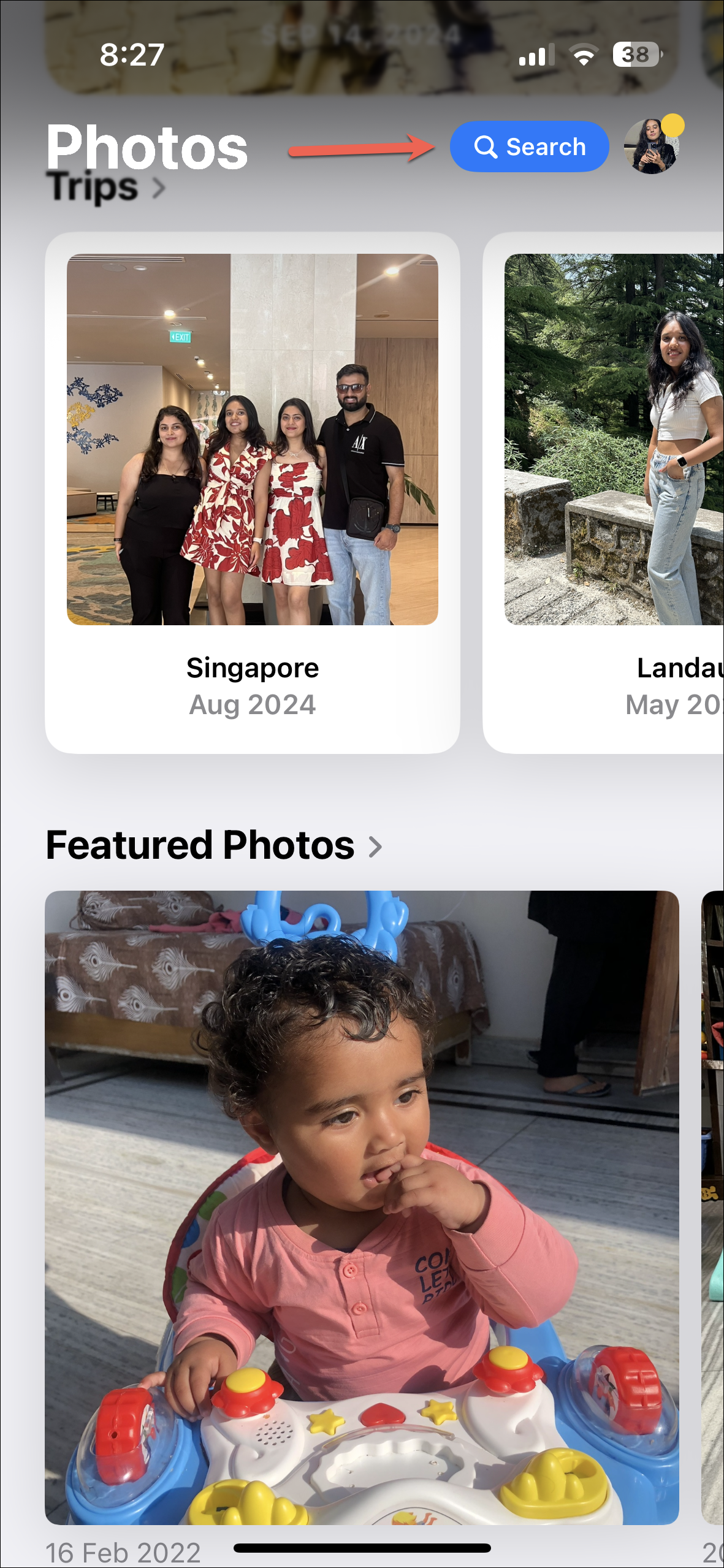
The search icon is now readily available everywhere in the Photos app on the top-right corner of the screen, whether you're viewing your photo grid or your collections.
This makes this approach markedly different from the previous iOS, where Search was a tab of its own. And I think I'm not too far off when I say it's impossible to hate this new redesign. Ever since updating to iOS 18, I've been using the search feature more, partly thanks to the fact that the Search button is always up there in my face, making it impossible to ignore it. But it's only half the reason.
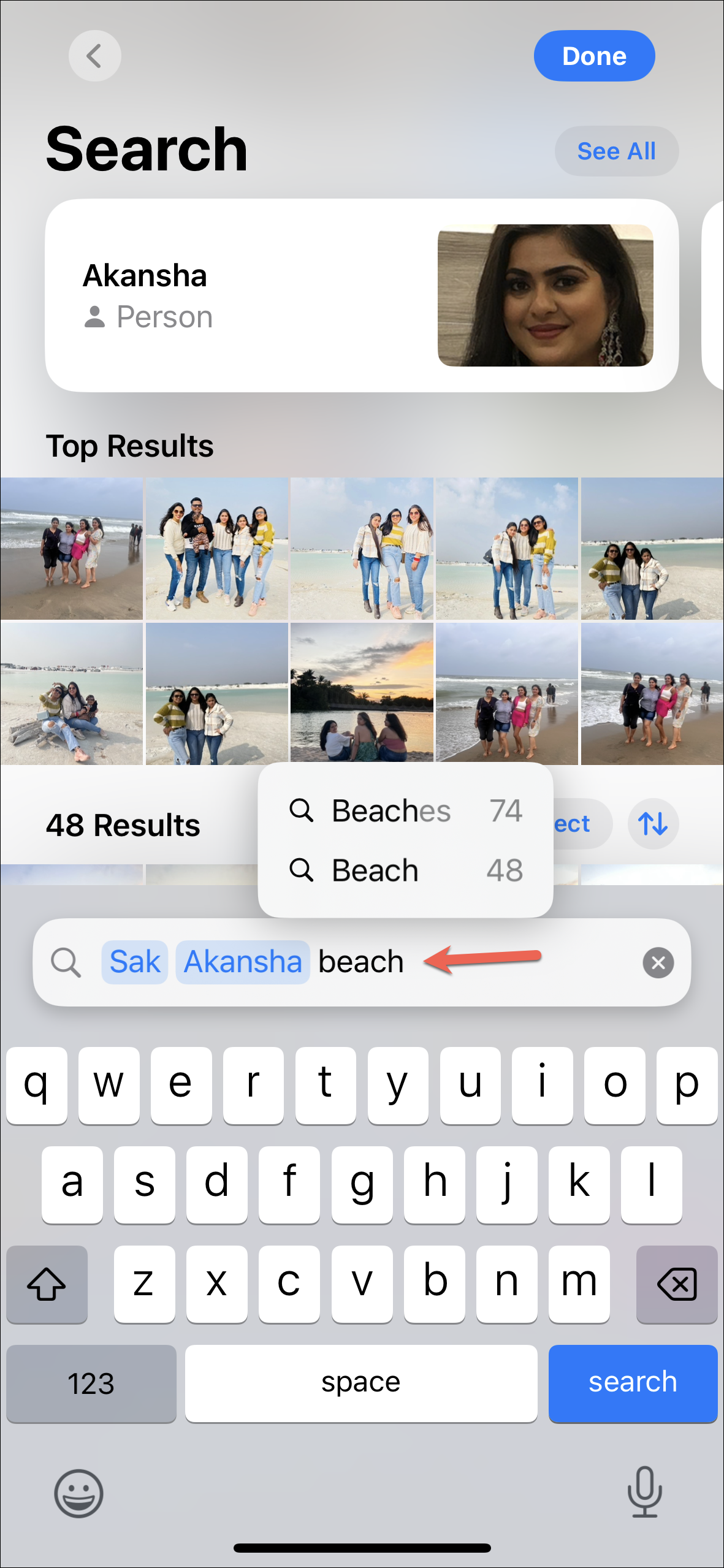
Search has also been improved massively in iOS 18 and that's the other reason I've been reaching for it more. You can now use more natural language queries to find your photos. For example, I can now find photos of my niece playing, and when I go to enter the query, the suggestions even include words like "Playing", "Playing music", "Playing on swings", etc. I can even include more than one search filter in a single query to find photos of me and my friend by the beach.
Filter and Sorting Options
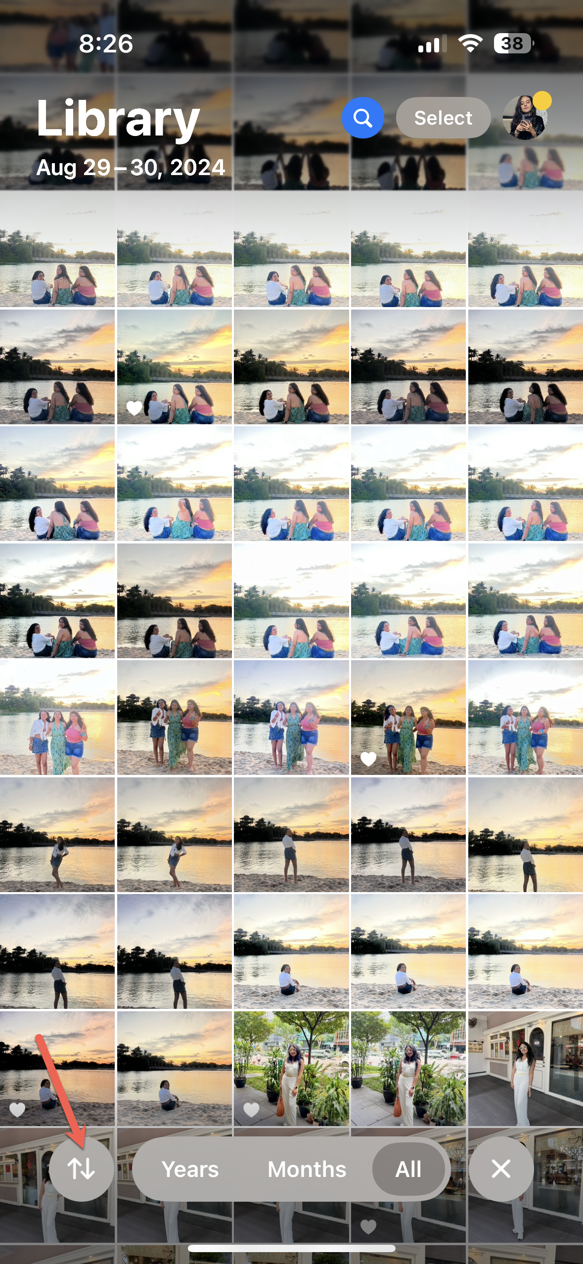
There are also new filters and sorting options for your photo grid that are accessible from the 'double arrows' that appear after you scroll up.
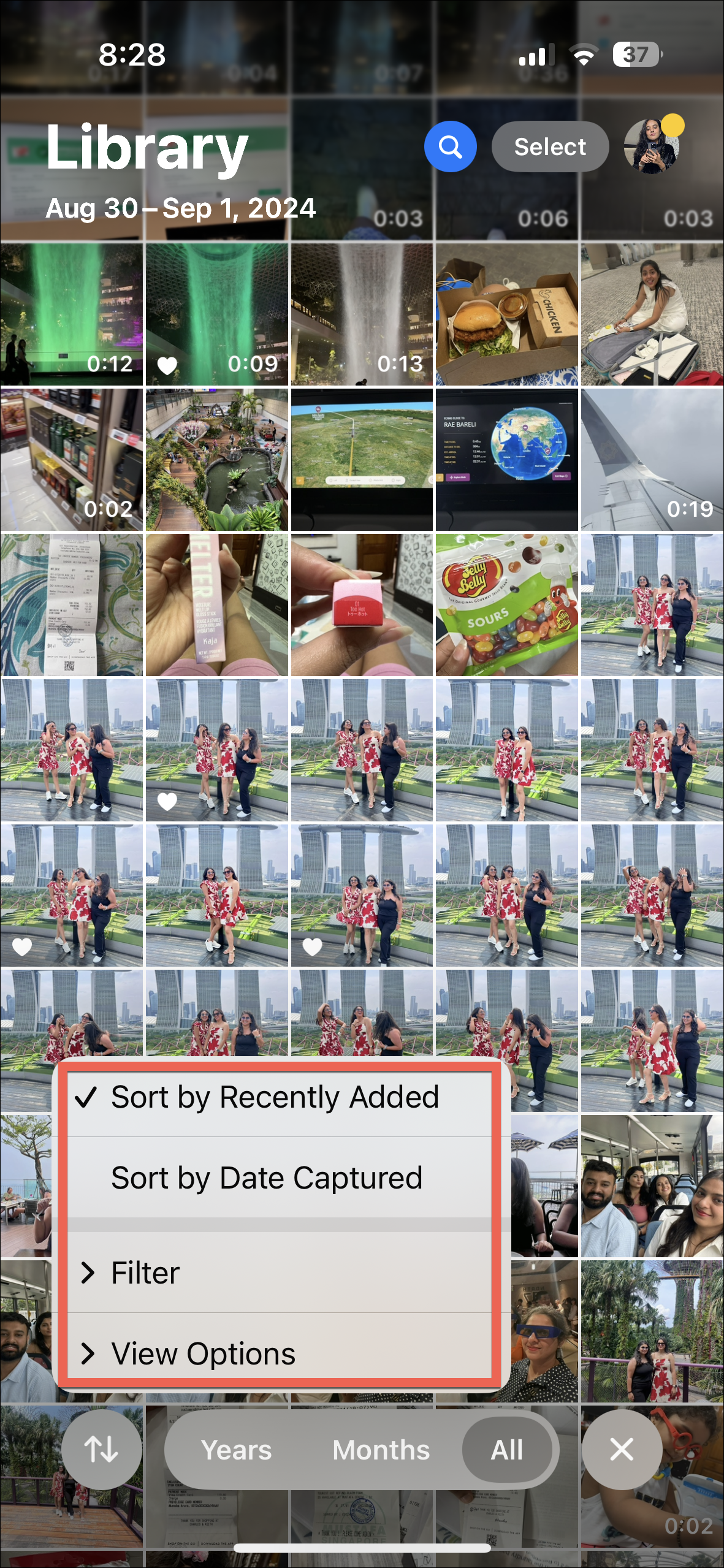
Right away, you get options to sort your photos by 'Recently Added' or 'Date Captured'.
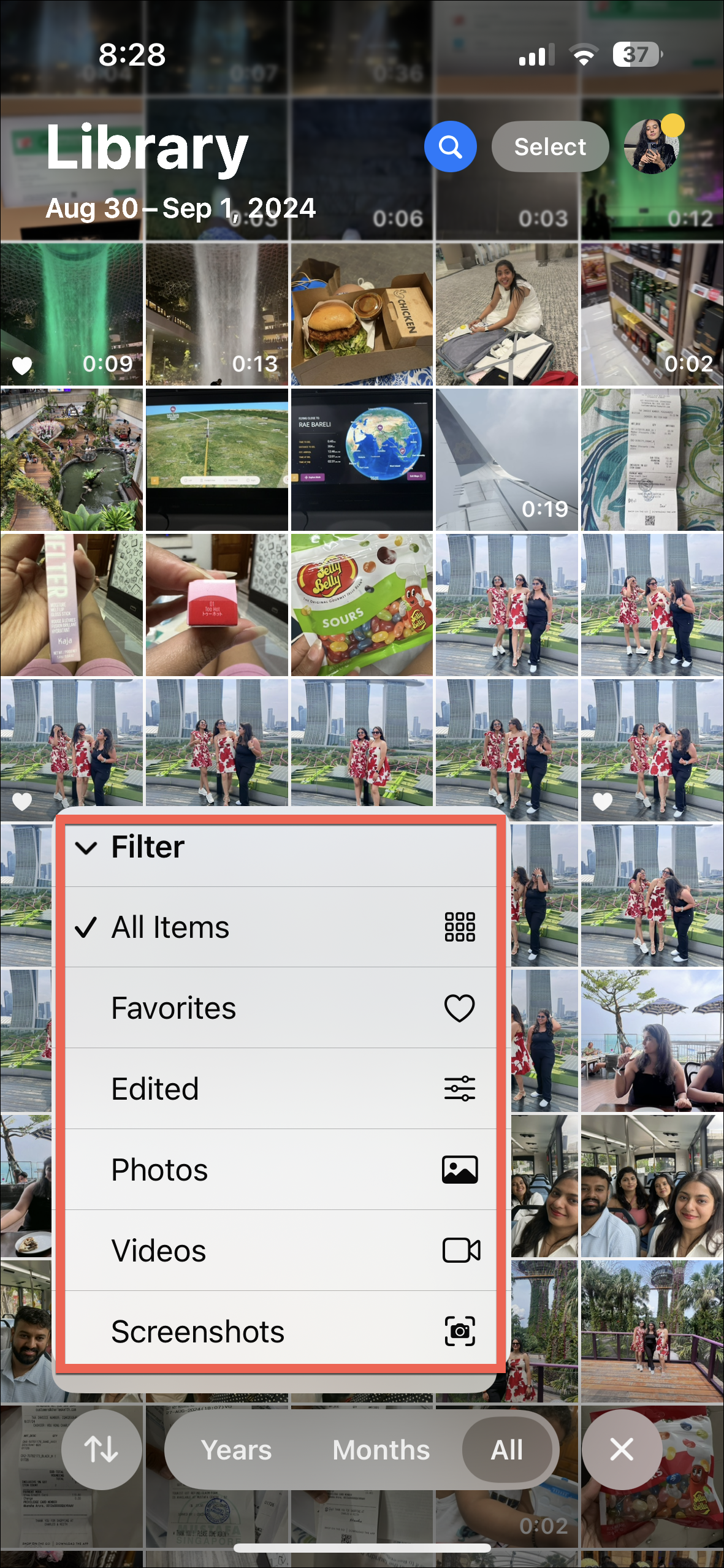
Expanding the 'Filter' menu gives you the option to view 'Favorites', 'Edited', 'Photos', 'Videos', or 'Screenshots' instead of all items.
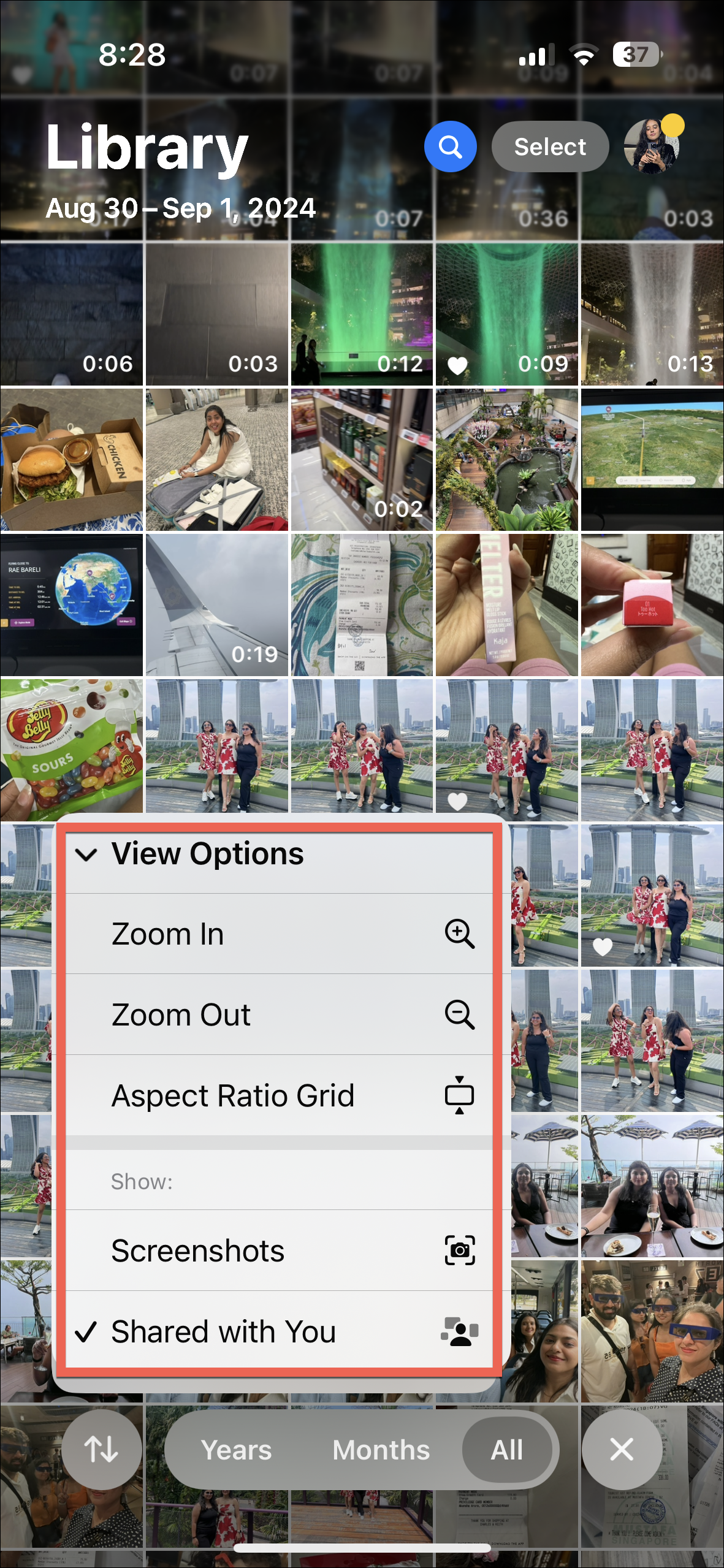
Finally, if you expand the 'View Options' menu, you'll get the options to change how to view the photo grid, as well as the options to remove screenshots and photos or videos shared with you from the grid. It's a great way to clean up your photo grid. Now, if the latter also removed photos and videos saved from other apps like WhatsApp from the grid and not just from Shared Albums, I would fall absolutely in love with it.
Customizable Collections
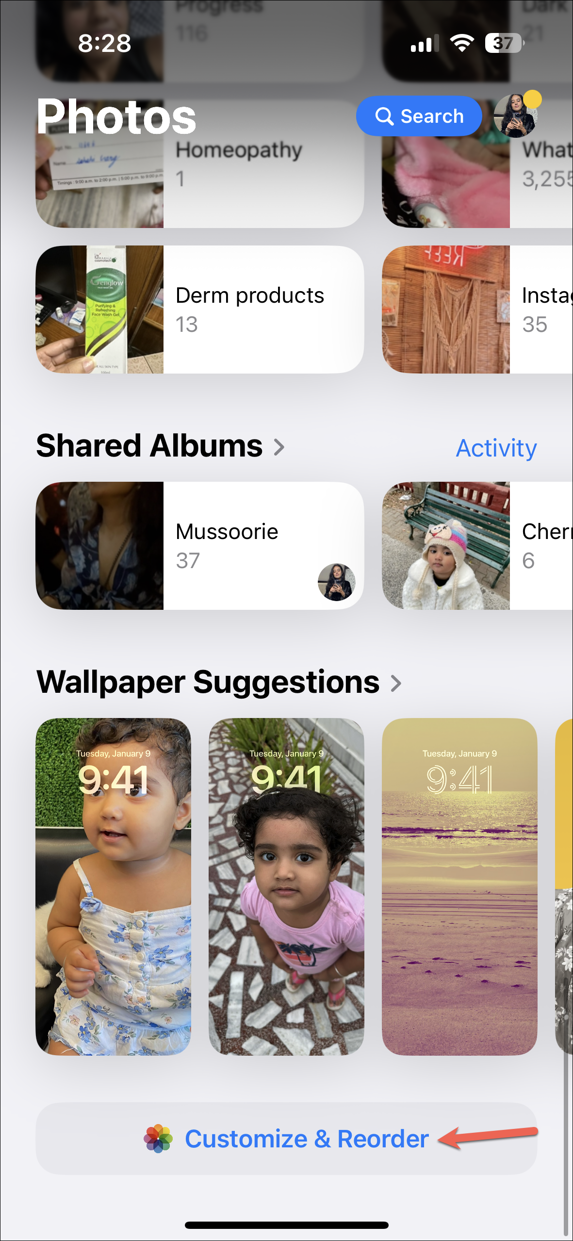
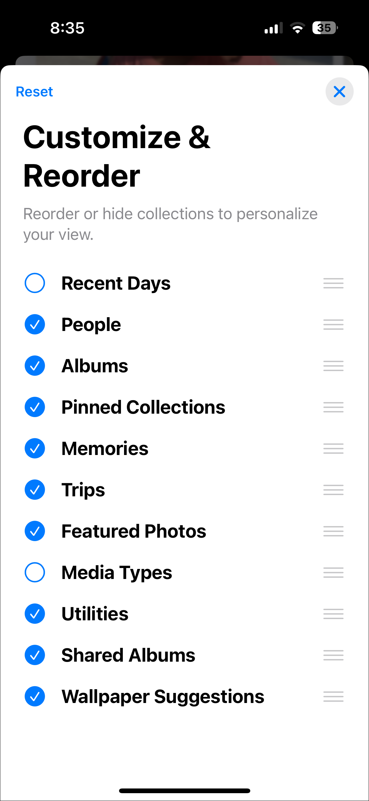
Below the photo grid are the Collections. These sections in iOS 18 organize your photos based on different parameters. There are collections for Albums, Recent Days, People & Pets, Memories, Trips, Featured Photos, Pinned Collections, Shared Albums, Media Types, Utilities, and Wallpaper Suggestions.
The best part is that you can customize and reorder these collections. Up until I customized my collections, it all felt like a bit of a clutter, to be honest. But with the option to customize the Photos app, I can put the categories I reach for the most towards the top so I don't have to scroll needlessly every time. I can also exclude the collections I don't care about at all to reduce the clutter in the app.
New Media Types and Utilities
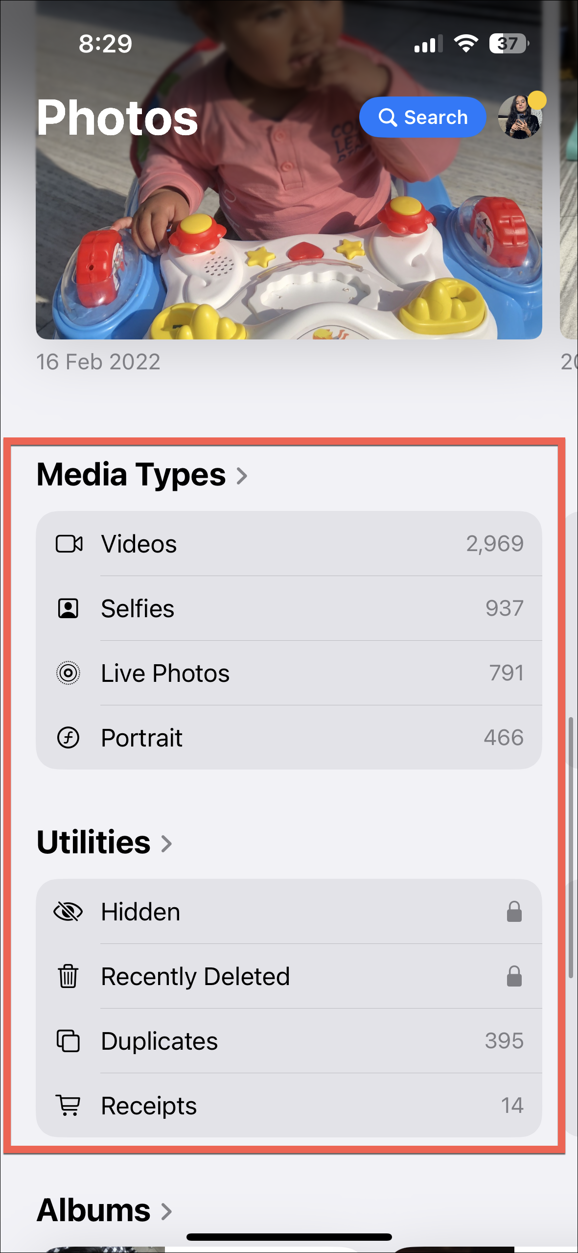
Photos in iOS 18 also include a whole lot more media types and utilities which you can access by swiping to the left. These inclusions make it easier to find your photos.
There are new Media Types like RAW, Animated, Slo-mo, Time-lapse, etc. The Utilities section also includes new types like Receipts, Handwriting, Illustrations, Documents, Recently Edited, Recently Viewed, etc.
To hate or not to hate the Photos app?
Now that we've taken a deep dive into the remake of the Photos app, what's the verdict? It's not deserving of all the hatred it's getting, in my opinion.
I'm not going to lie. As soon as you open the app after updating to iOS 18, you're going to be hit by the biggest wave of regret for upgrading your iOS because the interface of the Photos app is that different from what you're used to up until now. But it grows on you if you give it a fair chance.
It's also full of additions that only make it easier to find your photos and videos. And with the ability to customize the Photos app, you can organize it however you like it. There are also many Apple Intelligence features coming to the app, like Memory Maker, Clean Up, etc., that will make it more than worth it on compatible devices to update your iOS. But even without those features, the new Photos app is good. You just need to spend some time with it.

