Ever since Apple unveiled the iPhone 14 lineup, the two words you keep hearing everywhere are “Dynamic” and “Island”. iPhones 14 Pro and Pro Max have ditched the notch and adopted the pill-shaped cutout to house the camera and sensor array in the display, as many users were speculating would happen this year. iPhones 14 and 14 Plus still have a notch, though.
But in a not-so-surprising move, Apple did not do what people were simply expecting it to do. When has it ever? The tech giant loves to make moves that knock everyone’s socks off. Dynamic Island came rather close to achieving it, even with its simplicity. It’s one of those features that, once implemented, seem like such a glaringly obvious solution to a problem. In this case, it morphs the pill-shaped cut-out into a powerhouse of information, instead of something you just have to endure. It’s even got Android users trying to spoof the feature, despite calling it useless. Let’s have a look at it in all its glory, shall we?
What is the Dynamic Island?
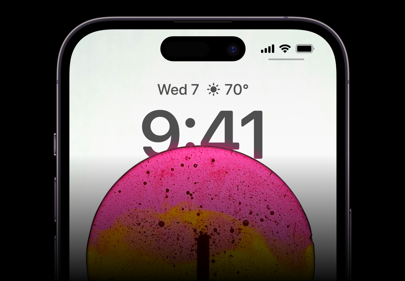
Although the name is somewhat ridiculous to hear the first time, it describes the pill cut-out on the front display exactly. After all, it is an island, suspended in the middle with the screen surrounding it on all sides. And it is dynamic, even if it is all a sleight-of-hand.
Curious choice of words, right? Why would I call it sleight-of-hand? Because that’s exactly what it feels like. When you see a magician pulling rabbits out of hats or making objects disappear, you know it isn’t real. But you let yourself be fooled that it is. That’s the exact nature of Dynamic Island.
Dynamic Island is basically the name for the area around the cut-out that has the sensors and the camera. The pixels around the cut-out morph into different shapes to deliver different alerts and notifications. But it integrates so beautifully with the hardware that it feels like the cut-out itself is expanding to provide you the different animations. And that’s impossible. It would require magic to make hardware dynamic, won’t it? Exactly my point. It’s not magic, but it feels like it – most of the time.
Of course, at certain angles and outside in the sun, there is a distinct separation of the cut-out from the screen and the island. But it isn’t a glaring distraction, just enough to remind you that it’s still the real world and not the magical corridors of Hogwarts.
Initial implementation doesn’t take Dynamic Island to its full potential. Sometimes, you won’t even realize it’s there. But a part of it’s because third-party app developers are yet to board this train. And with only limited apps utilizing this interface at the moment, the usage is sparse. But hopefully, that’ll change as soon as more and more third-party apps adopt it and when Live Activities also makes its way to iOS 16.1.
In its present state, here’s the complete extent of how you can use it.
Using the Dynamic Island
You can see the Dynamic Island at work with many system apps. As soon as you unlock your iPhone, you can see the island expanding to show an animation for Face ID. The animation for using the Face ID for unlocking the device is subtle as opposed to when using it in other apps.
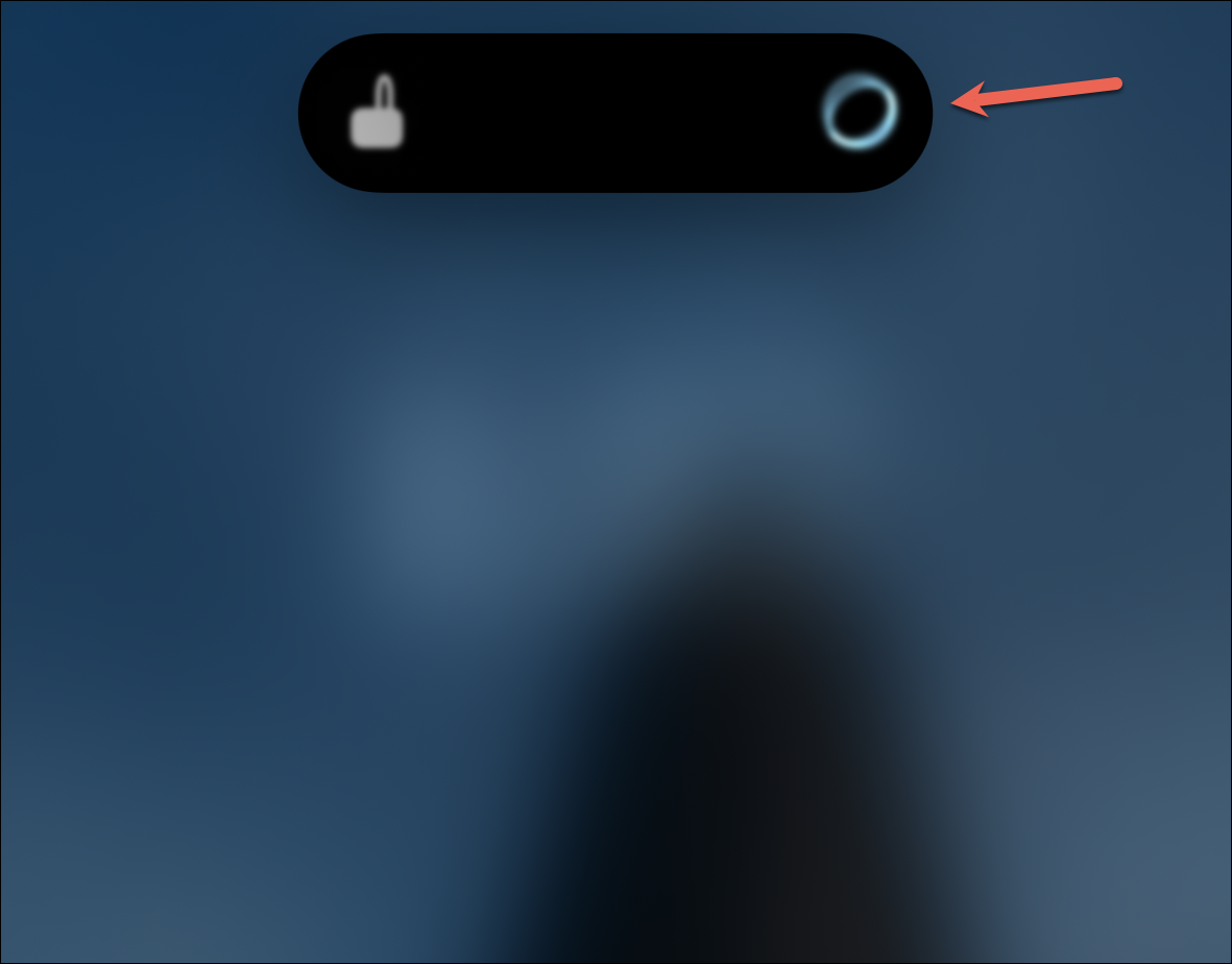
The Face ID expansion for using it within apps is a little unnecessary in my opinion. It expands to a huge square on the screen, which could have been incorporated into the small rectangle from above.
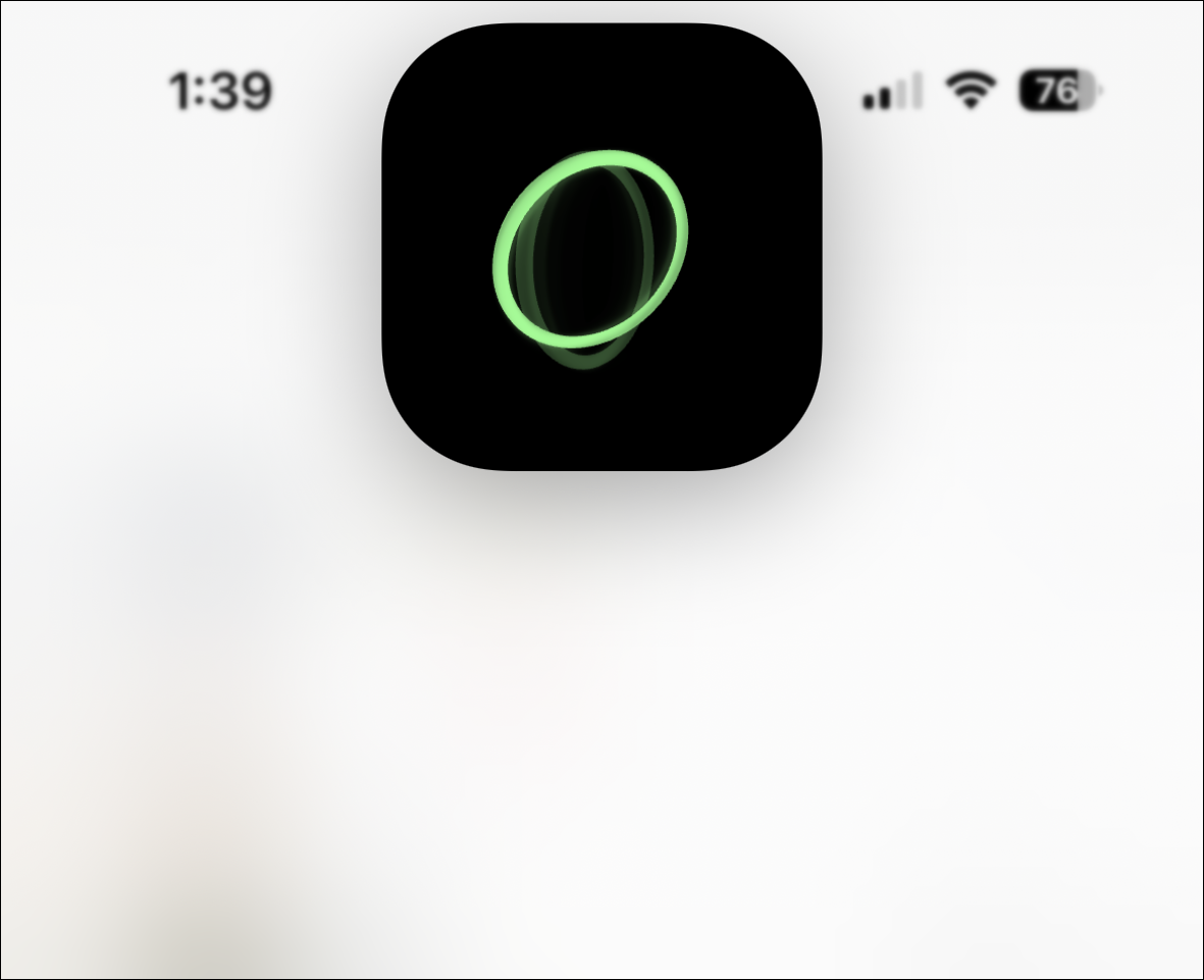
Opinions aside, Dynamic Island can show you a slew of alerts presently. Other alerts it shows include:
- Confirmation for Apple Pay Transactions
- Privacy indicators for camera and microphone that used to appear in the status bar
- AirPods connection and battery status
- iPhone charging status
- Low battery alert
- File receiving using AirDrop
- Switching between Silent mode and Ring
- Toggling Airplane mode from Settings
- Carkey locking/ unlocking
- AirPlay Connections
- Connecting accessories
- Find My Alerts
- Shortcut actions
Apart from these brief alerts, the Dynamic Island can also show activities that are ongoing when you have minimized the app. These include:
- Incoming calls
- Ongoing call durations
- Media playback for music and podcasts
- Active timers
- Screen Recording
- Voice Memo Recordings
- Directions from Apple Maps
- Personal Hotspot connections
- Live Activity Sports scores
For many of these apps, like music apps, when you swipe up on the app, instead of minimizing to the Control Centre, it minimizes to the Dynamic Island.
You’ll also see activities for some third-party apps in the Dynamic Island. It’s because they use existing APIs from Apple that the company has connected to the Dynamic Island. For example, the NowPlaying API used by music and Podcast apps or the CallKit API that apps like Whatsapp, Zoom, Skype, etc. use. App developers can make further changes to their app’s Dynamic-Island specific API, but even if they do not, you still get to enjoy the automatic integration they currently offer.
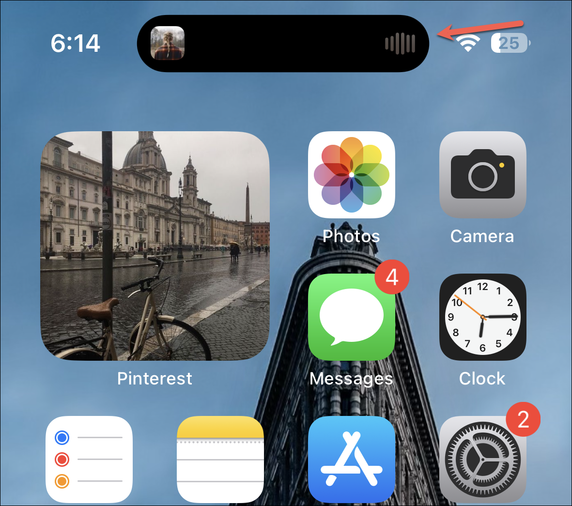
But do note that for some apps, the integration with Dynamic Island isn’t yet complete. For example, if you’re using Google Maps for directions, you’ll see an indicator of the same in the Dynamic Island.
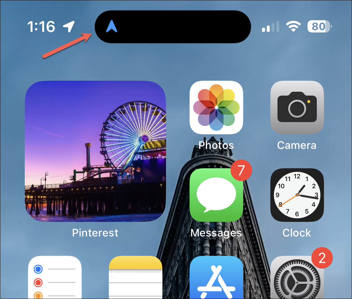
But it doesn’t show upcoming directions as Apple Maps do. But when using Apple Maps, Dynamic Island allows you to use other apps while still making sure you don’t miss any turns.
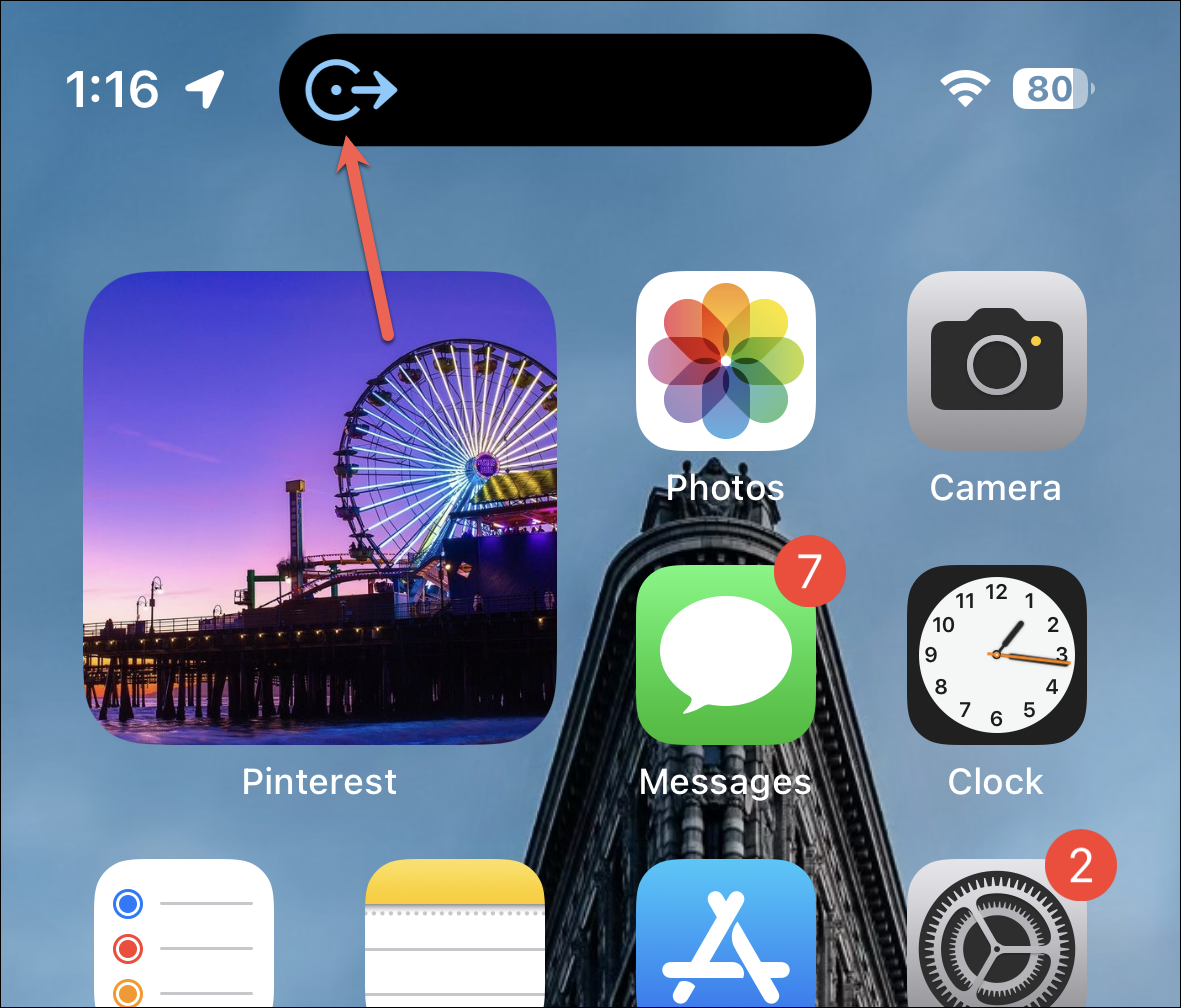
Interacting with the Dynamic Island
Tapping the Dynamic Island takes you to the app. For some of these Dynamic Island activities, you can also interact with the island by long pressing it. For instance, long pressing the island when music is playing brings the playback controls widget on the screen whereas tapping it will open the music app.
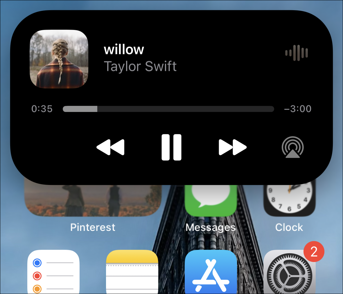
This lets you use those features even when using other apps. You don’t even have to swipe the Control Centre down to access the playback controls!
Long-pressing doesn’t work for all activities, though. Third-party apps will also be able to use this expanded view. App developers can use this expanded view creatively, so I’m excited to see what they’ll bring for us when they implement the functionality.
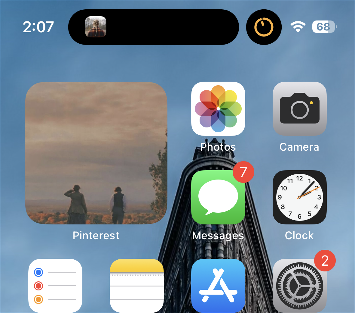
When you’re using two apps with Dynamic Island activities at once, the island splits into two to incorporate both. For example, if you’re listening to music while a timer is going on, you can find one in the larger island on the left (which Apple calls the leading side) and the other in the small circular island on the right (which is being called the trailing side). You cannot switch the apps between the two sides.
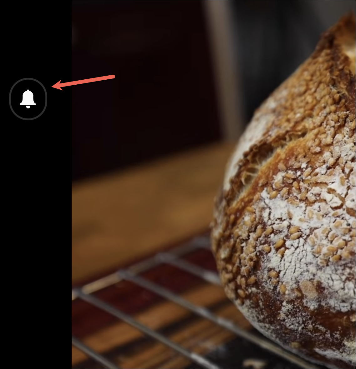
Dynamic Island also disguises itself nicely in the landscape mode in some apps, like YouTube. It disappears almost entirely, along with the status bar, in the landscape mode where a black margin on the left swallows it. Only when some activity happens does it become visible. In others, the cut-out does stick out like a sore thumb and is more noticeable than the notch unless you’re using the app in dark mode.
Live Activities in the Dynamic Island
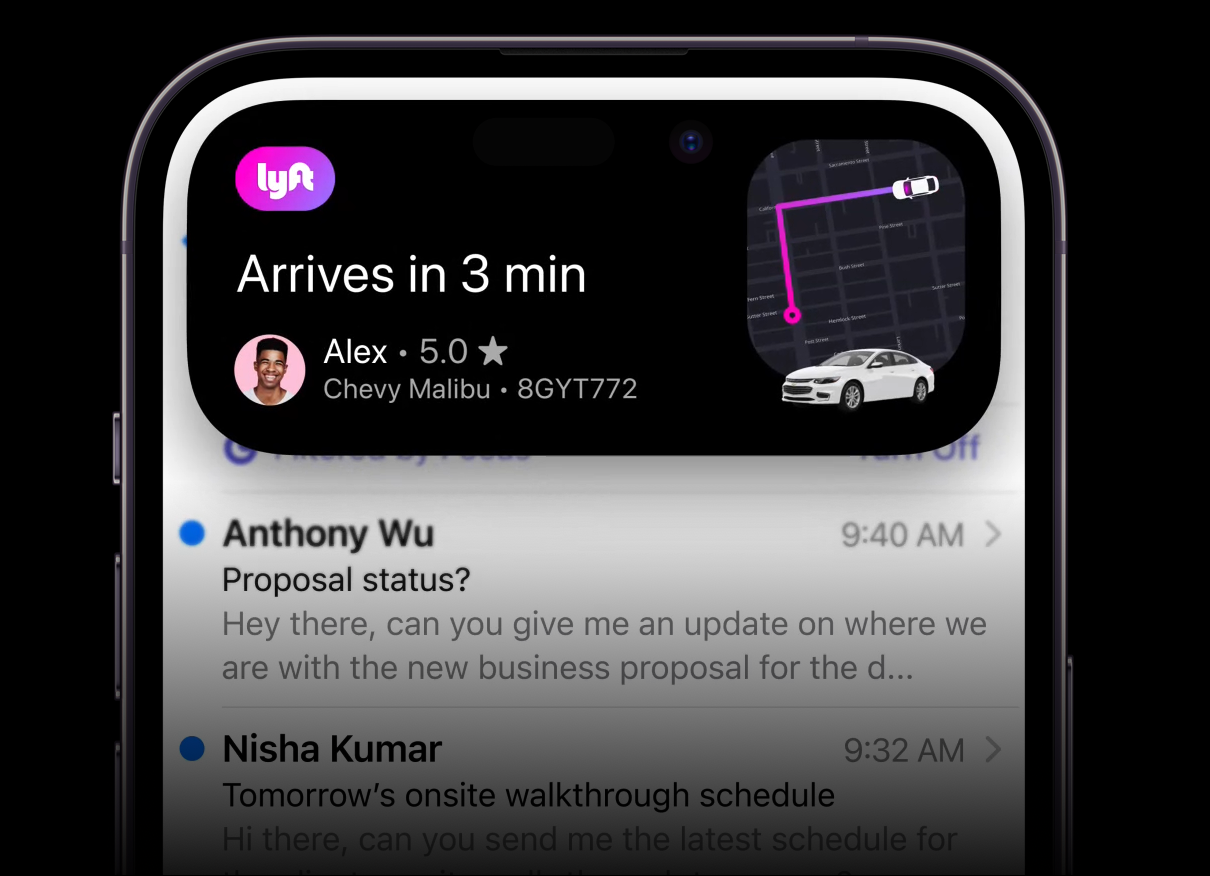
Live Activities are one of the much-awaited features of the iOS 16 update. And they’ll fit so nicely with the Dynamic Island that they deserve a special mention of their own. Live Activities will feature live updates from activities within apps on your Lock Screen. You can stay updated about scores from a live game or get updates about your food orders or the status of your cab from apps like Uber and Lyft. We all know that by now.
But how would Live Activities behave on unlocked devices? On phones without the Dynamic Island, users will receive Live Activity updates as banner-style notifications on their screen.
But on the iPhone with the Dynamic Island, the Live Activity will be displayed in the compact view in the island. Users can long-press it to view the expanded view at any time. And when there’s an update in the activity, it’ll automatically show it in the expanded view before going back to the compact view!
Where Dynamic Island Needs Fixing
For some activities in the Dynamic Island, you can swipe to make them even more minimal. For instance, if you swipe on the Dynamic Island activity for an ongoing call, it’ll hide the call duration to show only the icon for the call in the Dynamic Island.
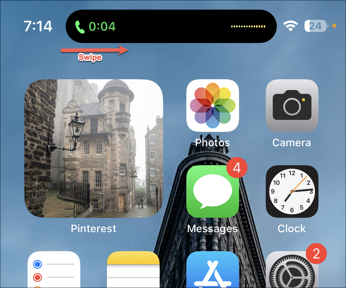
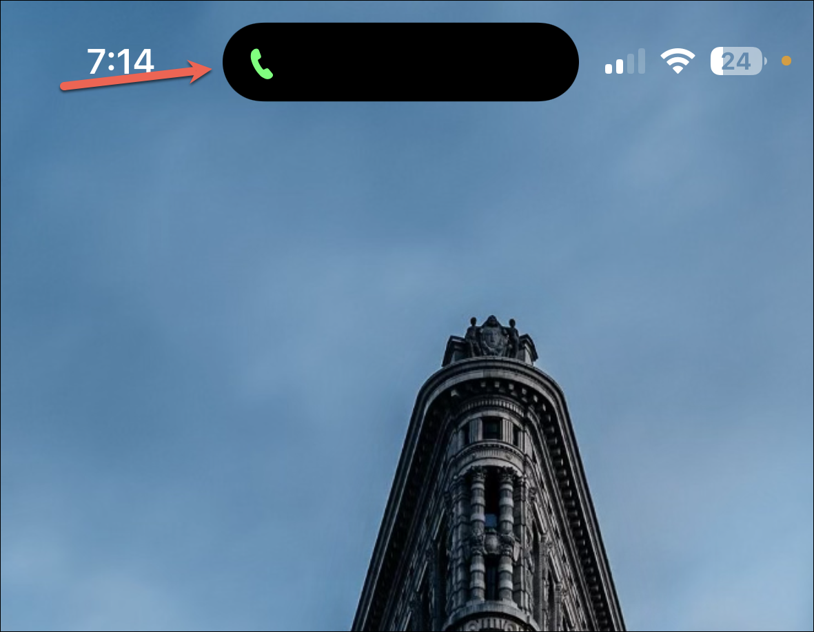
But in my testing, it appears the feature is somewhat broken yet. It does work with calls, but only to an extent. You can minimize the island, but once it has been minimized, getting the original view back is a pain in the neck. You first have to expand it and then close the expanded view for it to return to normal. That certainly cannot be normal behavior.
With all other apps, the feature goes completely awry. If you swipe on the Dynamic Island with the timer or media playback activity, the activity goes away completely. All you’re left with is the cut-out. Touching the island then does nothing. It doesn’t open the app nor can you long-press it for the expanded view. And there’s no getting it back until you close the app from the app switcher and open it again.
Screen Recording becomes much more convenient with the Dynamic Island. In phones with a notch, you have to go to the Control Centre to end the recording. But in phones with the Dynamic Island, you get the functionality right on the screen. Tapping or long-pressing the compact view expands the island and you can stop the recording.
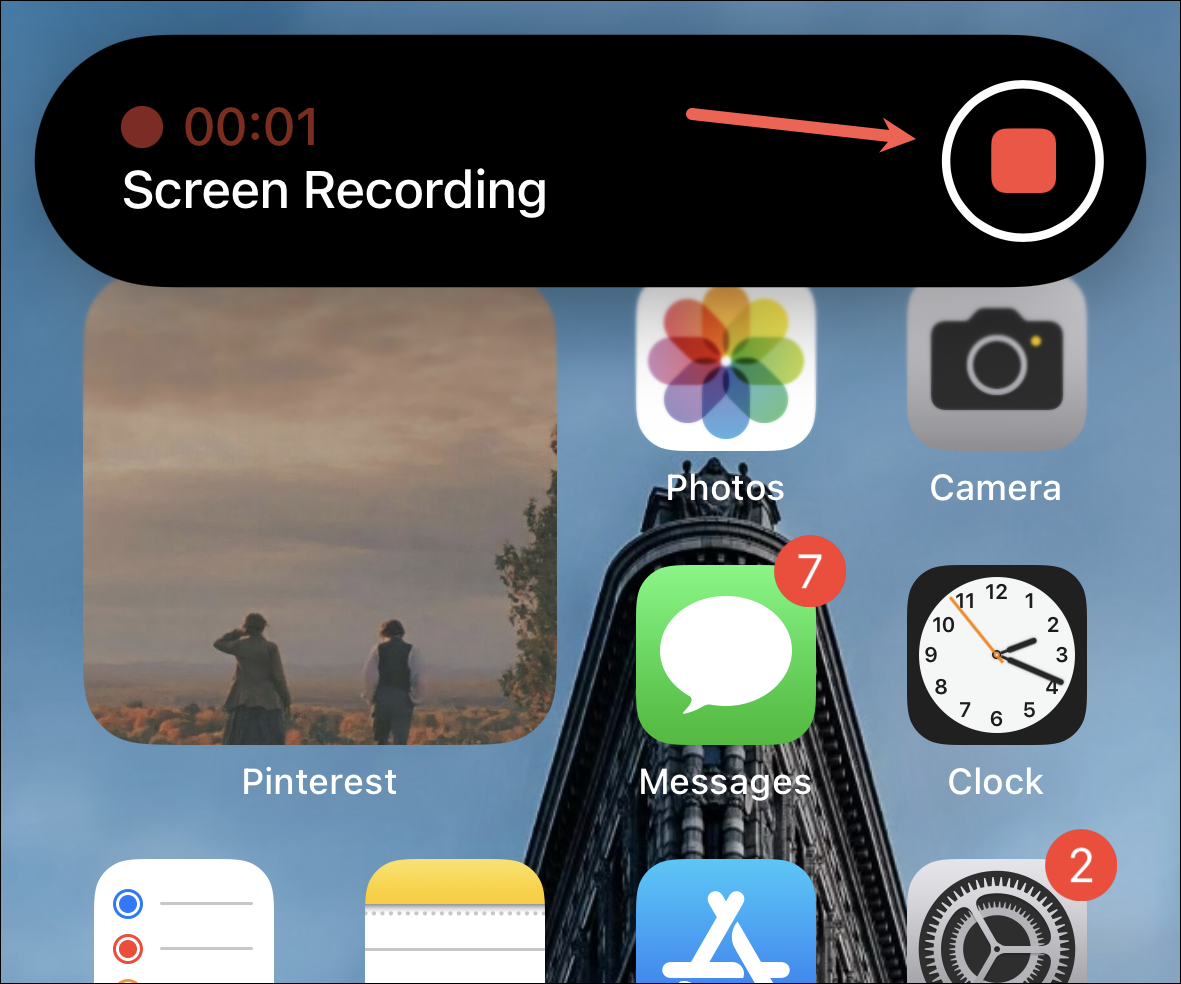
And the best part? The expanded view does not make it to the saved video. But there are a few kinks here also that need to be straightened out – the island appears to be glitching sometimes in the video in parts when it was expanded.
There are also inconsistencies with the Dynamic Island in the landscape mode which can become a problem while using it. It sometimes disappear entirely in the landscape mode and you can access it until you switch back to portrait. Now, if this is intentional or something that needs to be addressed in future iterations remains to be seen.
Use Dynamic Island to Play Games or Keep Pets
Perhaps the most innovative use of Dynamic Island, after Apple’s implementation, is using it in games or to keep virtual pets.
Hit the Island is a game you can find in the App Store that offers a simple ball game where the goal is to hit the Dynamic Island. You can get it from the App Store for some fun.

Apollo for Reddit, on the other hand, has implemented a feature called Dynamic Zoo. It lets you hang out with a Pixel Pal. These pixel pets keep you company on the island while you browse the app. The pals are customizable and you can choose from a cat, dog, fox, hedgehog, or an axolotl. Some of these are only available with a paid subscription, though. Only the cat and the dog are free.

These apps just show that there’s so much more experimenting that can be done with the Dynamic Island and what we’re seeing right now is just the tip of the iceberg.
Dynamic Island is still in the initial stages but it is a promising feature. And certainly, one that looks like the future of the pill!

