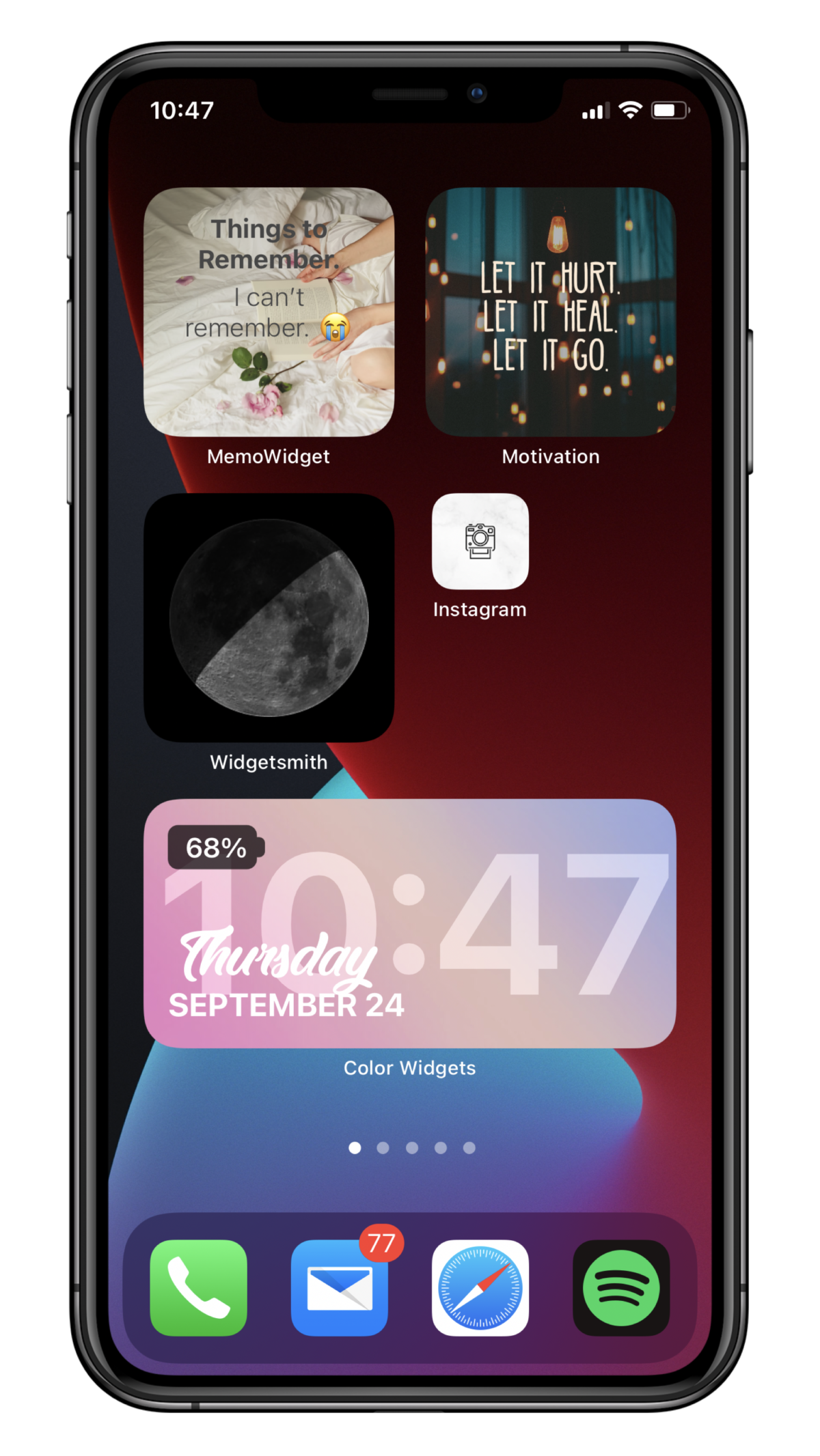
Even though iPhone users pretty much shrugged and dismissed Home screen customization whenever Android users brought it up over the years, they are officially going crazy over it (myself included). Social media is full of users showing off their pretty Home screen aesthetics.
From indulging in elaborate shortcut tricks to change icons to using various third-party apps for widgets to get that perfect look, we’re stopping at nothing. But there’s a slight bump in the road. And it’s bothering a lot of people out there – the name/ label of the widgets. No matter which widget you’re using on the Home screen – system app or a third-party app – the widget has a label underneath it.

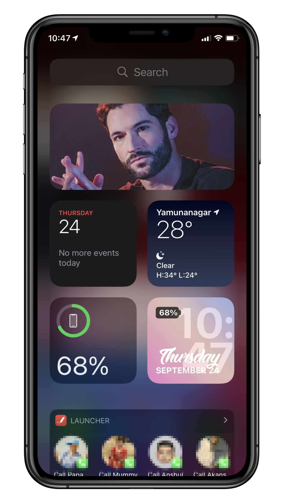
And many users are saying that it’s messing with their aesthetic. And that it definitely is. So is there a way to get rid of the widget name and have it appear as neatly as it does in the Today view?

Sadly, there isn’t. No matter which widget you’re using, it’ll display something as a label when adding it to the Home screen. The system apps will display their name, which is also the type of widget, so it doesn’t look as bad. But with third-party apps like Widgetsmith or Color widgets, that will have the app name as the widget label, no matter which type of widget you’re using, the app can kill the vibe. Especially if you’re using the app for more than one widget.
But unfortunately, there’s no solution for it yet. Maybe in the future, Apple might introduce the ability to hide app and widget names. But it’s a highly unlikely maybe, so there’s nothing else to do but hope and compromise in the meanwhile. Who knows, maybe the widget names will grow on you. (Boy, that’s a lot of maybes!.)

