
Displaying data in a visual format can significantly enhance understanding and insights. Pie charts in Google Sheets offer a simple way to represent parts of a whole, showing how different categories contribute to the total. This guide provides detailed instructions on how to create and customize a pie chart in Google Sheets, allowing you to effectively illustrate proportional data.
A pie chart is a circular graph divided into slices, each representing a fraction of the total. It’s ideal for comparing parts within a single data series. Unlike line or bar charts that can show multiple data series, pie charts focus on one set of data to highlight the relative sizes of its components.
For instance, you might use a pie chart to depict the market share of companies, distribution of expenses in a budget, or the popularity of different products sold in a store on a given day.
To create a pie chart in Google Sheets, you’ll need to prepare your data appropriately, insert the chart, and then customize it to fit your needs.
Prepare your data for pie chart
Before you can create a pie chart in Google Sheets, it’s essential to organize your data correctly. Pie charts represent a single data series—a collection of related data points. Your dataset should consist of two columns: one for the categories (labels) and one for the corresponding numerical values. Each row will represent a slice of the pie chart.
It’s important to note that the values should be positive numbers. Any negative values or zeros will be excluded from the chart.
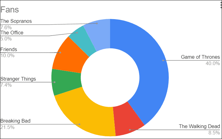
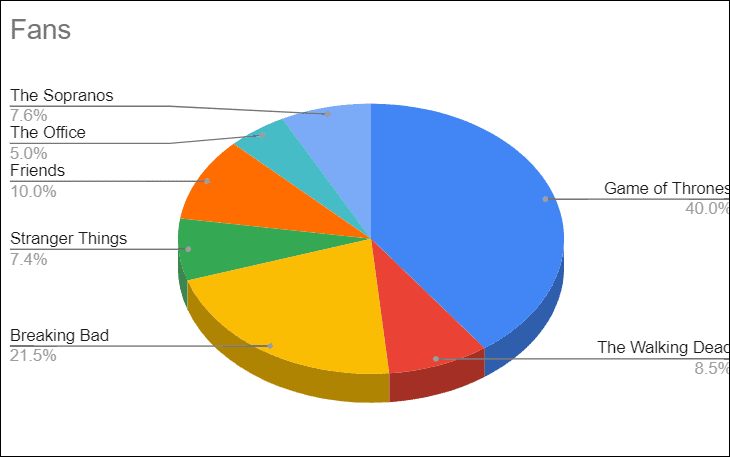
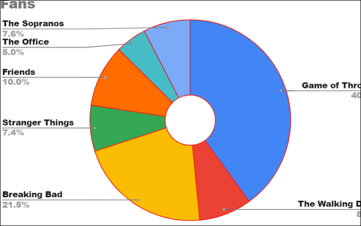
Below is a sample dataset illustrating the number of fans for various TV shows from a survey of 1,000 people.
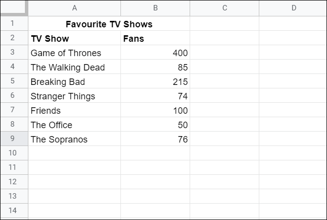
We’ll use this data to demonstrate how to create and customize a pie chart in Google Sheets.
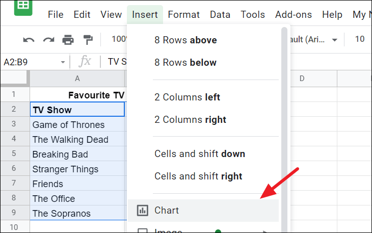
Insert a pie chart in Google Sheets
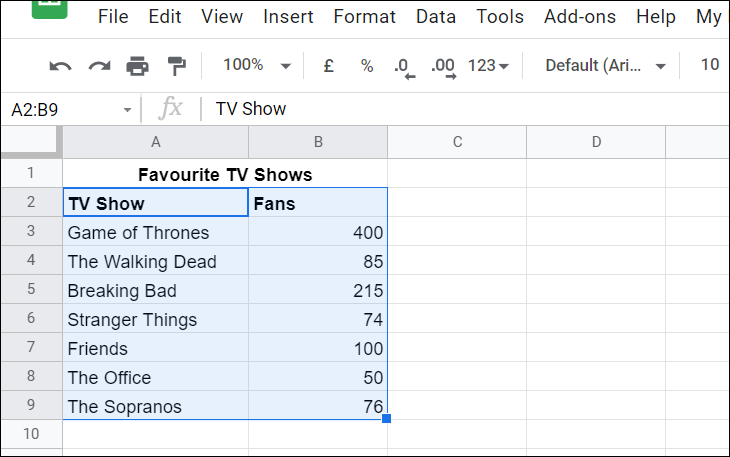
With your data prepared, it’s time to create the pie chart. Step 1: Select the range of cells that contains your data, including the headers. This ensures that Google Sheets knows what data to include in the chart.
Change the chart type
By default, Google Sheets will generate a chart type based on your data, which may or may not be a pie chart. If it’s not a pie chart, you can easily change it.
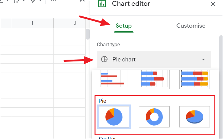
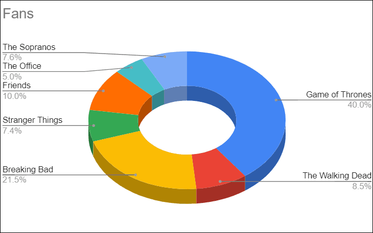
To create a doughnut chart, select the second option under ‘Pie’ charts.
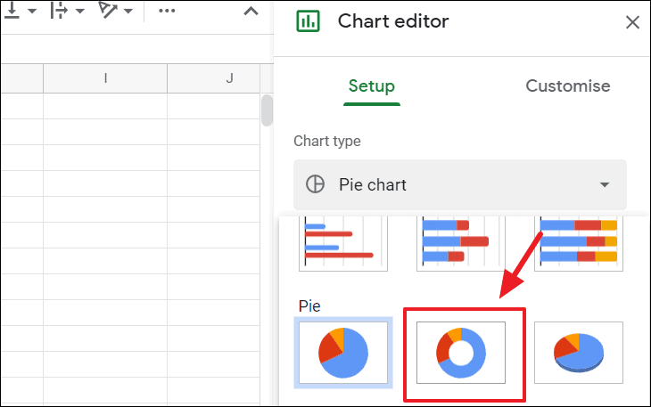
The doughnut chart will display as follows:
For a 3D pie chart, select the third option in the ‘Pie’ charts section.
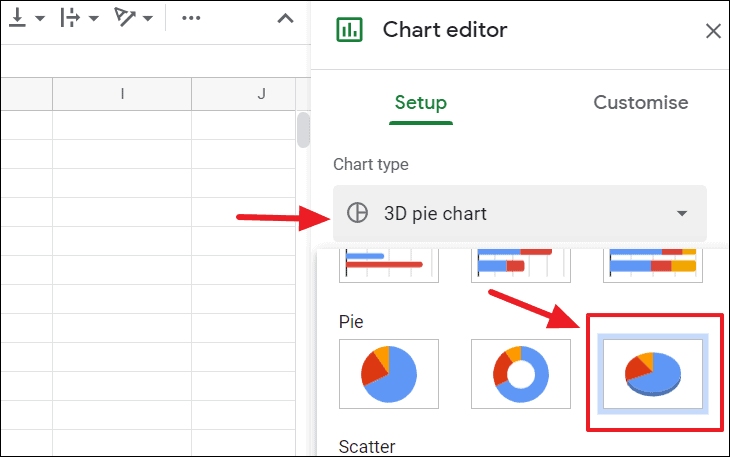
This will render a 3D pie chart:
To create a 3D doughnut chart, first choose the ‘Doughnut chart’ option, then enable the 3D option in the chart settings.
Edit and customize the pie chart
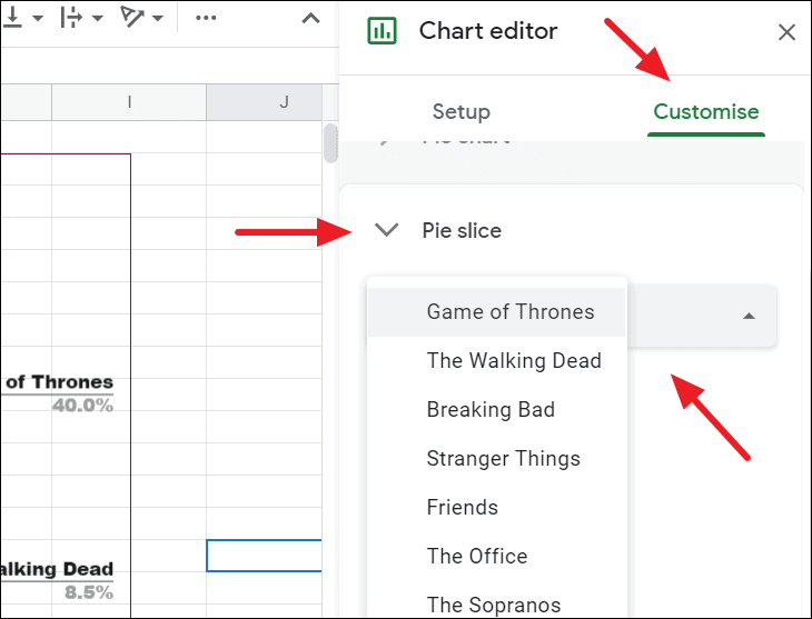
After inserting the chart, you may want to adjust its appearance to better suit your needs. Google Sheets allows you to modify almost every aspect of your pie chart through the Chart editor panel.
The Chart editor consists of two tabs: ‘Setup’ and ‘Customize’. The ‘Setup’ tab lets you modify data ranges and chart types, while the ‘Customize’ tab provides options to alter the chart’s appearance.
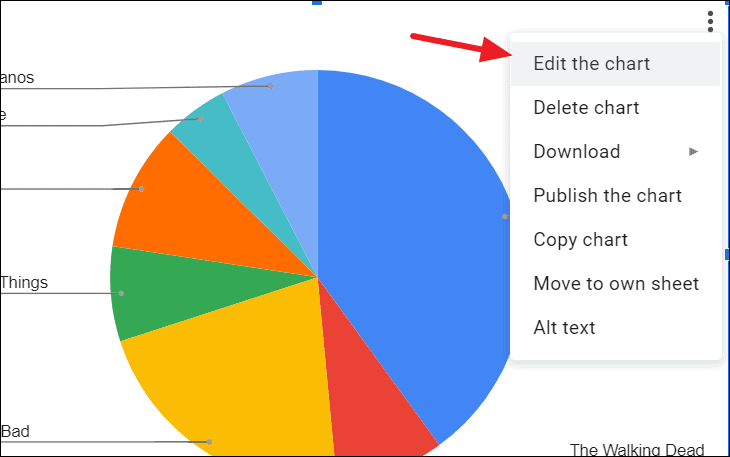
If the Chart editor doesn’t open automatically, you can access it by clicking the three vertical dots (more options) on the top-right corner of your chart and selecting ‘Edit chart’.
Changing the data range
If you need to adjust the data that your chart is based on, you can change the source data range in the Chart editor.
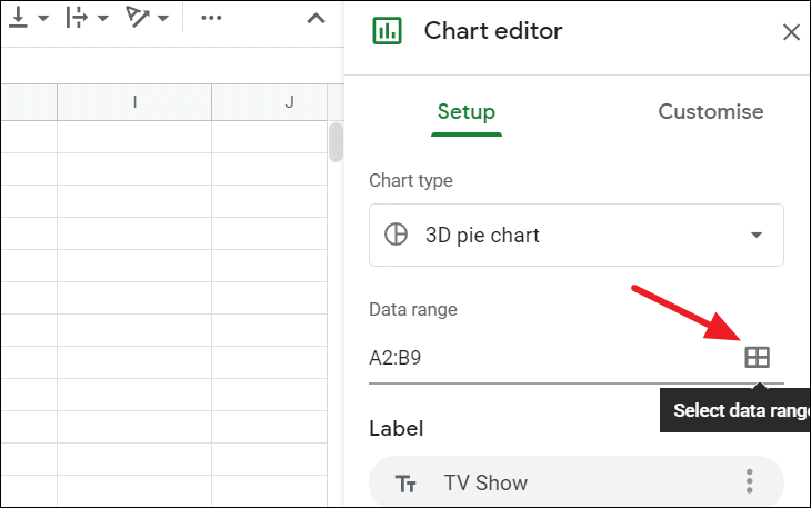
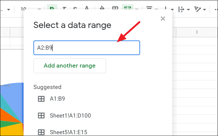
Your pie chart will immediately update to reflect the new data range.
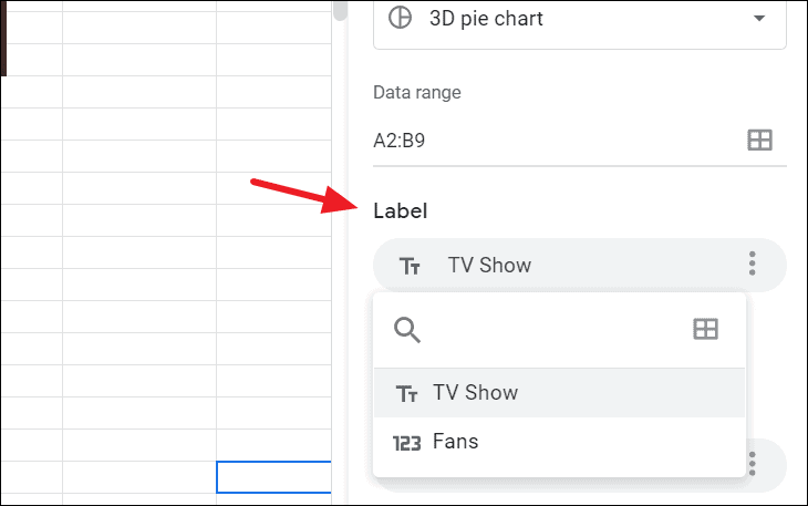
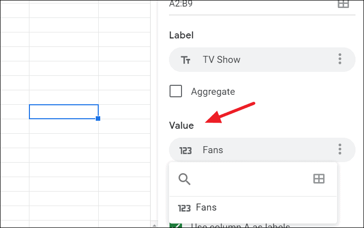
Modifying labels and values in the pie chart
You can also change the labels and values used in your pie chart.
To update the labels:
To adjust the values (which determine the size of the slices):
Adjusting the chart style
In the ‘Customize’ tab of the Chart editor, the ‘Chart style’ section allows you to modify the overall look of your pie chart. Here you can change the background color, border color, and font style.
You also have the option to maximize the chart, which reduces margins and padding to make the chart area larger.
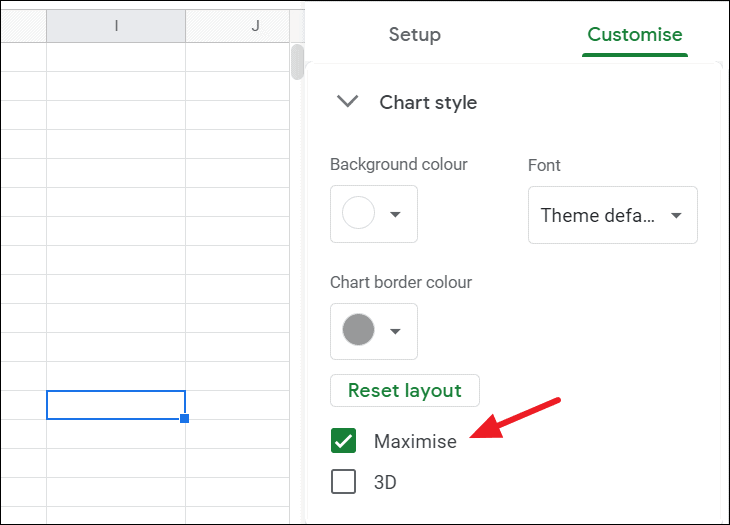
Additionally, checking the ‘3D’ option transforms your flat pie chart into a three-dimensional representation.
Customizing pie chart options
In the ‘Pie chart’ section of the ‘Customize’ tab, you can further personalize your chart. Options include converting the pie chart into a doughnut chart, modifying slice borders, and adding labels to slices with various formatting choices.
To access these options, expand the ‘Pie chart’ section.
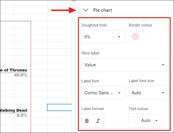
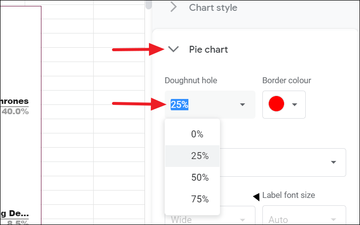
To turn your pie chart into a doughnut chart, adjust the ‘Doughnut hole’ slider to set the size of the central hole. You can also change the border color of the slices using the ‘Border color’ option.
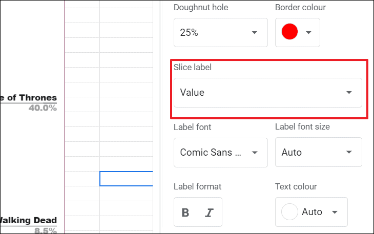
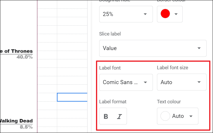
You can customize what labels appear on each slice by selecting the ‘Slice label’ dropdown. Options include displaying category names, values, percentages, or both values and percentages.
Once you’ve selected the label type, you can adjust the font style, size, format, and color to suit your preferences.
Customizing the pie slices
You can change the color of individual slices to enhance the visual appeal of your pie chart.
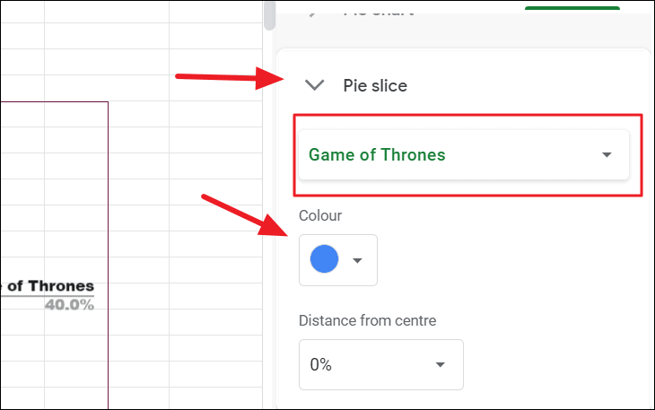
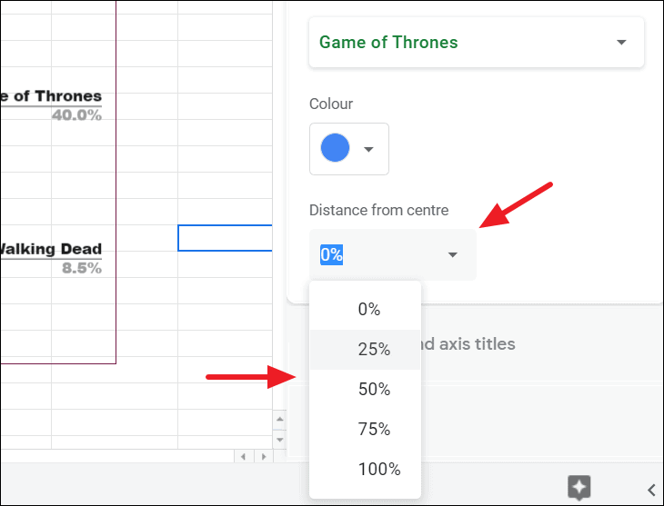
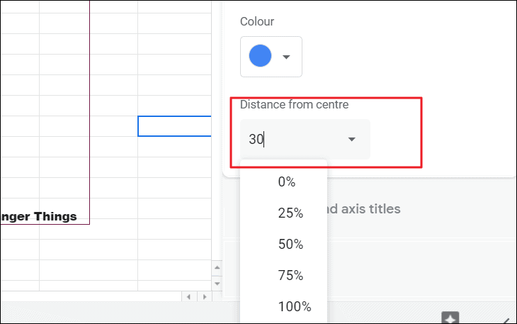
Additionally, you can emphasize a particular slice by ‘exploding’ it, which means offsetting it from the rest of the pie.
To explode a slice:
You can also double-click on the slice directly in the chart to access its settings.
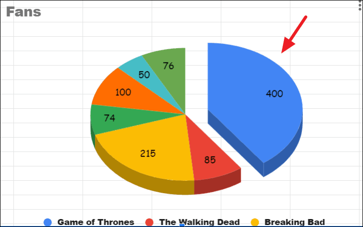
The chosen slice will now stand out from the rest of the chart.
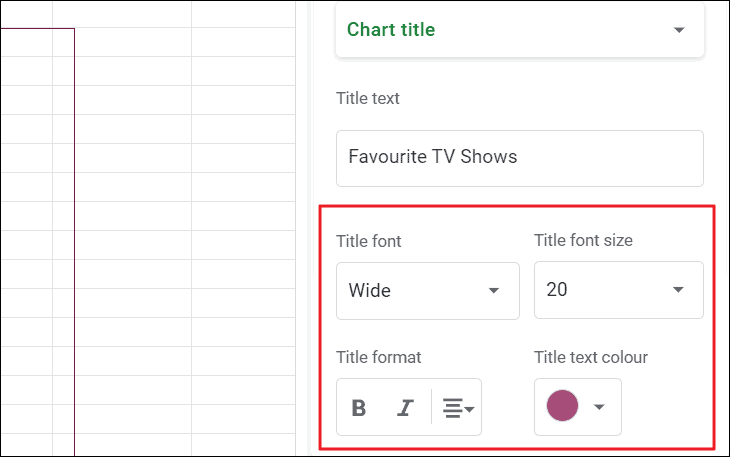
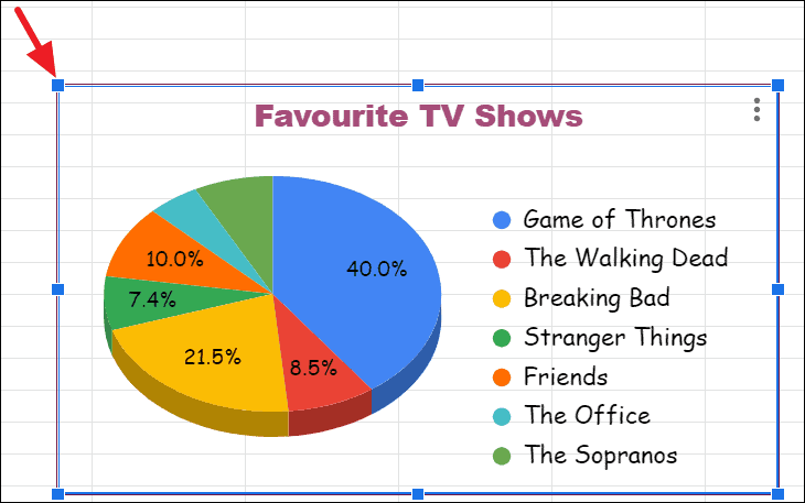
Adding a chart title
In the ‘Chart & axis titles’ section of the ‘Customize’ tab, you can add or modify the title and subtitle of your pie chart.
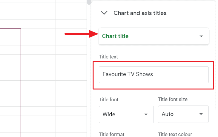
You can customize the font style, size, format, alignment, and color using the options provided below the text field.
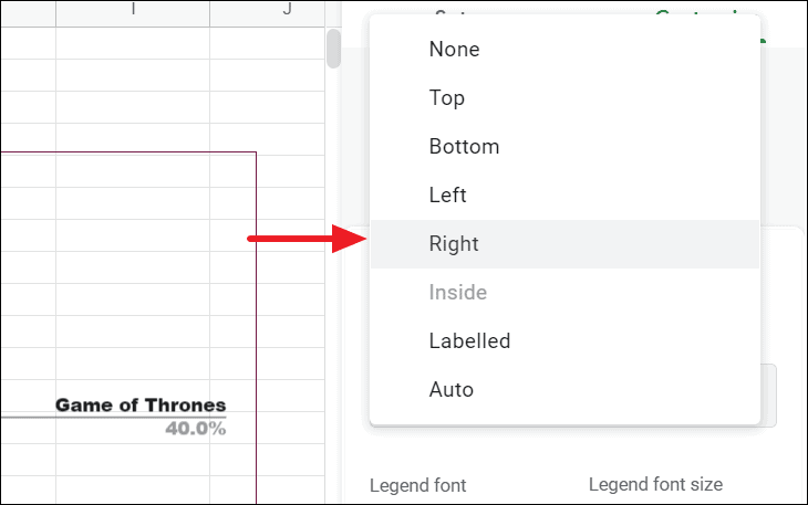
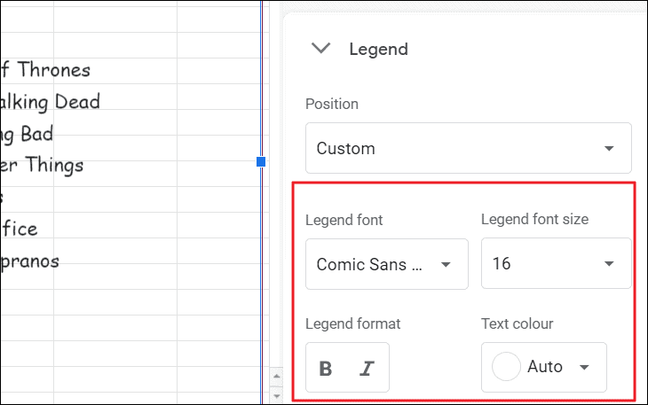
Adjusting the legend position
In the ‘Legend’ section of the ‘Customize’ tab, you can modify the appearance and placement of the chart’s legend.
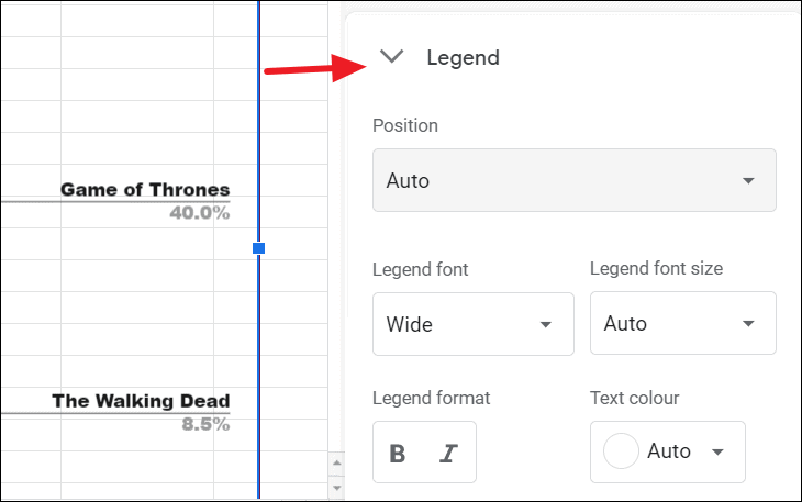
You can also manually reposition the legend by clicking and dragging it to your desired location on the chart.
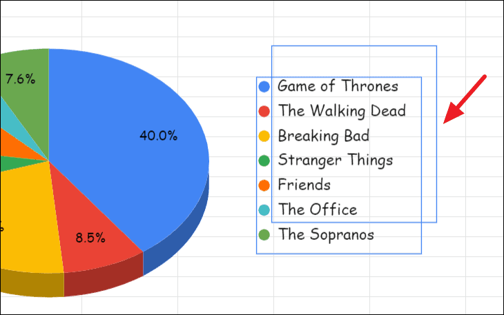
If adjusting the legend causes layout issues, you can resize the chart by clicking on it and dragging the handles at the edges to alter its dimensions.
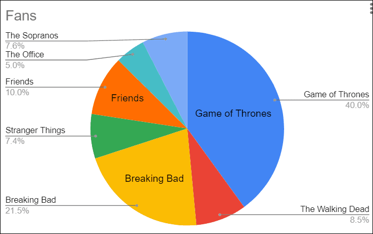
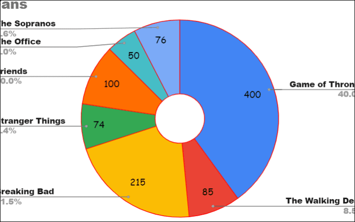
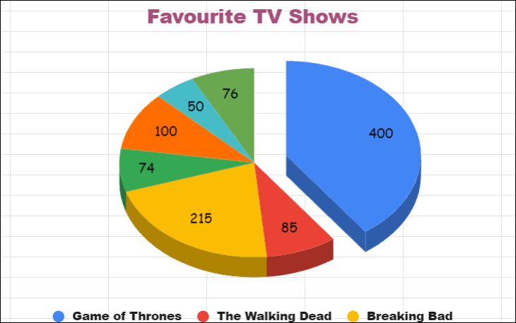
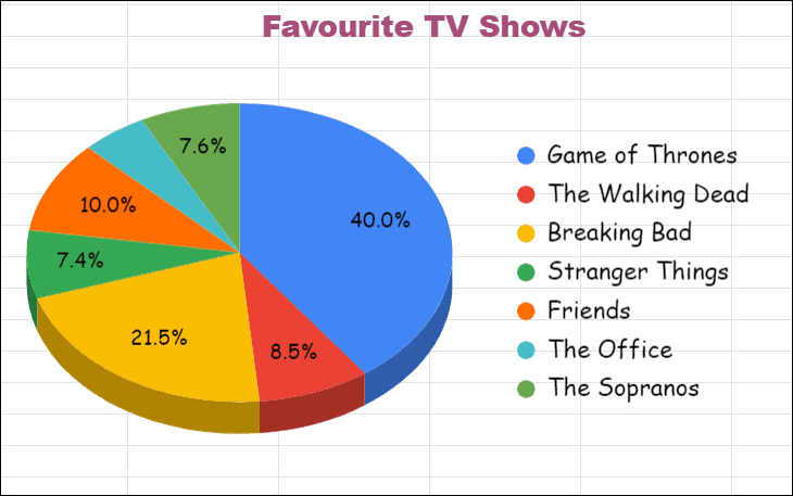
Here’s the final look of the pie chart after applying various customizations.
Download the pie chart in Google Sheets
After creating and customizing your chart, you may want to save it for use outside of Google Sheets. You can download your chart in several formats: PNG image, PDF document, or SVG file.
To download the chart:
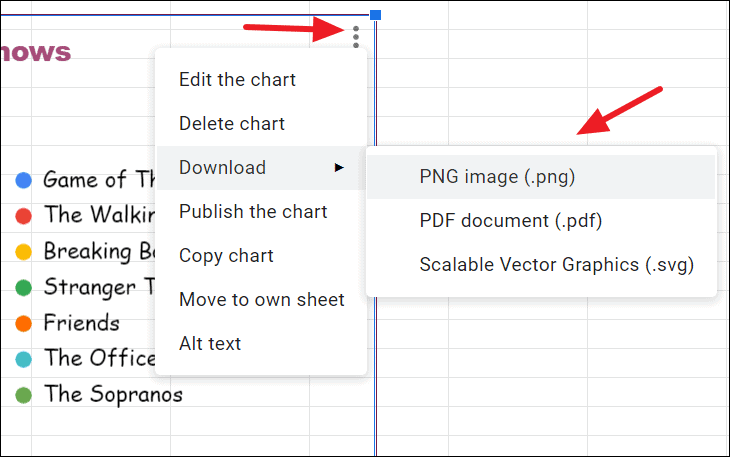
Your chart will be saved to your computer in the chosen format, ready to be used in reports, presentations, or on websites.
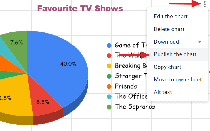
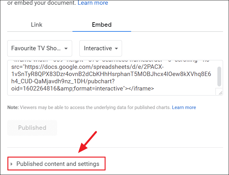
Publish the chart
If you want to share your pie chart with others or embed it in a webpage or article, you can publish it directly from Google Sheets.
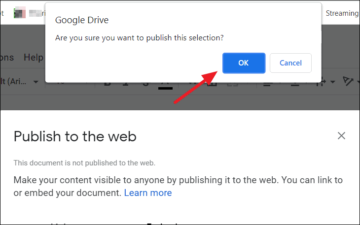
To publish your chart:
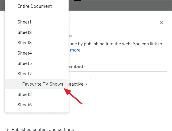
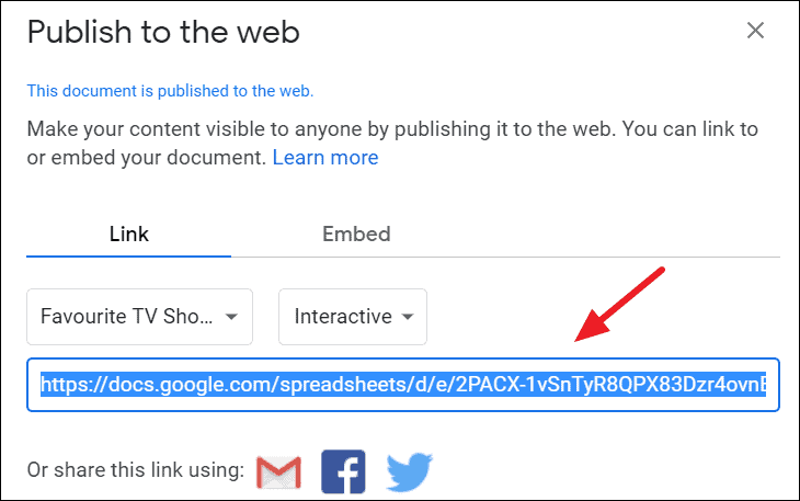
A ‘Publish to the web’ dialog will appear.
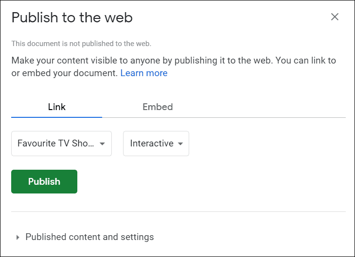
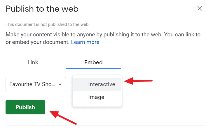
A link will be generated that you can share with others. Anyone with this link can view the chart.
To embed the chart on a webpage, use the link provided under the ‘Embed’ section.
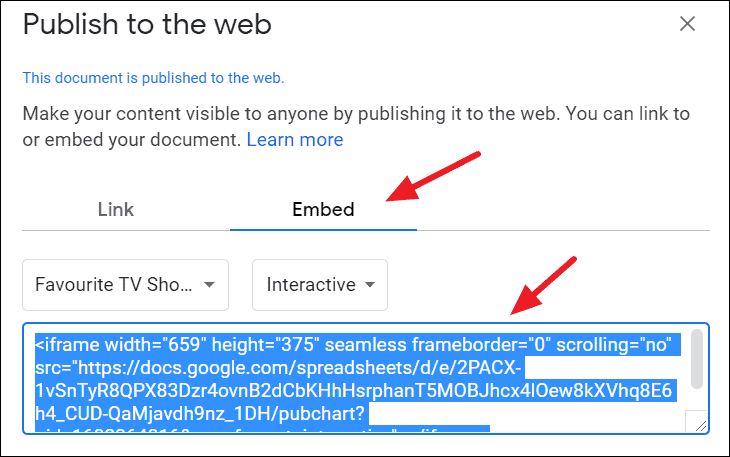
Note that any changes you make to the chart in Google Sheets will automatically update in the published version.
To stop publishing the chart:
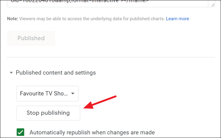
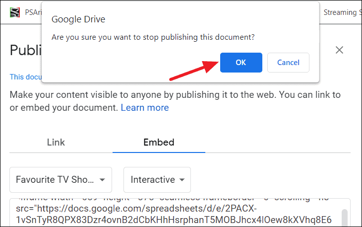
Once unpublished, the chart will no longer be accessible via the shared link, and anyone attempting to view it will see an error message.
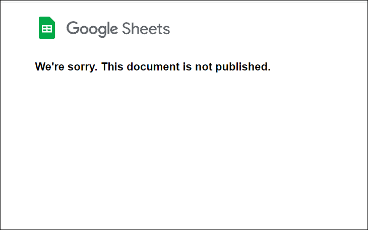
Alternatively, you can unpublish the chart by deleting it from your sheet or deleting the entire sheet.
Creating and customizing a pie chart in Google Sheets is a straightforward process that can greatly enhance your data presentation. By following these steps, you can effectively visualize data proportions and share insights with others.