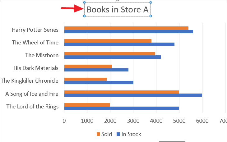
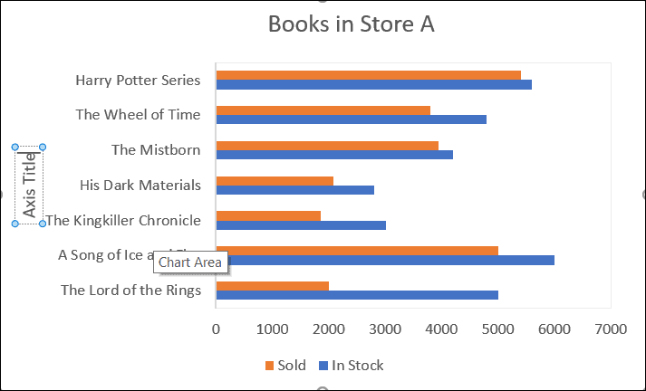
Bar graphs, also known as bar charts, are visual tools for presenting categorical data using horizontal bars across two axes. They are effective in comparing quantities, frequencies, or other measures for different categories.
In a bar chart, categories are plotted along the horizontal (x) axis, while their corresponding values are represented by the lengths of bars along the vertical (y) axis.
Distinguishing Between Bar Graphs and Histograms
Although bar charts and histograms may appear similar due to their use of bars to represent data, they serve different purposes and have distinct characteristics.
- Bar graphs display data with horizontal bars, whereas histograms (also known as column charts in Excel) use vertical bars.
- Histograms illustrate the frequency distribution of continuous numerical data, while bar charts are ideal for comparing discrete categories.
- Histograms are suited for continuous variables such as height, weight, temperature, or length. Bar charts compare discrete variables like the number of people in different classes, types of movies, or item counts.
Histogram/Column Chart Example:
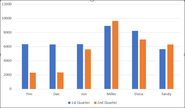
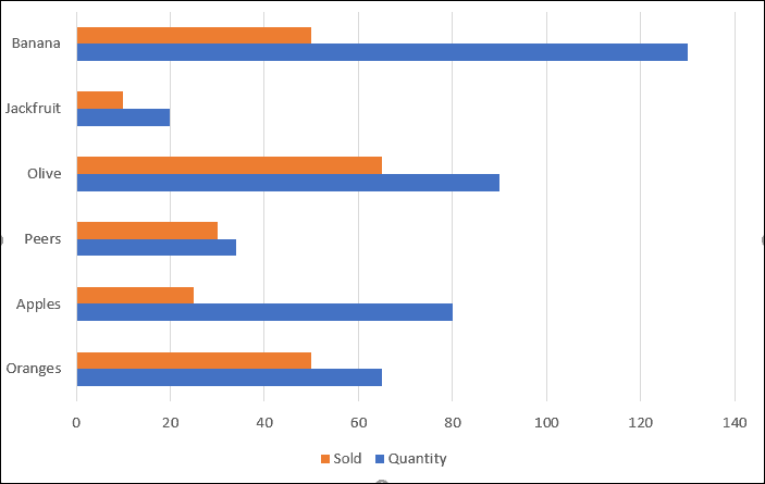
Bar Chart Example:
Creating a Bar Chart in Excel
Constructing a bar chart in Microsoft Excel is a straightforward process. Follow these steps to create your chart.
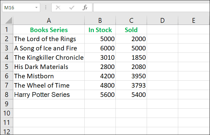
Each additional column of dependent variables will add another set of bars to your chart, allowing for comparison across multiple data series.
Insert tab on the Excel ribbon. In the Charts group, click on the Insert Column or Bar Chart icon to open the chart options.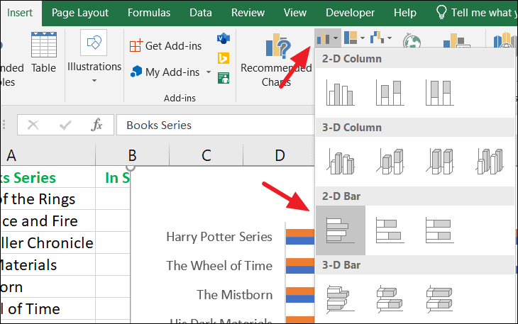
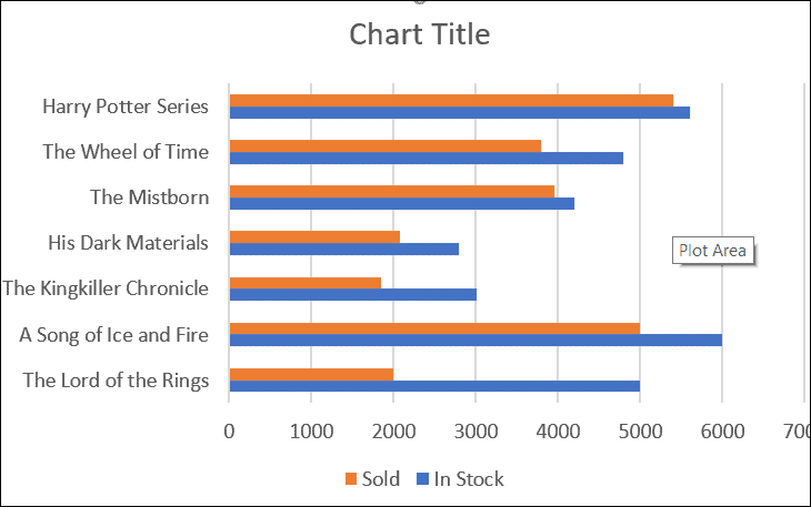
Each data series (column of numerical values) in your dataset will be represented by a set of bars in the chart, with different colors distinguishing each series.
Customizing Your Bar Chart
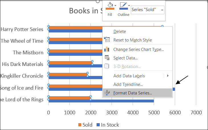
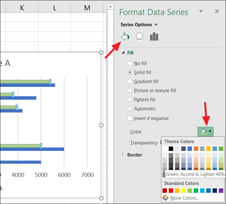
After creating the chart, you can enhance it by adjusting elements like the title, layout, styles, colors, and more. Excel offers various formatting tools accessible through the Design and Format tabs, as well as through context menus and floating buttons.
Adding and Editing the Chart Title
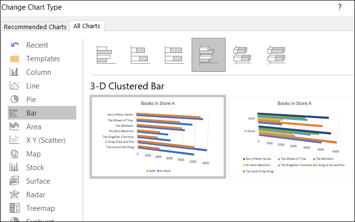
Modifying the Chart Type
Insert tab and choose a new chart type from the Charts group. Alternatively, right-click on the chart and select Change Chart Type from the context menu.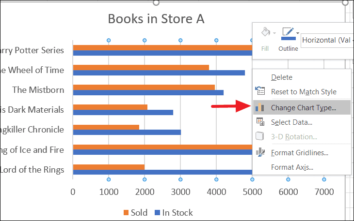
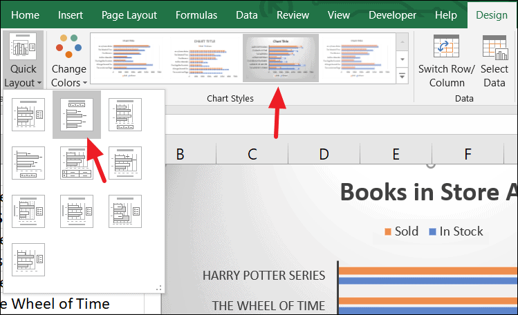
Adjusting Chart Layout and Style
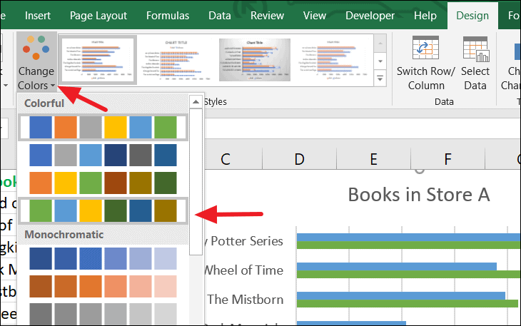
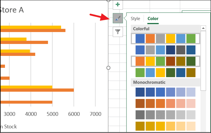
Changing Chart Colors
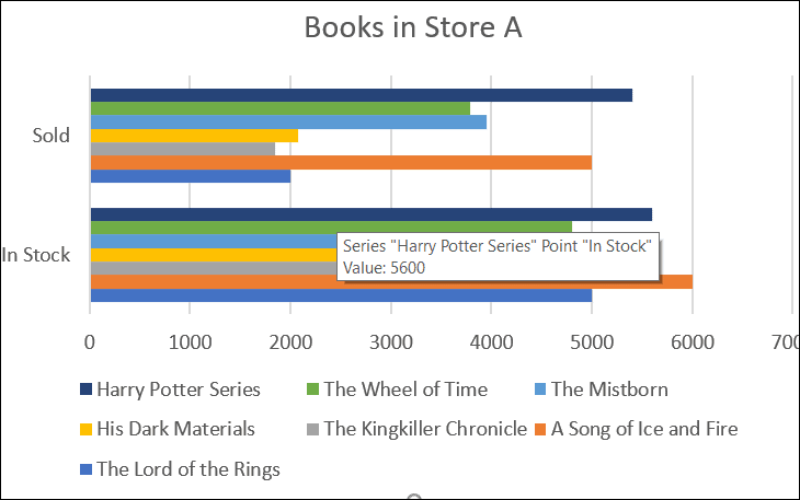
Switching the X and Y Axes
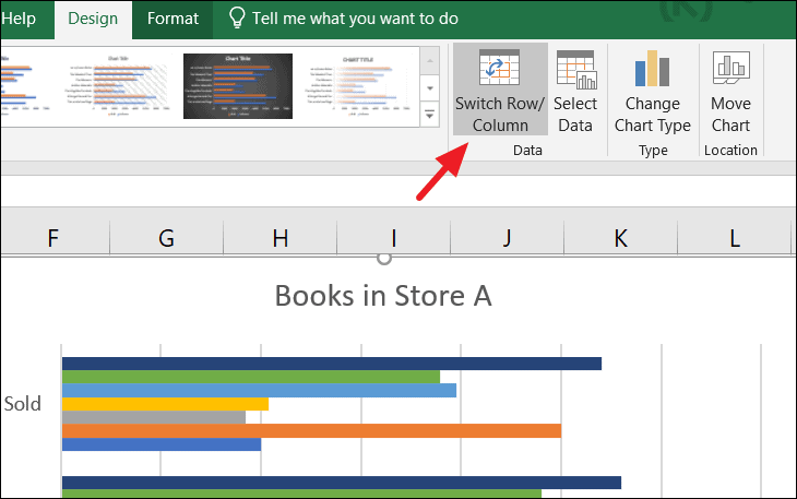
The chart will update to reflect the new data orientation.
Modifying Gridlines
Gridlines help in aligning the data points with their corresponding values, enhancing the readability of the chart.
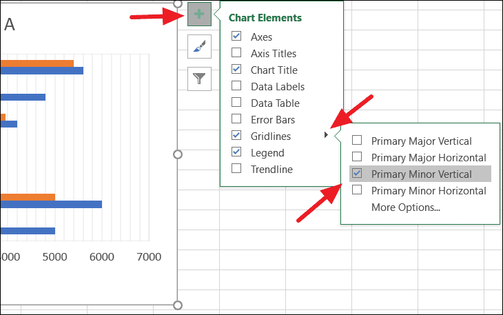
If you wish to remove gridlines, simply uncheck the Gridlines option in the Chart Elements menu.
Adding Axis Titles
Axis titles provide context for the data displayed on each axis, making your chart more understandable.
Axis Titles and select Primary Horizontal or Primary Vertical.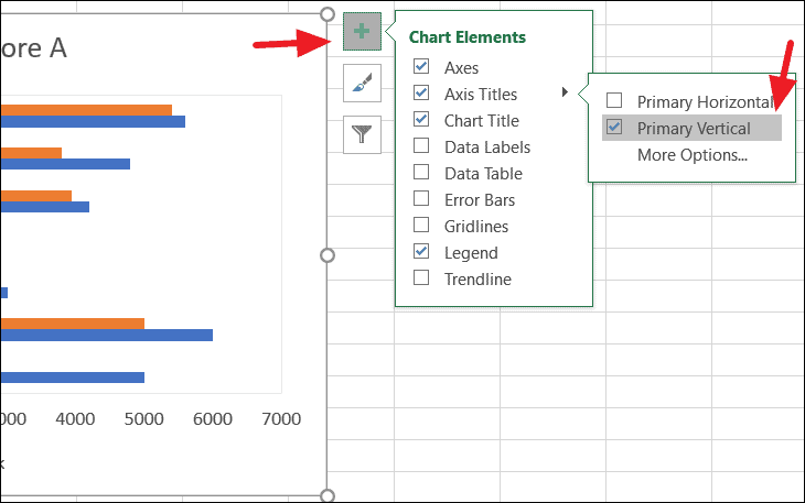
Format Axis Title. Use the formatting options in the pane that appears to adjust the font, color, and style.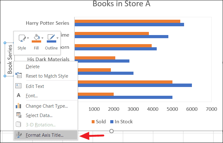
Relocating Your Bar Chart
You may want to move your chart to a different sheet or to a new sheet within your workbook.
Move Chart from the context menu. Alternatively, go to the Design tab and click on the Move Chart button.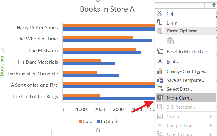
New Sheet to place the chart on a new worksheet, or select Object in and choose an existing worksheet from the dropdown menu.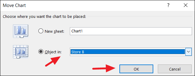
With these steps, you can create and customize bar charts in Excel to effectively represent and analyze your categorical data.