Gantt charts are essential tools for project management, providing a visual timeline of tasks and their durations. While Google Sheets doesn’t have a built-in Gantt chart feature, you can create one by customizing a stacked bar chart.
Create a Gantt Chart Using a Stacked Bar Chart in Google Sheets
You can build a Gantt chart in Google Sheets by setting up your project data, calculating task durations, and then transforming a stacked bar chart into a Gantt chart through customization.
Set Up Your Project Data
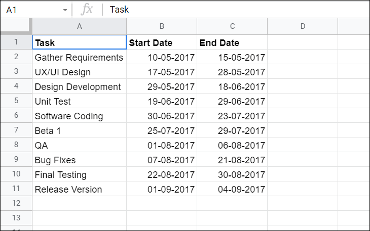
Open a new Google Sheets spreadsheet and enter your project tasks into three columns: Task, Start Date, and End Date. Input the names of your tasks in the Task column and their corresponding start and end dates in the adjacent columns, as shown below.
Calculate Task Durations
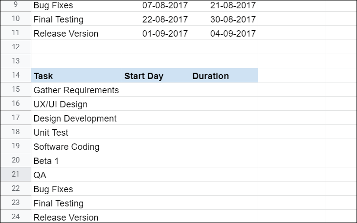
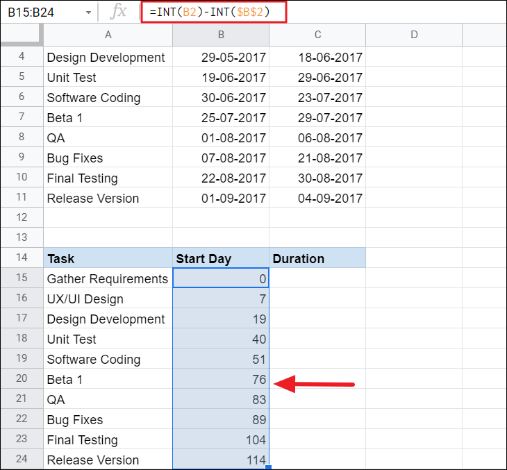
To calculate the durations of each task, create a second table below your original data. Copy the Task names from your first table into this new table.
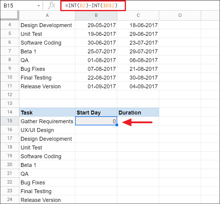
To compute the Start Day for each task, subtract the start date of the first task from the start date of each task. In the first cell of the Start Day column (e.g., cell B15), enter the formula:
=INT(B2) - INT($B$2)This formula calculates the number of days between the start date of each task and the start date of the project.
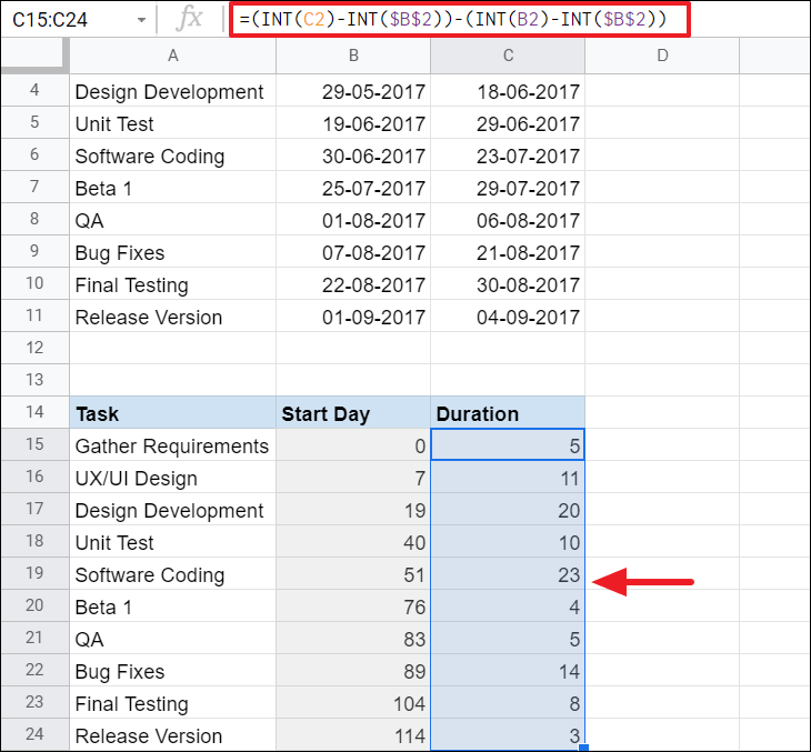
Next, calculate the Duration for each task by determining the difference between the start and end dates. In the first cell of the Duration column (e.g., cell C15), enter the formula:
=(INT(C2) - INT($B$2)) - (INT(B2) - INT($B$2))This formula computes the number of days each task will take to complete.
Insert a Stacked Bar Chart
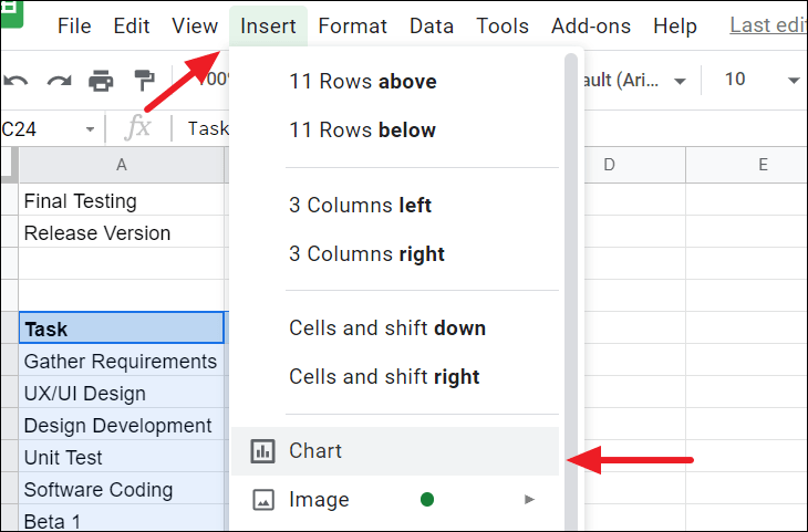
Click on the ‘Insert’ menu in the toolbar and choose ‘Chart’ to generate a chart based on your selected data.
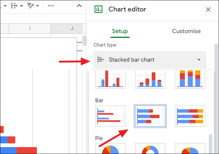
Google Sheets may automatically create a chart that doesn’t match your needs. If necessary, change the chart type to a ‘Stacked bar chart’ by accessing the Chart Editor. If the Chart Editor doesn’t appear, click on the three-dot menu in the top-right corner of the chart and select ‘Edit the chart’.
In the Chart Editor, go to the ‘Setup’ tab, click on the ‘Chart type’ dropdown menu, and select ‘Stacked bar chart’.
Customize the Chart to Create a Gantt Chart
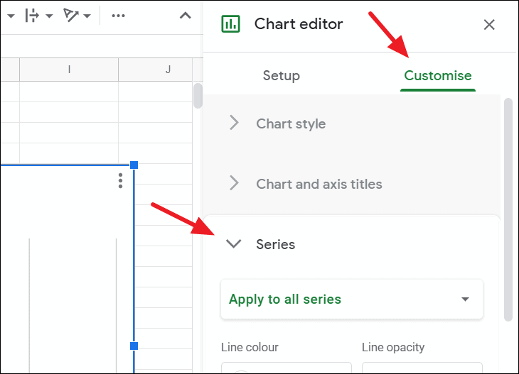
To transform your stacked bar chart into a Gantt chart, you need to adjust the formatting. In the Chart Editor, switch to the ‘Customize’ tab and expand the ‘Series’ section.
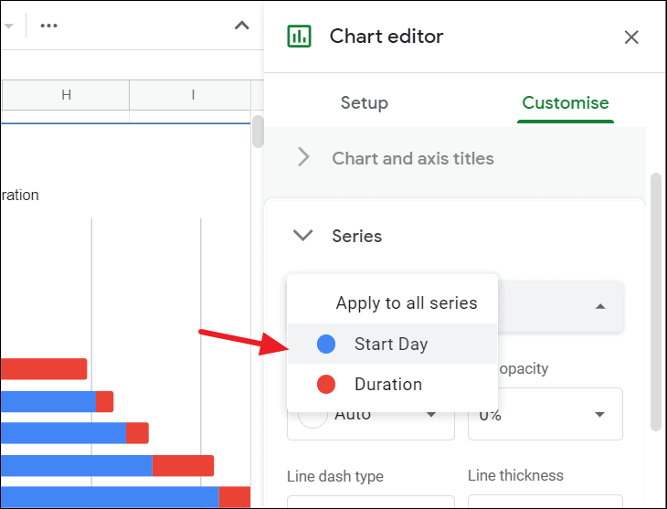
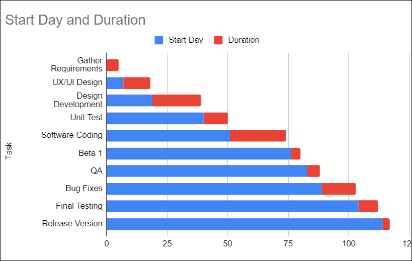
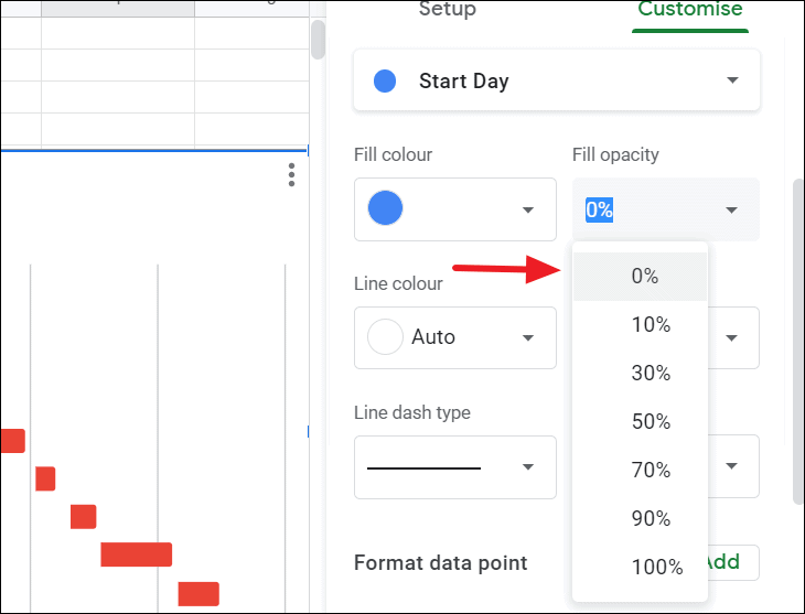
Adjust the ‘Fill opacity’ slider to 0%. This makes the ‘Start Day’ bars transparent, leaving only the ‘Duration’ bars visible, which represent your tasks’ timelines.
Your chart now visually represents a Gantt chart. Optionally, you can further customize the chart by changing colors, adjusting axis labels, or modifying the title and legend to better suit your project’s needs.
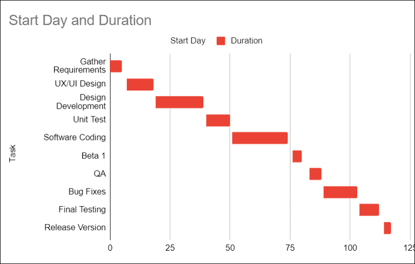
Review your Gantt chart to ensure all tasks and timelines are accurately represented. Make any necessary adjustments to the data or formatting.
By following these steps, you’ve successfully created a Gantt chart in Google Sheets to visualize your project schedule.