Quick Analysis Tool is one of the most useful tools in Microsoft Excel that allows you to instantly analyze your data and convert it into charts, tables, summaries, and sparklines as well as apply conditional formatting to your data.
Quick Analysis Tools saves you the trouble and time of searching through different tabs and command groups to access various analysis options. It makes it easier to quickly analyze the data set of any size and visualize it with the click of a button. In addition to that, the tool also suggests visualization methods that best fit your data, which is helpful for users who aren’t familiar with Excel or are new to Excel.
Excel’s Quick Analysis feature is available only for Excel 2013 and later versions. In this article, we will see how to analyze your data using Quick Analysis Tool and insert charts, visualizations, various formatting options, summary formulas, tables, and sparklines.
Where is Quick Analysis Tool in Excel and How to Access it?
If you are looking for the Quick Analysis Tool in the Excel Ribbon, you won’t find it there. It can only appear only after selecting the data you want to analyze.
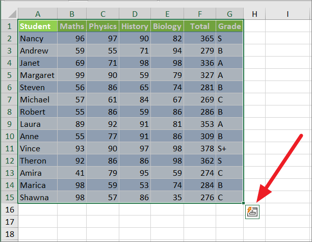
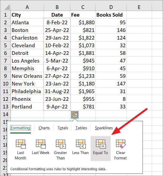
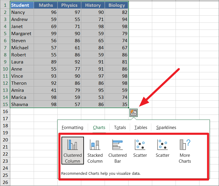
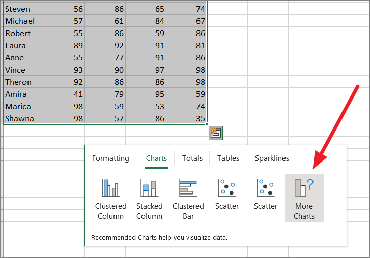
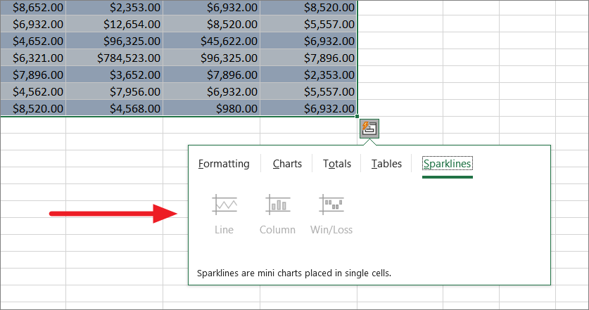
To access the Quick Analysis Tool, select a range of cells or a data table and the Quick Analysis button will appear in the bottom-right corner of the selection as shown below.
Then, simply click on the Quick Analysis icon to reveal the options. You can also press Ctrl+Q (Windows) or Command+Q (MAC) after selecting the data to open the tool.
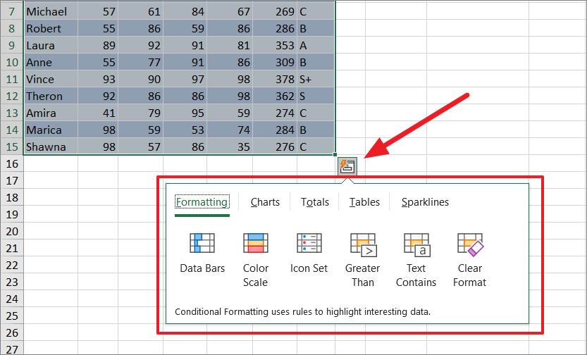
Once you click the icon, the tool will show you a galley of data analysis options you can use. Now, you can switch between the tab and click on the option to create a visualization.
Note: You should know that the Quick Analysis tool won’t appear if you select an entire row or column as well as empty cells.
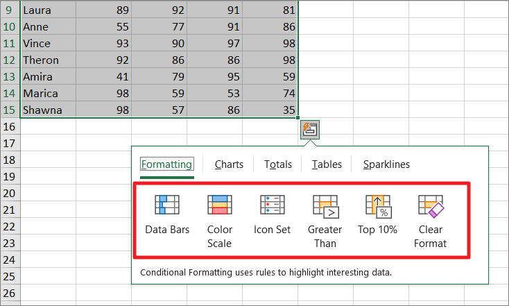
In Quick Analysis Toolbar, the options will available under 5 categories. These include
- Formatting
- Charts
- Totals
- Tables
- Sparklines
The options available in the toolbar may change based on the data you selected but you cannot add or remove options from it.
The Quick Analysis Icon is Not Showing?
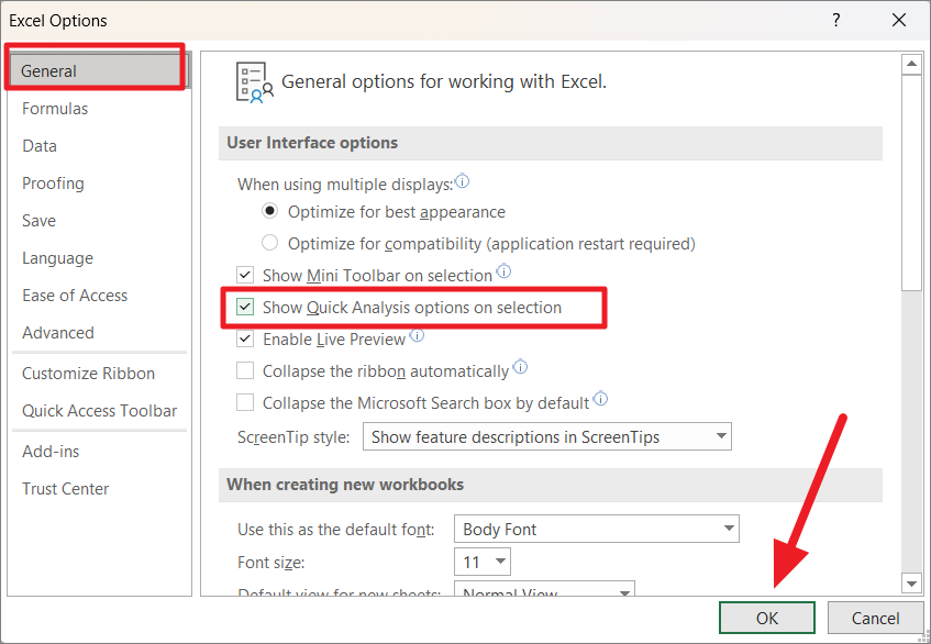
If the quick analysis tool button is not appearing when you select the data, you need to check if the option is disabled from the options.
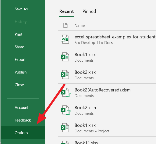
To do that, go to the ‘File’ tab and click ‘Options’ at the bottom left corner.
In the Excel Options, make sure the ‘Show Quick Analysis options on selection’ option is checked on the right side of the General tab. Then, click ‘OK’.
Also, if you are using an Excel version earlier than Excel 2013, you need to upgrade it to any of the modern versions to get this option.
How to Use Quick Analysis Tool
The Quick Analysis Tool is simply a collection of easy-to-use data analysis options that helps understand and manage your data. The tools also give a quick preview of each option by simply hovering over it. Now, let us show you how to use each option in the five categories (tabs) of the Quick Analysis tool.
Apply Conditional Formatting using Quick Analysis Tool
The Formatting tab in the Quick Analysis Toolbar offers you five formatting options (and one clear format option) that allow you to apply conditional formatting to your data. Conditional formatting lets you highlight important data in a dataset and visualize data using data bars, color scales, icon sets, etc.
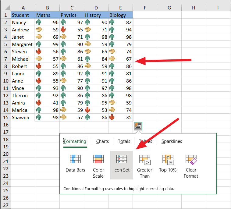
You can access it by simply selecting the range of cells you want to format, clicking the ‘Quick Analysis’ button below the selection and selecting the ‘Formatting’ tab.
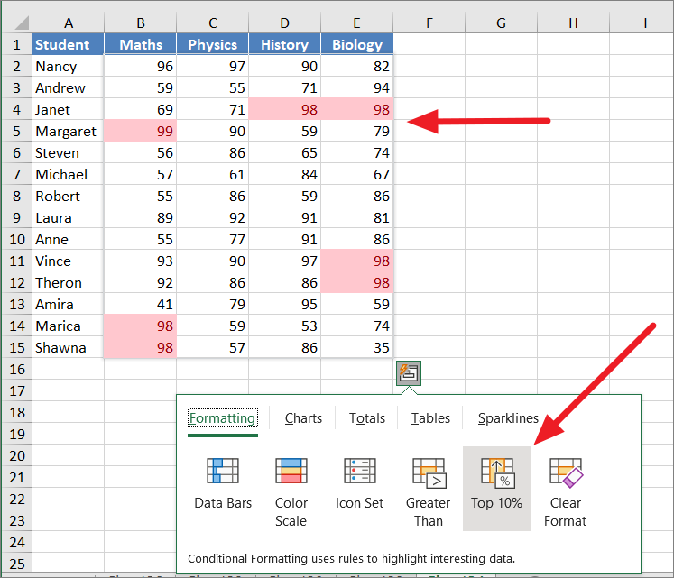
This is a smart tool that will suggest conditional formatting options based on the data you selected. For example, if you select a range of cells that contains numbers, you will only see these six options – Data Bars, Color Scale, Icon Set, Greater Than, Top 10%, and Clear Format.
As you hover over each option, you will see a preview of how it will affect your data. When you find the correct option, click on it to apply the formatting.
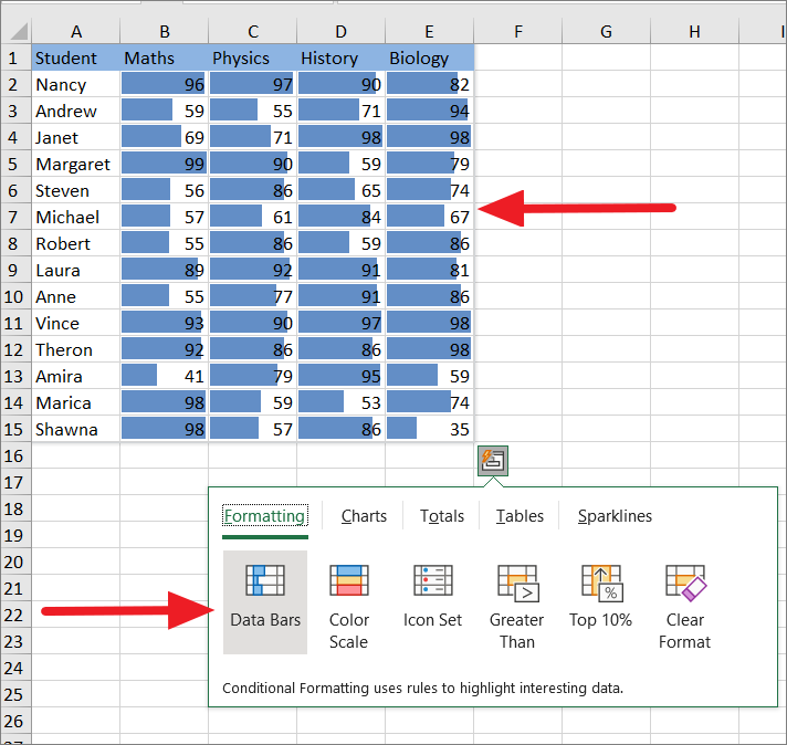
Data Bars
The data bars option will add solid data bars (Blue) on/over each value of the selected area. The size of the bars will be based on the relative size of each value compared to the largest value in a data set. Bar color can change based on the negative or positive values in the data set.
To visualize your data in data bars, select the data set, click the ‘Quick Analysis’ icon and select the ‘Data Bars’ option under the Formatting tab.
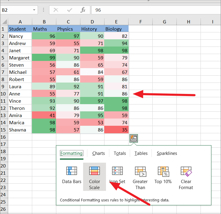
Color Scales
If you want to apply different colors to each cell, select the ‘Color Scales’ option under Formatting.
Color Scales option applies background color to cells based on how small or how big each value in the cell is. This is a great formatting technique for understanding data distribution and variation.
The largest values will be colored in darkest green while the smallest value will be colored in dark red. All the other values will be colored with shades of green or red based on how far they are from the median (middle value).
Icon Set
The Icon Set option adds icons to represent your data in three to five categories based on the threshold values. In the below example there are three different colored icons – red, green, and yellow.
Each colored icon represents a range of values and each cell contains an icon that represents that range.
To add an icon set to a range, click ‘Icon Set’ under the Formatting tab.
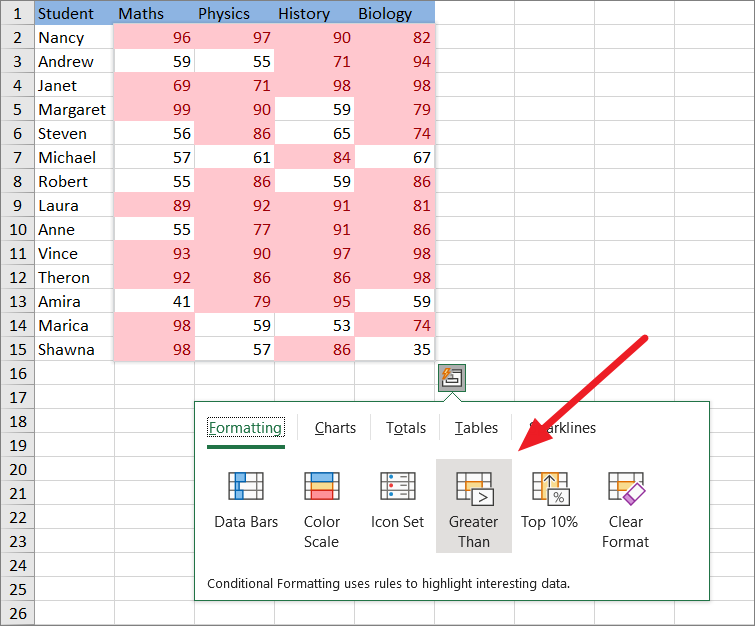
Greater Than
Greater Than is a conditional formatting option that will highlight all the cell values that are greater than a specified value.
To use this option, first, click the ‘Greater Than’ option under Formatting.
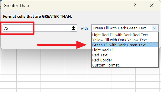
In the Greater Than dialog box, enter the number in the text field and choose formatting from the drop-down next to ‘with’. For example, if you want to highlight all the values which are greater than 75, enter this number in the ‘Format cells that are GREATER THAN:’ field.
Then, click ‘OK’ to apply the formatting rule.
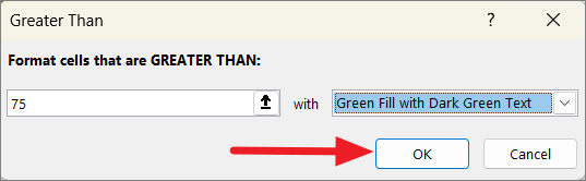
This will highlight all the cells that contain values greater than 75.
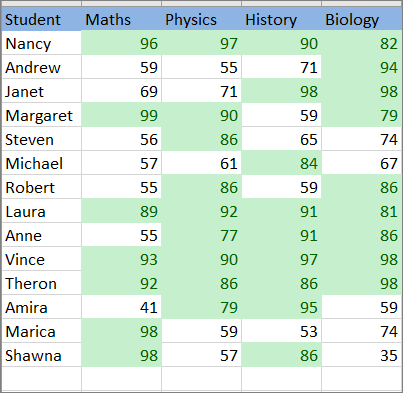
Top 10%
This option highlights the top 10 percent of values in the selected data set. For example, this could be helpful for finding the top 10 scores of students in a mark list.
To highlight the top 10%, in the Formatting tab, simply click ‘Top 10%’.
If you select a range of cells with text values, the Quick Analysis tool will show you a different set of formatting options.
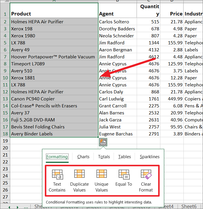
Text Contains
This conditional formatting rule changes the background color of cells that contains the specified text as the value or part of the values.
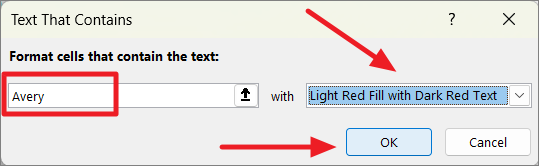
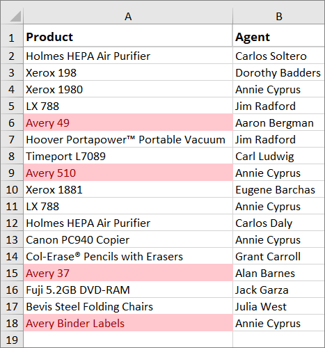
Suppose you have the list of product items in a data set as shown below and you want to highlight all the ‘Avery’ products. To do that, first the range of cells, click the Quick Analysis icon, and select the ‘Text Contains’ option under the Formatting tab.
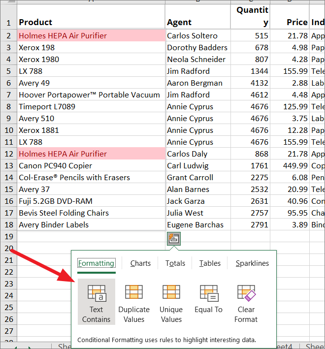
In the Text That Contains dialog box, enter the text (Avery) that you want to use to highlight the cells that contain it. Then, choose formatting from the ‘with’ drop-down and click ‘OK’.
This will format all the cells that contain ‘Avery’ as the value or part of the value.
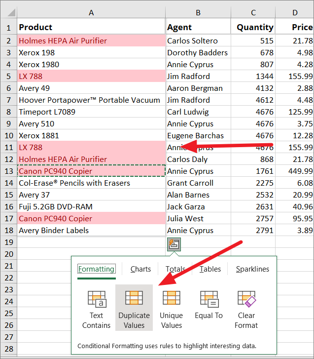
Duplicate Values
If you want to color all the duplicate occurrences (multiple occurrences) of values in the data set, select the range and click the ‘Duplicate Values’ option under Formatting.
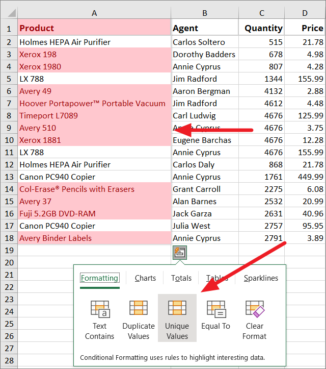
Unique Values
This formatting option colors all the cells that contain the values that occur only once in the selected range.
To highlight the unique values in a data set, choose the ‘Unique Values’ option.
Equal To
This option is similar to the ‘Text contains’ option but it colors the cells that are equal to the specified value not just as a part of the value. It formats the cells that contain only the specified text.
To highlight the equal values, select the range of cells that contains text, and select the ‘Equal To’ option.
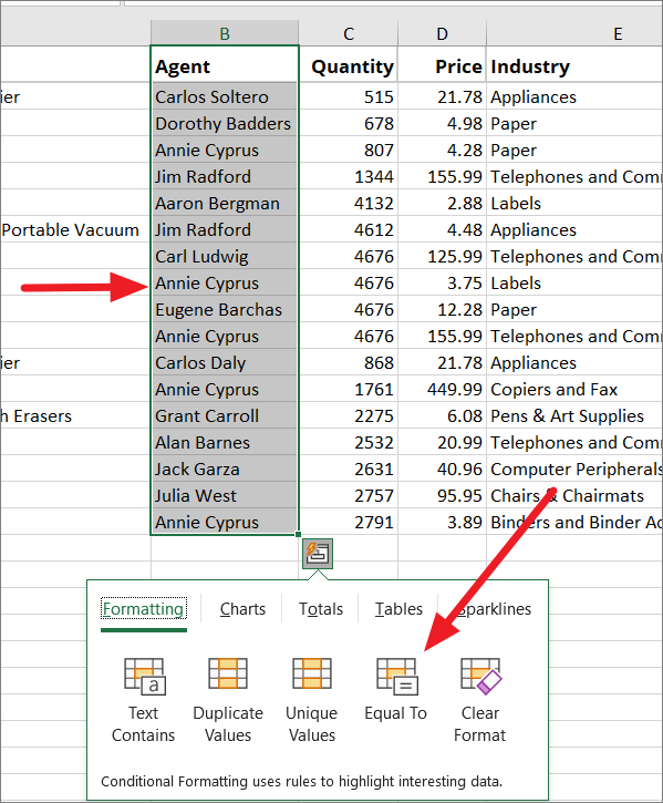
In the Equal to dialog window, enter the text in the ‘Format cells that are EQUAL TO’ field, choose formatting, and click ‘OK’.
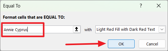
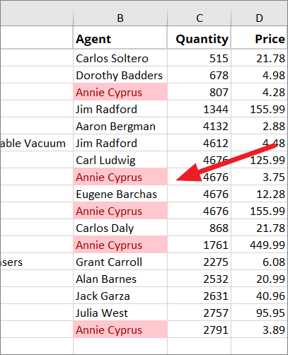
Then the cells that are equal to the specified value (Annie Cyprus) will be formatted.
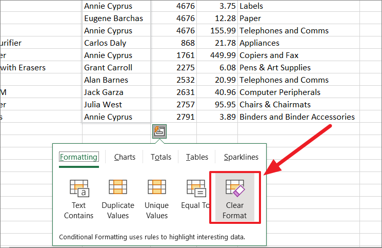
Clear Format
No matter what kind of conditional formatting you apply to your data, you can remove any formatting using the ‘Clear Format’ option.
Select the range of cells that has conditional formatting applied and click ‘Clear Format’ under the Formatting tab of the Quick Analysis tool.
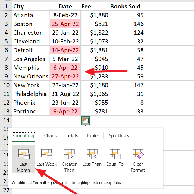
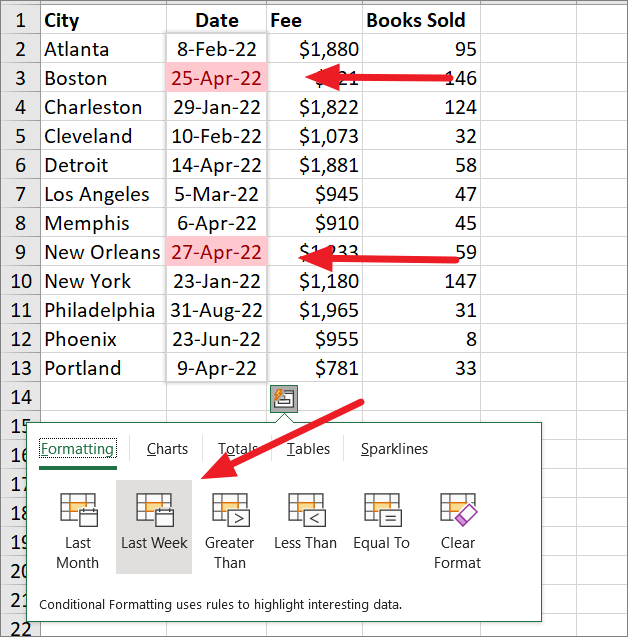
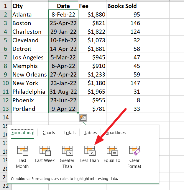
Analyze Dates with Quick Analysis Tool
You can also analyze dates using the Quick Analysis tool. If you select dates from your worksheet, the Quick Analysis tool will show you a different set of conditional formatting options under the Formatting tab.
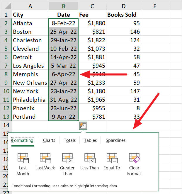
Last Month
If you select this option under Formatting, it will highlight all the dates that are from the previous month.
Last Week
This option will highlight all the dates from the previous week.
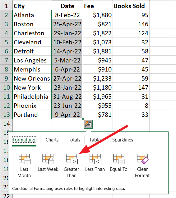
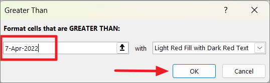
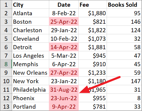
Greater Than
If you want to highlight all the dates that come after a specific date, you can select the ‘Greater Than’ option.
Then, enter the date in the text field, specify the formatting in the ‘with’ drop-down, and click ‘OK’.
The result:
Less Than
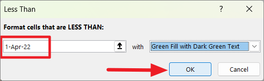
If you want to highlight all the dates that come before a specific date, then you need to select the ‘Less Than’ option.
Then, specify the date in the text field, select the formatting and click ‘OK’.
The result:
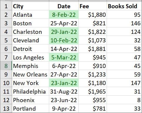
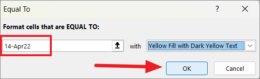
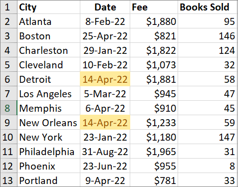
Equal To
If you want to highlight all the dates that are equal to the date you specify, then select the ‘Equal To’ option.
Then, specify the date in the field, choose formatting, and click ‘OK’.
The result:
Insert Charts using Quick Analysis Tool
Charts are a great way to visualize your data and make it easy to understand. With Quick Analysis Tool, you can quickly insert different types of charts and graphs into the spreadsheet. The ‘Chart’ tab in the Quick Analysis toolbar will show you recommended charts based on the data you have highlighted. The recommended charts can include Bar charts, column charts, line charts, pie charts, scatter, etc. Here’s how you can insert charts using the quick analysis tool:
First, highlight the data set for which you want to create charts, click the ‘Quick Analysis’ button at the lower right corner or press Ctrl+Q. When the toolbar appears, switch over to the ‘Charts’ tab.
As you hover over each chart option, you will see a preview of what the chart will look like based on the data. If you find a chart type that will work best with your data, you can then insert that chart or graph by clicking it. Here, we are selecting the ‘Clustered Column’ chat type.
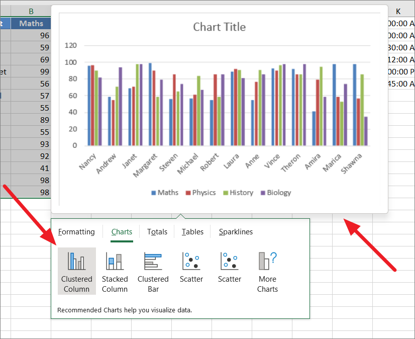
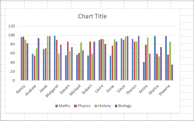
This will insert the selected chart into the same worksheet.
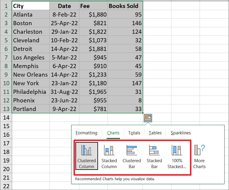
As we mentioned before, the tool will recommend charts based on the data you have selected. For example, if we select a different type of data, the ‘Chart’ tab will show you different types of charts.
If you don’t like any of the chart types recommended by the Quick Analysis tool, you can click the ‘More Charts’ option to view all the available charts.
This will open up the Insert Chart dialog box. Here, you can switch to the ‘All Charts’ tab and choose from a wider range of charts and graphs.
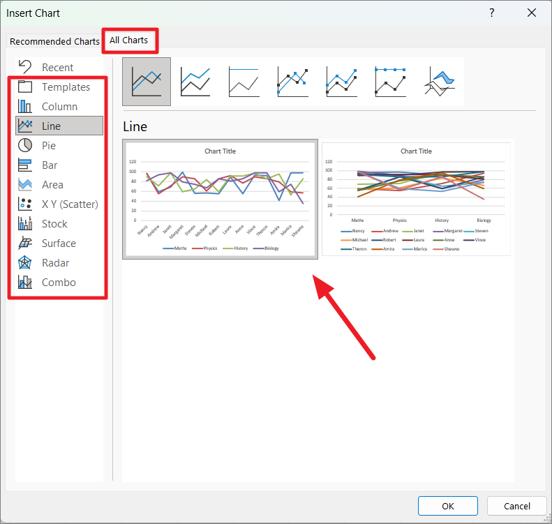
After selecting your desired chart type, click ‘OK’ to close the dialog window and insert the chart into the worksheet.
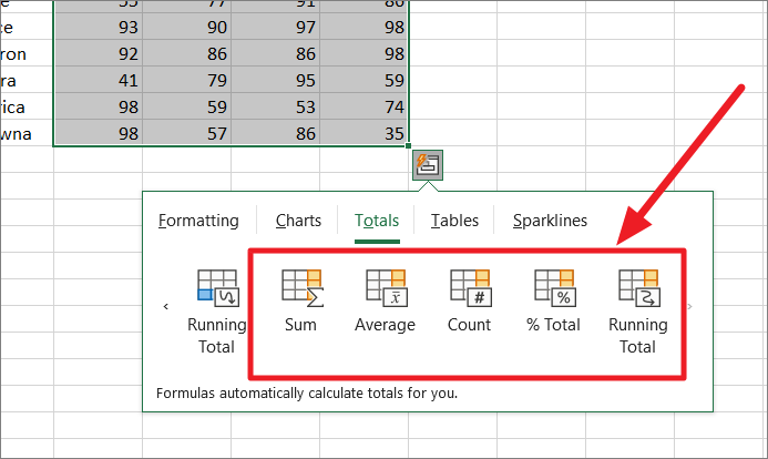
Quickly Analysis Data through Totals
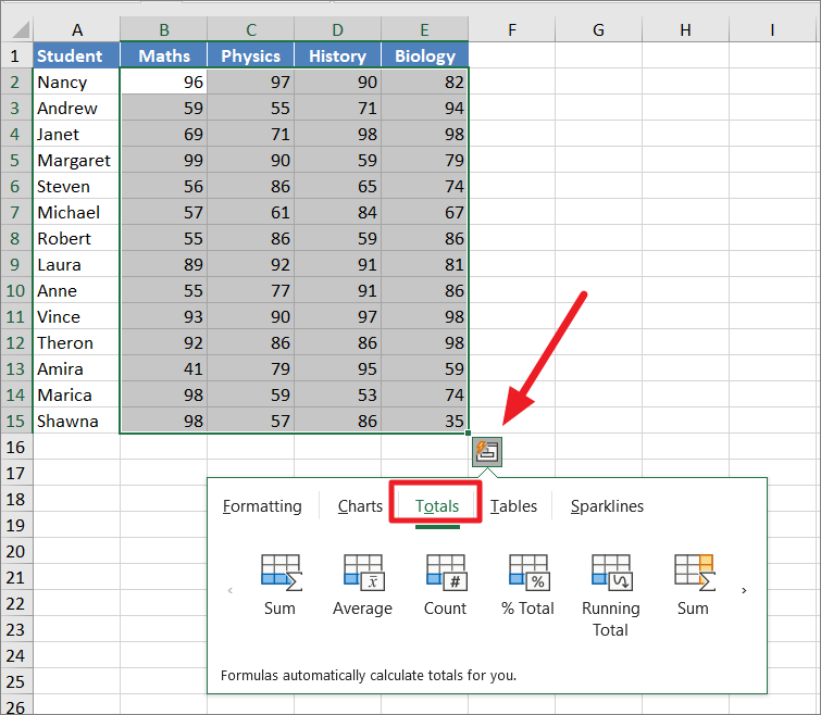
The Quick Analysis Tool offers various formulas to calculate numbers in selected columns or rows. The Totals tabs options include Sum, Average, Count, % Total, and Running Total. With the quick Analysis tool, you don’t have to enter formulas for simple data summarizations because the tool will do it for you and show you the results.
To quickly analyze data through totals, select the data set you want to calculate, click the ‘Quick Analysis’ icon and go over to the ‘Totals’ tab to see the options.
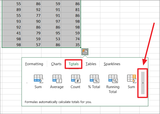
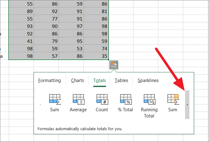
You can click the small arrow button to the right to view more formulas.
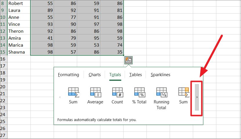
You may think they are the same options, but if you look closer, the icons are different. The blue highlighted color buttons are for calculating columns while the yellow highlighted color buttons are for calculating rows.
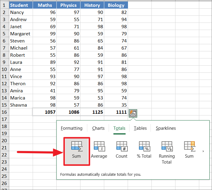
Sum
The Sum formula allows you to summarize each column and give you a total of the values at the end of each column.
Before you summarize column(s), make sure that there is an empty row below the data you want to sum. Otherwise, the sum results will overwrite the existing row of data.
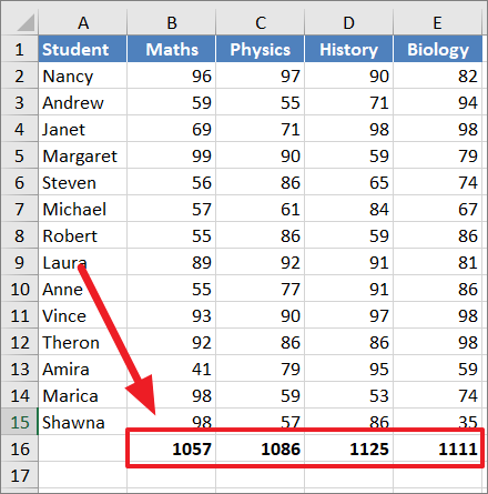
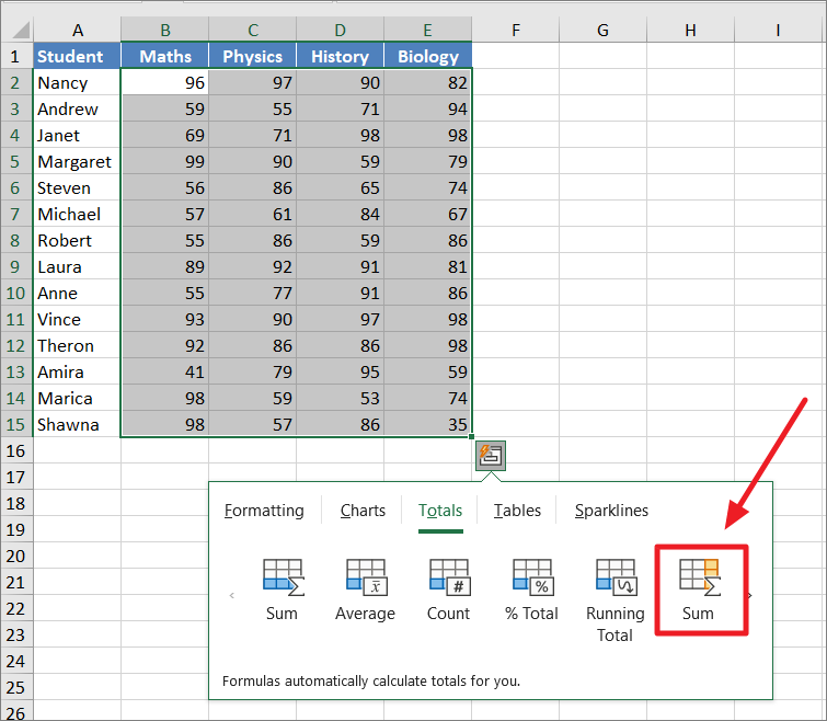
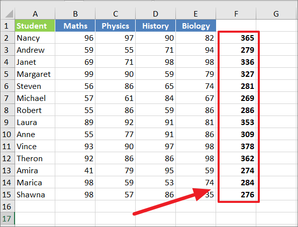
Next, select the column(s) you want to sum and click the ‘Quick Analysis’ icon on the bottom right corner of the range. Then, go over to the ‘Totals’ tab and select the blue-colored ‘Sum’ (First option) option. As you hover over the Sum option, you will see a live preview.
This will create a row right below the selected range and show you the total of each column.
If you want to sum the values to the right or sum the rows of values instead of columns, select the yellow-colored ‘Sum’ button.
This will create a column to the right and show you the sum of each selected row.
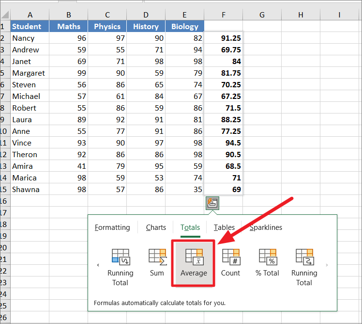
Average
If you want to calculate the average value of each column, click the blue-colored ‘Average’ button under the Totals tab.
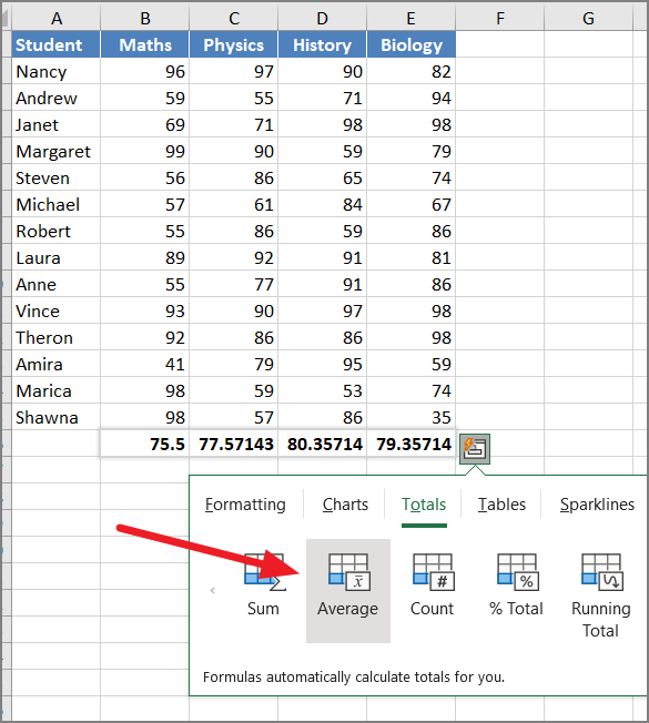
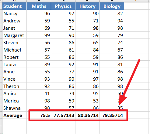
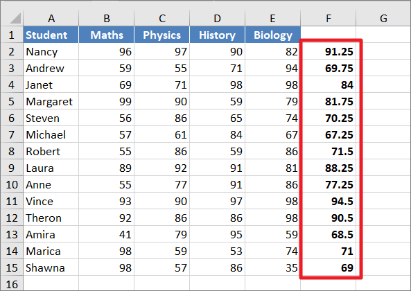
The formula will automatically calculate the average values and show the results below the table.
If you want to calculate the average value of each row, go to the ‘Totals’ tab, and click on the small arrow button to the right.
Then, click the yellow-colored ‘Average’ button under the Totals tab.
The result:
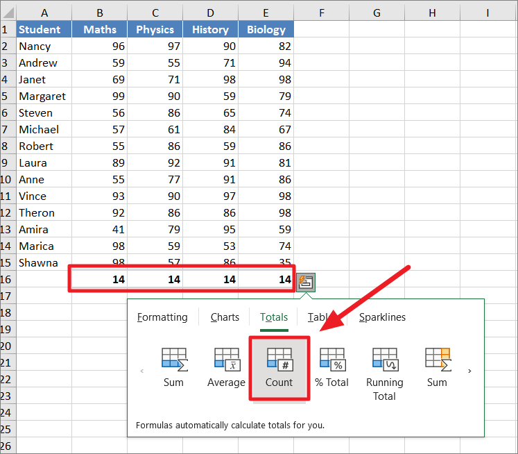
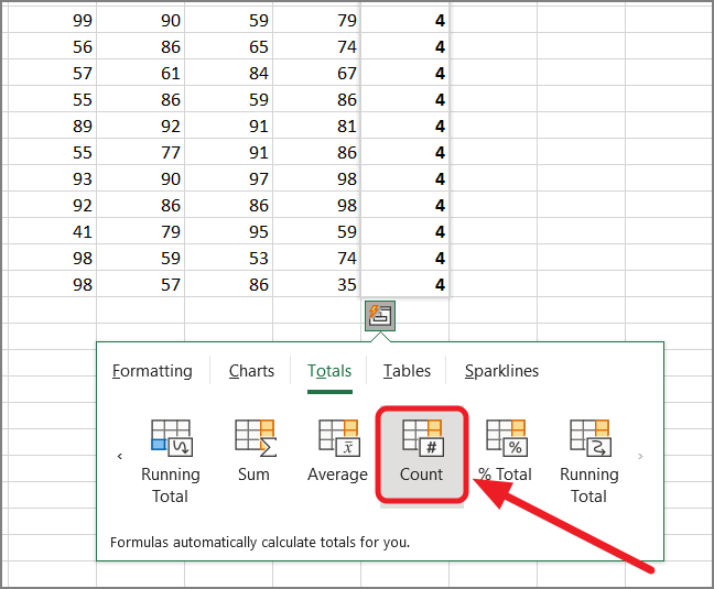
Count
In case, you want to count the number of items in each column from the selected range, click the ‘Count’ button with blue highlighted blue color.
If you want to count the number of items in each row from the selected range, click the small arrow button.
Then, click the ‘Count’ (with yellow highlighted color) button.
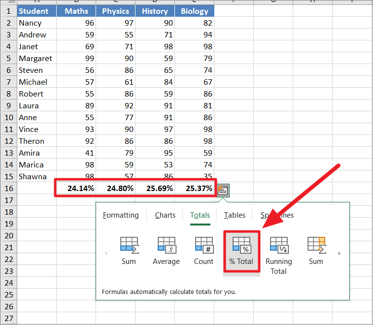
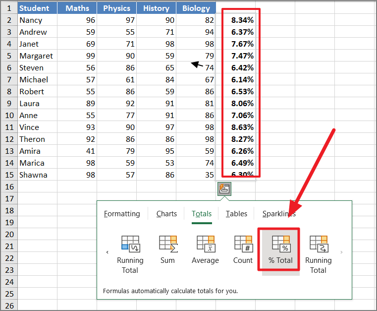
% Total
This option adds add an % total row or column to display the respective size of the sum of numbers (in percentage) in each row or column within the selected range.
To get the percentage of the total of each column within the data set, click the ‘% Total’ (blue colored) button under Totals.
To get the percentage of the total of each row within the data set, click the small arrow button to view more options and then select the ‘% Total’ (yellow colored) button under Totals.
Running Total
The running total is also known as the cumulative sum is the partial sum of a data set or the sum of the values so far. It is the sum of the values as it grows over time.
The difference between total sum and running total is that total sum is the sum of all the values in a row or column and the running total is the cumulative sum of the range from the first value to the current cell value.
There are four different ways to calculate the running total in Excel using the Quick Analysis tool.
Running Total for a Single Column
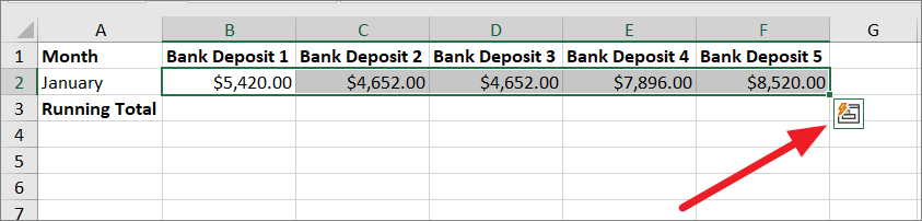
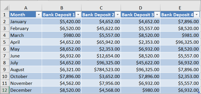
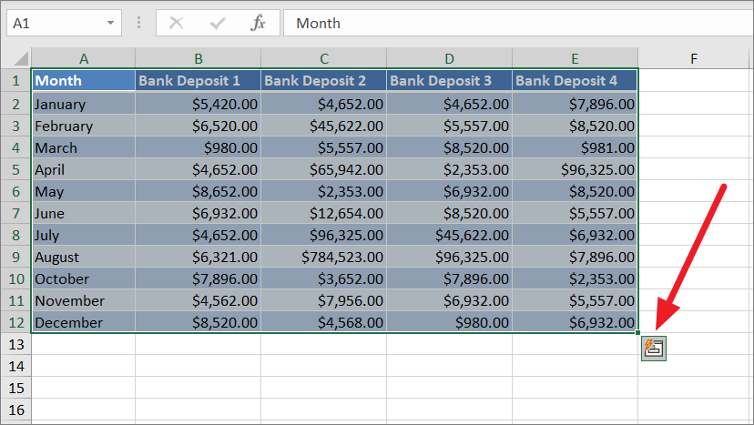
When you calculated the running total for a single column, it adds each value of the column on top of the next value. Suppose, you have the below data, where you have a list of bank deposits for each month.
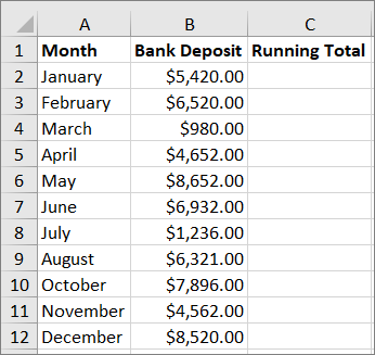
To calculate the running total in the single column, select the range of cells, and click on the Quick Analysis symbol on the bottom right corner of the range.
You can click the arrow button on the right side to reveal more options.
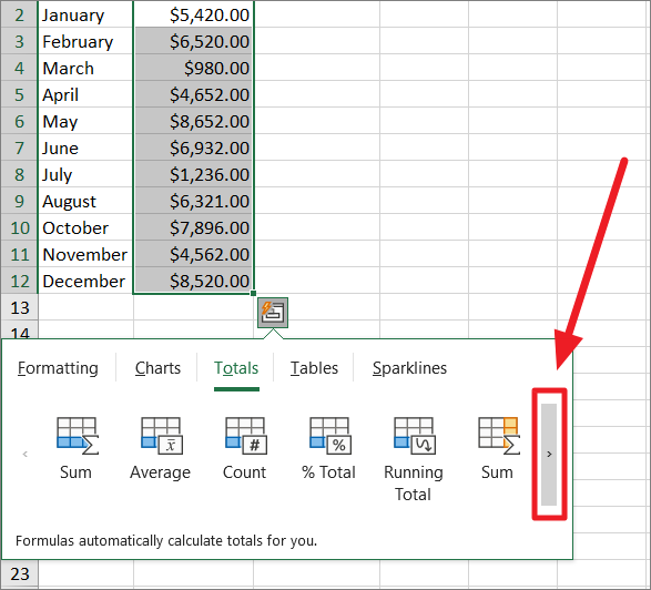
And then, select the ‘Running Total’ (the yellow highlighted button).
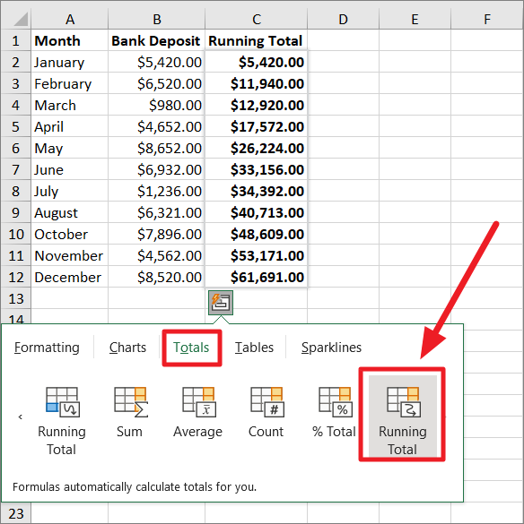
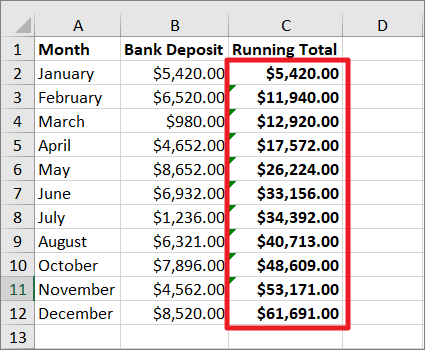
Now, you will get the running total for each month on a new column. As you can see, the January deposit is added to the February deposit to create a running total of February, then the running total of February is added to the March deposit to produce the March running deposit, and so on. It is essentially a sequential summation of values in the column.
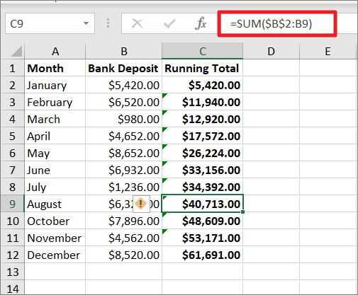
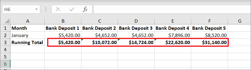
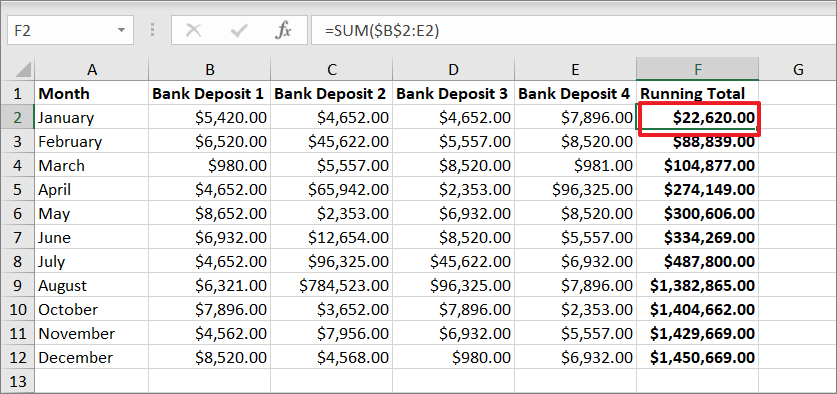
When you select any cell in the running total column, you will see the running total is calculated using the SUM function.
Running Totals for a Single Row
If you want to calculate the running total for a row instead, follow these steps:
First, select the range, and click on the ‘Quick Analysis’ button at the lower right corner of the range.
Then, switch to the Totals tab in the Quick Analysis toolbar and select the ‘Running Total’ (Blue color highlighted) option.
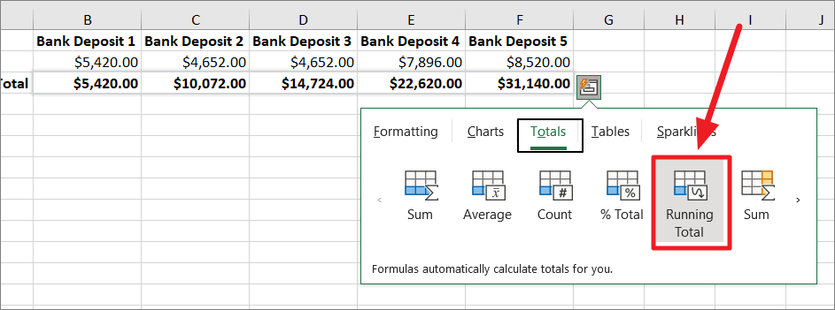
Now, you got the running total of a row at the end of each column as shown below.
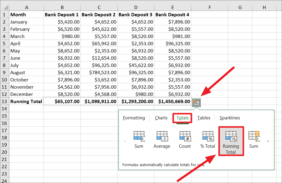
Running Total for Multiple Columns
We have seen how to get a running total of a single column and row, now let’s see how to calculate the running total of multiple columns in a data set.
Select the range, and click on the ‘Quick Analysis’ icon to open the toolbar. Then, switch to the ‘Totals’ tab and click on the indicated symbol on the right side.
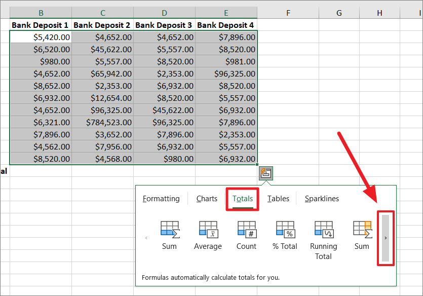
Then, click the ‘Running Total’ option with an icon having a yellow highlighted color as shown below.
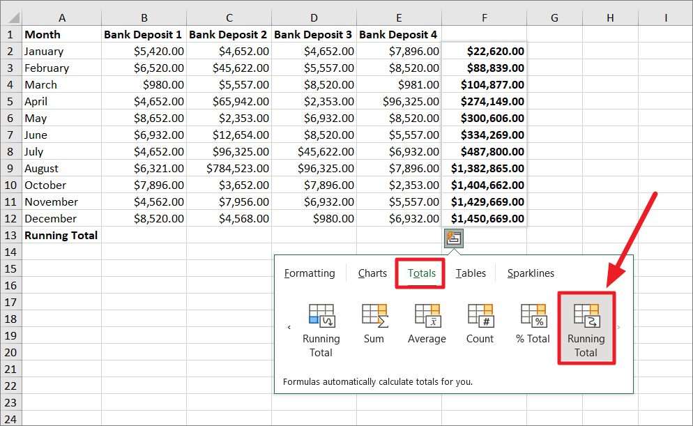
This will create a column and show you the running total of multiple columns at the end of each row.
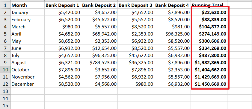
The first running total (F2) at the end of the January column F2 has the sum of all the deposits for the month of January.
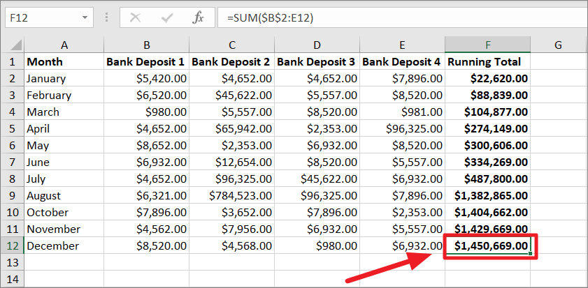
And the last running total in cell F12 contains all four bank deposits up to the month of December.
Running Total for Multiple Rows
If you want to calculate the running total for multiple rows instead of columns, you can also do that with the Quick Analysis tool.
To do that, select the range of cells, click the ‘Quick Analysis’ tool, and then switch to the ‘Totals’ tab. After that, select the ‘Running Total’ (blue highlighted color) option.
This will automatically insert a SUM function at the end of each column and calculate the running total for each deposit.
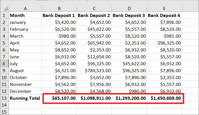
The first running total (B13) at the end of the Bank Deposit 1 column shows the sum of all the first deposits for each month. And the last running total in cell E13 contains all four bank deposits up to the month of December.
You can achieve the same results by manually entering formulas at the end of a row or column but quick analysis makes this process automatic with a click or two.
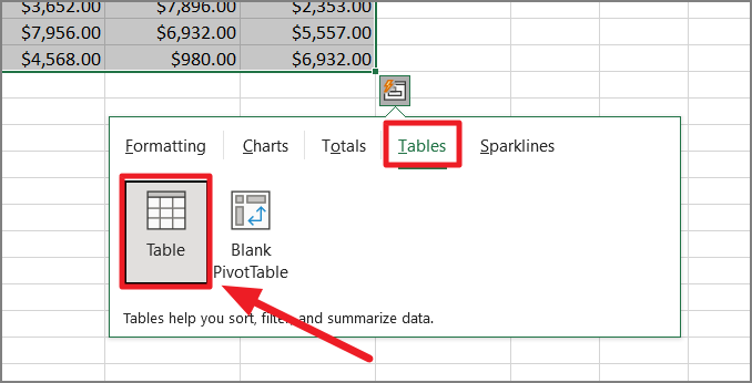
Create Tables using the Quick Analysis Tool
Tables make it easy to sort, filter, and analyze your data in Excel. The Tables tab under the Quick Analysis toolbar allows you to convert your current range into a table or pivot table. Converting your data into a table gives you additional data analysis and formatting options which can be helpful for many purposes.
The Table tab has two options – Table and Pivot Table. When creating a table from the data, you will see a preview, but in the case of PivotTable, no preview will be available.
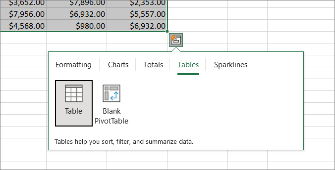
Table
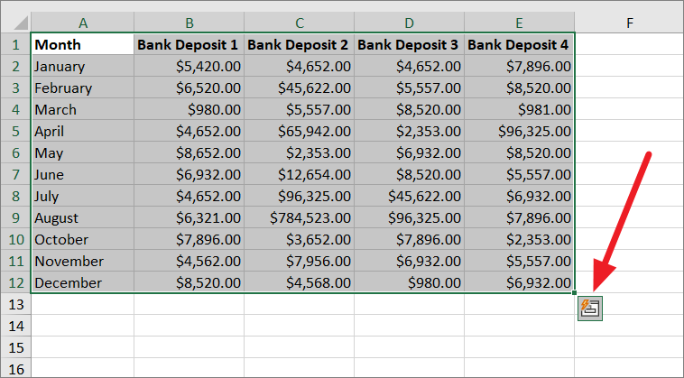
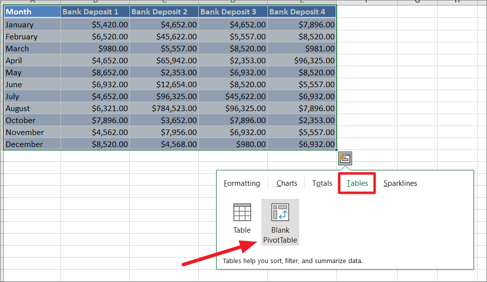
To insert a table from your data, select the range of cells you want to convert into a table, and click the on the ‘Quick Analysis’ button on the bottom right corner of the range.
Now, go over to the ‘Tables’ tab and click on the ‘Table’ icon.
This will convert the selected range into a table.
In cases, you accidentally created a table with a wrong range, you can press the Ctrl+Z keyboard shortcut to reverse the change.
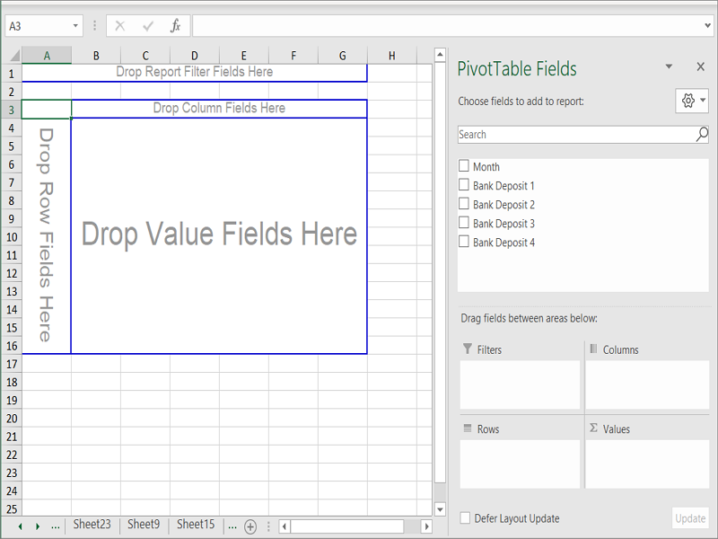
Blank PivotTable
The second option under the Tables tab is the Pivot table which allows you to create a blank pivot table with the selected range. The pivot table enables you to quickly summarize and analyze a large amount of data which helps you see patterns and trends in your data.
To create a pivot table, select the data range and select the ‘Blank PivotTable’ option under Table.
Now, Excel will create a blank pivot table in a new worksheet with the corresponding columns as PivotTable fields. You can then drag the fields between the areas to customize your pivot table.
Create In-Line Sparklines using Quick Analysis
Sparklines are small charts that can fit in a single cell to provide a visual representation of data. It is typically drawn without axes or coordinates to show a single trend or pattern in your data. With the Sparklines tab under the Quick Analysis tool, you can insert line, column, and win-loss sparkline charts to the right of the data.
If you cannot access the (greyed out) options under the Sparkline tab, you are probably using the ‘Excel 97-2003 workbook (.xls)’ file.
You can only use Sparklines in the following Excel file types:
- Excel Workbook (.xlsx)
- Excel Macro-Enabled Workbook (.xlsm)
- Excel Binary Workbook (.xlsb)
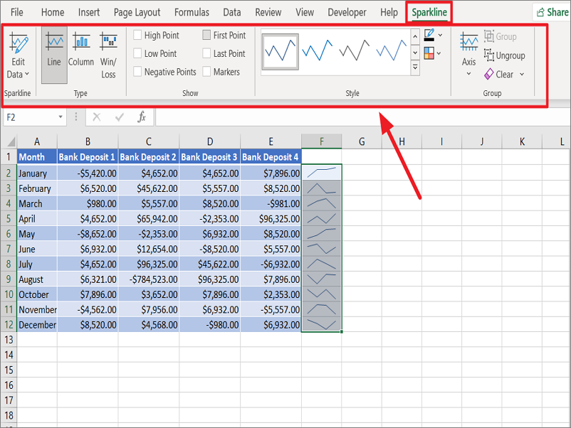
Line
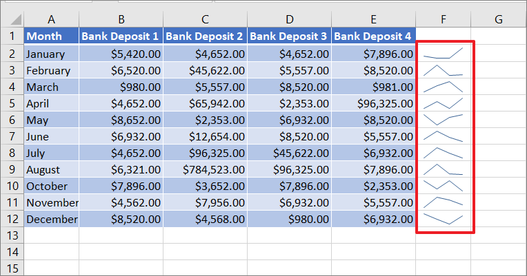
Line Sparklines will be in the form of lines which allows you to easily spot trends at a glance. It shows how high and low values are.
To insert line sparkling, select the range of data for which you want to create the sparkline and click the ‘Quick Analysis’ icon at the lower right corner of the selection.
Then, go to the ‘Sparkline tab’ and choose the ‘Line’ chart type.
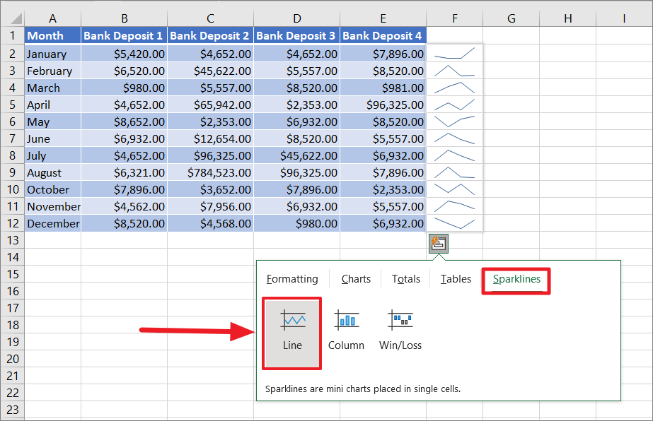
The mini line sparkline charts will be inserted within each cell to the right of the data.
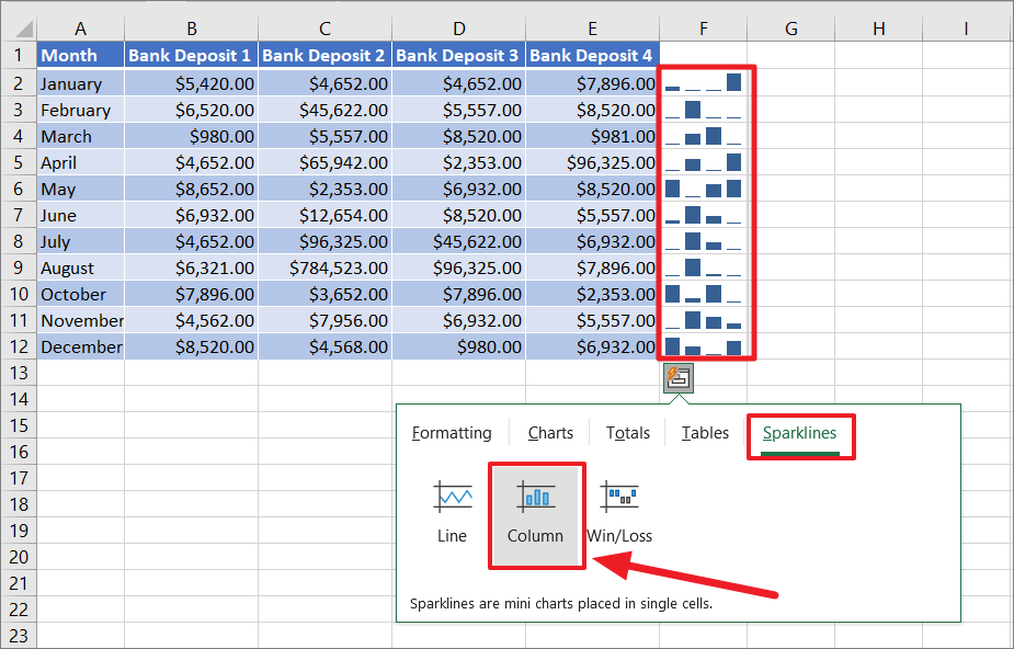
Column
The column sparkline chart is similar to the line chart where each column or bar shows the changes in values.
To insert a column sparkline, click the ‘Column’ option under the ‘Sparklines’ tab in the Quick Analysis tool.
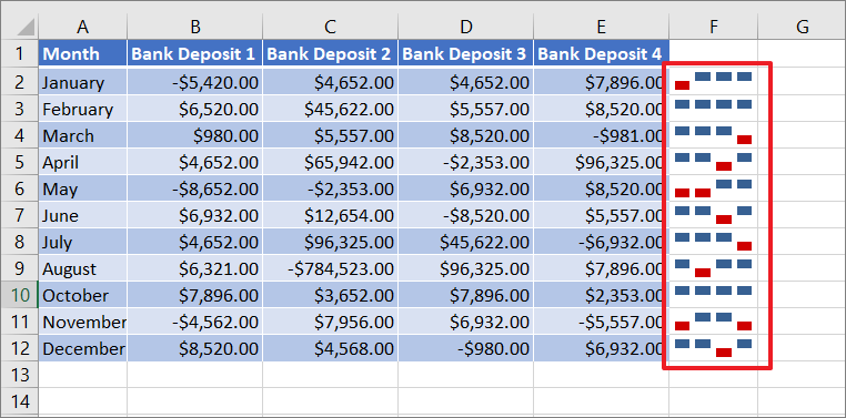
Win/Loss
Win/Loss is similar to the Column chart except it shows us whether each value is positive or negative. Blue upward-facing bar means positive values and red downward-facing bars mean negative values.
To insert Win/Loss sparkline, select the data, go to the ‘Sparklines’ tab, and select the ‘Win/Loss’ option.
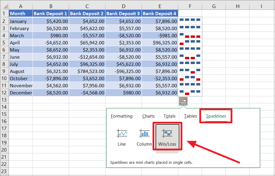
The sparklines will be added to the left of the data for each row.
After inserting the sparklines, you can customize them using the tools from the Sparkline tab on the Ribbon.
That’s it.