Gauge charts, often referred to as dial or speedometer charts, are effective tools for visualizing progress toward a goal. They mimic the appearance of a vehicle’s speedometer by using a pointer to indicate data values on a gauge.
Although Excel doesn’t have a built-in gauge chart type, it’s possible to create one by combining a doughnut chart and a pie chart. This method allows you to represent one data field’s performance on a scale from minimum to maximum.
Set Up the Data for the Gauge Chart
Preparing the data is the first step in creating a gauge chart. You’ll need to organize three separate data tables: one for the dial, one for the pointer, and an optional one for chart data.
Arrange your data as follows:
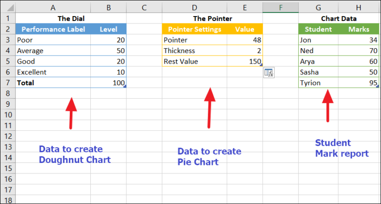
The Dial
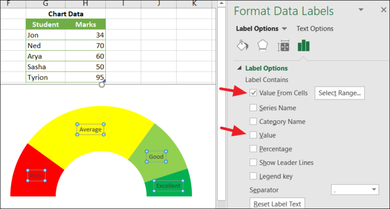
- Performance Labels: These are the labels you want displayed on the dial, such as Poor, Average, Good, and Excellent.
- Levels: These values divide the speedometer into different sections.
The Pointer
The pointer data determines the position and appearance of the needle on the gauge chart.
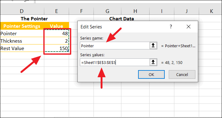
- Pointer: This value specifies where the needle should point on the gauge chart.
- Thickness: This sets the width of the needle. It’s advisable to keep this value under five for optimal appearance.
- Rest Value: This value represents the remaining portion of the pie chart. It can be calculated using the formula
=200-(E3+E4), which should be entered in cell E5.
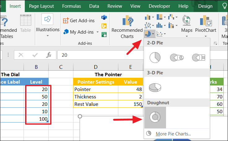
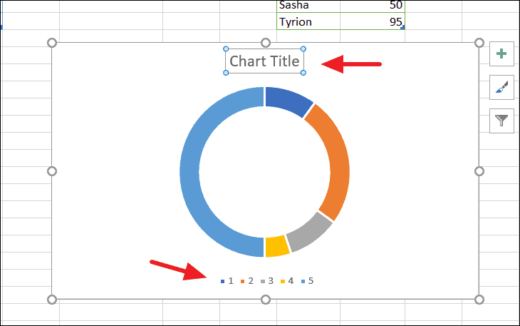
Create a Doughnut Chart
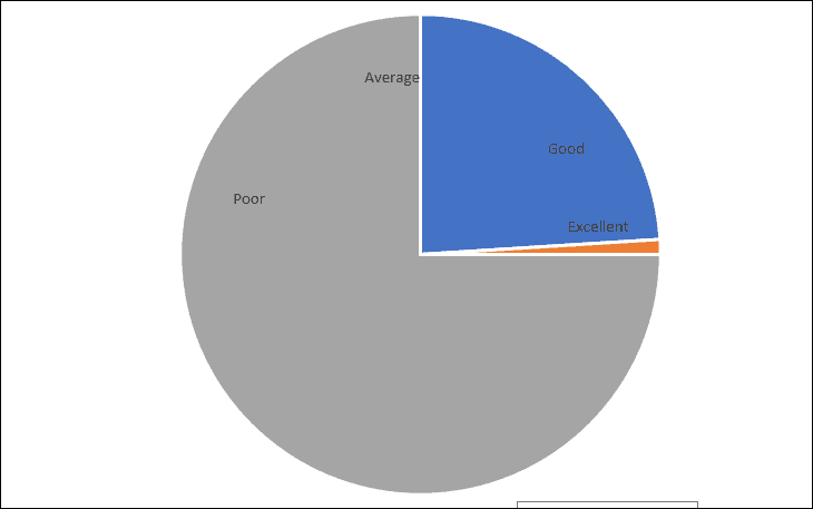
After inserting the chart, remove the default chart title and legend to simplify the visualization. The resulting doughnut chart will display a semi-circle representing the ‘Level: 100’ on one side and the other levels on the opposite side.
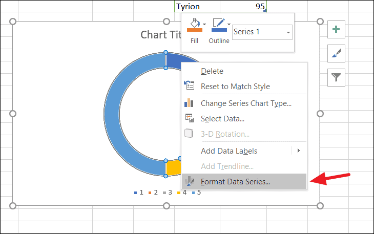
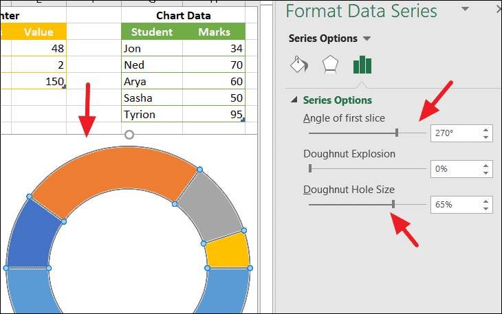
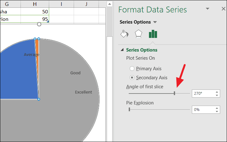
Rotate the Doughnut Chart and Remove the Chart Border
In the Format Data Series pane that appears on the right, set the Angle of first slice to 270° using the slider or by typing directly into the box. You can also adjust the Doughnut Hole Size if desired.
Transform the Doughnut Chart into a Semi-Circle
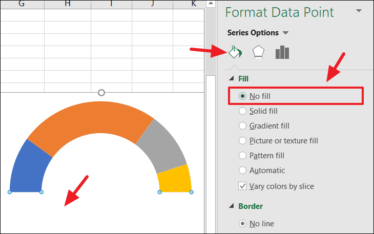
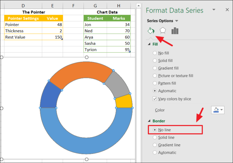
Customize the Slice Colors
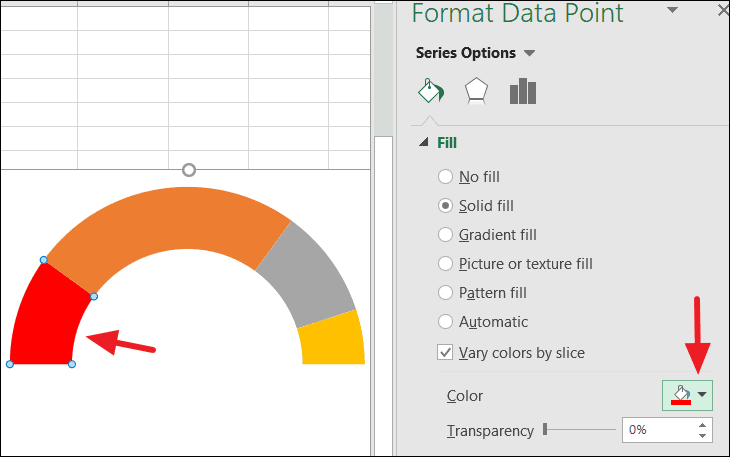
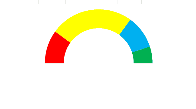
Repeat this process for each slice until all sections of the chart have your desired colors. Your chart should now look similar to this:
Add Data Labels to the Chart
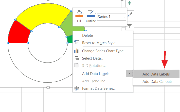
This action will display the level values from the ‘Levels’ column of your data table on the chart. Double-click on the data label for the bottom (now hidden) slice and delete it to remove unnecessary clutter.
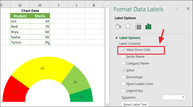
Uncheck the Values option in the Format Data Labels pane to display only the labels you selected.
Create the Pointer Using a Pie Chart
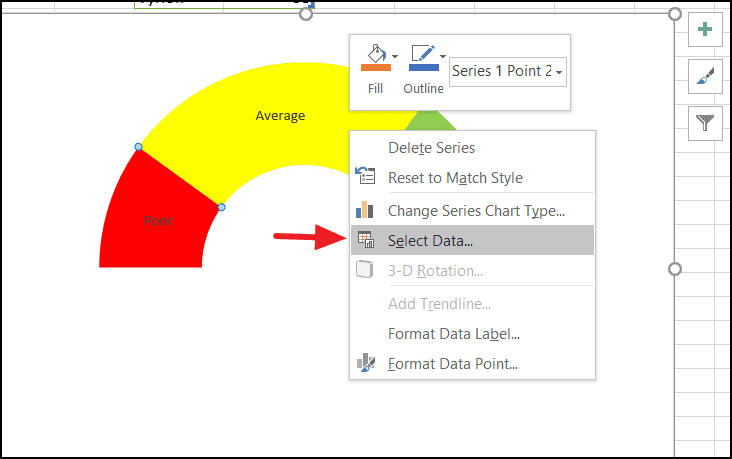
In the Select Data Source dialog, click the Add button to open the Edit Series dialog box. Enter Pointer in the Series Name field. For the Series Values, delete the default value and select the range containing the ‘Pointer’, ‘Thickness’, and ‘Rest Value’ data from your pointer table (e.g., E3:E5). Click OK to confirm.
Click OK again to close the Select Data Source dialog box.
Convert the Pointer Doughnut Chart to a Pie Chart
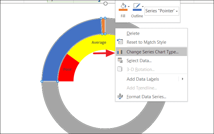
In the Change Chart Type dialog, go to the Combo category. For the series named ‘Pointer’, change the Chart Type to Pie from the dropdown menu. Check the Secondary Axis box next to the ‘Pointer’ series, then click OK.
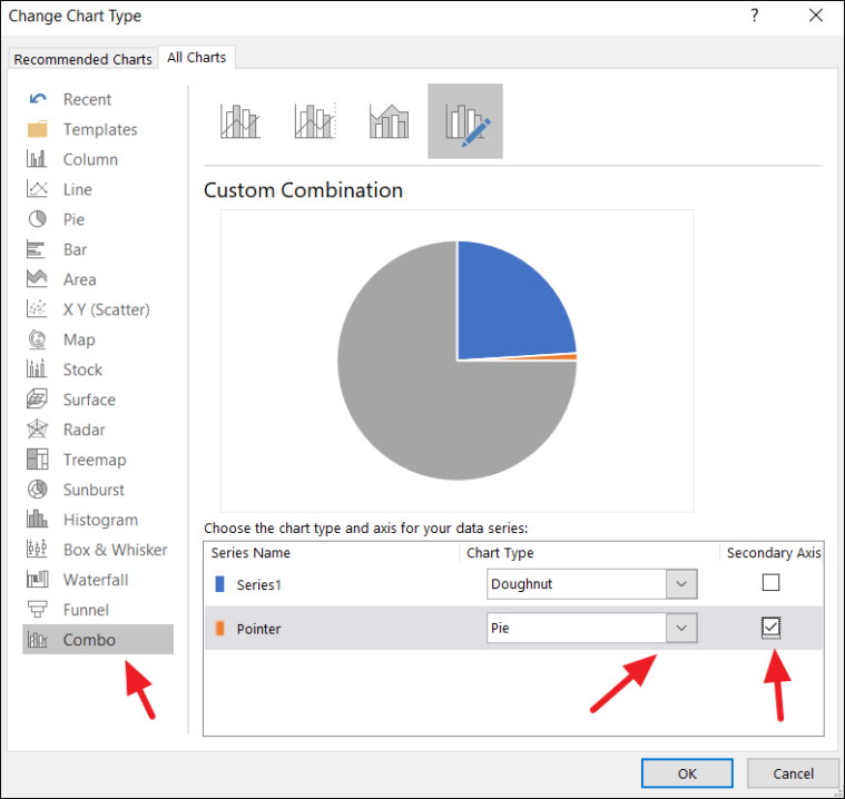
Your chart will now include a pie chart overlaying the doughnut chart, which will serve as the pointer.
Transform the Pie Chart into a Pointer (Needle)
Align the Pie Chart with the Doughnut Chart
Remove Pie Chart Borders
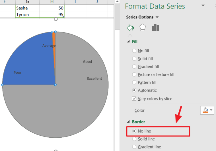
At this point, your chart will display three slices in the pie chart: two large ones and a thin slice at the top.
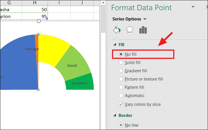
Configure the Pointer Appearance
Your gauge chart now features a functional pointer, resembling a speedometer.
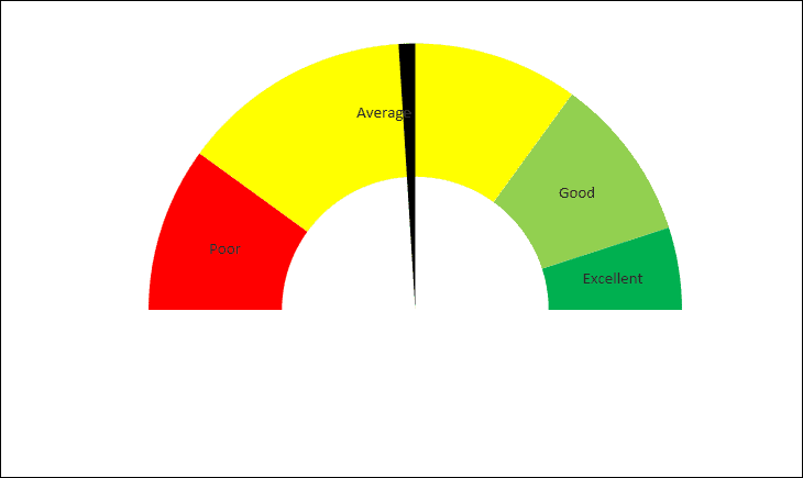
Understanding How the Gauge Chart Works
With the gauge chart complete, it’s beneficial to see how it functions. The position of the needle is determined by the ‘Pointer’ value in your pointer data table.
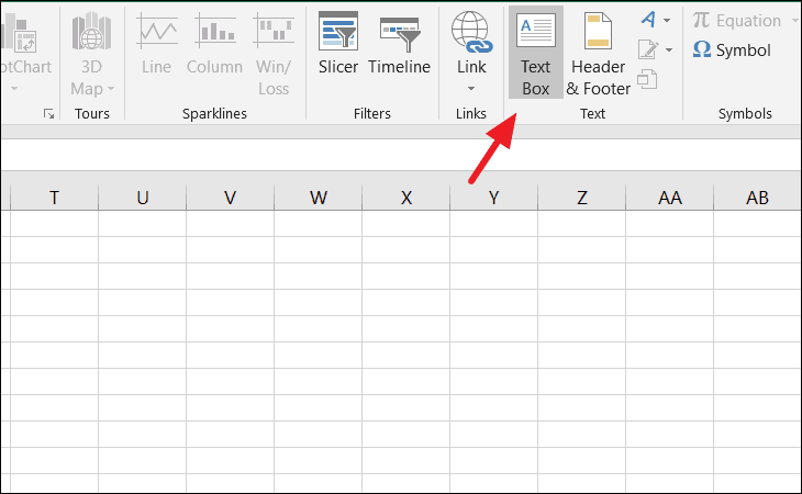
Draw the text box on your chart where you’d like the value to appear. Click inside the text box, then go to the formula bar, type =, and select the cell containing the ‘Pointer’ value (e.g., cell E3). Press Enter to link the text box to that cell. You can format the text box’s font and size as desired.
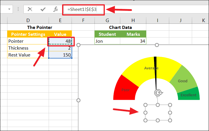
Now, whenever you change the value in the ‘Pointer’ cell, the needle on the gauge chart and the linked text box will update automatically. This allows you to assess performance metrics or other data points easily.
Here’s an example of the gauge chart in action with updated data:
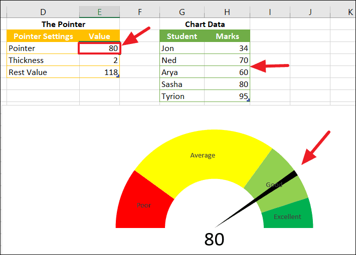
You can also adjust the needle’s thickness by modifying the ‘Thickness’ value in your pointer data table.
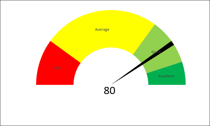
By following these steps, you’ve successfully created a dynamic gauge chart in Excel that can visually represent data against a defined performance scale.