
Excel’s built-in tools allow users to visually organize project milestones, historical events, or schedules along a chronological axis. Whether you need a simple project timeline or a multi-category chart showing overlapping events, Excel provides several methods to create a timeline that fits your needs.
Method 1: Building a Timeline with SmartArt
SmartArt offers a quick way to produce a visual timeline, especially for straightforward lists of events or milestones. This method is ideal for users who want to create a graphical sequence without extensive chart formatting.
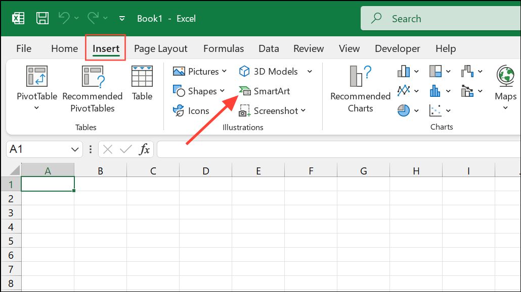
Step 1: Go to the Insert tab on the Excel ribbon and select SmartArt from the Illustrations section. This opens the SmartArt Graphic dialog box.
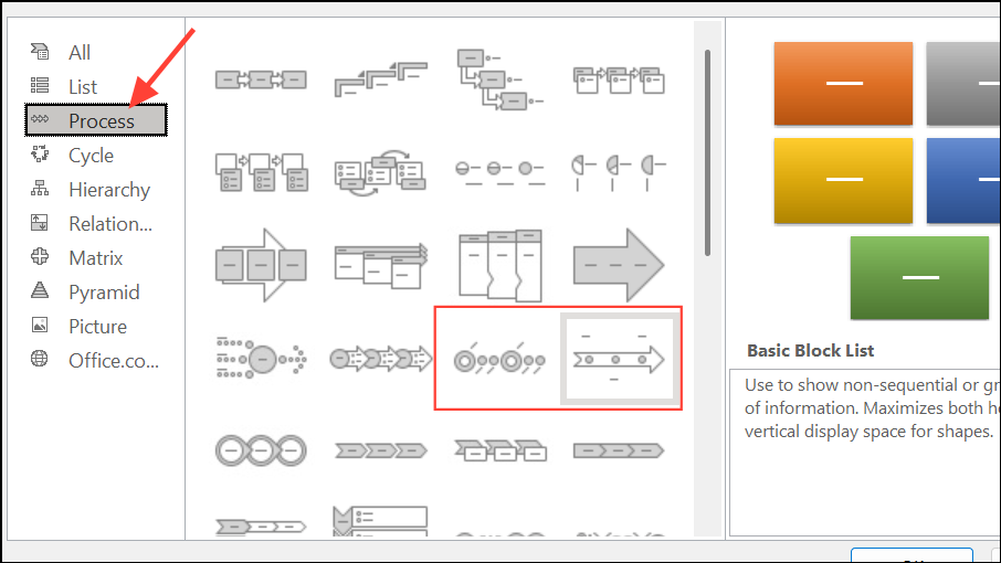
Step 2: In the dialog box, select Process from the left pane. Choose a timeline layout such as Basic Timeline or Circle Accent Timeline, then click OK. The timeline graphic will appear on your worksheet.
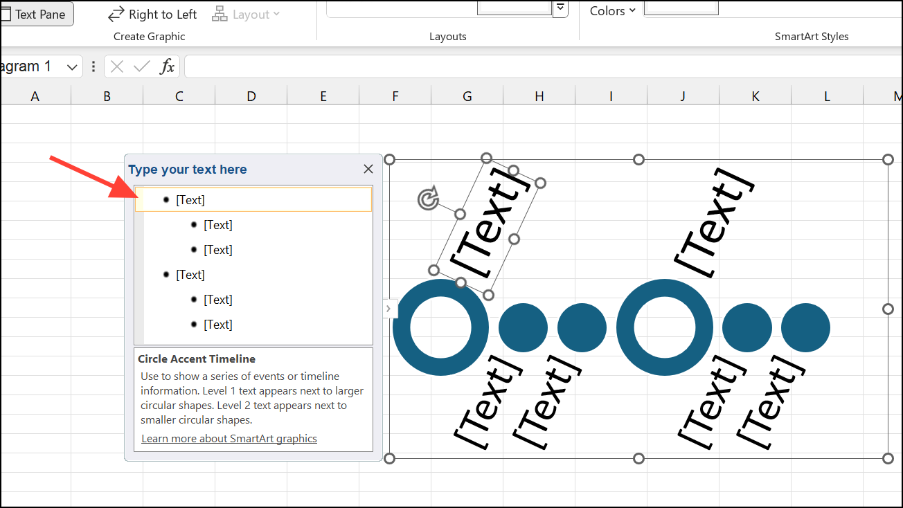
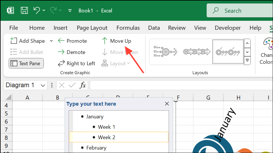
Step 3: Click the [Text] placeholders on the timeline or open the Text Pane to input your event names and dates. Press Enter to add new events, or Tab to add descriptions.
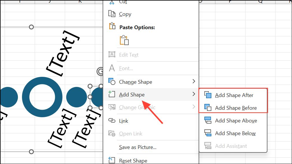
Step 4: To add more events, right-click a timeline shape and select Add Shape, then choose Add Shape Before or Add Shape After.
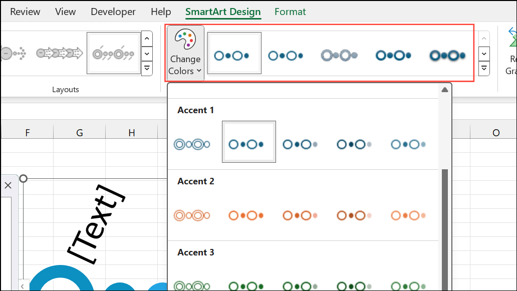
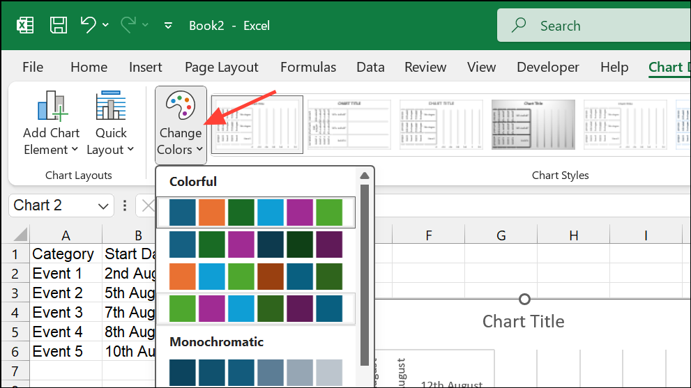
Step 5: Adjust the timeline’s appearance by using the SmartArt Design tab. Change layouts, colors, or apply different styles for a more polished look. Hover over color combinations to preview them before applying.
Step 6: Move events as needed by selecting a shape and using Move Up or Move Down from the SmartArt Design tab. This reorders the timeline without re-entering data.
Step 7: Finalize your timeline by formatting text, resizing the graphic, or applying 3D effects for improved readability.
Method 2: Creating a Timeline with a Scatter Chart
This method is suitable for timelines that require precise date placement, overlapping events, or custom formatting—such as project schedules or lifespans. It involves plotting milestones on a Scatter chart and formatting it to resemble a timeline.
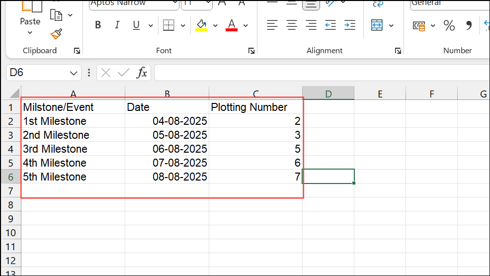
Step 1: Organize your data in an Excel table with three columns: Milestone/Event, Date, and a Plotting Number (used to vary the vertical position of each point and prevent label overlap).
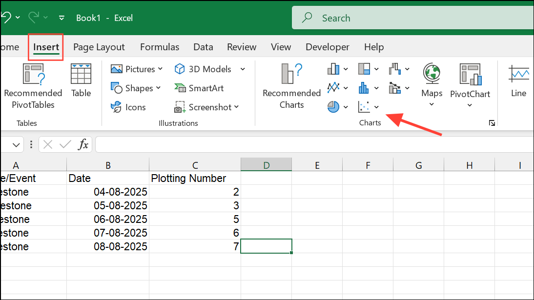
Step 2: Insert a Scatter chart by selecting a blank cell, navigating to the Insert tab, and choosing Scatter from the Charts section. This adds a blank chart area to your worksheet.
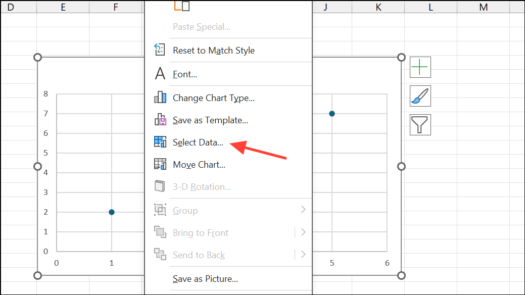
Step 3: Right-click the chart area and select Select Data. Add a new series: for Series X values, select your date column; for Series Y values, select your plotting numbers.
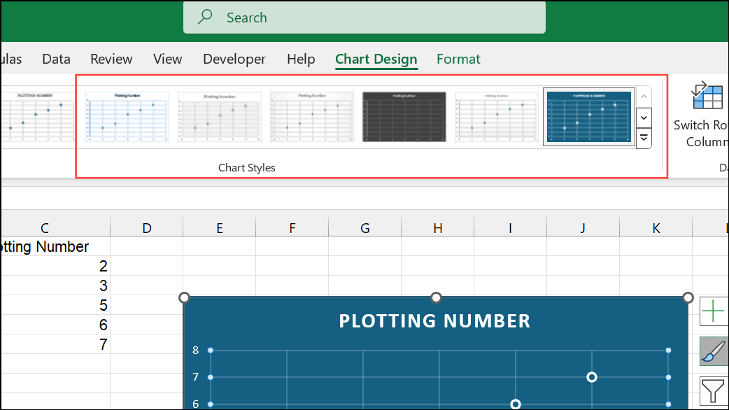
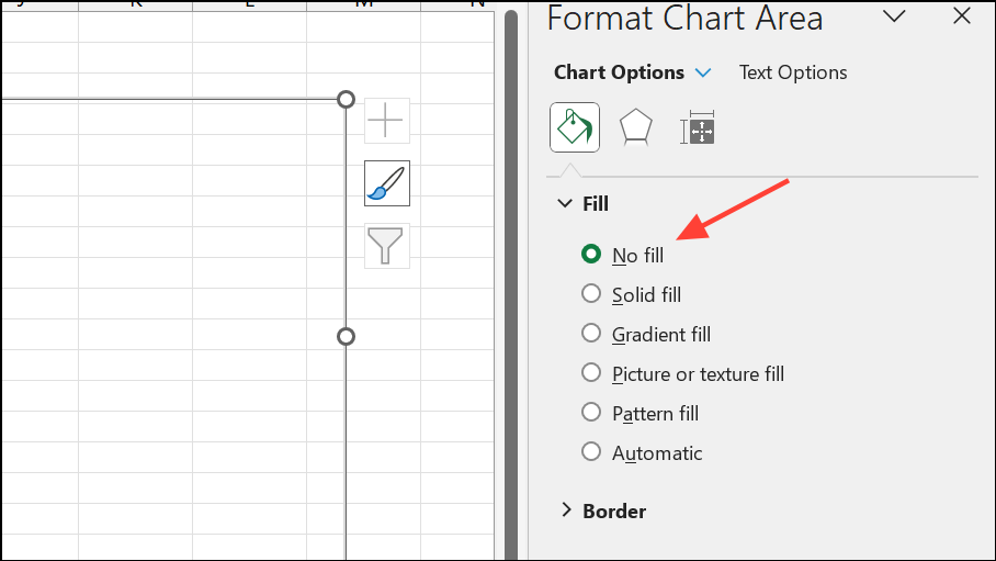
Step 4: Format the Scatter chart to look like a timeline. Remove unnecessary gridlines and chart titles. Keep only the horizontal (date) axis visible. Add data labels and error bars to connect milestone points to the timeline axis.
Step 5: Adjust error bars to create vertical connectors. Set the direction to Minus and the error amount to 100% to draw lines from each milestone point down to the timeline axis.
Step 6: Add milestone descriptions as data labels. Use the Value From Cells option to pull descriptions from your data table. This improves clarity and reduces manual editing.
Step 7: Refine the timeline’s appearance by customizing marker colors, adjusting connector transparency, and modifying axis bounds to focus the timeline on your event range. Use the plotting numbers column to stagger milestone heights and prevent overlapping labels.
Step 8: Optionally, save your timeline as a template for future use or export it as an image for use in presentations.
Method 3: Using Excel Timeline Templates
Excel provides ready-made timeline templates for rapid setup. This approach is ideal for users who prefer minimal setup and want to avoid detailed formatting.
Step 1: Go to File > New and search for timeline in the template search box. Browse available templates such as Project Timeline or Milestone Chart.
Step 2: Select a template and click Create. The template will open as a new workbook with sample data.
Step 3: Replace the sample data with your own events and dates. The template automatically updates the chart or timeline graphic.
Step 4: Customize colors, fonts, and layouts as needed. Save the completed timeline for reuse or share it with your team.
Method 4: Creating Multi-Category or Gantt-Style Timelines
When you need to show overlapping events, durations, or categories (such as project tasks, lifespans, or leadership terms), a Stacked Bar chart can be used to simulate a Gantt chart or multi-category timeline.
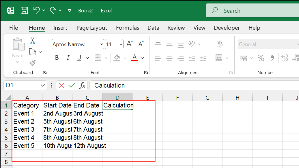
Step 1: Prepare your data with columns for Category/Name, Start Date, and End Date. Add a calculation column for the duration in days (=End Date - Start Date).
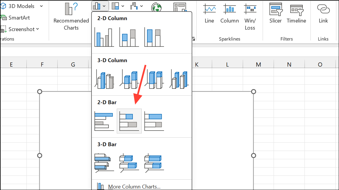
Step 2: Insert a Stacked Bar chart. Add two series: one for the start date (serves as the offset) and one for the duration (the visible bar representing the time span).
Step 3: Format the chart by removing the fill color from the start date series, leaving only the duration bars visible. Set the horizontal axis bounds to match your date range and format labels to show years or specific dates as needed.
Step 4: Add category or event labels to the bars for clarity. Adjust colors to distinguish between categories or event types.
Step 5: Refine the chart by reversing the category axis order, removing unnecessary axes, and adjusting bar spacing for a cleaner look.
Tips for Managing and Sharing Excel Timelines
- To move a timeline from Excel to PowerPoint, copy and paste the chart or save it as an image for use in presentations.
- For recurring timeline updates, consider using a PowerPoint add-in like Office Timeline, which imports Excel data and generates presentation-ready visuals with minimal effort.
- When using SmartArt, remember that the Design and Format tabs only appear when the graphic is selected.
- Adjust plotting numbers or bar heights to prevent overlapping labels and improve readability.
- For complex timelines with frequent updates, automated tools or templates can save significant time compared to manual formatting.
Excel provides flexible options for building timelines, from quick SmartArt graphics to detailed charts for complex schedules. By choosing the method that matches your project’s requirements, you can clearly communicate progress, milestones, or historical events with minimal effort.