Excel does not offer Gantt as a chart type, but with the help of this tutorial, you can easily create a Gantt chart from Bar chart.
Excel does not offer Gantt as a chart type, but with the help of this tutorial, you can easily create a Gantt chart from Bar chart.
by Raj Kumar
Despite Excel not offering a built-in Gantt chart feature, you can create one by customizing a stacked bar chart. This approach allows you to display your project’s schedule, showing the start and end dates of tasks, their durations, and the dependencies between them.
This guide will walk you through the process of building a Gantt chart in Excel by setting up your project data and modifying a stacked bar chart to visually represent your project timeline.
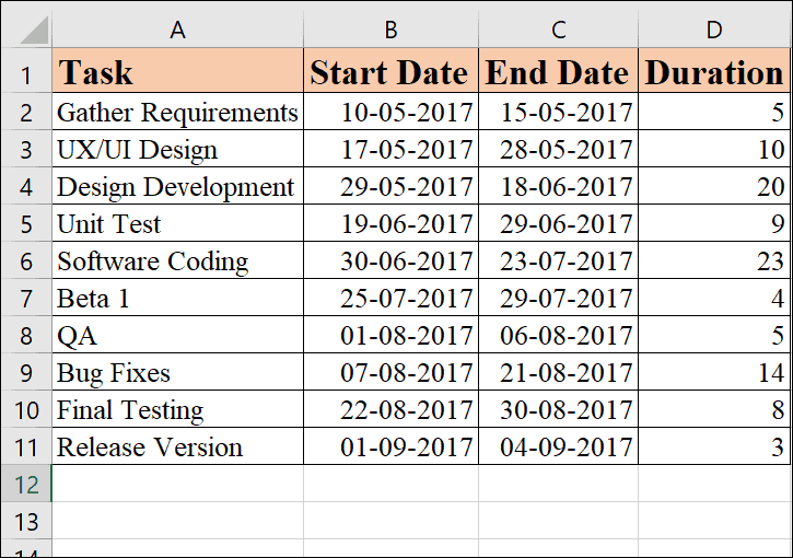
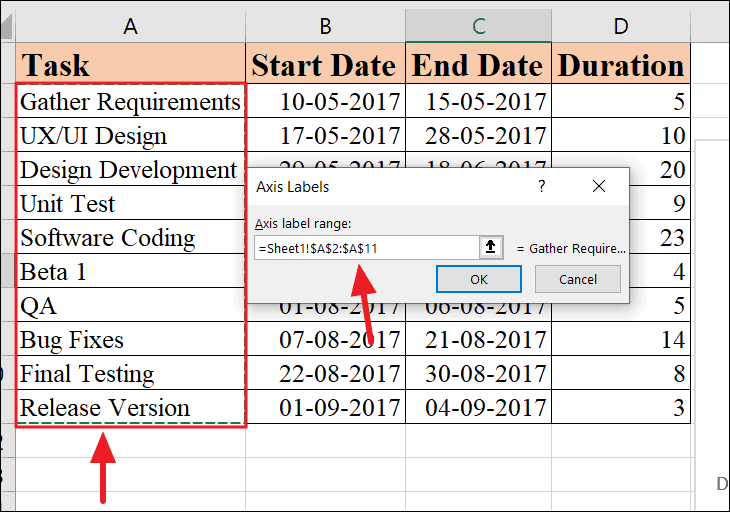
Begin by inputting your project tasks into an Excel spreadsheet. List each task on a separate row, and for each task, include its start date, end date, and duration (the number of days required to complete the task) in adjacent columns.
Ensure that your tasks are ordered by their start dates to accurately reflect the project timeline in your Gantt chart.
Here is an example of how your data should look for a software project:
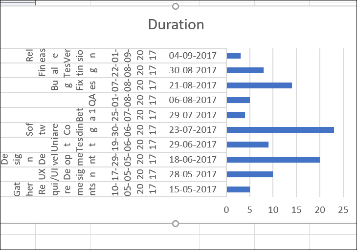
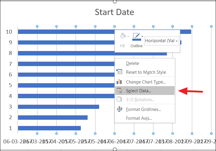
With your data in place, you can now create a stacked bar chart, which will serve as the basis for your Gantt chart. However, instead of selecting the entire data range, you’ll need to add data series individually to avoid creating a cluttered chart.
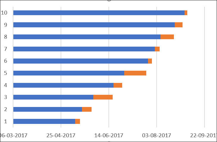
If you select all your data and insert a bar chart, the result may not accurately represent your project schedule and could look messy:
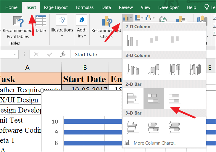
Select the ‘Start Date’ column range, including the header (e.g., cells B1:B11). Be careful not to select any empty cells to ensure the accuracy of your chart.
Go to the Insert tab on the Excel ribbon. In the Charts group, click on the Bar Chart icon, and under the 2-D Bar section, choose the ‘Stacked Bar’ chart type.
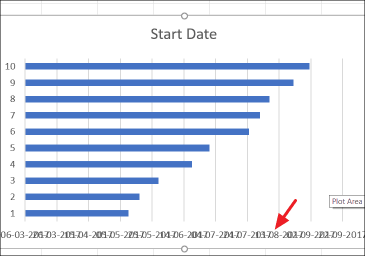
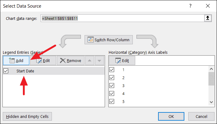
This action will insert a bar chart based on your Start Date data. Initially, the dates on the horizontal axis may appear crowded or overlapping, but this will be resolved as you add more data to the chart.
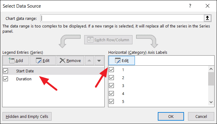
In the ‘Select Data Source’ window, you’ll notice ‘Start Date’ is already listed under ‘Legend Entries (Series)’. Click the Add button to add a new data series for Duration.
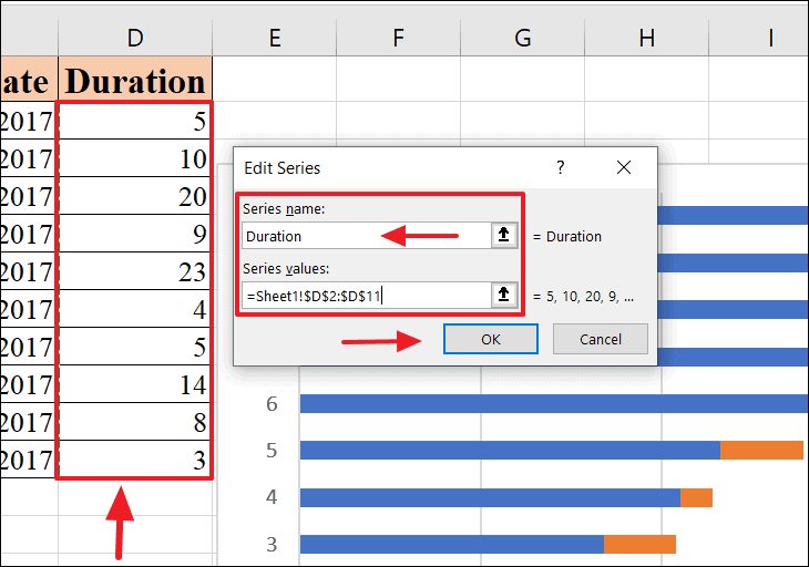
In the ‘Edit Series’ dialog box, enter ‘Duration’ in the ‘Series name’ field. Then, click the ‘Series values’ field and select the range of duration data (e.g., cells C2:C11), excluding the header. Click OK to confirm.
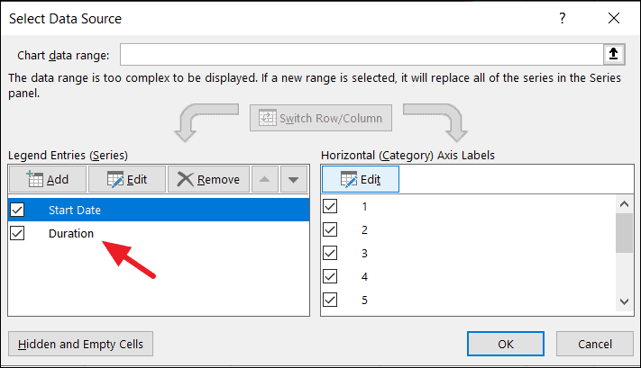
Back in the ‘Select Data Source’ window, both ‘Start Date’ and ‘Duration’ should now be listed under ‘Legend Entries (Series)’. Click OK to apply the changes to your chart.
Your chart will update to include the duration data, resulting in a stacked bar chart that begins to resemble a Gantt chart.
Click OK again in the ‘Select Data Source’ window to apply the changes. Your chart will now display the task names on the vertical axis, providing clarity to your project’s structure.
To transform your chart into a Gantt chart, you need to hide the ‘Start Date’ series so that only the ‘Duration’ bars are visible. This will make the chart display tasks starting from their respective dates.
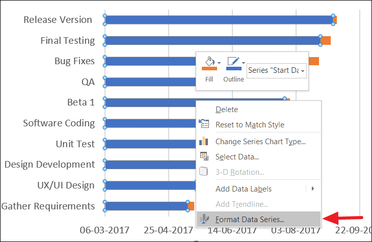
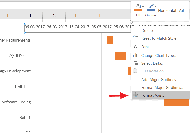
Click on any of the blue bars representing the ‘Start Date’ series to select all of them. Right-click and select Format Data Series from the context menu.
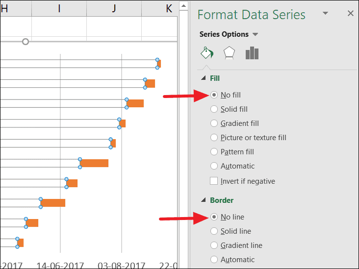
In the ‘Format Data Series’ pane on the right, under the ‘Fill & Line’ tab, choose No fill for the Fill option and No line for the Border option. This will make the ‘Start Date’ series invisible on the chart.
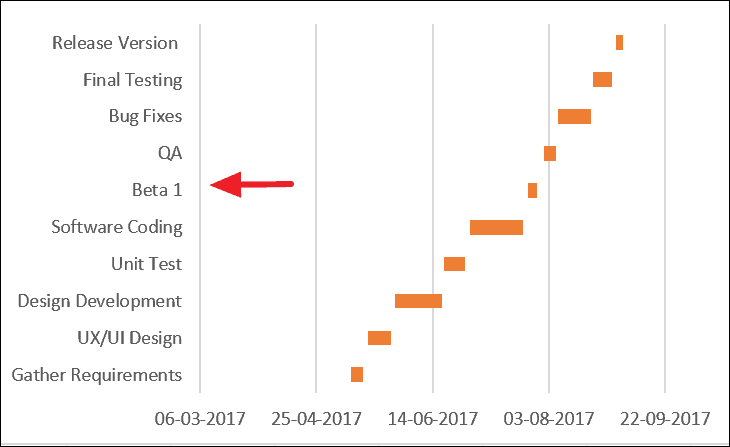
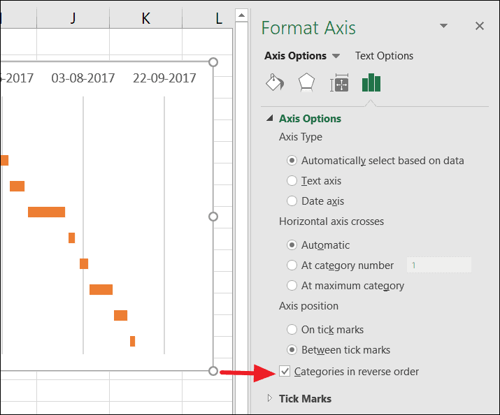
After applying these changes, the blue bars will disappear, leaving only the orange ‘Duration’ bars. However, you’ll notice that the tasks are now listed in reverse order on the vertical axis.
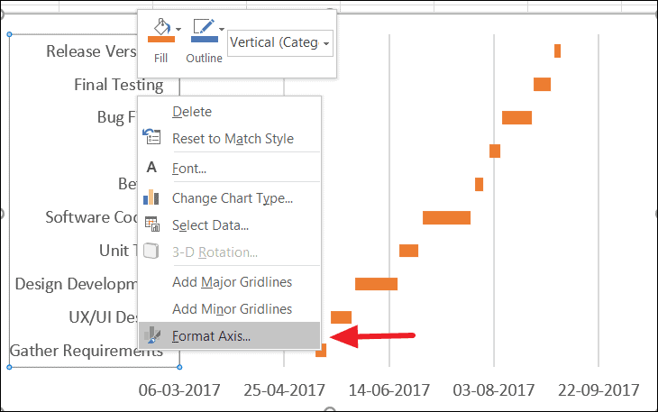
In the ‘Format Axis’ pane, under ‘Axis Options’, check the box for Categories in reverse order. This will reorder the tasks correctly and move the horizontal axis to the bottom of the chart.
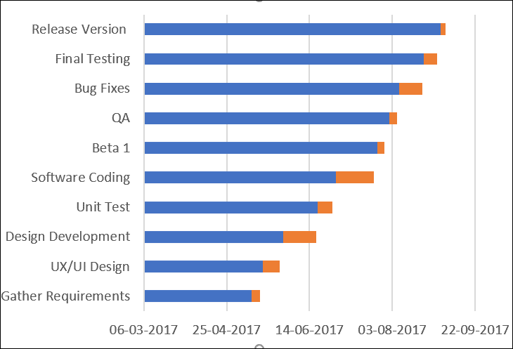
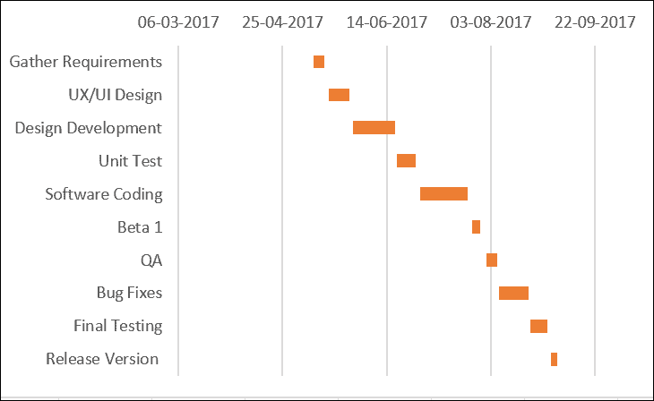
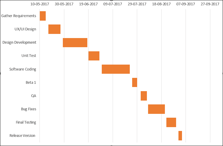
Your chart now displays the tasks in the proper order, enhancing the readability of your Gantt chart.
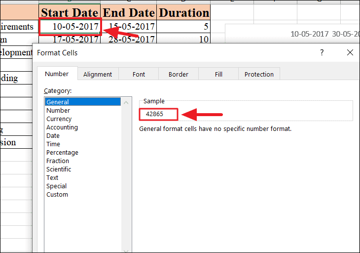
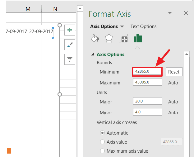
To remove the excess blank space at the beginning of your chart (where the ‘Start Date’ series used to be), you’ll need to adjust the chart’s time scale. First, find the serial number of your project’s earliest start date.
Right-click on the cell containing your earliest start date, select Format Cells, and in the ‘Number’ tab, choose General. Note down the serial number shown in the ‘Sample’ field (e.g., 42865). Click Cancel to exit without changing the cell format.
In the ‘Format Axis’ pane, under ‘Axis Options’, enter the serial number you noted earlier (e.g., 42865) into the ‘Minimum’ Bounds field. This will adjust the chart to start exactly at your earliest start date, removing unnecessary blank space.
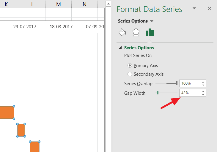
In the ‘Format Data Series’ pane, adjust the ‘Gap Width’ slider under ‘Series Options’ to decrease the spaces between the bars. A smaller gap width will make the bars thicker and the chart more readable.
Your Gantt chart is now complete, providing a clear visual representation of your project’s schedule and task durations in Excel.
By customizing a stacked bar chart in Excel, you can effectively create a Gantt chart to manage and visualize your project timelines without the need for specialized software.