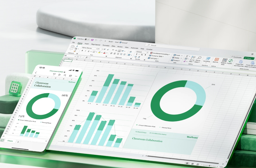
Pivot tables in Excel are invaluable tools that allow you to summarize and analyze extensive datasets efficiently. They enable you to reorganize, sort, and group data, providing insights from different perspectives and simplifying complex information.
This guide provides detailed instructions on how to create and utilize pivot tables in Excel to enhance your data analysis capabilities.
Organize your data
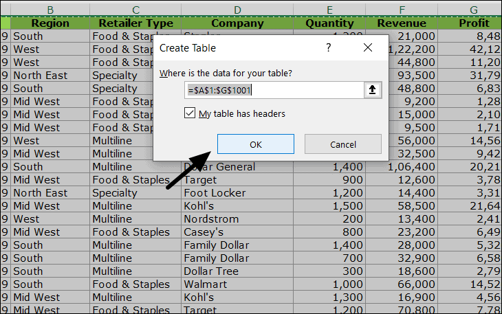
Before creating a pivot table, it’s crucial to ensure that your data is well-organized in a tabular format with rows and columns. To convert your dataset into an Excel table, select all the data, navigate to the Insert tab, and click on Table. In the ‘Create Table’ dialog box, confirm the range and click OK to format your data as a table.
Using an Excel table as the source for your pivot table ensures that it remains dynamic. Any additions or deletions you make to the table will automatically reflect in the pivot table when refreshed.
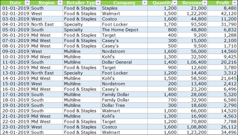
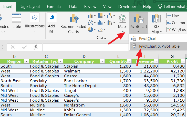
Suppose you have a sizable dataset like the one below, containing over 500 records across seven fields: Date, Region, Retailer Type, Company, Quantity, Revenue, and Profit.
Insert pivot table
To begin creating a pivot table, select all the cells in your dataset. Go to the Insert tab and click on PivotChart. Then, choose PivotChart & PivotTable from the dropdown menu.
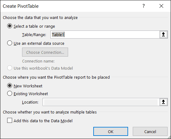
The ‘Create PivotTable’ dialog box will appear. Excel usually detects and fills in the correct range in the Table/Range field automatically. If not, manually select the appropriate table or cell range. Next, decide where you want to place the pivot table—either in a New Worksheet or an Existing Worksheet—and click OK.
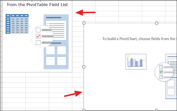
If you select New Worksheet, Excel will create a new sheet containing a blank pivot table and a pivot chart.
Build your pivot table
In the new worksheet, you’ll see an empty pivot table on the left and the PivotTable Fields pane on the right. This pane provides all the options you need to configure your pivot table.
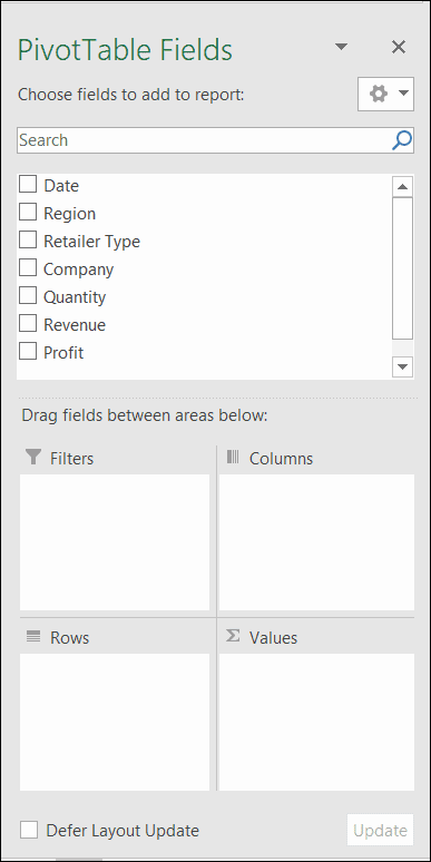
The PivotTable Fields pane is divided into two sections:
- The Fields Section at the top lists all the fields (columns) from your source data.
- The Layout Section at the bottom contains four areas—Filters, Columns, Rows, and Values—where you can drag and drop fields to build your pivot table.
Add fields to pivot table
To construct your pivot table, drag and drop fields from the Fields Section into the areas of the Layout Section. You can rearrange fields within these areas to change how your data is displayed.
Add rows
Let’s start by adding the Company field to the Rows area. Typically, non-numeric fields are placed in the Rows section. Simply drag the Company field into the Rows area.
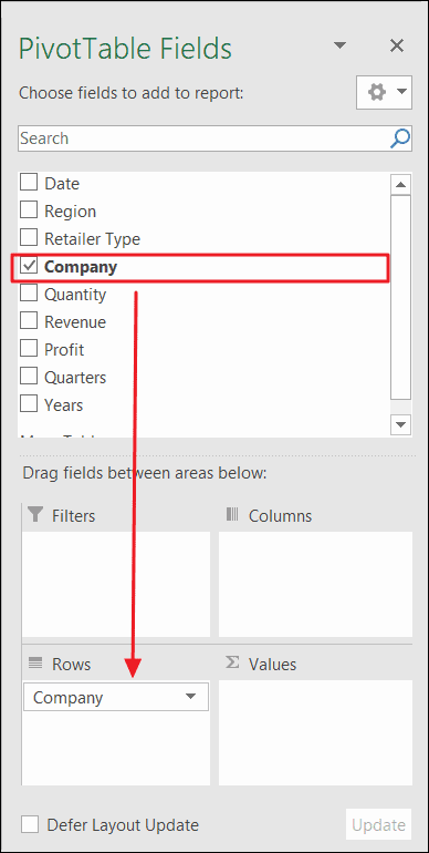
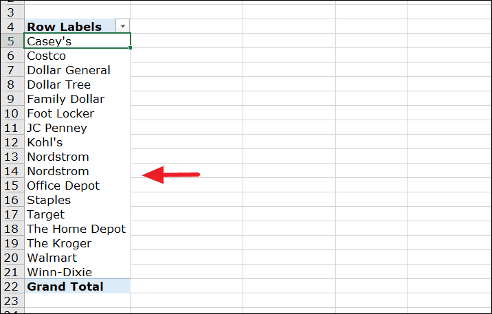
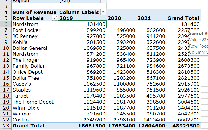
All the company names from your data source will now appear as row labels in the pivot table, sorted in ascending order by default. You can click the dropdown arrow next to Row Labels to change the sorting order if desired.
Add values
Now, to create a one-dimensional pivot table, we’ll add a value to accompany the row labels. For example, to calculate the total revenue for each company, drag the Revenue field into the Values area.
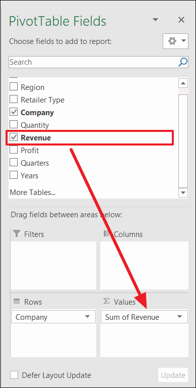
If you need to remove any fields from the pivot table, simply uncheck the box next to the field in the Fields Section.
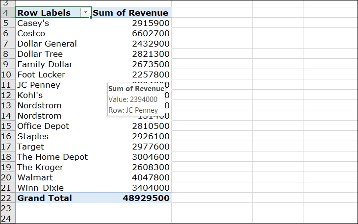
After adding the Revenue field to the Values area, your pivot table will display each company along with the sum of its revenues.
Add columns
Creating a two-dimensional table
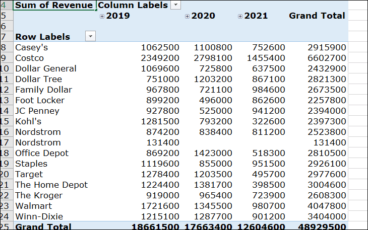
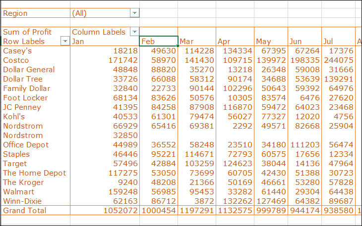
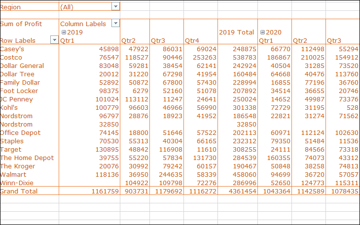
By adding fields to both the Rows and Columns areas, you can create a two-dimensional pivot table that displays data across two axes. For instance, if you want to see each company’s revenue broken down by date, you can add the Date field to the Columns area. Excel will automatically group the dates into Quarters and Years to help summarize the data.
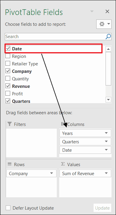
Now, your pivot table displays companies as rows and dates as columns, with revenue values filling the intersecting cells.
Add filters
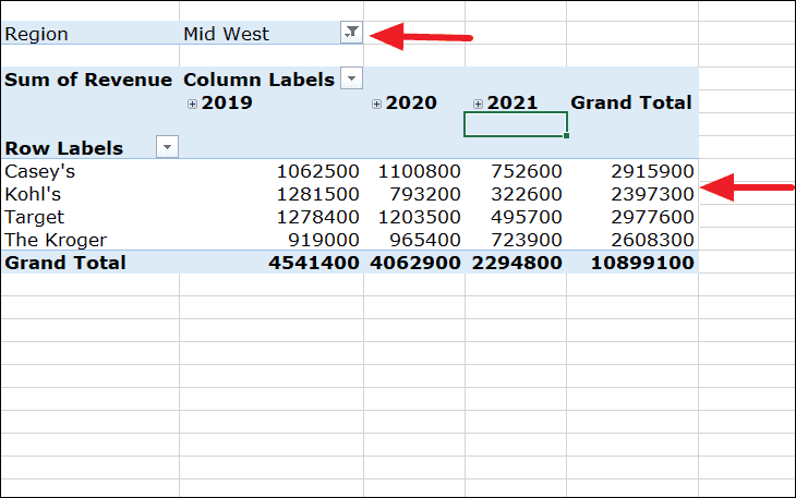
If you want to filter your pivot table to display data for specific regions, drag the Region field into the Filters area.
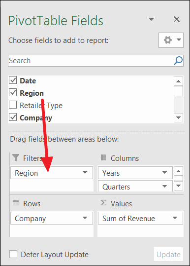
This adds a filter drop-down above your pivot table. You can use this to view data for individual regions or multiple regions. To select multiple regions, check the Select Multiple Items option at the bottom of the filter drop-down.
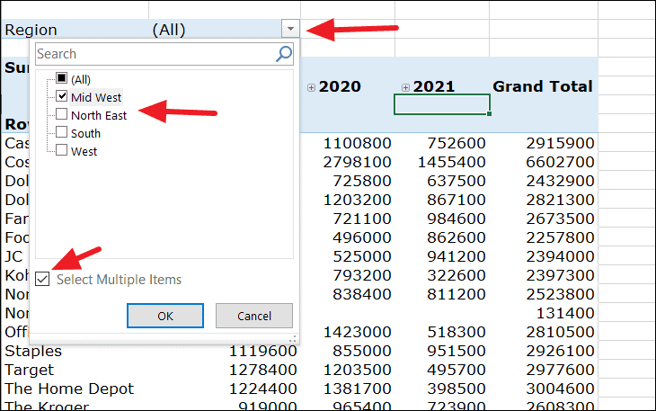
For example, after selecting the desired regions, your pivot table will update to display data only for those regions.
Sorting data
To sort the data in your pivot table, right-click on any value in the Sum of Revenue column. Hover over Sort and choose either Sort Smallest to Largest or Sort Largest to Smallest based on your preference.
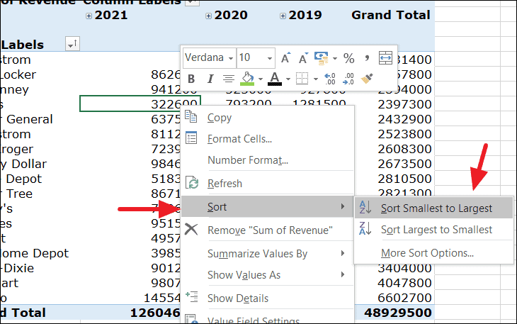
The pivot table will rearrange the data according to the selected sort order.
Grouping data
If your pivot table displays data by months but you’d prefer to see it grouped by financial quarters, you can adjust this setting. First, select the date columns in your pivot table, right-click, and choose Group from the context menu.
In the ‘Grouping’ dialog box, select Quarters and Years as the grouping criteria, then click OK.
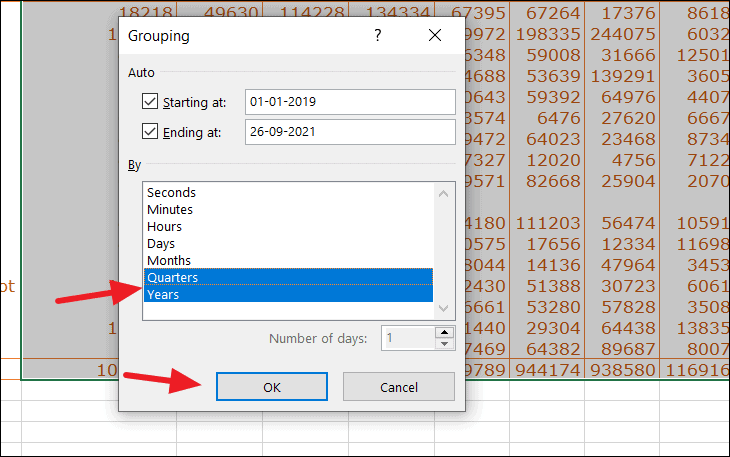
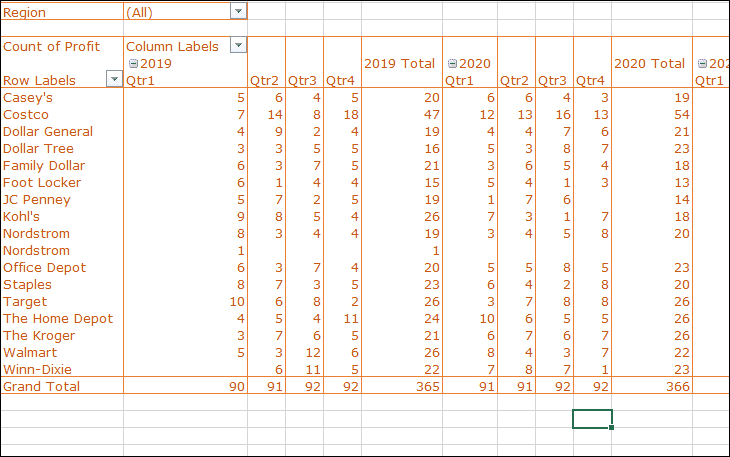
Your pivot table will now display data organized by financial quarters for each year.
Adjust value field settings
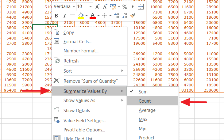
By default, pivot tables summarize numeric data using the Sum function. However, you can change the type of calculation used. To modify the summary function, right-click on any value in the pivot table, select Summarize Values By, and choose the desired calculation.
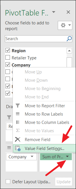
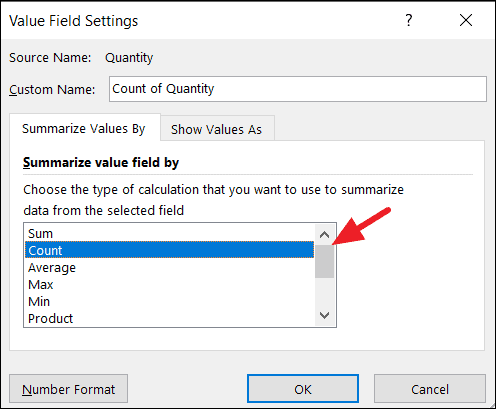
Alternatively, you can click the downward arrow next to the field in the Values area and select Value Field Settings.
In the ‘Value Field Settings’ dialog box, choose the function you want to use to summarize the data, then click OK. For instance, selecting Count will display the number of entries for each field.
The pivot table will update to reflect the new calculation.
Pivot tables also allow you to display values in different formats, such as percentages of the grand total, column total, or row total. This can provide additional insights into your data.
To display values as percentages, right-click on any value in the pivot table, select Show Values As, and choose the desired percentage calculation.
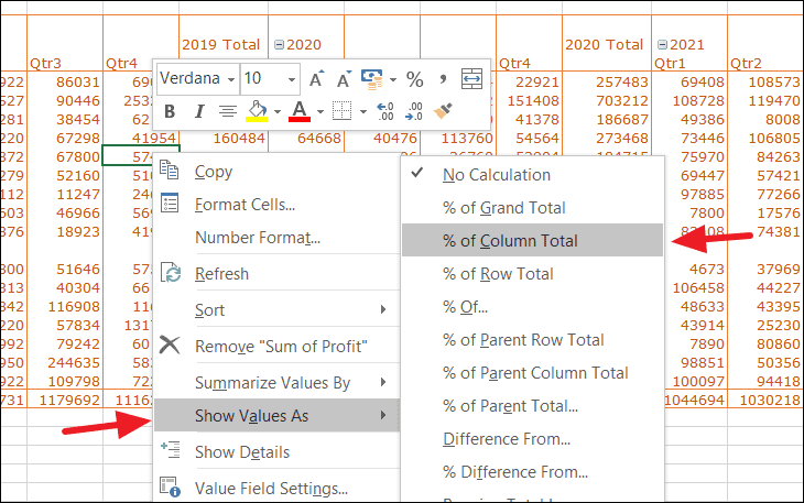
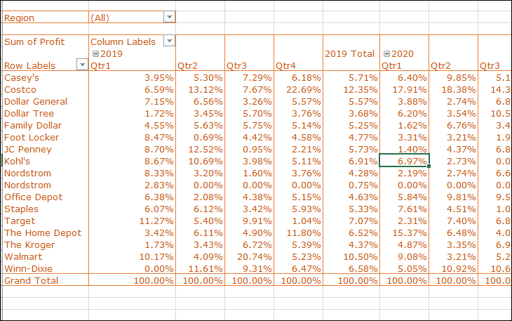
For example, selecting % of Column Total will display each value as a percentage of the total for that column.
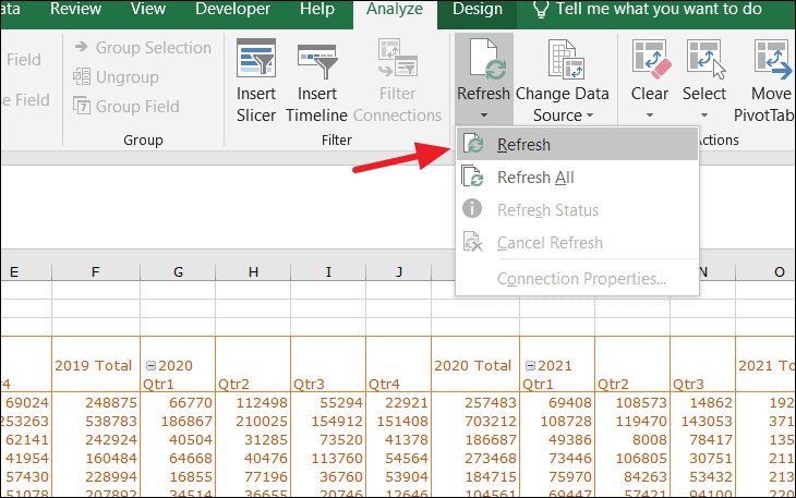
Refresh the pivot table
When changes are made to the source data, the pivot table does not automatically update. To refresh the pivot table and reflect any changes, click anywhere inside the pivot table, go to the Analyze tab, and click Refresh in the Data group. You can choose Refresh to update the current pivot table or Refresh All to update all pivot tables in the workbook.
You can also right-click within the pivot table and select Refresh from the context menu.
By following these steps, you can create pivot tables in Excel to efficiently summarize and analyze large datasets. Pivot tables are versatile tools that can provide valuable insights from your data.