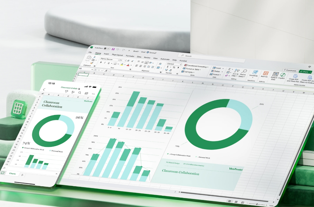
Microsoft Excel provides powerful tools to convert extensive data into clear and visually engaging graphs and charts. Instead of navigating through lengthy spreadsheets, creating a graph can simplify data analysis and presentation.
In Excel, ‘graphs’ and ‘charts’ are often used interchangeably, but they have distinct purposes. Graphs illustrate changes and trends over time, making them ideal for analyzing raw data or precise numbers. Charts represent large data sets and categories, which may or may not be related, and are commonly utilized in business presentations and survey results.
While the idea of creating graphs in Excel might seem challenging, the process is quite straightforward. The following steps outline how to transform your data into an informative graph.
Creating a graph in Excel
To start, input your data into Excel. This can be done by manually entering the data or importing it from another source.
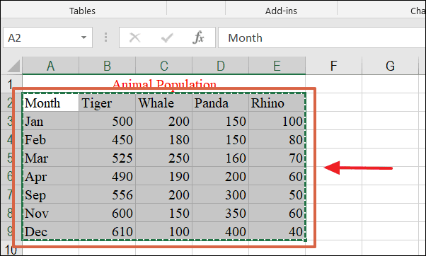
The sample data below will be used to demonstrate how to create and customize a graph.
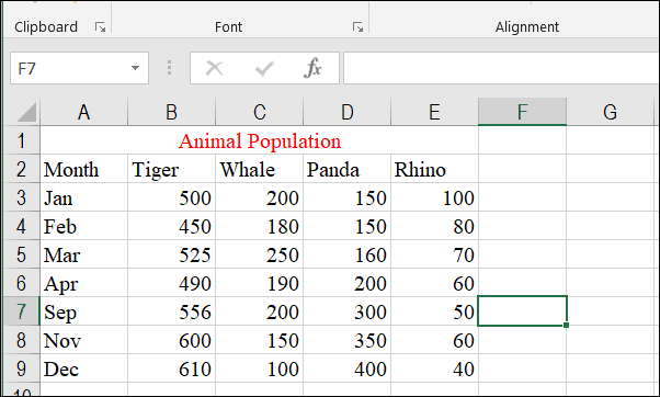
Select the data sets you wish to include in your graph by clicking and dragging across the relevant cells, as shown below.
Choosing a graph or chart
Determining the most suitable chart type for your data is crucial. Depending on the information, some data are best represented as 3D columns, others as 2D lines, or perhaps a pie chart.
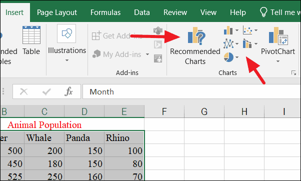
To select a chart type, go to the Insert tab at the top of the Excel window and locate the ‘Charts’ group. Here, you will find various chart types grouped into drop-down menus. Click on an icon to expand the menu and choose your desired chart. You can also click on the Recommended Charts icon to see suggestions from Excel based on your data.
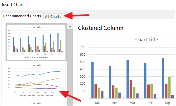
Click on any chart under the ‘Recommended Charts’ tab to preview how your data will appear. If none of the recommendations suit your needs, select the ‘All Charts’ tab to view all available chart types.
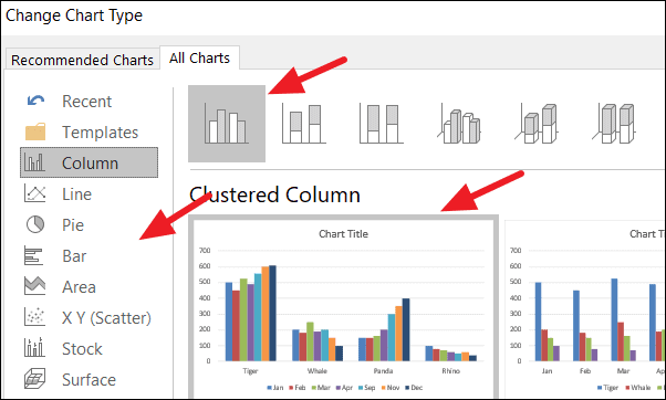
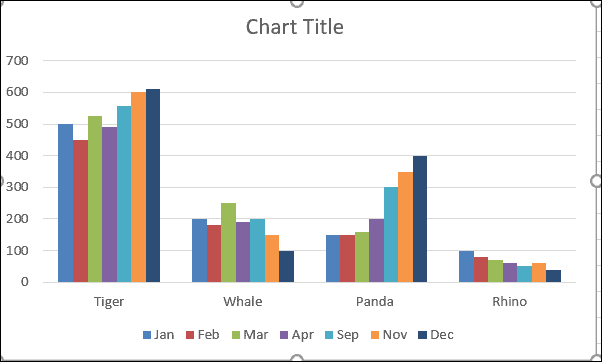
Choose the chart type on the left side and select the specific style on the right. For this example, the ‘Column’ chart type with the ‘Clustered Column’ style is selected. Remember, you can change the chart type later if needed.
After selecting your chart type, the graph will appear as shown below.
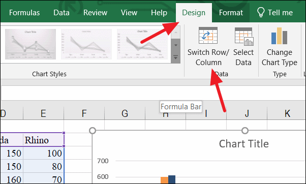
Switching data between X-axis and Y-axis
If the graph does not display your data as intended, you can switch the parameters on the X-axis and Y-axis. To do this, go to the Design tab and select the Switch Row/Column option. This will adjust the data representation on your graph.
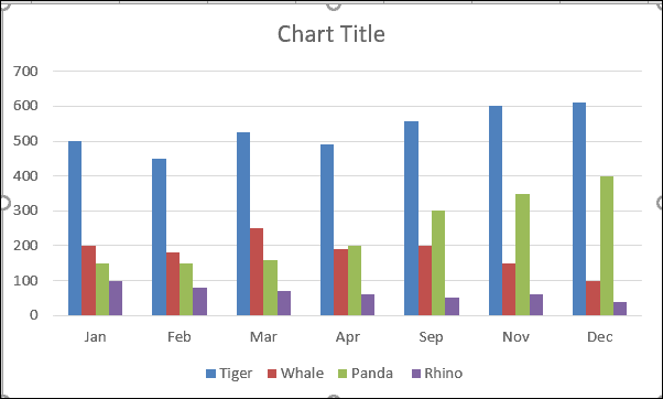
After switching the parameters, your graph may look like this:
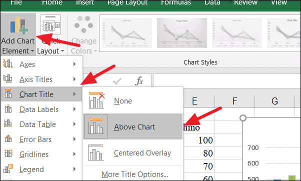
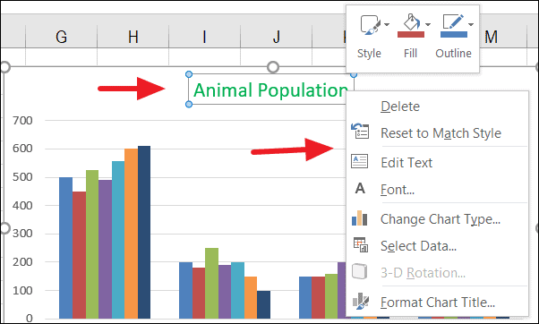
Adding a title to the chart
To add a title to your chart, navigate to the Design tab and click on Add Chart Element. Alternatively, you can click the plus sign next to the chart for quick access to chart elements. Expand the Chart Title option and choose either Above Chart or Centered Overlay to position your title.
To customize the appearance of your title, right-click on the title text and select Format Chart Title to access design options.
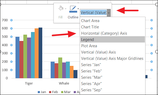
Formatting chart elements
To modify other chart elements, right-click on the specific element and choose the appropriate formatting option from the context menu. This allows for customization of various aspects of the chart, such as colors, fonts, and effects.
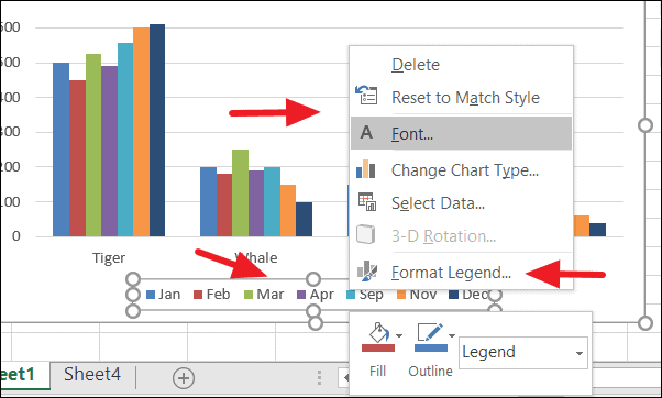
Formatting the legend
Adjusting the legend can enhance the readability of your chart. To format the legend, right-click on it and select Font to change the text style. Choosing Format Legend allows you to modify the position and effects of the legend within the chart.
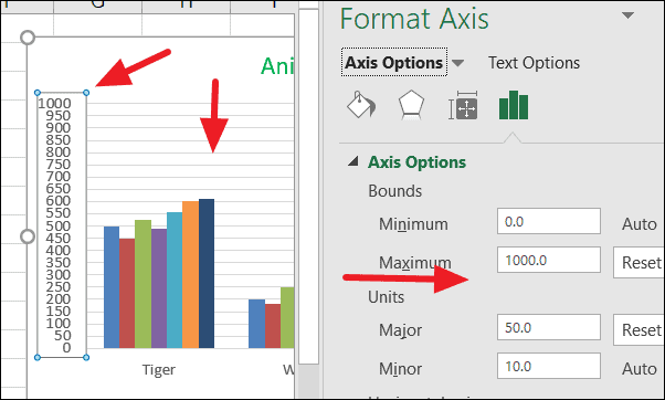
Formatting the axis
To change the values displayed on the Y-axis, right-click on the axis and select Format Axis to open the formatting pane. Under the Axis Options tab, you can adjust the Bounds and Units values to refine the scale of the axis.
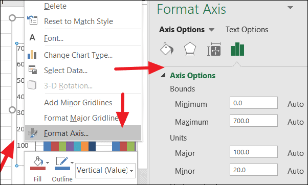
In this example, the Maximum value in ‘Bounds’ is set to 1000, and the Major unit in ‘Units’ is adjusted to 50. The changes will reflect on the chart as shown below.
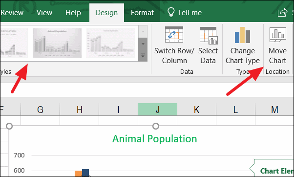
Moving the chart location
If you wish to move your chart to a different sheet within the same Excel document, go to the Design tab and click on Move Chart Location.
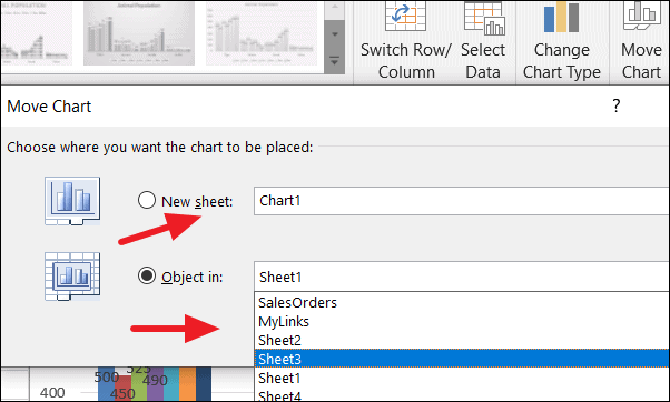
In the dialog box that appears, select the desired sheet from the dropdown menu next to Object in. If you choose New Sheet and provide a name, Excel will create a separate sheet exclusively for your chart.
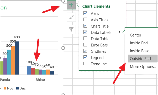
Adding data labels can draw attention to specific data series or points. To add data labels, click the plus sign next to the chart, expand the Data Labels option, and select the desired placement within the chart. In this example, choosing Outside End places the data labels at the outer ends of the data points.
By following these steps, you can create and customize graphs in Excel to effectively present your data.