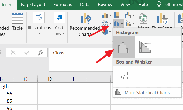
You can easily create a histogram using the Data Analysis ToolPak or the built-in histogram chart in Excel.
You can easily create a histogram using the Data Analysis ToolPak or the built-in histogram chart in Excel.
by Raj Kumar
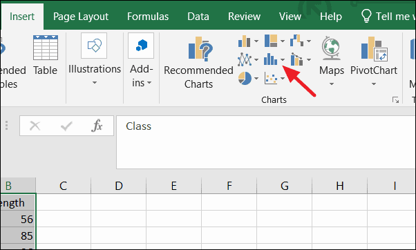
Creating a histogram in Excel is an effective way to visualize the frequency distribution of a dataset, enabling you to analyze patterns and trends within your data. Excel provides built-in tools that make generating histograms straightforward and customizable.
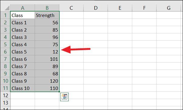
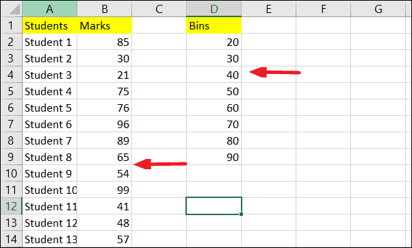
Begin by entering your dataset into an Excel worksheet. For instance, you might have a list of student scores or measurements collected from an experiment.
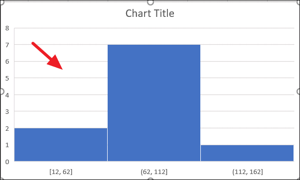
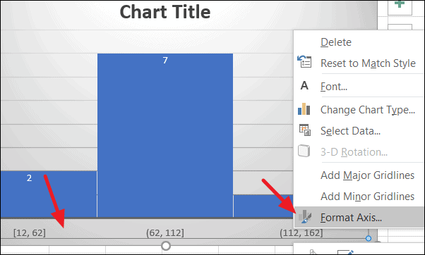
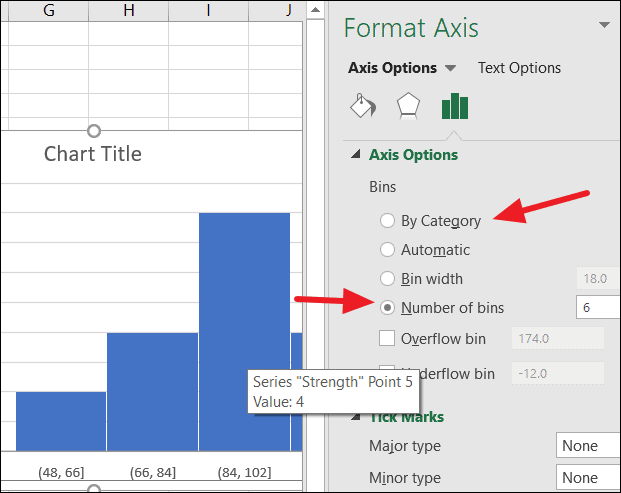
In the Format Axis pane, you can specify the bin width, number of bins, or define custom bin ranges to refine how the data is grouped.
For example, changing the number of bins to six will regroup the data accordingly.
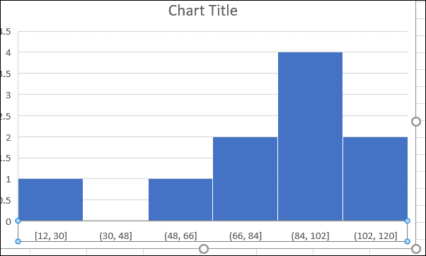
The updated histogram will reflect these changes:
Creating a histogram using the Data Analysis ToolPak
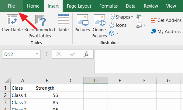
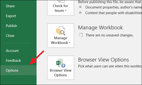
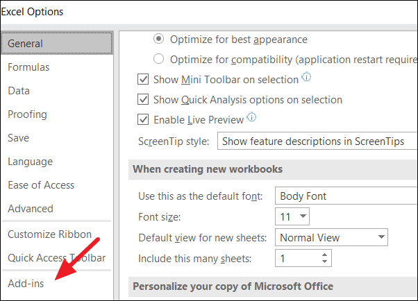
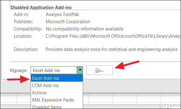
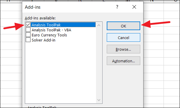
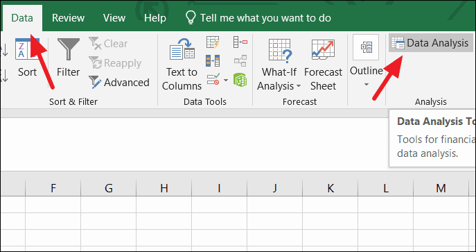
The Data Analysis ToolPak is an Excel add-in that provides advanced data analysis tools, including histogram creation. If you prefer using this method, you may need to install the ToolPak first.
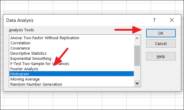
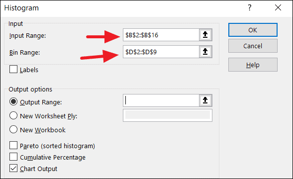
In the Histogram dialog window, specify the input range by selecting the cells containing your data. Next, define the bin range by selecting the cells with your bin intervals.
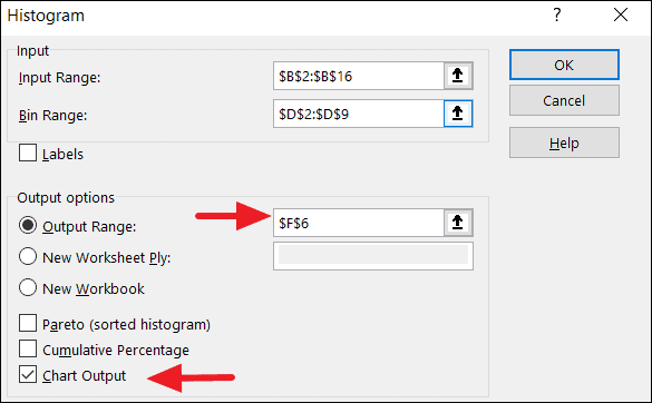
Choose an output range by clicking on the Output Range box and selecting a cell where you want the histogram data to appear. Check the Chart Output option and click OK.
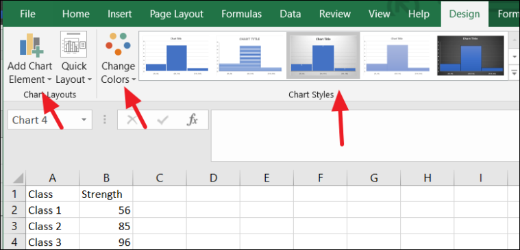
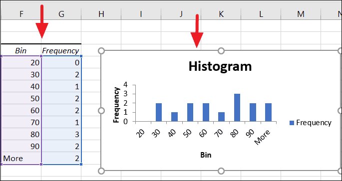
You can customize the histogram by editing axis titles, adjusting bin ranges, and modifying chart styles to better represent your data.
By utilizing Excel’s built-in chart features or the Data Analysis ToolPak, you can effectively create histograms to analyze and interpret your data distributions with ease.