Visualizing data trends over time is crucial for analyzing changes and making informed decisions. In Excel, line graphs offer a simple yet powerful way to represent data sequences and observe how values fluctuate across different periods.
A line graph displays data points connected by straight lines, illustrating value changes over intervals such as days, months, or years. It’s widely used in fields like marketing, finance, and scientific research to track progress and forecast future trends.
Creating and Customizing Line Graphs in Excel
Excel provides robust tools for creating line charts and offers extensive customization options to tailor them to your specific needs.
Preparing Your Data
Before constructing a line graph, organize your data appropriately in Excel. Your dataset should include at least two columns: one for the time intervals (e.g., months or years) and another for the corresponding values you wish to plot (e.g., sales figures or population numbers). This setup allows you to create a single-line graph.
If you have multiple data series to compare, include additional columns for each dataset. Excel will plot each series as a separate line on the same graph, enabling you to visualize multiple trends simultaneously.
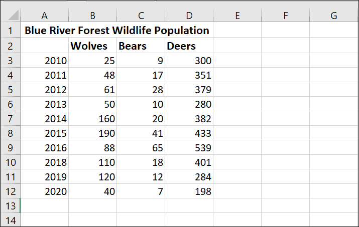
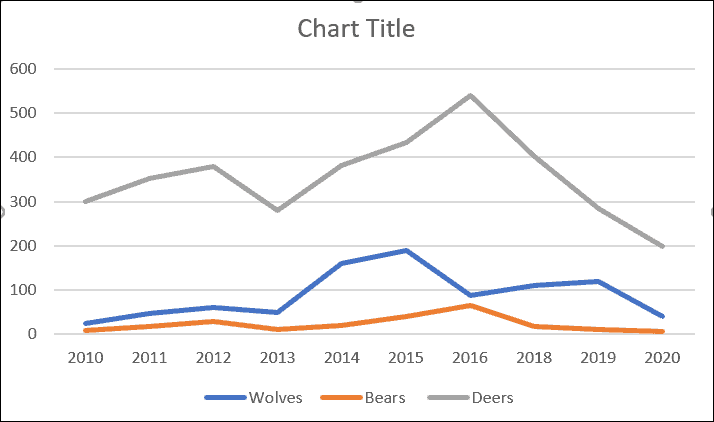
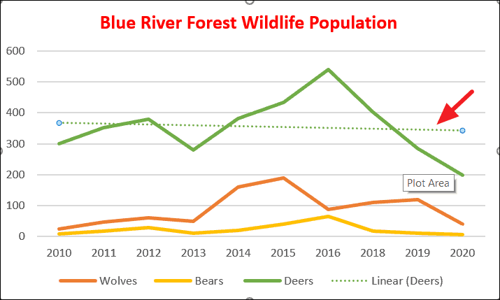
For instance, consider the following dataset representing wildlife populations in the Blue River forest over several years:

In this example, each column after the first represents a different animal species, and we will create a multi-line graph to compare their populations over time.
Inserting a Line Graph
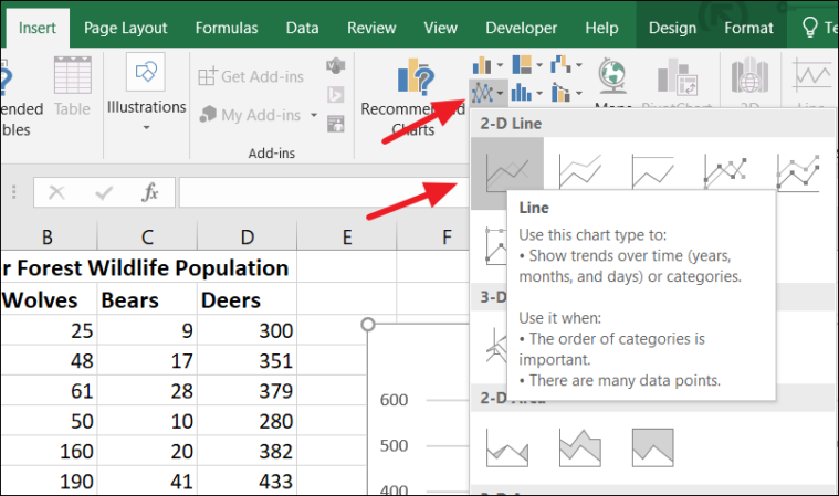
With your data prepared, you can now create the line graph. Begin by selecting the data range you want to include in the chart (e.g., A2:D12):
Navigate to the Insert tab on the Ribbon. In the Charts group, click on the Line Chart icon to display the available line chart types. Hover over each option to see a description and preview. Click on the basic 2-D Line chart to insert it into your worksheet.
Your data will now be represented in a line graph:
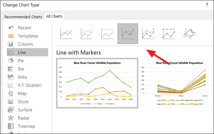
Types of Line Charts in Excel
Excel offers several types of line charts to suit different visualization needs:
Line: The standard 2-D line chart connects data points with straight lines, suitable for displaying trends over time for one or more data series.
Stacked Line: This chart shows the cumulative contribution of each data series at each point. Lines do not cross because each series is stacked on top of the previous one.
100% Stacked Line: Similar to the stacked line chart, but the Y-axis represents percentages totaling 100%. This is helpful for displaying the proportional contribution of each series over time.
Line with Markers: Includes markers on each data point, making it easier to see individual values along the line.
3-D Line: Provides a three-dimensional perspective to the line chart, which can enhance visual appeal but may make precise data interpretation more challenging.
Customizing Your Line Chart
After creating the line graph, you can customize various elements to enhance its readability and appearance.
Adding and Formatting the Chart Title
To give your chart a descriptive title, click on the default Chart Title text box on the graph. Click again to enter editing mode, delete the placeholder text, and type your desired title.
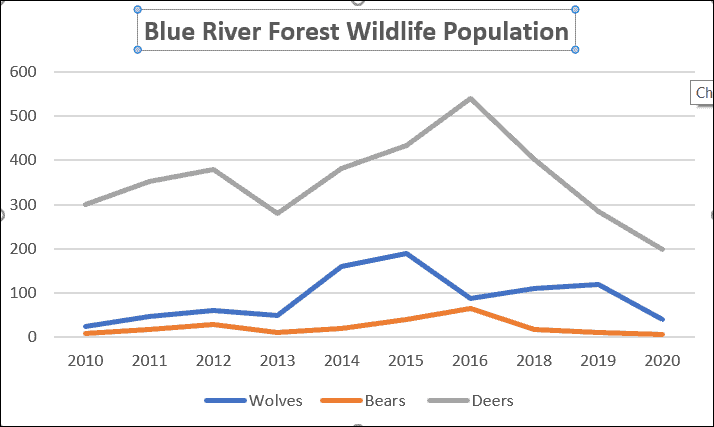
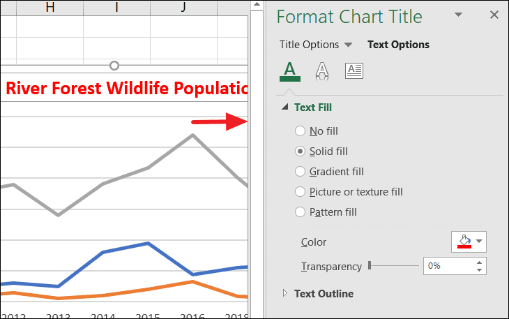
To format the title’s appearance, right-click on the title and select Format Chart Title, or double-click the title to open the formatting pane. Here, you can adjust settings like font style, size, color, and effects.
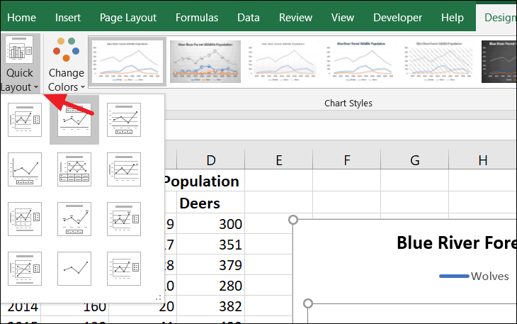
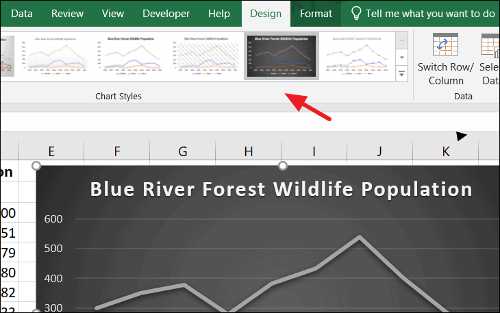
Modifying Chart Layouts, Styles, and Colors
Excel provides preset layouts and styles to quickly enhance your chart’s design. With the chart selected, go to the Design tab under Chart Tools. Click on Quick Layout to choose a predefined layout that adjusts elements like titles, legends, and data labels.
To apply a different style, select a chart style from the Chart Styles group on the same tab. These styles change the overall look of the chart, including line styles and background formatting.
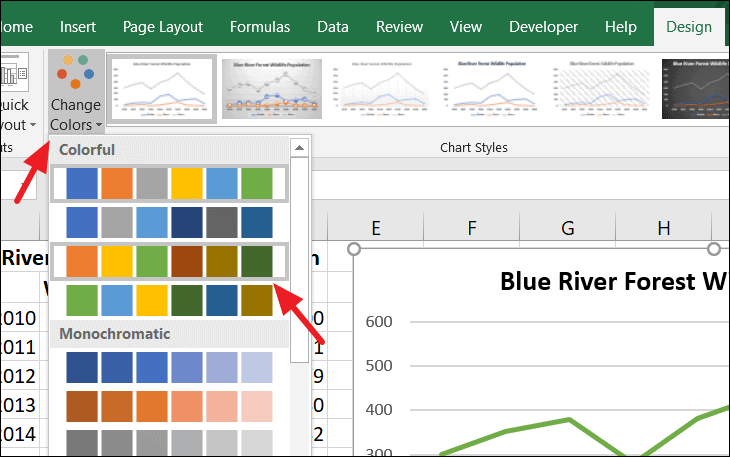
Adjusting Line Colors
To change the color scheme of your chart, click on Change Colors in the Chart Styles group under the Design tab. Select a color palette that suits your preference or corporate branding.
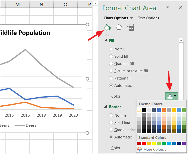
For more granular control, you can change the color of individual lines. Right-click on the specific line you wish to modify and select Format Data Series. In the formatting pane, under the Fill & Line tab, expand the Line options and choose a new color from the Color dropdown.
Changing the Chart Type
If you decide to present your data differently, you can change the chart type at any time. With the chart selected, go to the Design tab and click on Change Chart Type. Alternatively, right-click on the chart and select the same option.
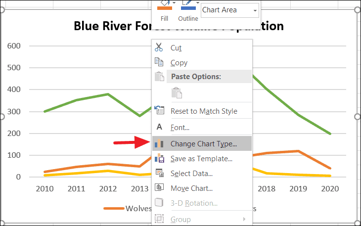
In the dialog box that appears, explore different chart templates and select the one that best fits your data presentation needs. Click OK to apply the new chart type.
Updating the Data Range
If you need to adjust the data included in your chart—perhaps to add new data series or exclude certain data points—you can modify the data range. With the chart selected, go to the Design tab and click on Select Data in the Data group.
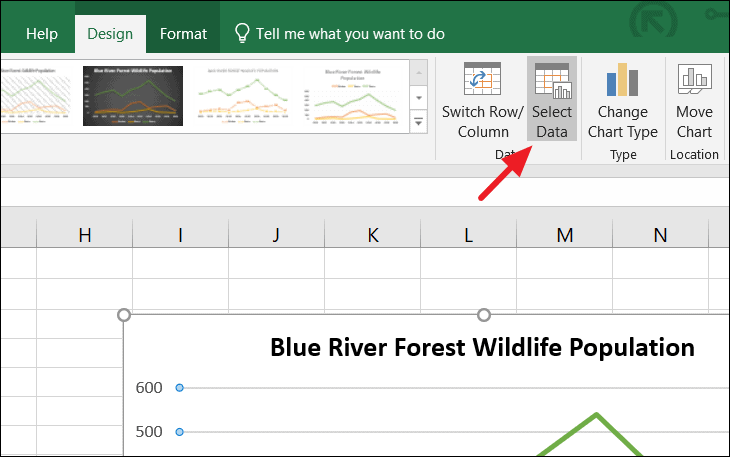
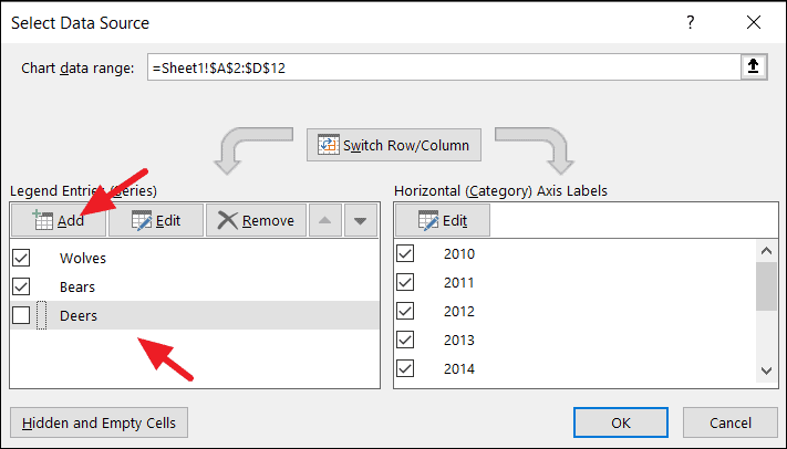
In the Select Data Source dialog box, you can add or remove data series, edit the data range for existing series, and switch the rows and columns if needed. After making your changes, click OK to update the chart.
Adding Trendlines
Trendlines help to emphasize patterns in your data by highlighting the general direction of data points. To add a trendline, click on the data series line you want to analyze. Then, click the green + icon that appears next to the chart to open the Chart Elements menu. Check the Trendline option, or click the arrow beside it for more options.
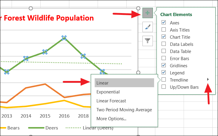
For additional customization, select More Options to open the Format Trendline pane. Here, you can choose the trendline type (e.g., Linear, Exponential) and adjust settings like line color and forecast periods. In this example, we’ll select a Linear trendline.

The chart now includes a trendline illustrating the overall direction of the data series:
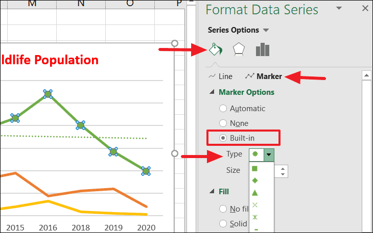
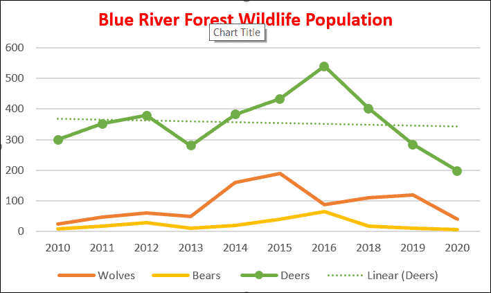
Adding Data Markers
Data markers can make individual data points more visible on your line graph. To add markers, click on the line in the chart to select the data series. Then, right-click and choose Format Data Series to open the formatting pane. Alternatively, you can double-click on the line.
In the formatting pane, go to the Fill & Line tab and expand the Marker section. Under Marker Options, select Built-in, and choose a marker type and size that suits your chart.
After applying markers, your chart will display symbols at each data point:
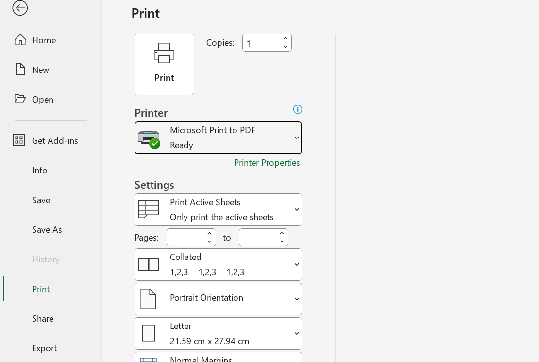
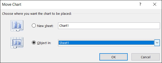
Moving the Line Chart to a Different Worksheet
If you want to place your chart in a different location, you can easily move it to another sheet. Right-click on the chart and select Move Chart.
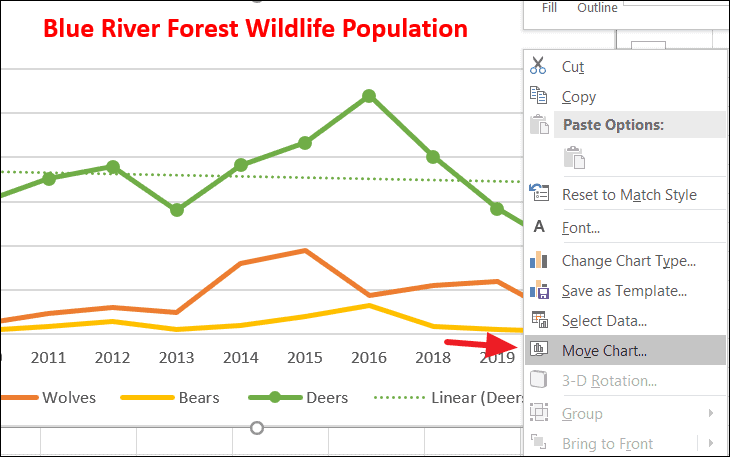
In the Move Chart dialog box, you can choose to place the chart as an object in an existing worksheet or move it to a new sheet. Make your selection and click OK to relocate the chart.
With these steps, you can effectively create and customize line graphs in Excel to visualize data trends and communicate insights clearly.