Pie charts are a popular choice for visualizing data because they offer a simple way to represent parts of a whole. Each segment of the circle reflects a proportionate value, giving a quick snapshot of the distribution within a dataset.
Unlike bar graphs or line charts that compare data across categories or over periods, pie charts focus on illustrating the relative sizes of data segments in a single dataset. They are most effective when you need to highlight the contribution of each category to the total.
In this guide, we’ll walk you through the process of creating and customizing a pie chart in Microsoft Excel.
Creating a pie chart in Excel
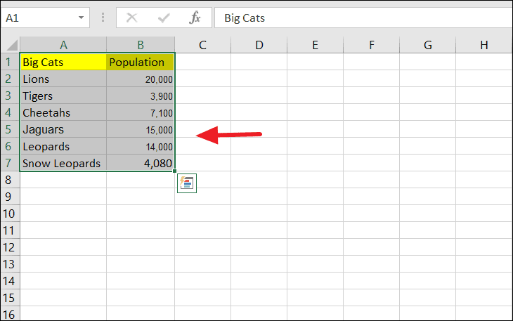
To begin, organize your data in a simple table format where the first column contains the categories (labels) and the second column contains the corresponding values.
For instance, let’s create a pie chart representing the population of various big cats in the wild:
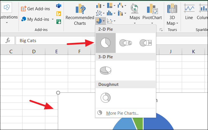
After setting up your dataset, select all the data in the table.
Next, navigate to the Insert tab on the Excel ribbon, and click on the pie chart icon within the Charts group.
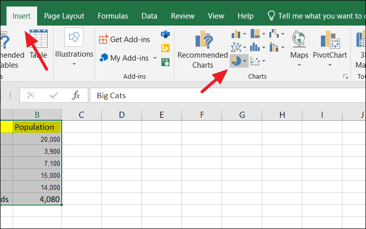
From the dropdown menu, select the type of pie chart you prefer. Hovering over each option provides a description and a preview. For this example, we’ll choose the 2-D pie chart.
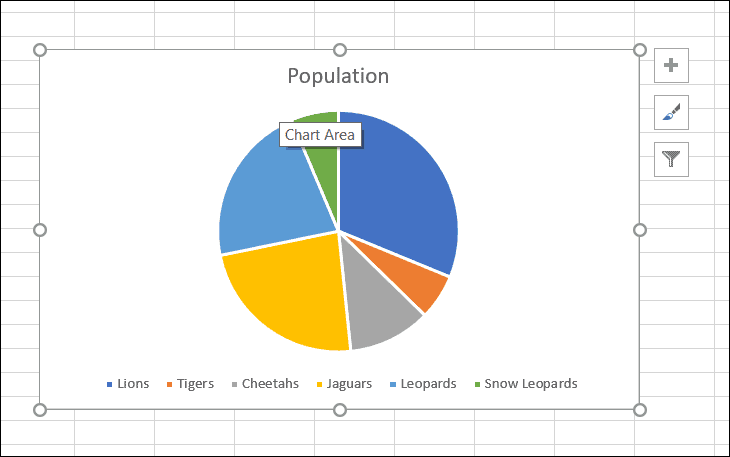
You should now see a basic pie chart displayed on your worksheet:
Customizing the pie chart in Excel
After creating the pie chart, you can customize various elements to enhance its appearance and readability.
Formatting data labels
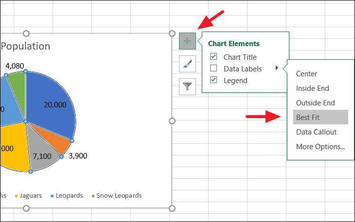
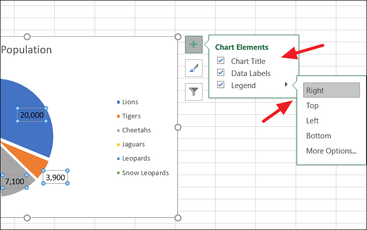
To add data labels to your chart, click on the chart to reveal the chart elements icons. Click the plus icon (Chart Elements) on the right side of the chart. Check the Data Labels option, and choose the placement of the labels as desired.
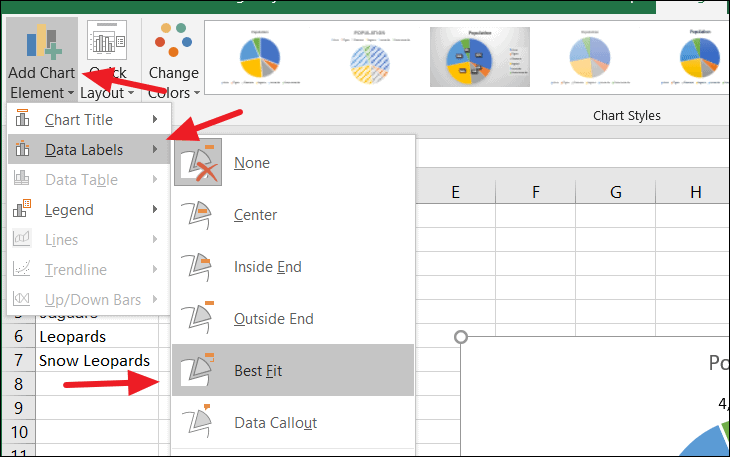
You can also access these options by selecting the chart and navigating to the Design tab, then clicking on Add Chart Element.
To adjust the position of the legend or the chart title, click the Chart Elements icon again, then select Legend or Chart Title and choose the preferred location.
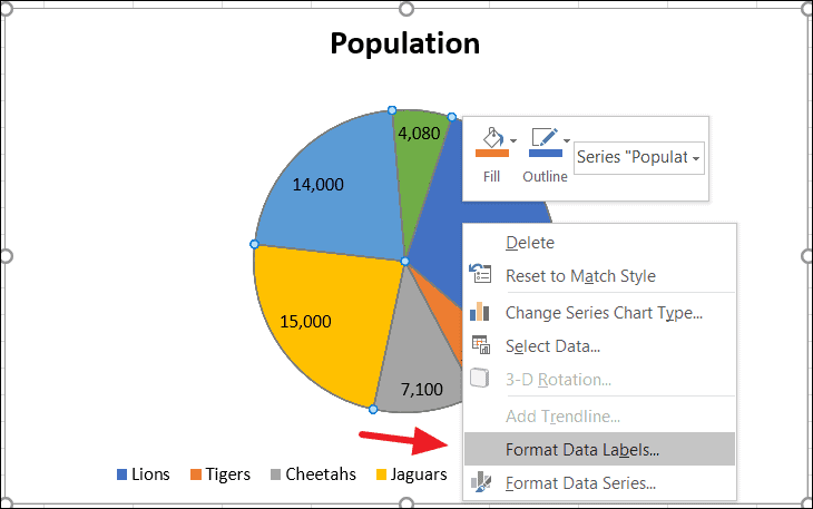
For more advanced formatting of data labels, right-click on any data label in the chart and select Format Data Labels.
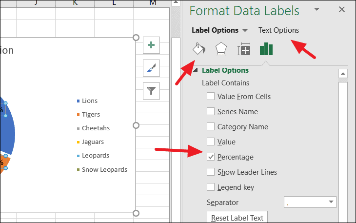
In the Format Data Labels pane, you can modify the size, alignment, color, and effects of the labels. Additionally, you can specify what information the labels display. For example, to show percentages instead of actual values, select the Percentage option and deselect Value.
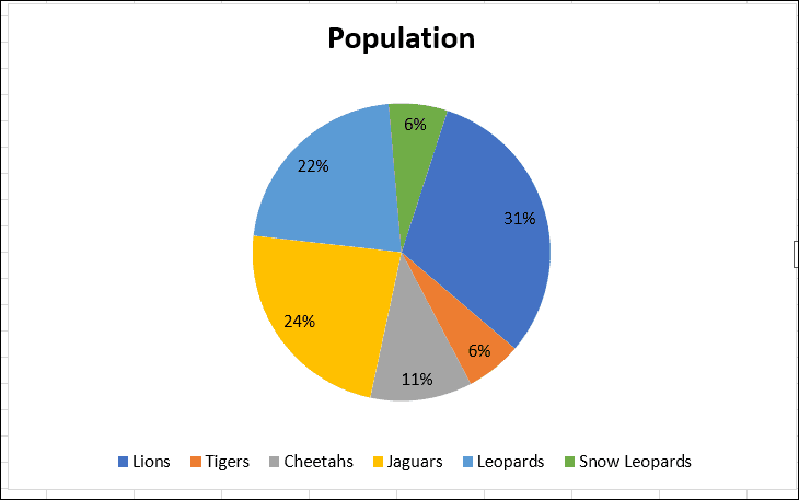
The data labels in the chart will now reflect percentages of the whole:
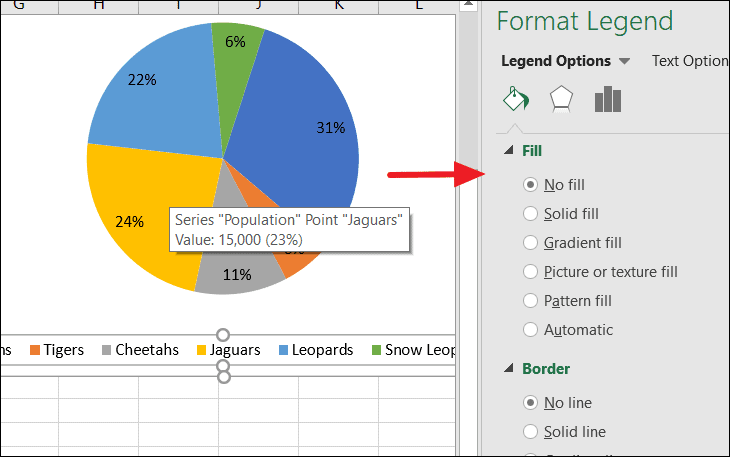
Customizing the legend
To format the chart legend, right-click on the legend area and choose Format Legend.
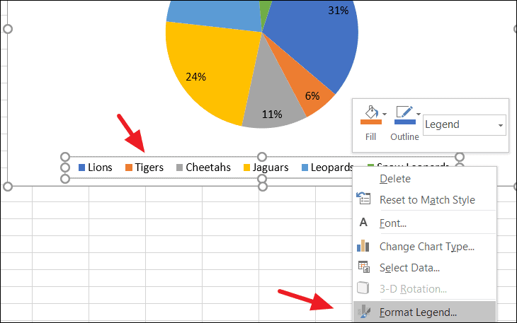
The Format Legend pane allows you to change the legend’s position, fill, border, and text styles to better suit your chart’s design.
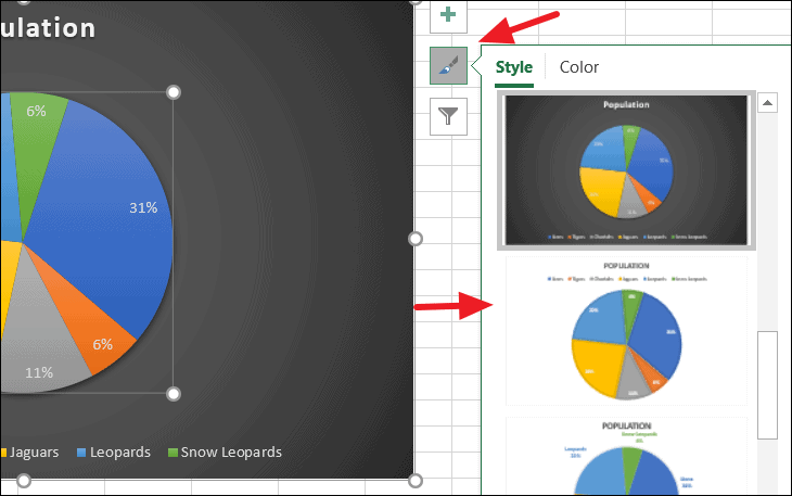
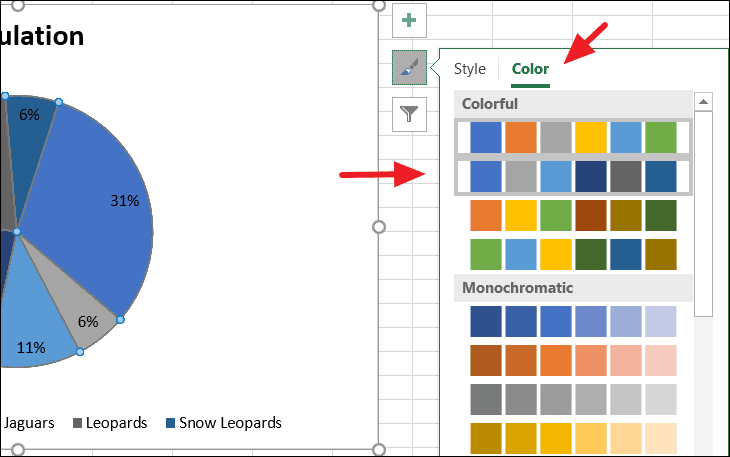
Adjusting chart style and colors
To change the overall style of your pie chart, click on the brush icon (Chart Styles) next to the chart. Under the Style tab, select from various predefined styles that adjust the chart’s appearance.
To modify the color scheme of the chart, switch to the Color tab within the same menu and choose a color palette that complements your data presentation.
Formatting the data series
The collection of slices in a pie chart is known as the data series. To format the entire series, right-click on any slice and select Format Data Series.
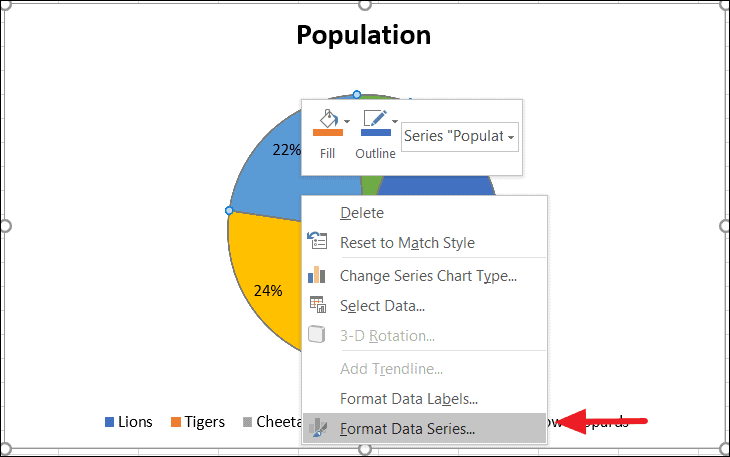
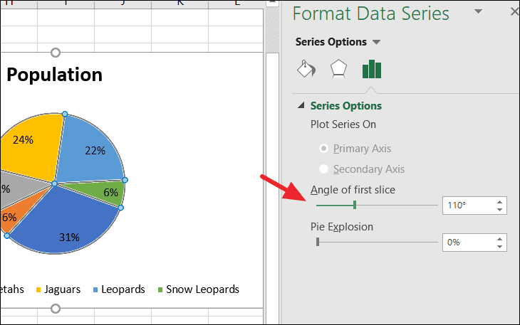
In the Format Data Series pane, under the Series Options tab, you can rotate the pie chart by adjusting the Angle of first slice. This changes the starting position of the first category in your chart.
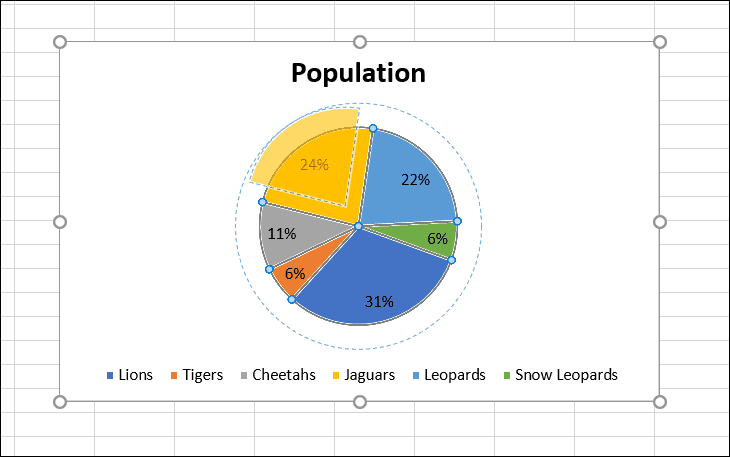
Exploding the pie chart
To emphasize all slices equally, you can “explode” the pie chart by separating all slices from the center. In the same Series Options tab, adjust the Pie Explosion slider to increase the spacing between slices.
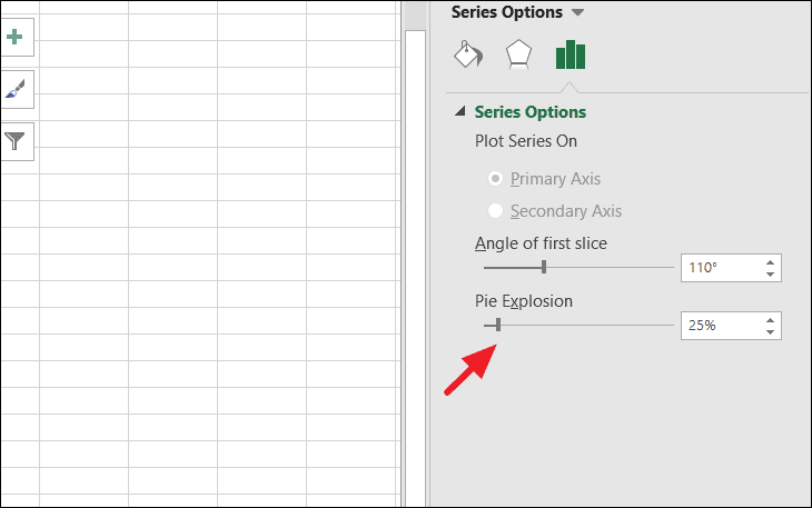
The pie chart will now display with the slices pulled apart from each other:
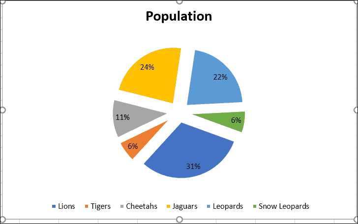
You can also achieve this effect manually by clicking on any slice and dragging it outward from the center of the chart.
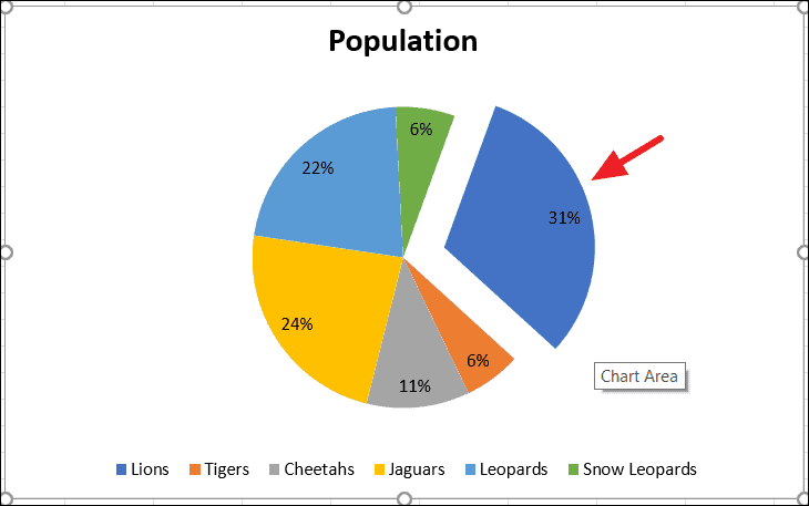
Highlighting a single slice
To draw attention to a specific category, you might want to explode just one slice of the pie chart. Double-click on the slice you wish to highlight to select it individually, then click and drag it away from the center of the pie.
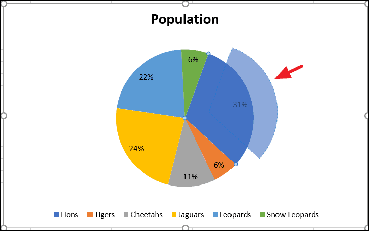
The selected slice will now stand out from the rest of the chart:
Formatting individual data points
You can customize each slice of the pie chart separately. To format an individual data point, double-click on the specific slice and choose Format Data Point from the context menu.
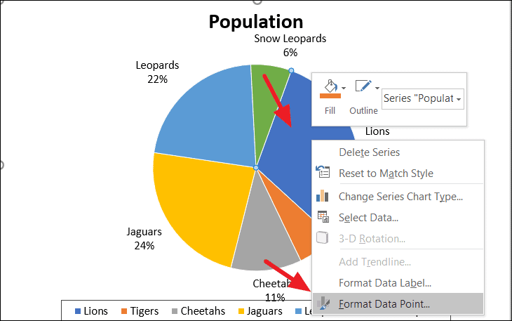
This allows you to change the fill, border, and effects for that particular slice, giving you control over its appearance.
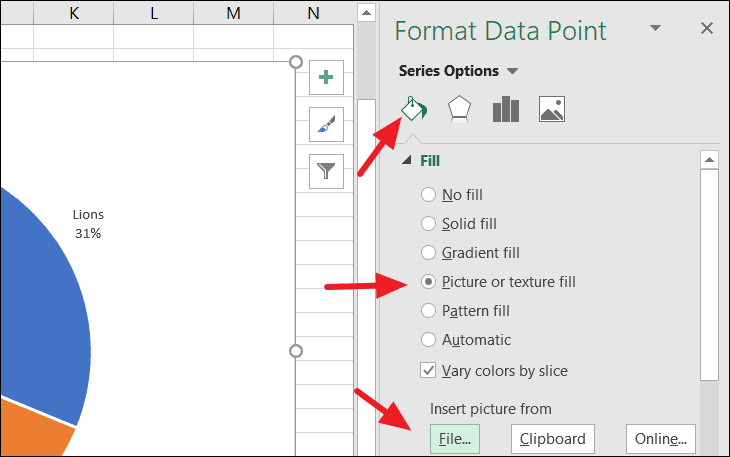
Adding images to pie slices
To make your pie chart more visually engaging, you can fill slices with images instead of solid colors. In the Format Data Point pane, under the Fill & Line tab, select Picture or texture fill. Then, choose an image by clicking Insert and selecting a file from your computer, clipboard, or an online source.
This technique can enhance the visual appeal of your chart:
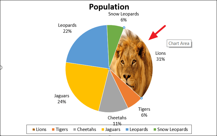
Apply these steps to each slice to complete your customized pie chart. The final result might look something like this:

By following these steps, you can create and personalize a pie chart in Excel to effectively represent your data.