Scatter plots are invaluable for demonstrating the relationship between two numerical variables. Known also as XY graphs, scatter charts, or scattergrams, they plot data points on two axes to show how one variable influences another.
Excel offers powerful tools to create scatter plots, allowing for easy visualization of correlations. For example, scatter charts can help analyze whether investments correlate with profits, smoking is linked to cancer, or increased study time leads to higher exam scores.
A scatter chart assigns the independent variable to the horizontal (X) axis and the dependent variable to the vertical (Y) axis. Here’s how to create and customize a scatter plot in Excel.
Creating a scatter plot
Begin by preparing a data set with two sets of numerical data in separate columns. Since scatter charts depict relationships between quantitative variables, it’s important to organize your data correctly.
Place the independent variable—the one that predicts or influences outcomes—in the left column. This ensures it will be plotted on the X-axis. The dependent variable, which is affected by the independent variable, should be in the right column so it will appear on the Y-axis.
Example: A local beverage shop tracks the number of cool drinks sold against the afternoon temperature over the last 13 days. The sales figures are compiled as follows:
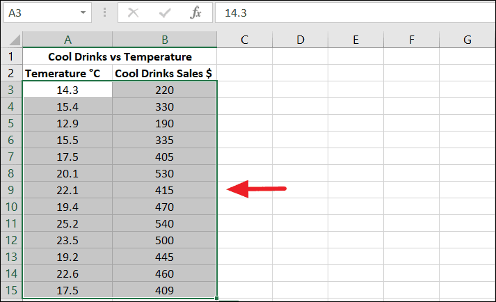
First, select the two columns containing the data, as shown in the image above.
Next, navigate to the Insert tab. In the Charts group on the Ribbon, click the Scatter icon. From the drop-down menu, select the desired chart type.
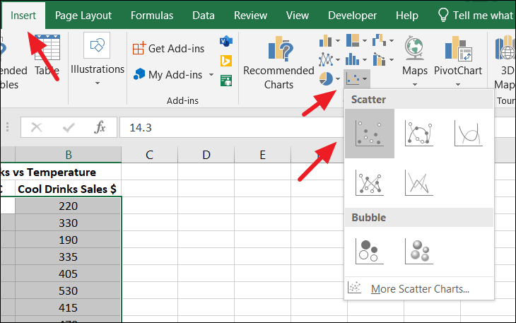
You can choose from various chart types such as Scatter, Scatter with Smooth Lines and Markers, Scatter with Smooth Lines, Scatter with Straight Lines and Markers, Scatter with Straight Lines, Bubble, or 3-D Bubble.
For this example, select the basic Scatter chart option.
Formatting axes on the scatter chart
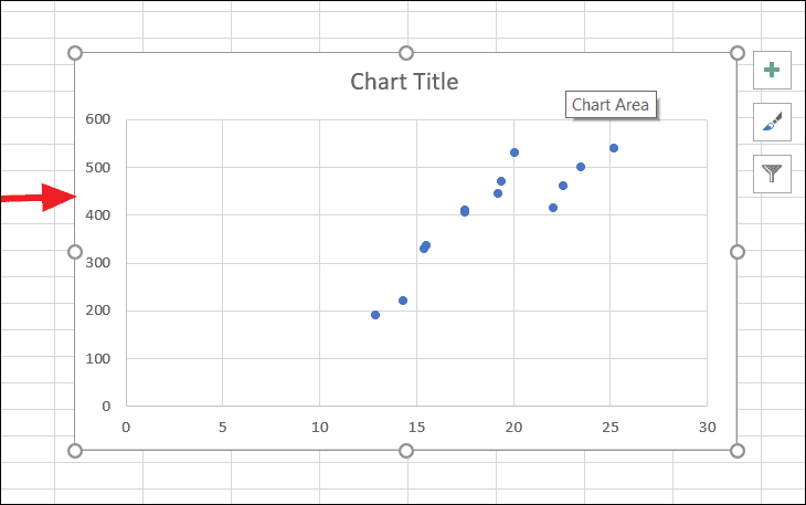
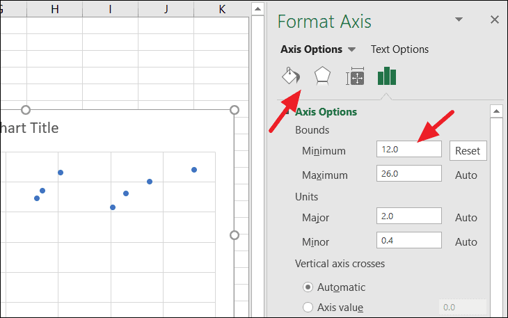
After creating the chart, you may notice gaps before the first data point on both axes. This can be adjusted in the Format Axis pane. To reduce the gap on the horizontal axis, right-click on the X-axis and select Format Axis from the context menu.
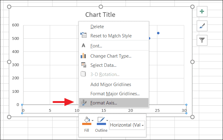
The Format Axis pane will appear on the right side of the Excel window. Here, you can modify various axis options. Under the Bounds section, change the minimum value to reduce the gap. For instance, set the minimum value to 12 for the X-axis.
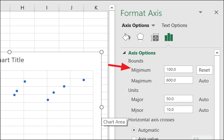
To adjust the gap on the vertical axis, click directly on the Y-axis. The Format Axis pane will automatically update to show the options for the selected axis. Change the minimum value under Bounds; for example, set it to 100.
Adjusting these values reduces the gaps, resulting in a more precise scatter plot.
Adding elements to the scatter chart
Enhance your chart by adding or removing specific elements like Axes, Axis Titles, Data Labels, Error Bars, Gridlines, Legend, or Trendline. Use the floating + button at the top right corner of the chart or access these options from the Design tab. To add titles to the axes, click the + button, expand Axis Titles, and check both Primary Horizontal and Primary Vertical boxes.
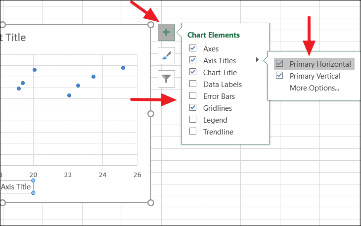
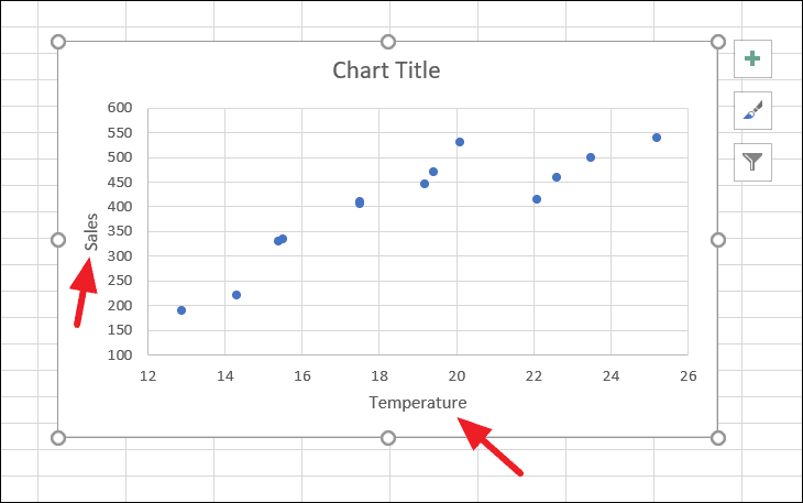
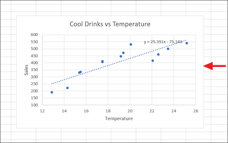
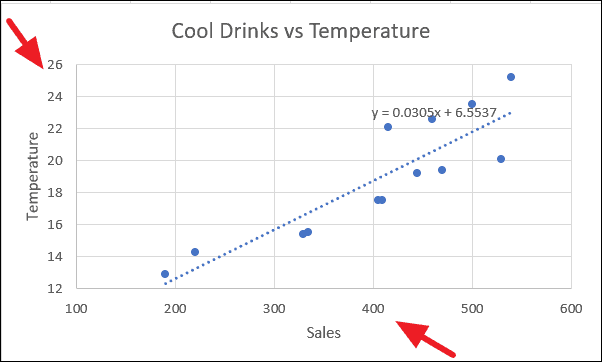
After adding the titles, you can label the X-axis as Temperature and the Y-axis as Sales.
Adding a trendline and equation to the scatter chart
A trendline helps in understanding the data’s direction and trend. To add a trendline, click the + button on the top right side of the chart. Then, check the Trendline option and choose the desired type. Select the Linear trendline for this example.
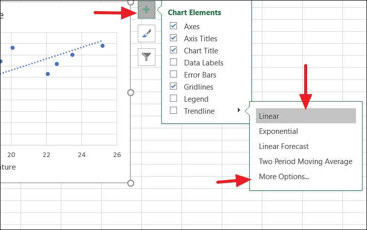
To display the equation of the trendline, which shows the mathematical relationship between the variables, click on More Options under the Trendline menu.
The Format Trendline pane will open on the right side. Alternatively, right-click on the trendline and select Format Trendline. In the pane, check the Display Equation on chart box.
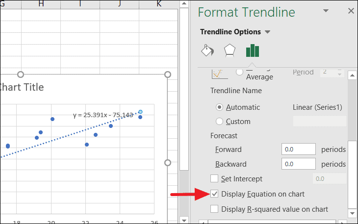
The trendline and its equation will appear on the chart, providing a clear representation of the data’s relationship.
If you’re curious about how different elements affect the chart, hover your mouse over an option, and a preview will display the changes.
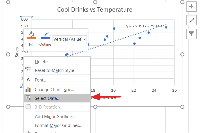
Switching axes on a scatter plot
By default, scatter charts plot the independent variable on the X-axis and the dependent variable on the Y-axis. If you need to switch these axes, you can do so easily. Right-click on either axis and select Select Data from the context menu.
In the Select Data Source dialog box, click the Edit button.
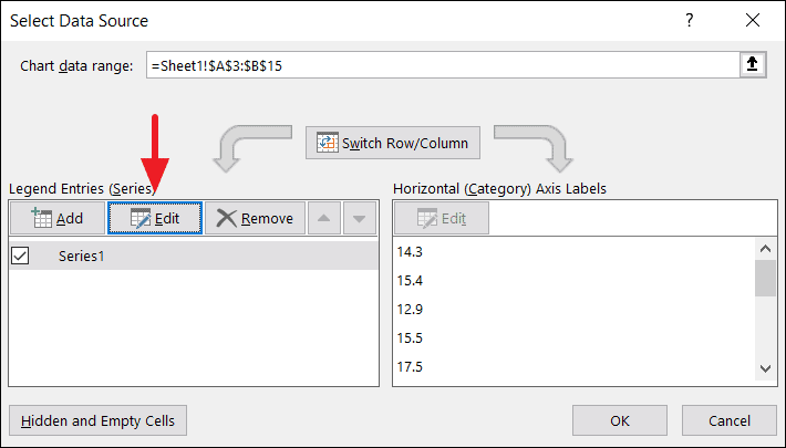
The Edit Series dialog will open. Here, swap the values in the Series X values and Series Y values fields.
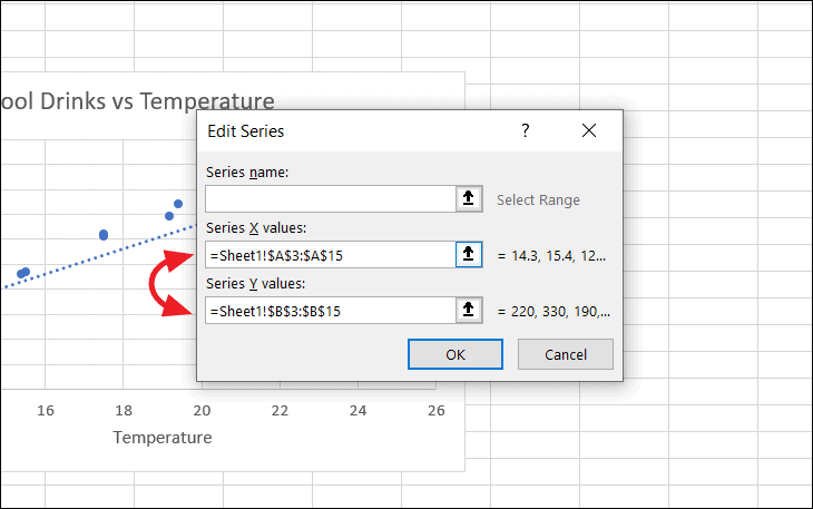
Click OK to close both dialog boxes. The variables on the axes will switch places, altering the chart accordingly.
Formatting the scatter chart
After setting up the chart, you can customize its appearance to make it more informative and visually appealing. You can modify colors, sizes, effects, text formatting, and chart styles. For instance, to change the colors of the data points (dots) on the chart, right-click on any of the dots and select Format Data Series from the context menu.
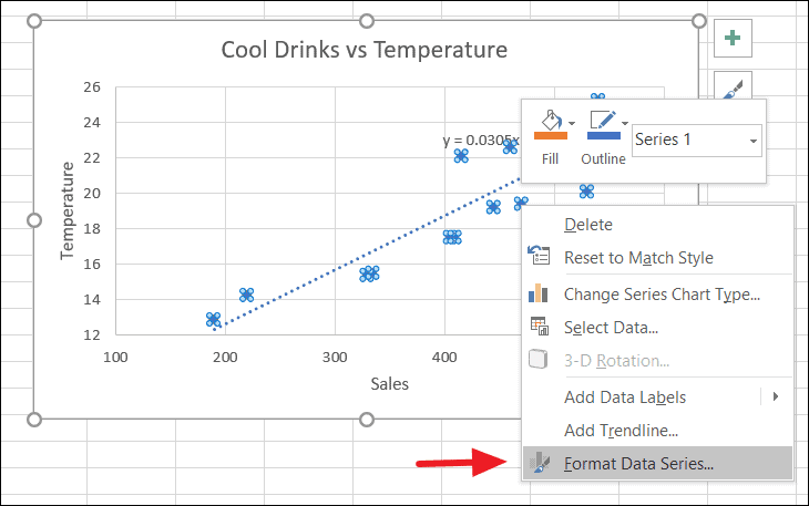
In the Format Data Series pane, click on the Fill & Line tab under Series Options, then select the Marker option. Under the Fill section, check the Vary colors by point box.
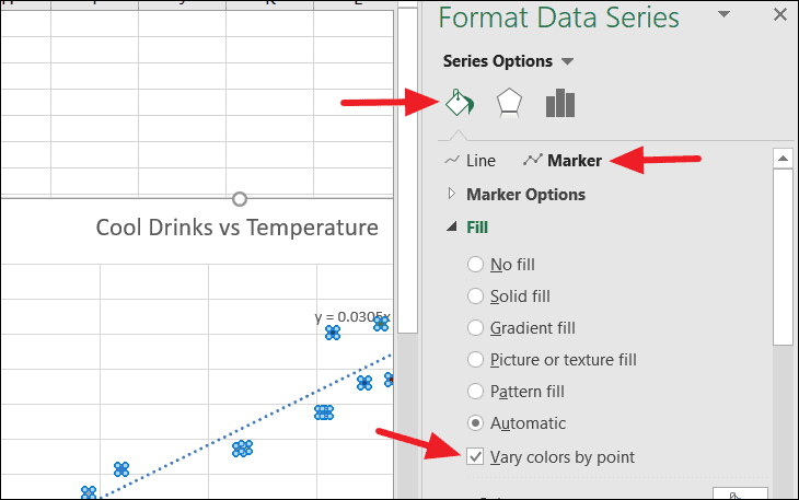
This will assign different colors to each data point, making them easier to distinguish.
To adjust the size of the data points, expand the Marker Options section under Marker. Choose Built-in and then increase the size value as desired.
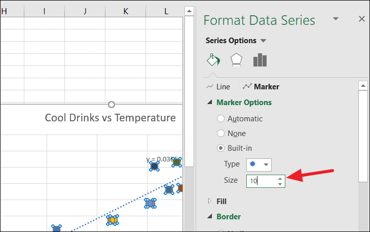
Modifying this value will change the size of the dots on the chart.
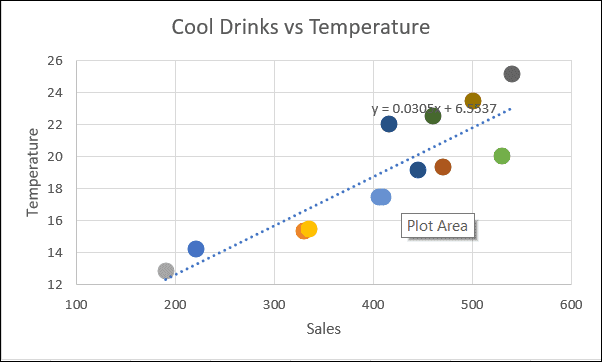
Now, the scatter plot is fully customized and provides a clear visualization of the data relationship.
Creating a scatter plot in Excel is a straightforward process that offers valuable insights into the relationship between variables. By customizing and formatting the chart, you can enhance its effectiveness and make your data analysis more impactful.