Building a clear organizational chart in Microsoft Excel simplifies management, clarifies reporting relationships, and streamlines onboarding for new employees. Excel offers several effective ways to generate org charts, from quick visualizations with SmartArt to more advanced, data-driven diagrams that update automatically as your employee list changes. Selecting the right method depends on your team size, update frequency, and need for automation.
Method 1: Creating an Organization Chart Using SmartArt in Excel
Insert tab in the ribbon, then select SmartArt. This opens the SmartArt Graphic gallery, which offers a range of diagram types.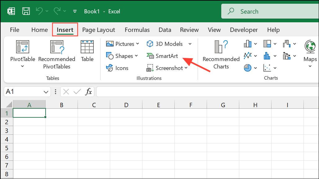
Hierarchy category from the sidebar on the left. Choose the layout labeled “Organization Chart” or a similar hierarchy style. Click OK to insert the chart into your worksheet.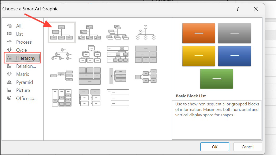
Enter to add new lines within a shape if you need to display multiple data points for each employee.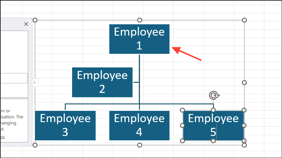
Ctrl+Click on Mac) on any item on the list and select options to promote or demote. Alternatively, use the + button in the SmartArt Text pane to insert new positions at the desired level.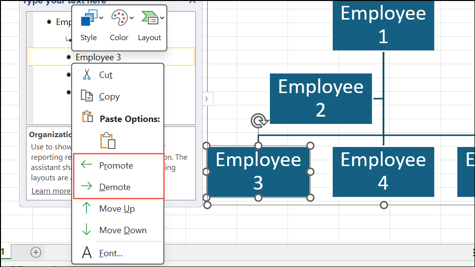
SmartArt Design tab. Here, you can change color schemes, apply different shape styles, and modify the hierarchy layout to improve readability. For further adjustments, use the Format tab to update font styles, sizes, and shape borders.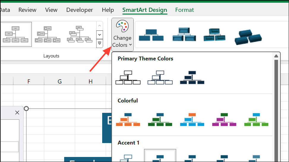
SmartArt is best for small to medium-sized teams or when you need a quick visual without complex data integration. However, updating the chart for new hires or role changes requires manual editing, which can become time-consuming as your organization grows.
Method 2: Building an Organization Chart from an Employee List in Excel
This approach is useful when you already maintain employee data in Excel and want to quickly visualize the hierarchy. However, changes in the data table do not automatically update the chart—you’ll need to manually adjust the SmartArt diagram each time your team changes.
Method 3: Automatically Generating and Updating Org Charts from Excel Data (Advanced)
For larger organizations or teams with frequent personnel changes, automating org chart creation saves significant time. While Excel does not natively support fully automated org chart generation, you can achieve this with add-ins, VBA scripts, or by integrating with Microsoft Visio.
Data Visualizer add-in for Excel (available in newer versions of Office or via Microsoft 365) or Microsoft Visio. In Visio, select File > New > Organization Chart and choose the option to create a chart from an existing data source. When prompted, point to your Excel file and map the required fields (employee name, unique identifier, manager).Data > External Data > Refresh All to pull in the latest changes.Automated org chart generation is ideal for organizations with dynamic teams or when accuracy and efficiency are critical. The initial setup may require additional steps or software, but ongoing maintenance becomes much simpler.
Tips for Maintaining and Updating Organization Charts in Excel
- Store your employee data in a structured table to make updates easier.
- Use unique identifiers for employees and managers to prevent errors in reporting lines.
- For frequent changes, opt for automated or semi-automated solutions to avoid repetitive manual edits.
- Leverage Excel add-ins or integrate with Visio for advanced features and easier updates.
- Regularly review your org chart for accuracy, especially after onboarding or restructuring.
Whether you need a quick visual or a fully automated org chart, Excel offers flexible solutions for every team size. Choose the method that fits your workflow and enjoy clearer, more organized reporting structures.