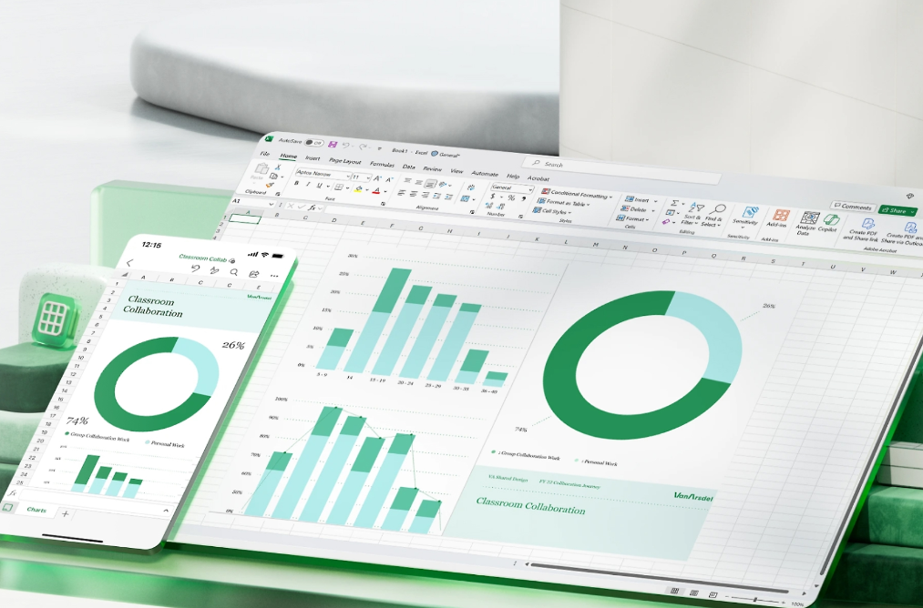
Conditional formatting in Excel provides a direct way to visualize task or project completion with progress bars, making spreadsheets more informative and actionable. By converting percentage or numeric completion data into visual bars, you can quickly gauge status, spot bottlenecks, and prioritize work. Below are detailed instructions on the most effective ways to create progress bars in Microsoft Excel, including built-in data bars, custom formulas, and chart-based solutions.
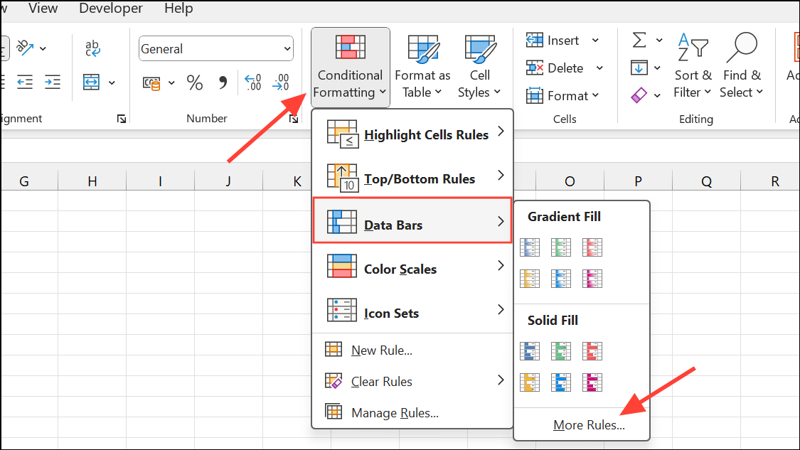
Creating Progress Bars with Conditional Formatting Data Bars
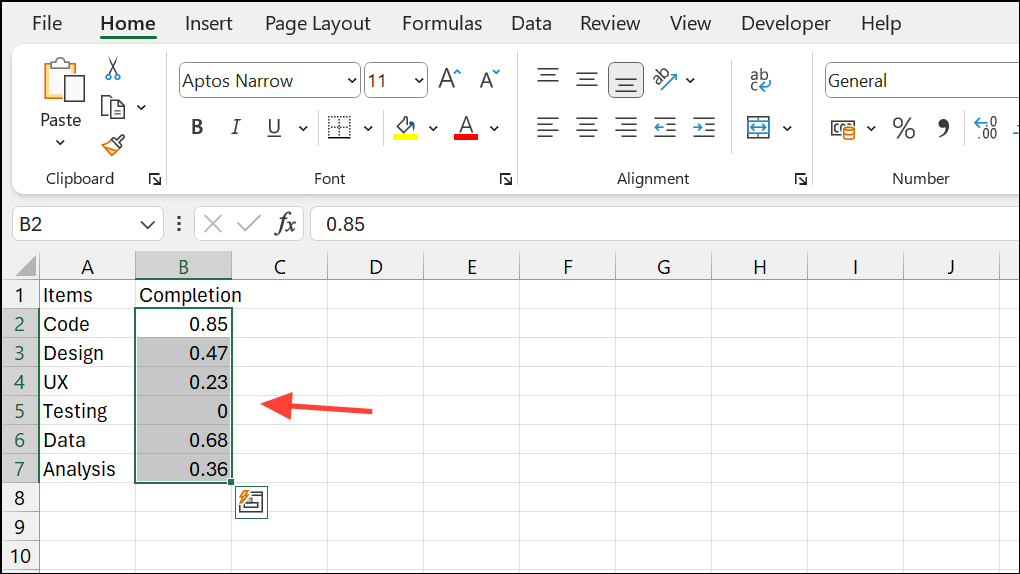
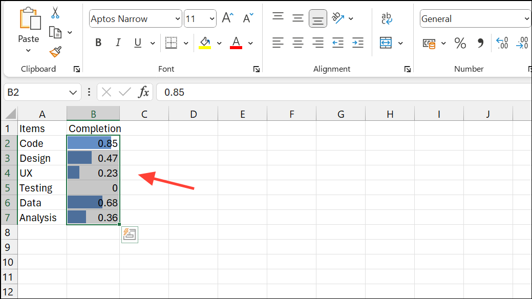
0.25 for 25%) in the adjacent column. For example, list your tasks in column A and completion percentages in column B, from B2 to B11.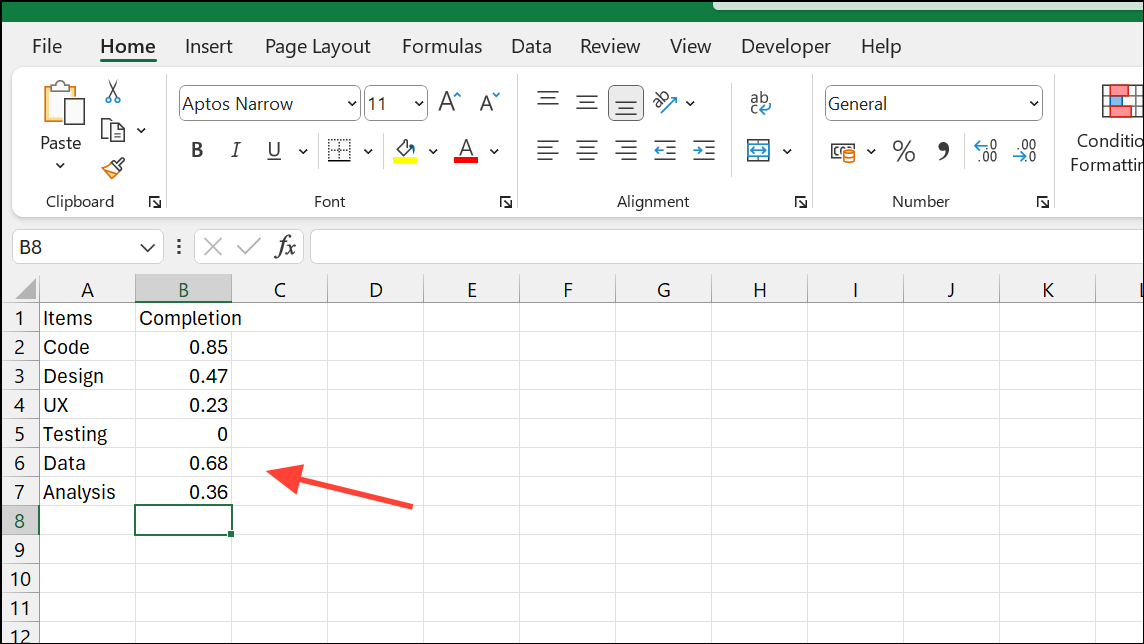
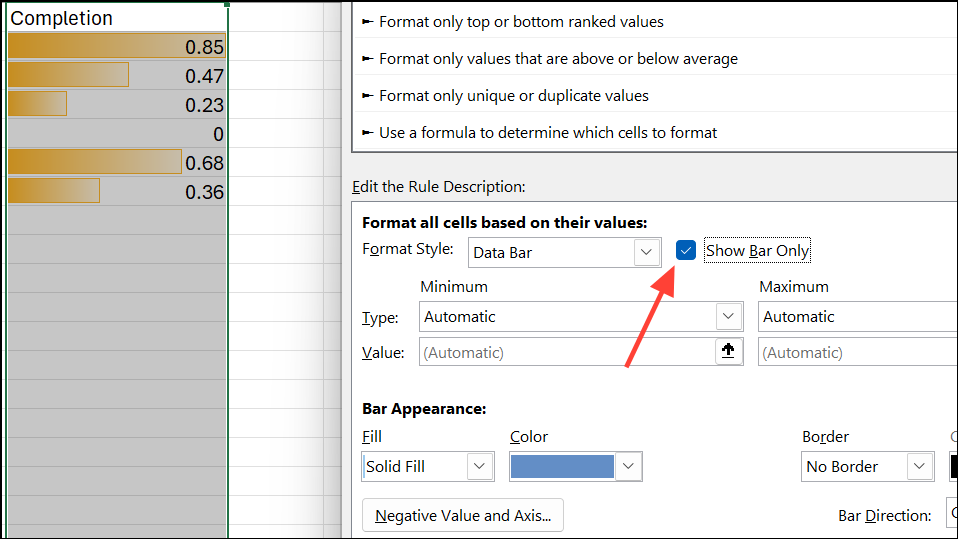
0 for Minimum and 1 for Maximum, so the data bar reflects a true 0% to 100% scale. Pick a fill color for the bar to match your preference.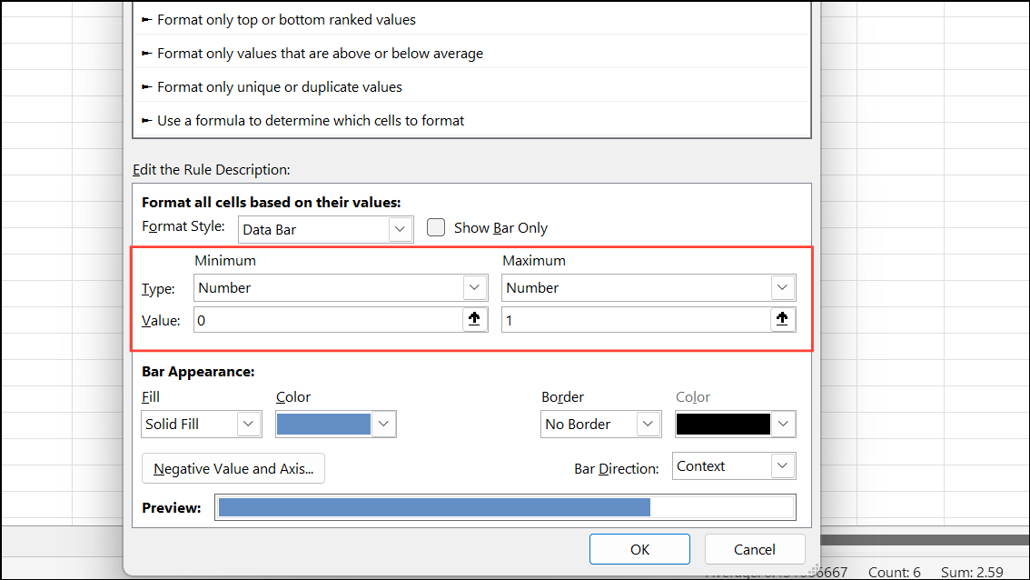
Customizing Progress Bars with Conditional Formatting Rules
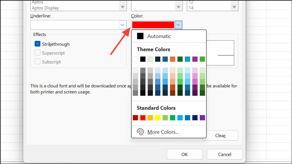
To visually indicate when a value exceeds a specific threshold—such as showing a red fill if a percentage goes over 100%—you can layer additional conditional formatting rules.
=B2>1 (adjust the cell reference as needed) to target cells where the value is greater than 100%.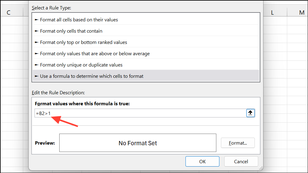
Now, if any task exceeds 100% completion, the cell turns red, immediately drawing attention to outliers or over-completed tasks.
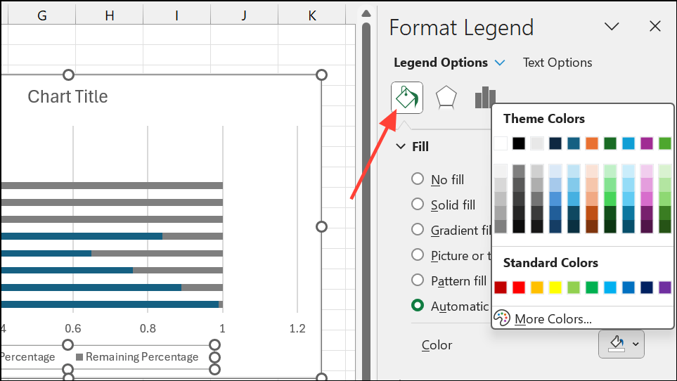
Building Accurate Progress Bars with Stacked Bar Charts
When you need a more precise or visually prominent progress bar—such as showing exactly 25% fill rather than a full bar—using a stacked bar chart provides a reliable solution.
=1-B2 for each row).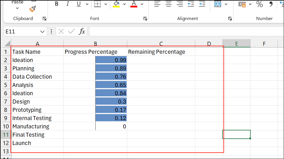
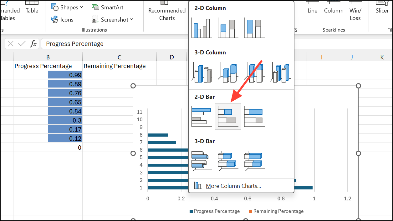
This approach produces a visually accurate progress bar for each task, updating dynamically when you change values in the data table.
Creating Text-Based Progress Bars with Formulas
For a more creative or minimalist display, you can build a progress bar using repeated characters via formulas.
=REPT("▓", B2*10) & REPT("-", (1-B2)*10)This formula displays a string of solid blocks (“▓”) representing completed segments and dashes (“-”) for remaining progress. Each “▓” corresponds to 10% completion.
This method works well for dashboards where you want a compact, text-only indicator within a cell, though it lacks the color and interactivity of chart- or formatting-based bars.
Progress Bars with Checkboxes and Weighted Completion
When tracking tasks of unequal importance or duration, you can assign specific weights to each item and use checkboxes to mark completion.
=SUMPRODUCT(--(status_range=TRUE), weight_range)Alternatively, using dynamic arrays in Excel, a formula like:
=BYROW(status * {0.6,0.2,0.1,0.1}, LAMBDA(x, SUM(x)))This calculates the total weighted completion based on which checkboxes are checked. You can then use any of the formatting or chart methods above to visualize the overall progress.
This approach is especially useful for projects where not all tasks contribute equally to the final outcome.
Progress bars in Excel provide a quick visual reference for tracking status and completion, whether you use conditional formatting, charts, or custom formulas. Regularly updating your data ensures the visual indicators remain accurate and useful for decision-making.