iOS 16 is finally available for the public. And for the first time in years, Apple has made considerable changes to the lock screen. First, you can now have multiple lock screens. Then, there’s Lock Screen customization that allows you to change the appearance of time and add widgets above and below the clock. Apple has also added a new aesthetic wallpaper effect – Depth Effect, to be precise – that artfully puts the subject of the photo in front of the clock.
Among all these changes that have generally sat well with most users, one change has arrived that’s divided the user base into factions. We’re talking about the Notifications on the Lock Screen.
What’s New with Notifications in iOS 16?
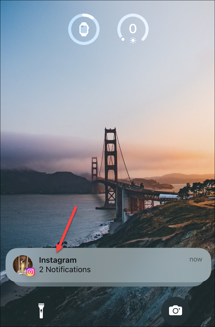
If you’ve made the shift to iOS 16, you’ll find there’s a new way your notifications are delivered. Notifications now roll from the bottom of the screen. What does that mean exactly? New notifications will appear at the bottom of the screen and go upward as more notifications arrive. This is completely opposite to iOS 15 where new notifications appeared just below the clock and went downward.
And this small change has sparked a lot of debate. While some users find it practical as getting the notifications at the bottom increases reachability, especially on bigger screen sizes, others just find it painful. When you’re used to seeing the notifications in a single place for more than a decade, the change can be unsettling.
And those who don’t find any trouble reaching the notifications at the top with a single hand think the new notification style was only for aesthetic purposes. After all, the new notification style does make it easy to show off your lock screen like some tchotchke, especially if you’re using the depth effect. And there’s also the fact that the notifications below the clock will make it impossible to have a wallpaper with the depth effect, just like widgets do.
But would it be fair to call them a mere accomplice in this supposed scheme to show off the lock screen? Well, everyone’s entitled to their opinions. I personally like the new notifications.
Let us move on to a better question instead. Is there a way to get the old notification style back? Not at the moment. Notifications in iOS 16 will roll from the bottom only, and there’s no way to get them back under the clock, or the widgets if you have placed them, for that matter.
But you can change the notification style. And that’s as close as you’ll get to the way things used to be before.
Change Notifications Display Setting
iOS 16 delivers the new notifications as a stack at the bottom by default. To view all the new notifications that have accumulated, you have to swipe up or tap the stack to reveal them.

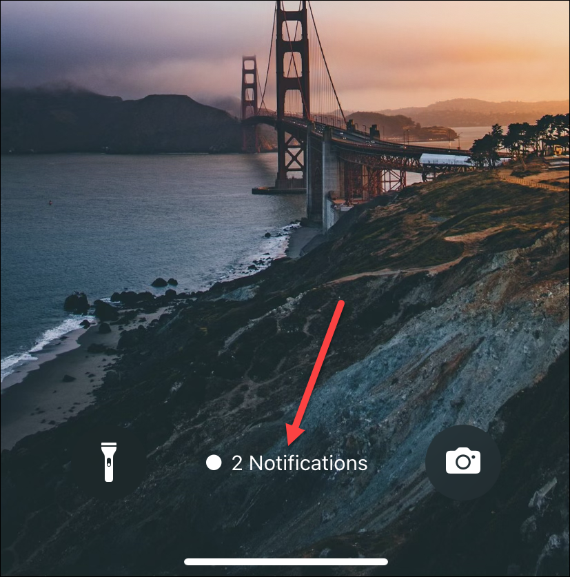
Swiping down on this stack hides the notifications from the lock screen completely. It instead displays them as a number that says ‘N Notifications’ at the bottom. But you can change the notification style from the settings.

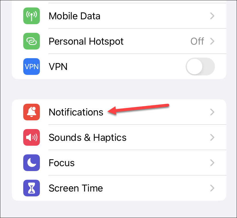
Open the Settings app and tap the option for ‘Notifications’.

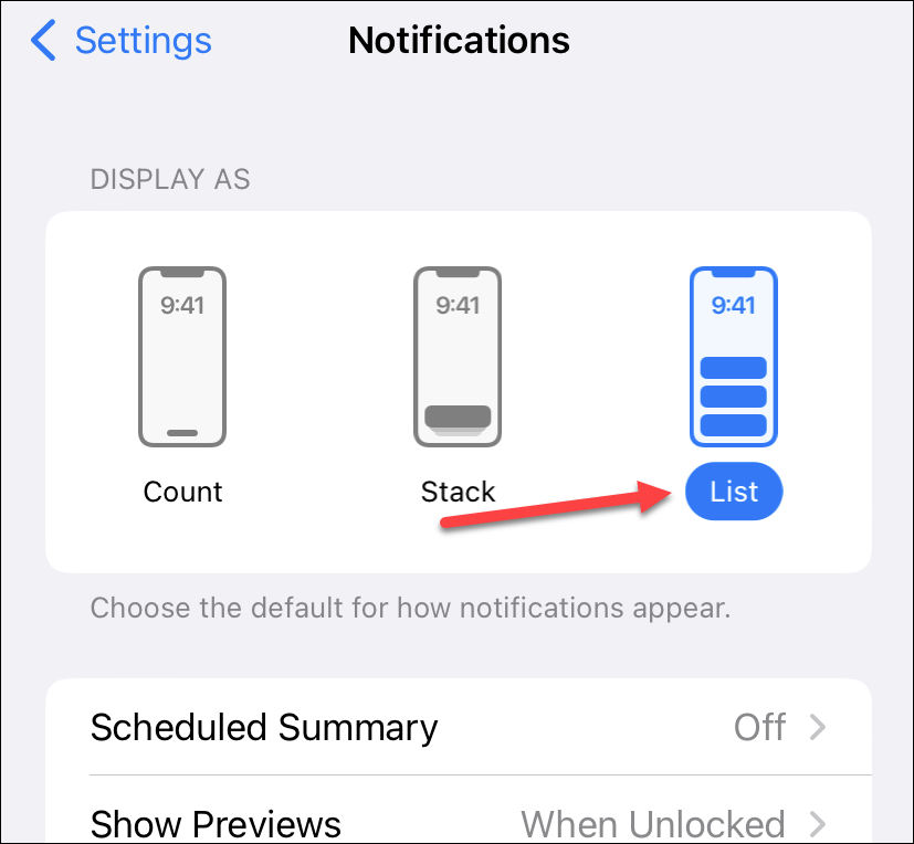
Then, under the ‘Display As’ section, you’ll find three categories:
- Count: When you select Count, new notifications will only appear as a number on the bottom of the screen. You’ll have to tap or swipe up on them to see your notifications.
- Stack: This is the default setting we discussed above where notifications appear as a stack at the bottom.
- List: This is the setting that’ll get you closest to the notification display style of before. The notifications will appear fully across the screen. But they’ll still start at the bottom and go upward as new notifications accumulate.
Tap ‘List’ to change the notification display style so your notifications arrive separately.

There will always be changes that some people will love while others will hate. Whether Apple will offer a choice in the future to get the notifications back under the clock, only time will tell. But I’ll say I find it unlikely.

