Complementary Colors is one of the round themes in Dress To Impress on Roblox. The game gives only the name, so the reading here is the plain colour-wheel one: complementary colours sit directly opposite each other on the wheel, and putting two of them side by side makes both look stronger. Below are two complete looks we built in Freeplay Mode, one in purple and yellow and one in orange and blue, with our own picture for every step. Every piece, hairstyle and material used is free. For the other themes, see every Dress To Impress theme we have built.
Quick answer: Pick one opposite pair and split it across every piece. We did a purple ruffled coat set with yellow ruffles, yellow curls and a purple crown, and an orange shirt with blue ribbons over a blue skirt with orange panels.
Complementary Colors outfit ideas in Dress To Impress
Dress To Impress shows no item names, so every piece here is described by where it sits, what it looks like and the exact spot we used on the Default palette. Both looks use pieces from the same short-dress shelf and the long curls with a small crown and gem that we were already wearing. The rule for both: every piece and the hair go in one of the two colours of the pair, nothing else. Both keep the character’s soft glam face, and both are barefoot: we wore no shoes.
Look 1 (Purple and yellow): ruffled coat set
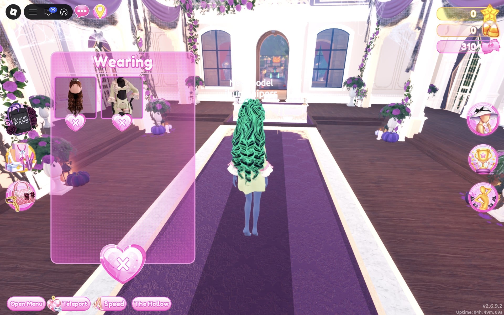
Colour pair: purple and yellow. It needs one piece, the six-part ruffled coat set from the top row of the short-dress shelf; the rest is colour and material, set on the Freeplay Runway.
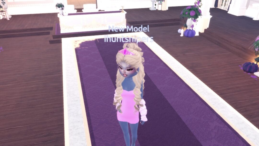
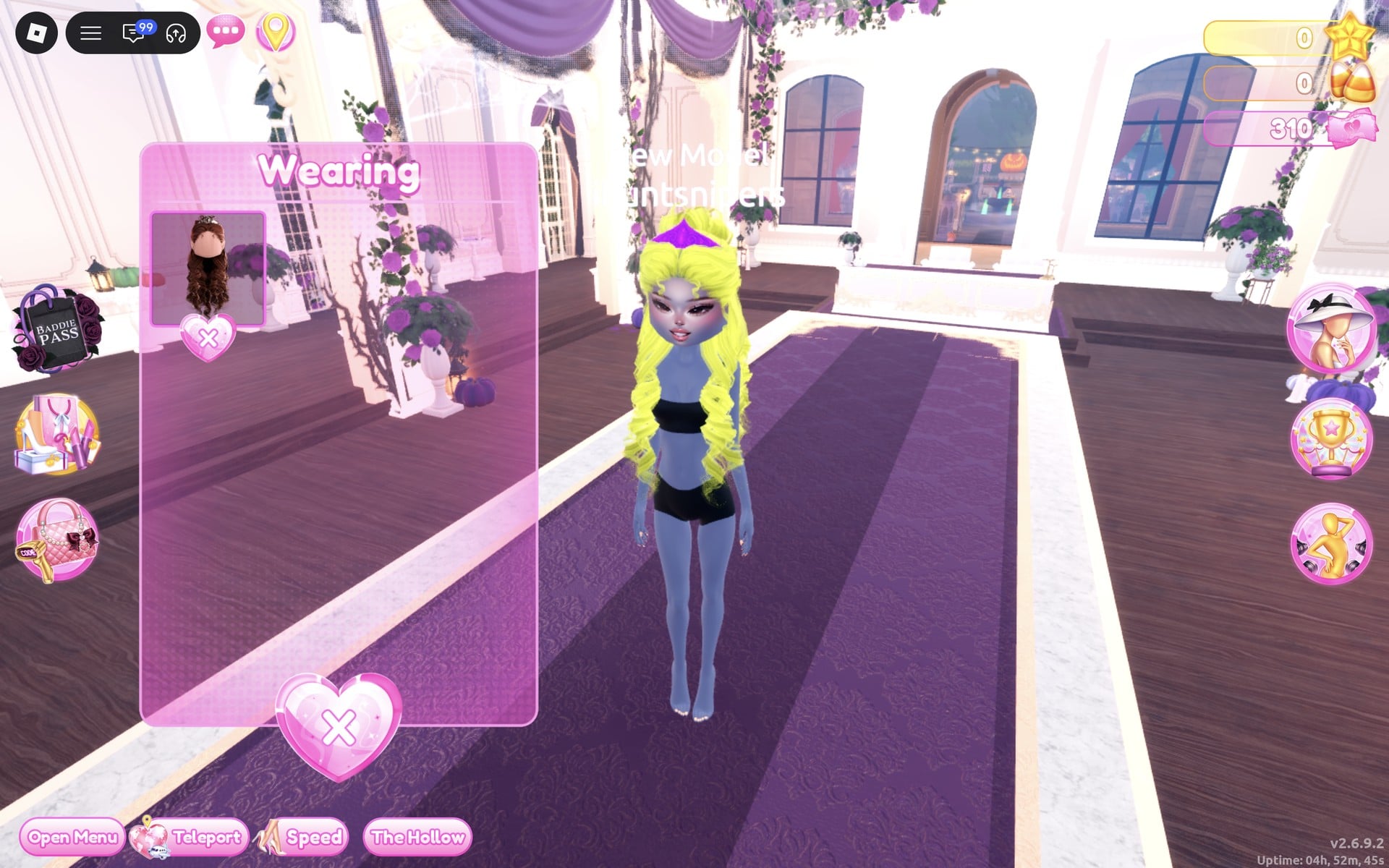
The black top and black shorts that show now are the base body, not a piece. They cannot be taken off, only covered. In this look the coat covers the top, but the base black shorts stay visible under it.
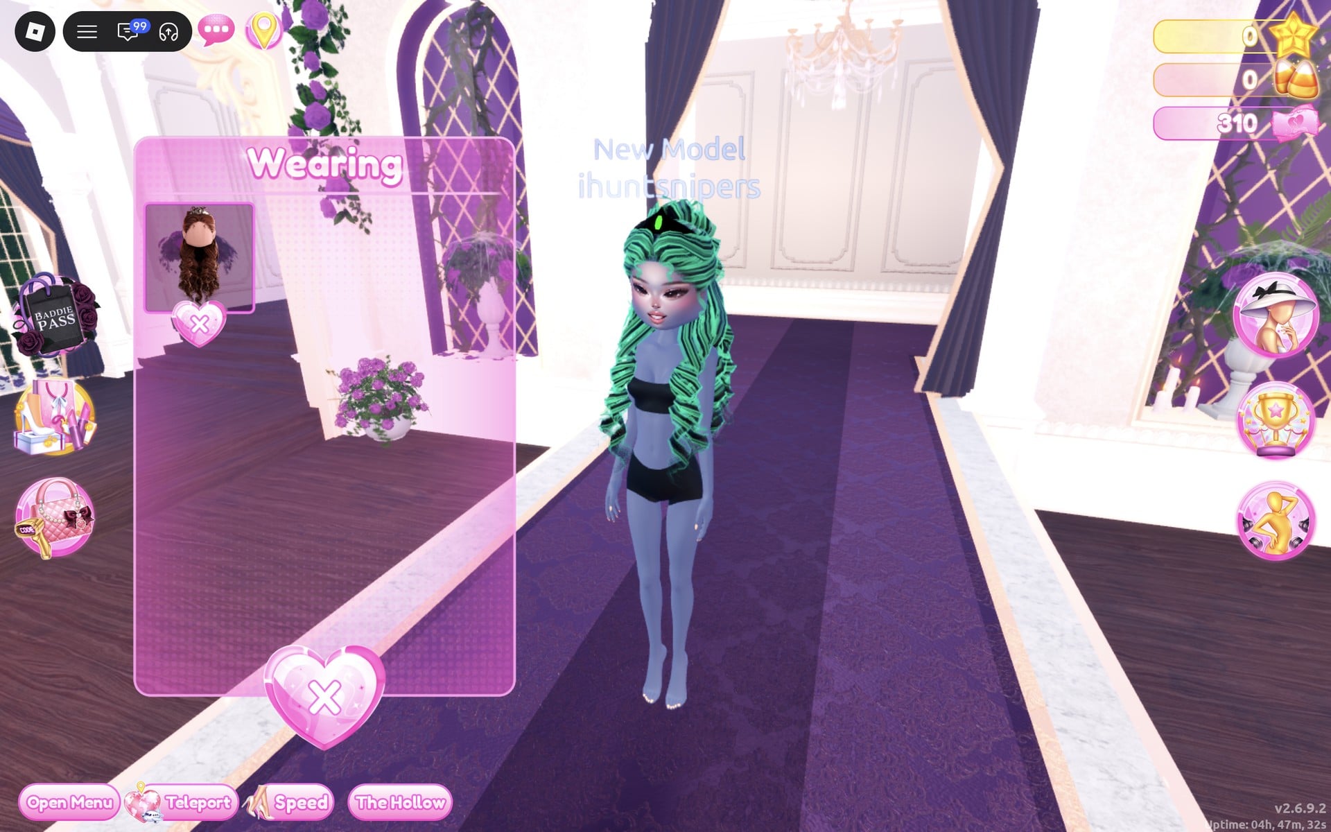
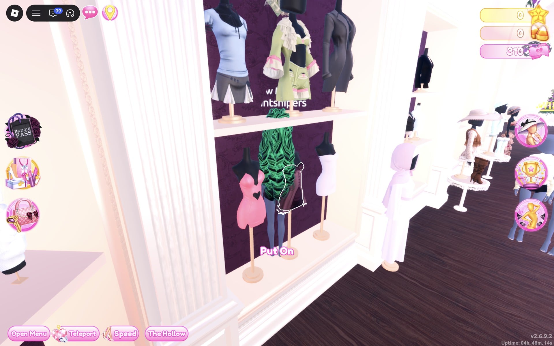
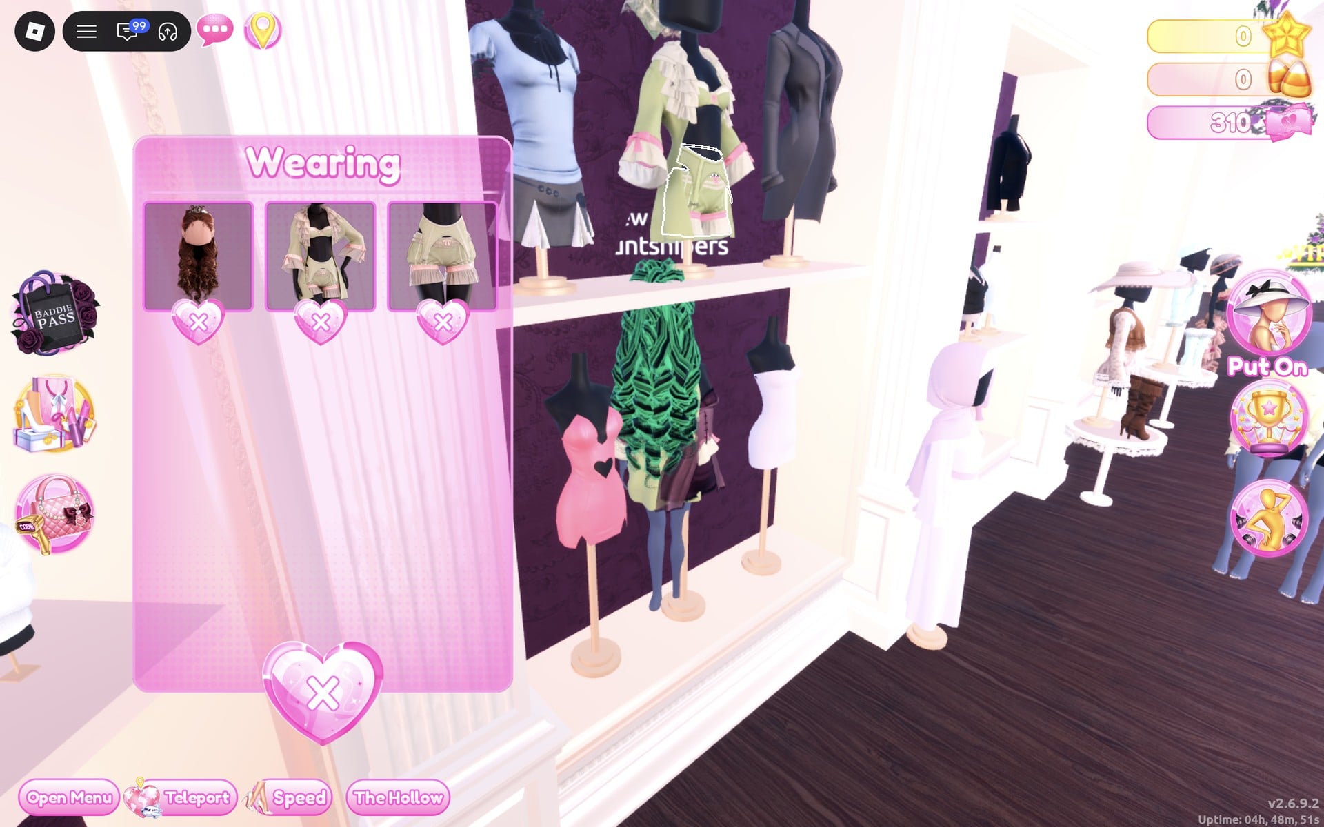
The coat set comes with its bloomers: the Wearing panel now shows three pictures, the hair, the coat set and the bloomers.
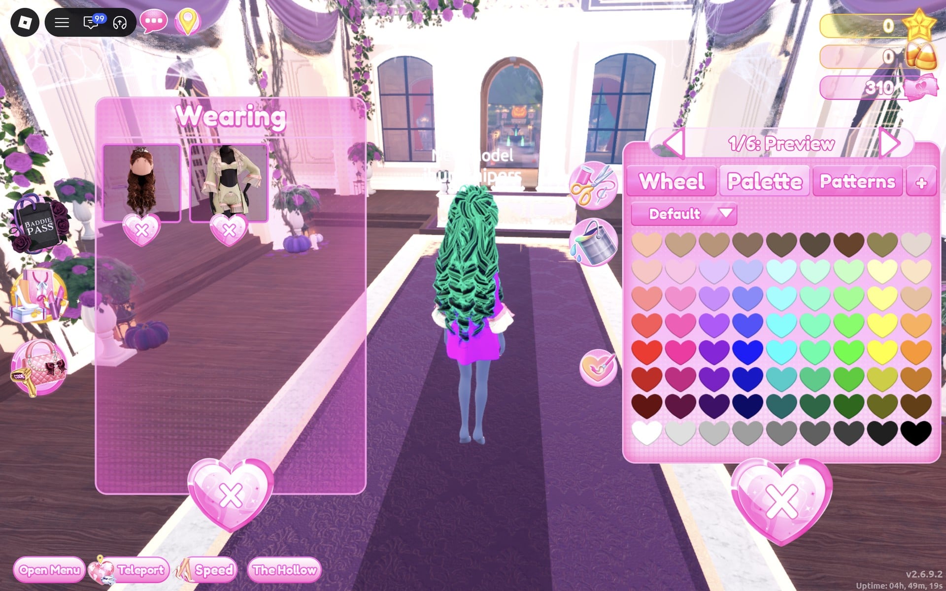
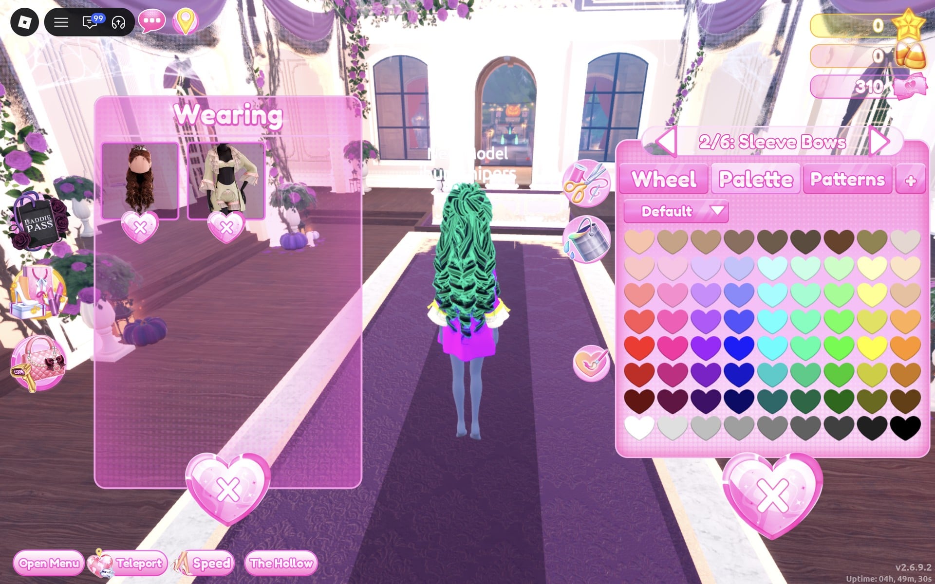
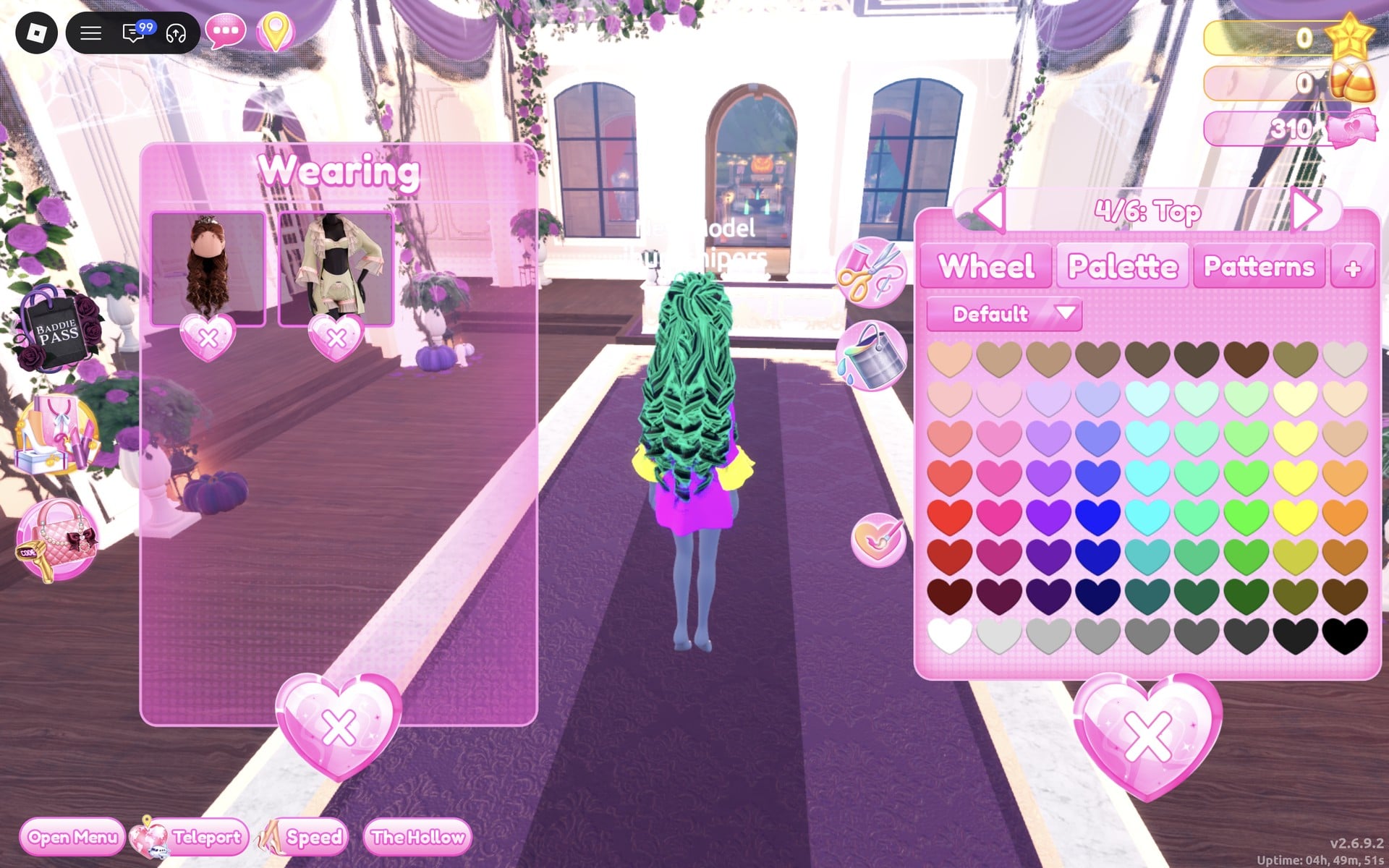
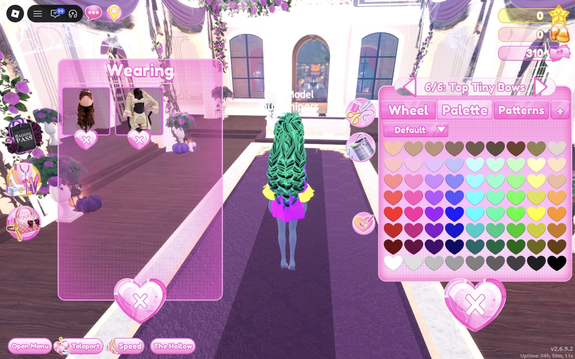
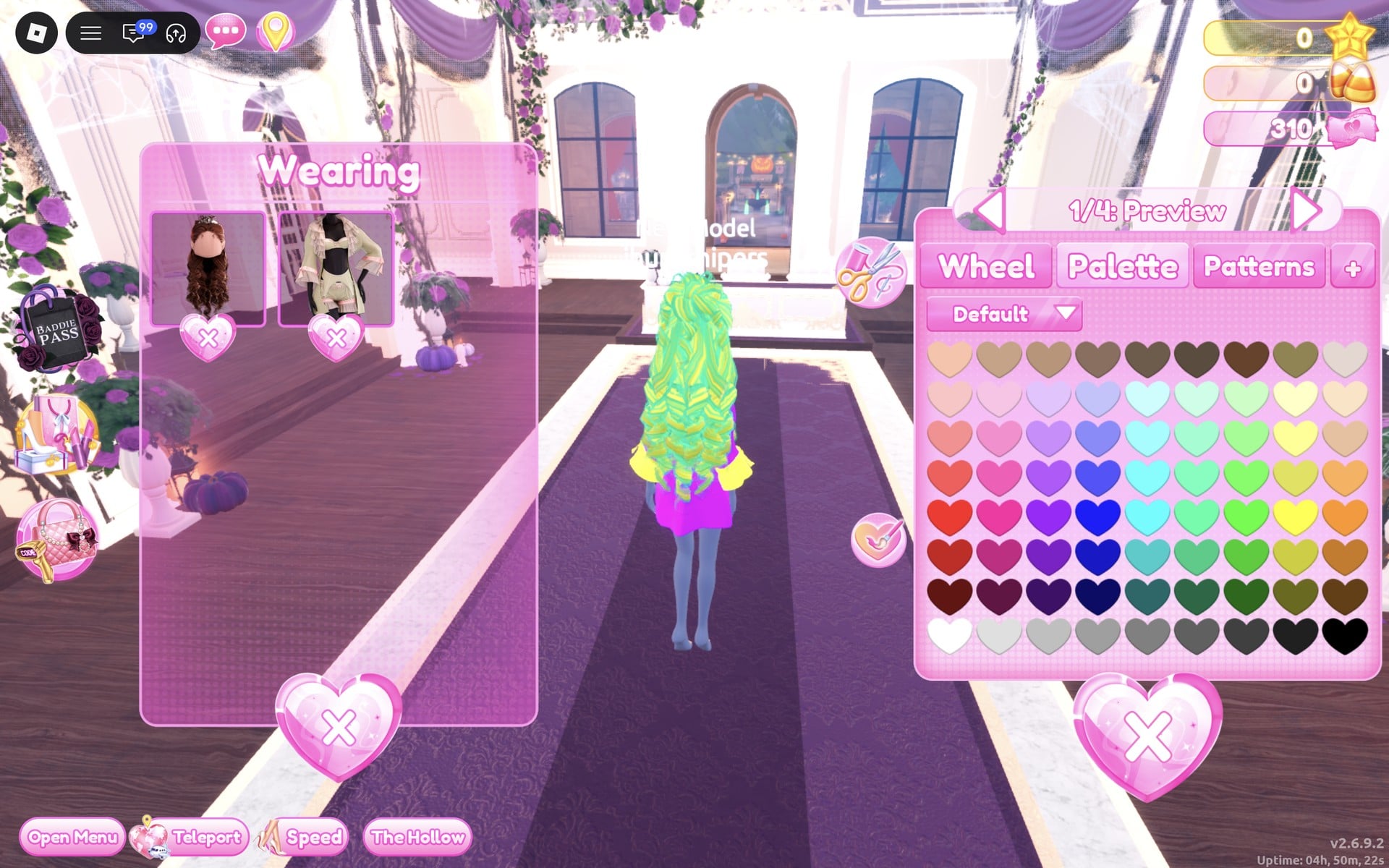
Set “2/4: Preview” to the same yellow with Silk. Now the whole head of curls is lemon yellow.
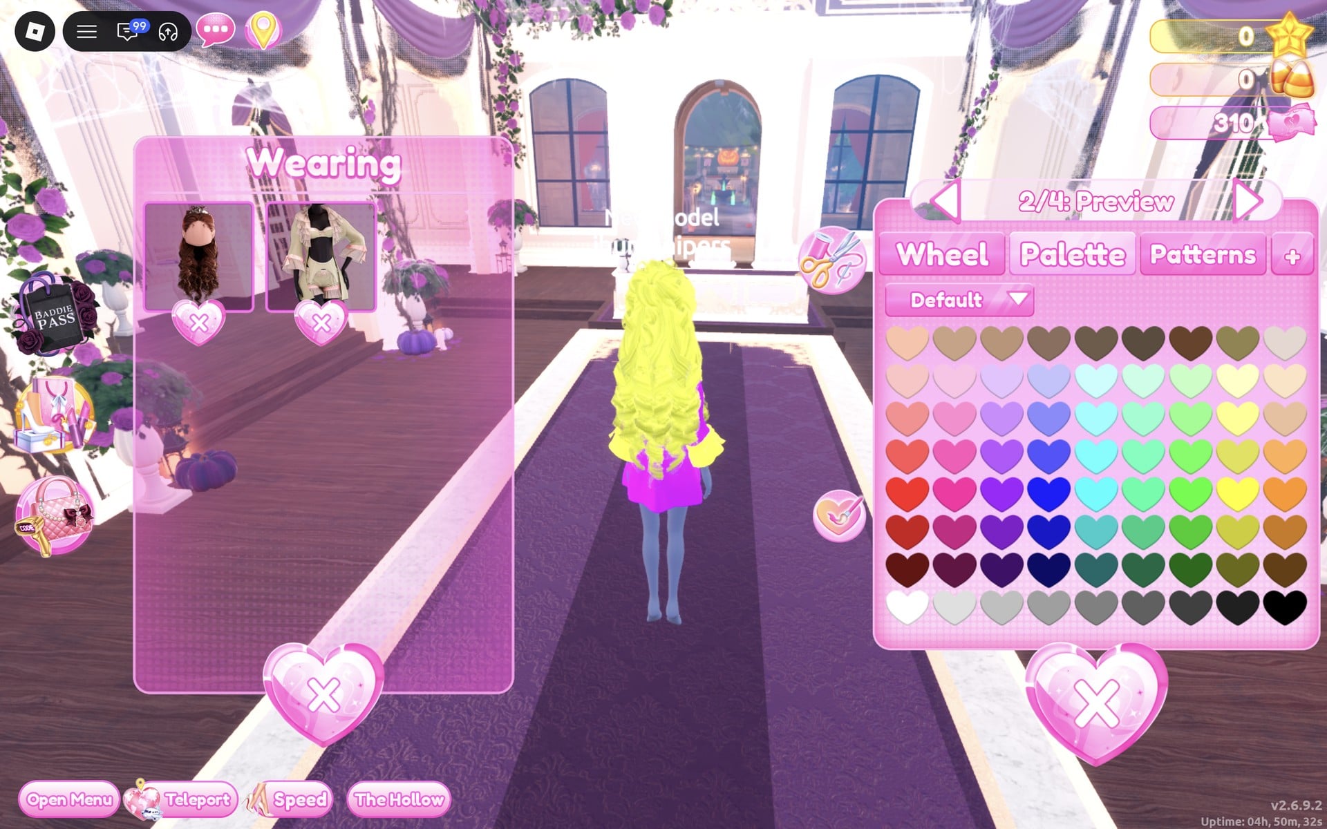
Set “3/4: Crown” to purple (column 3, row 5) with Metallic.
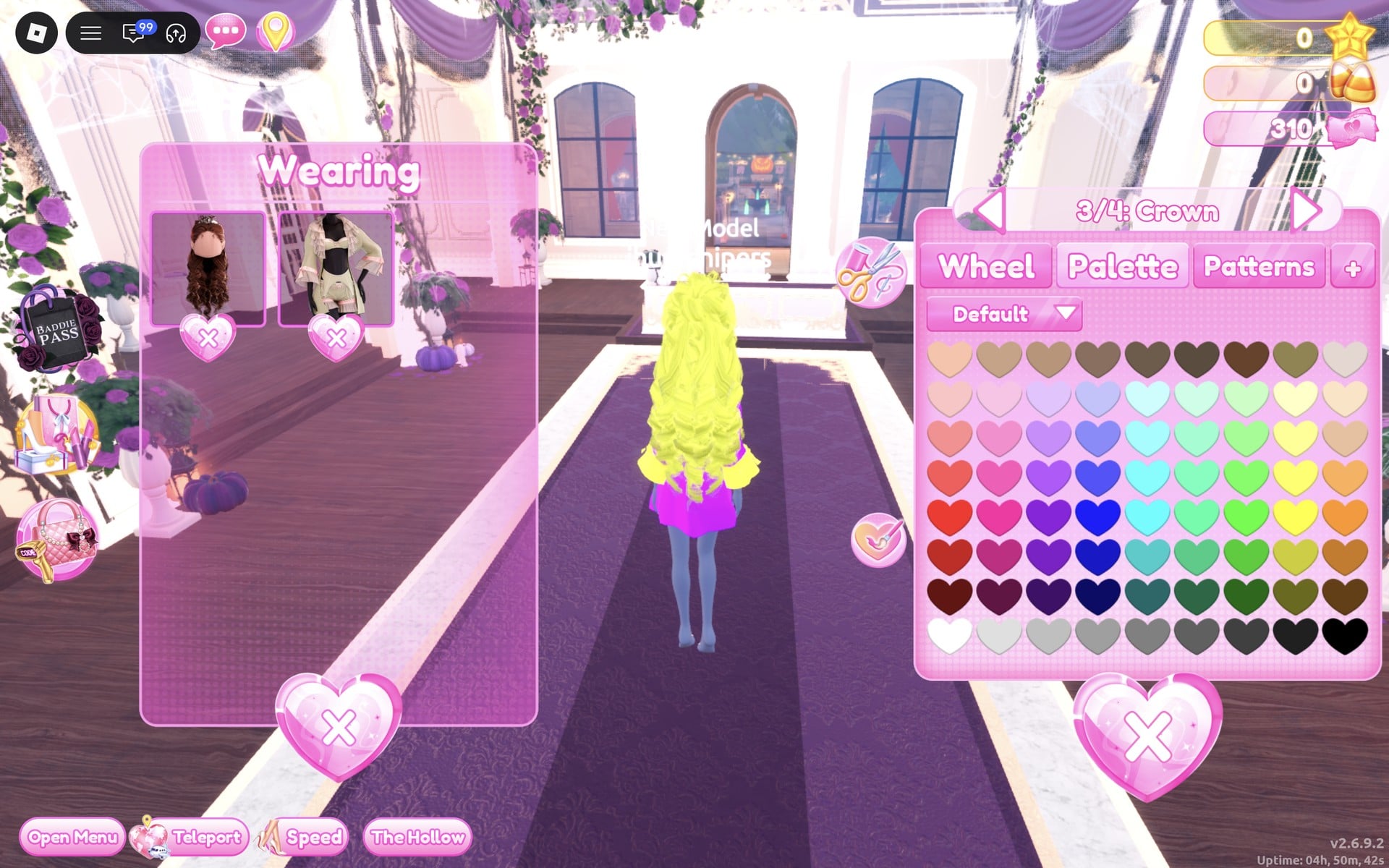
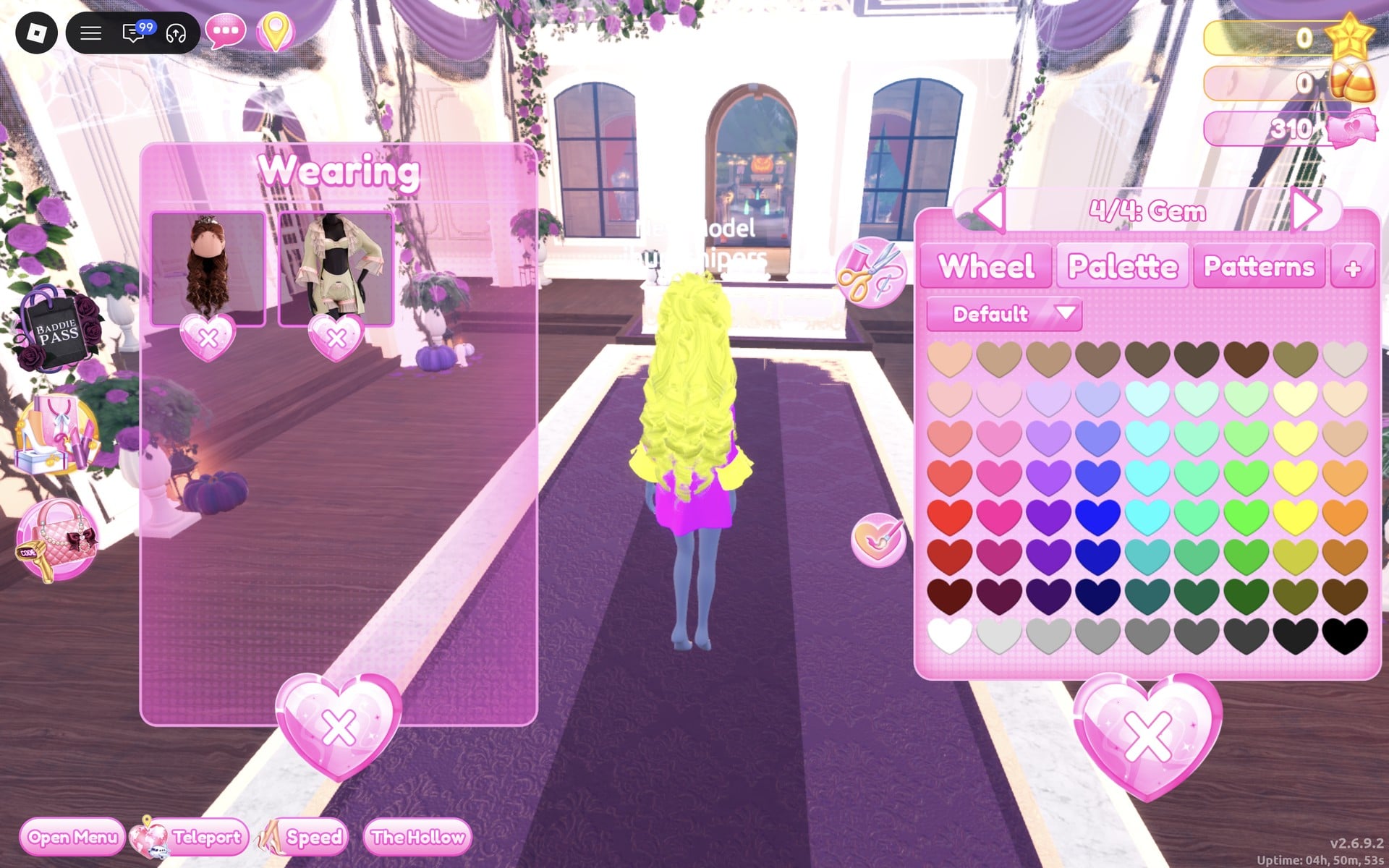
Finally set “4/4: Gem” to purple with Glitter, so the crown is purple all over.
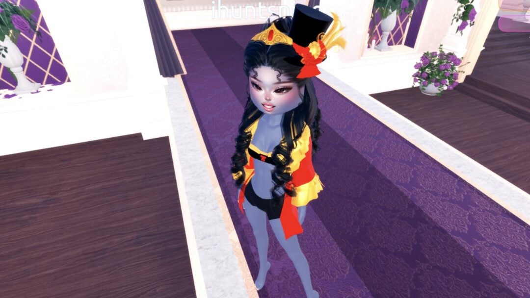
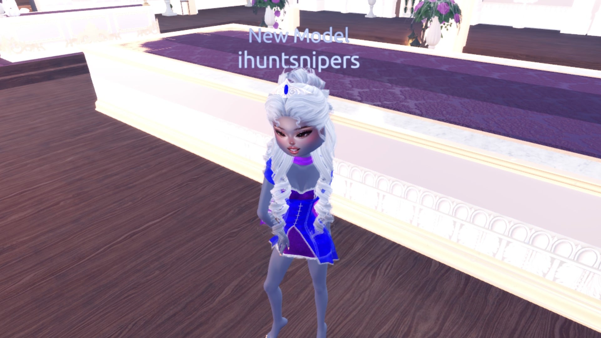
The finished look is a bright purple bandeau top with a yellow bow, an open purple coat with yellow ruffled cuffs, the base black shorts, long lemon yellow curls and a purple crown.
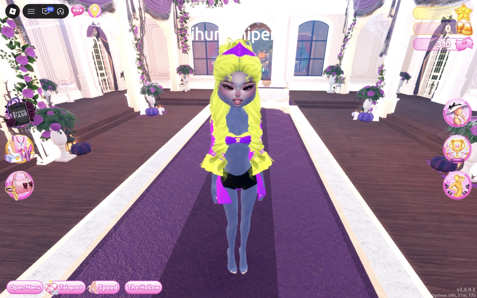
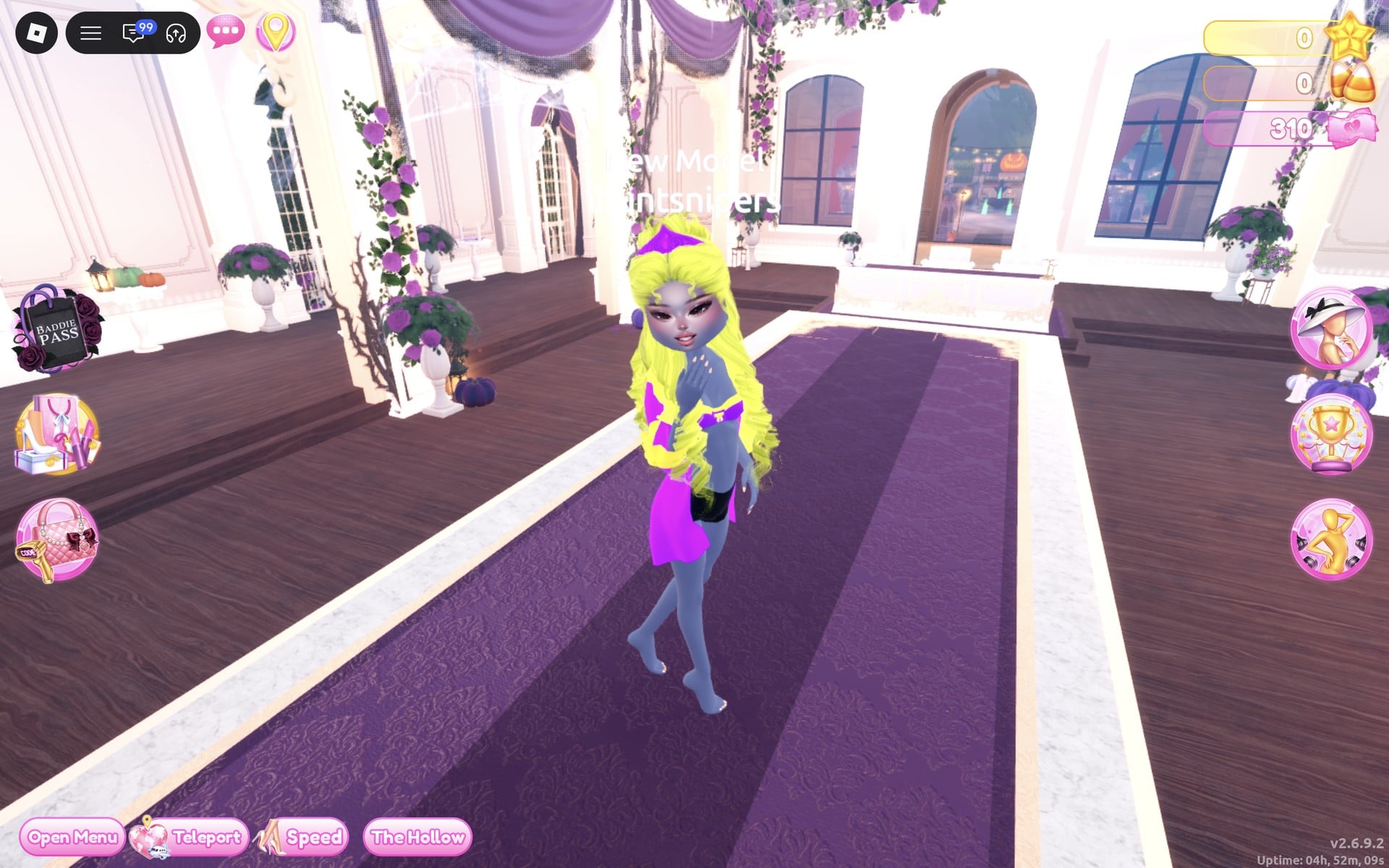
Prism raises one hand to the chin with a walking step, which turns the coat so its purple side and yellow cuffs show.
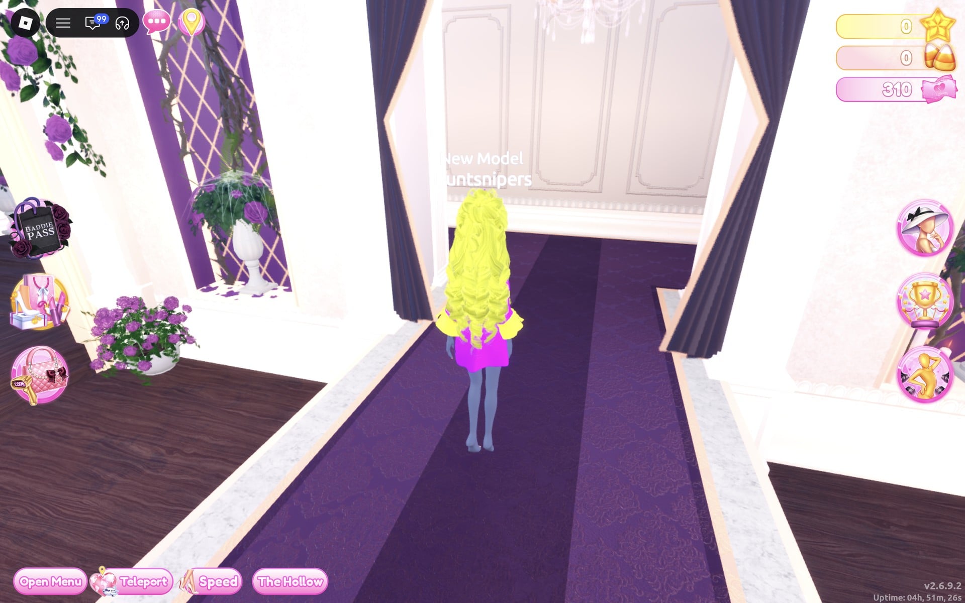
From the back, the yellow curls cover the coat almost to the hem, with the purple showing at the sides.
Look 2 (Orange and blue): shirt and skirt
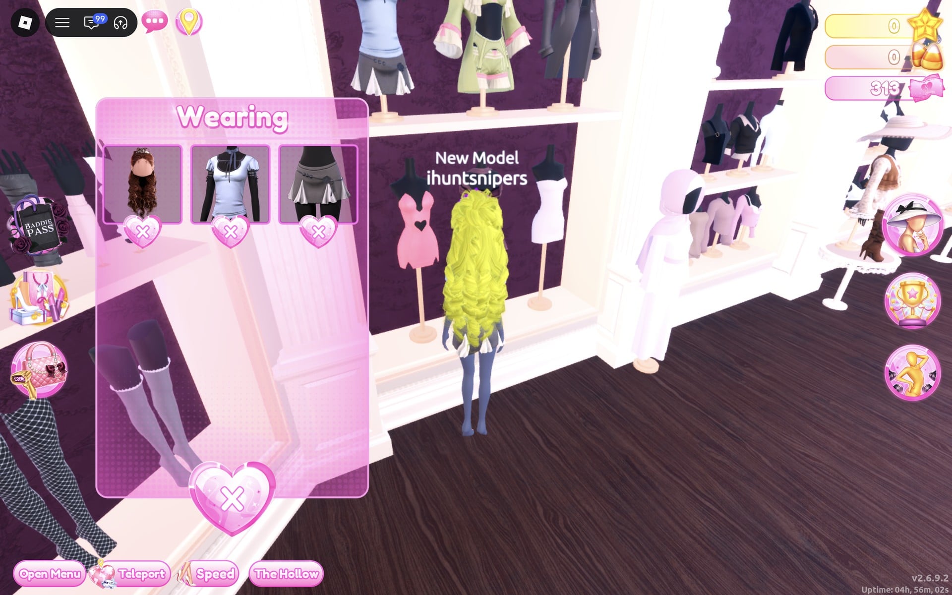
Colour pair: orange and blue. It uses the pale blue shirt and the grey skirt under it, both on one stand at the left of the same top row, and the colours are swapped between them: an orange shirt with blue trim over a blue skirt with orange trim.
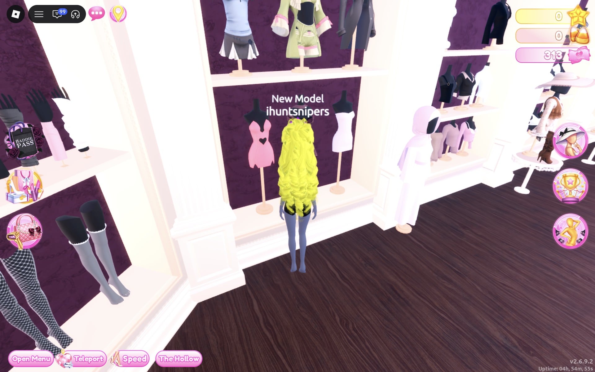
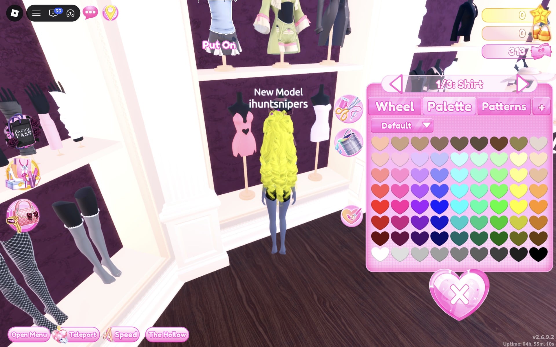
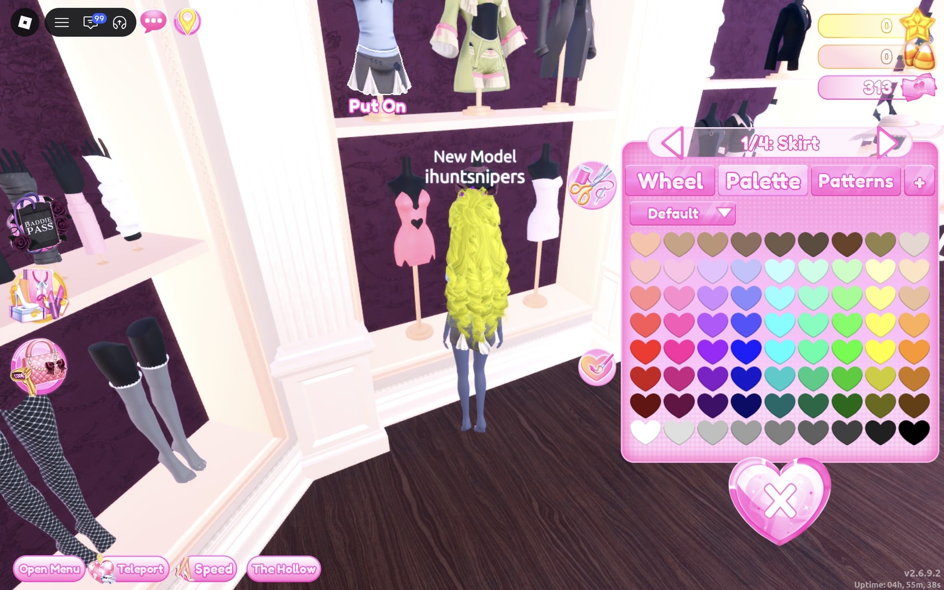
The Wearing panel now shows three pictures: the hair, the shirt and the skirt.
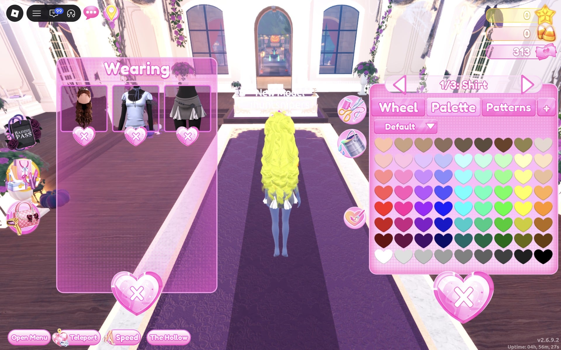
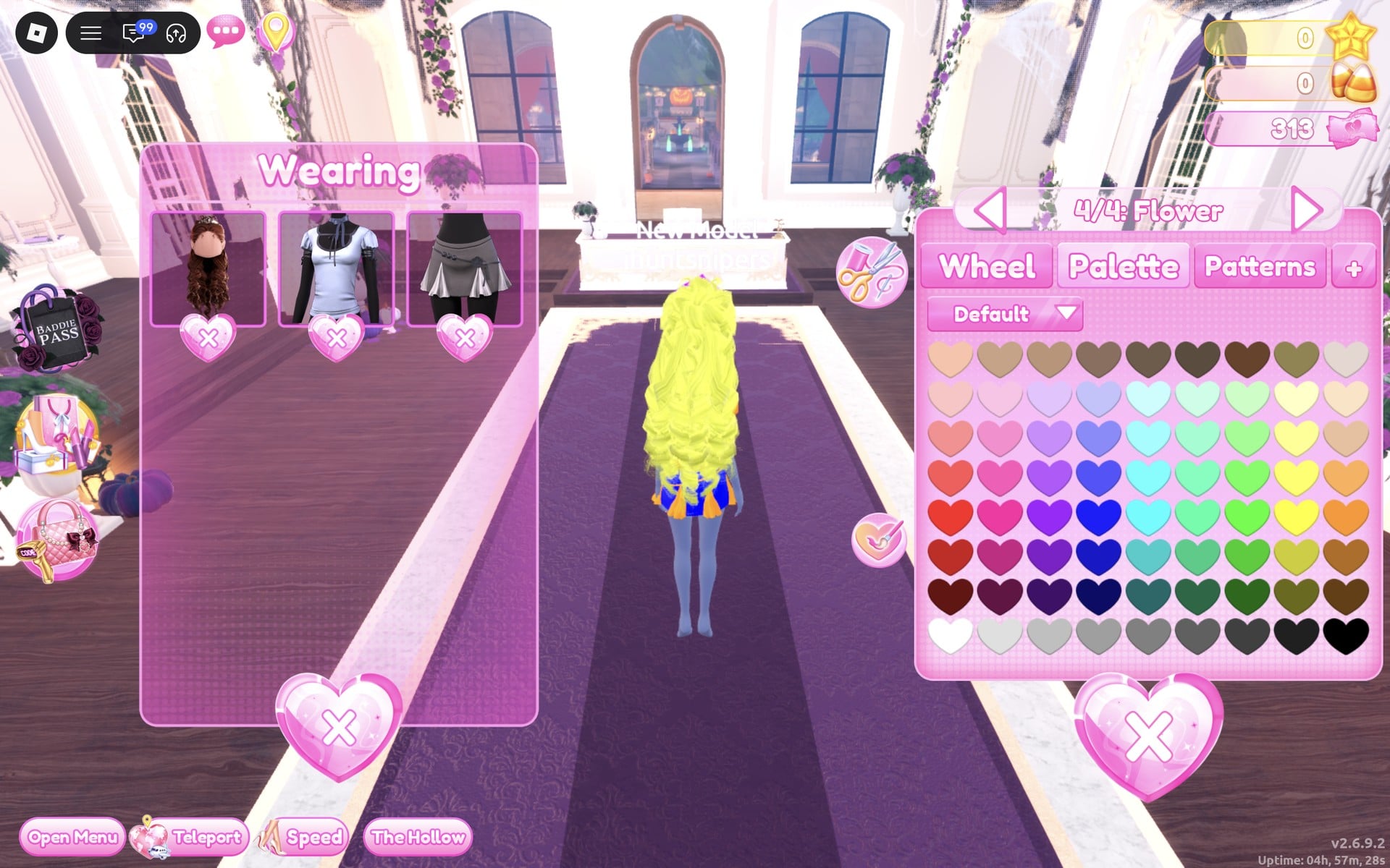
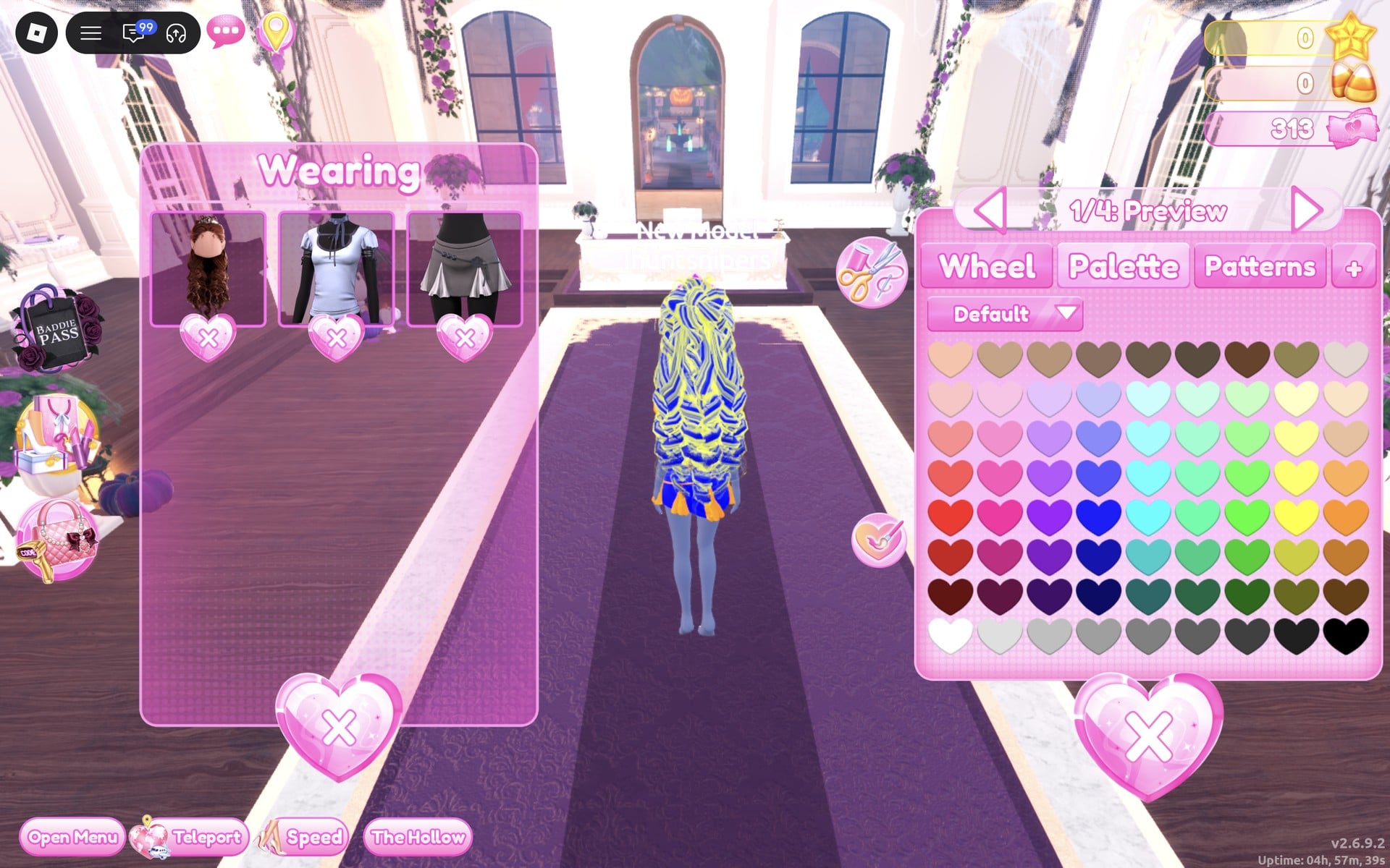
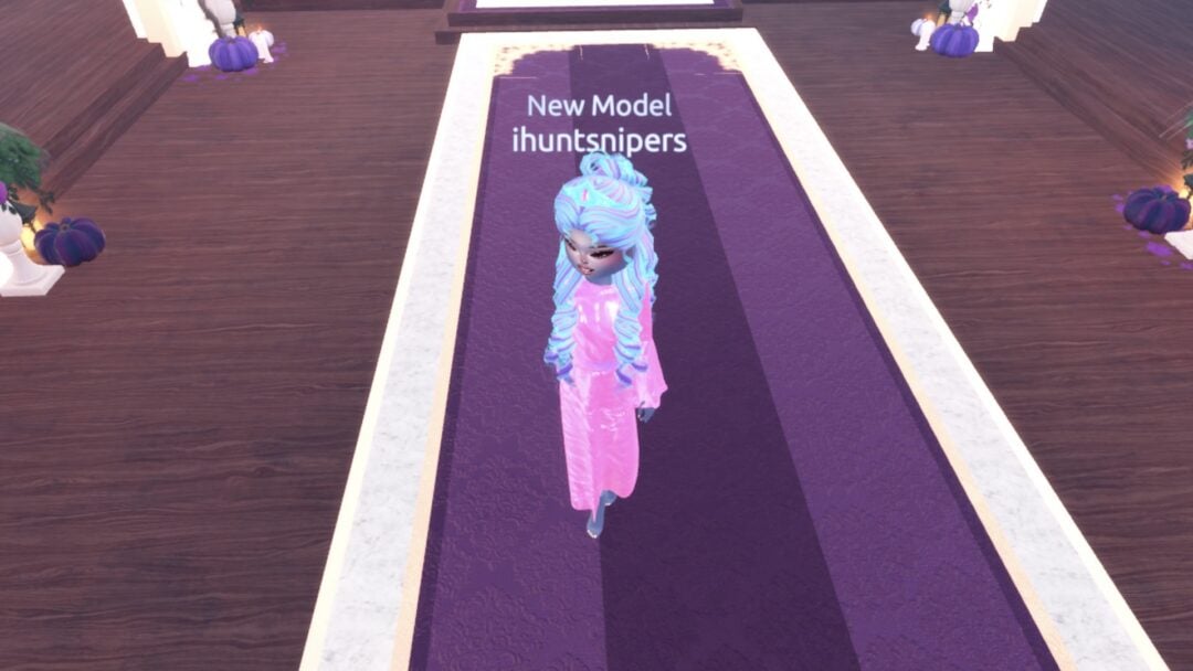
Set “2/4: Preview” to the same blue with Silk. The whole head of curls turns a bright royal blue.
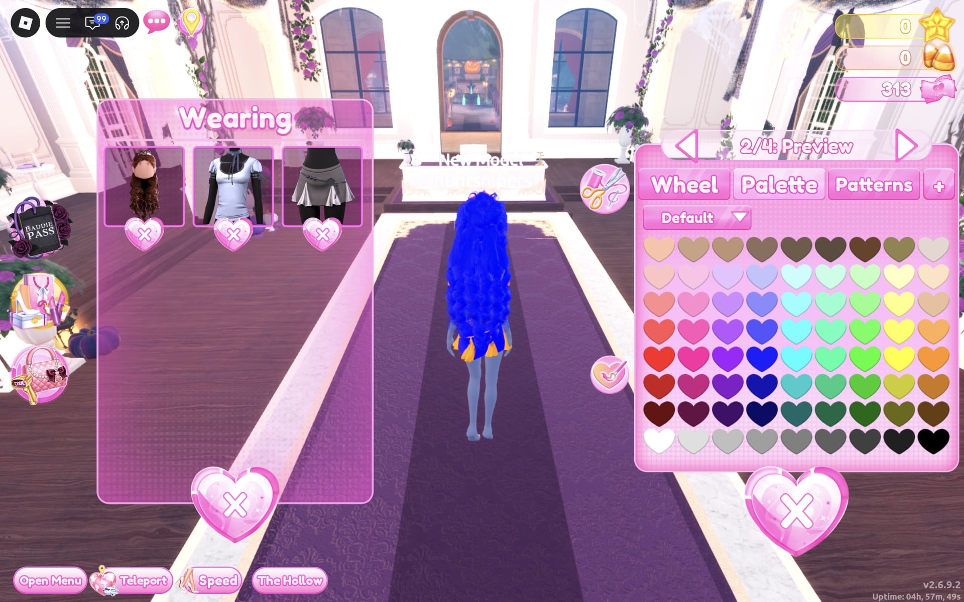
Set “3/4: Crown” to orange (column 9, row 6) with Metallic, then “4/4: Gem” to orange with Glitter.
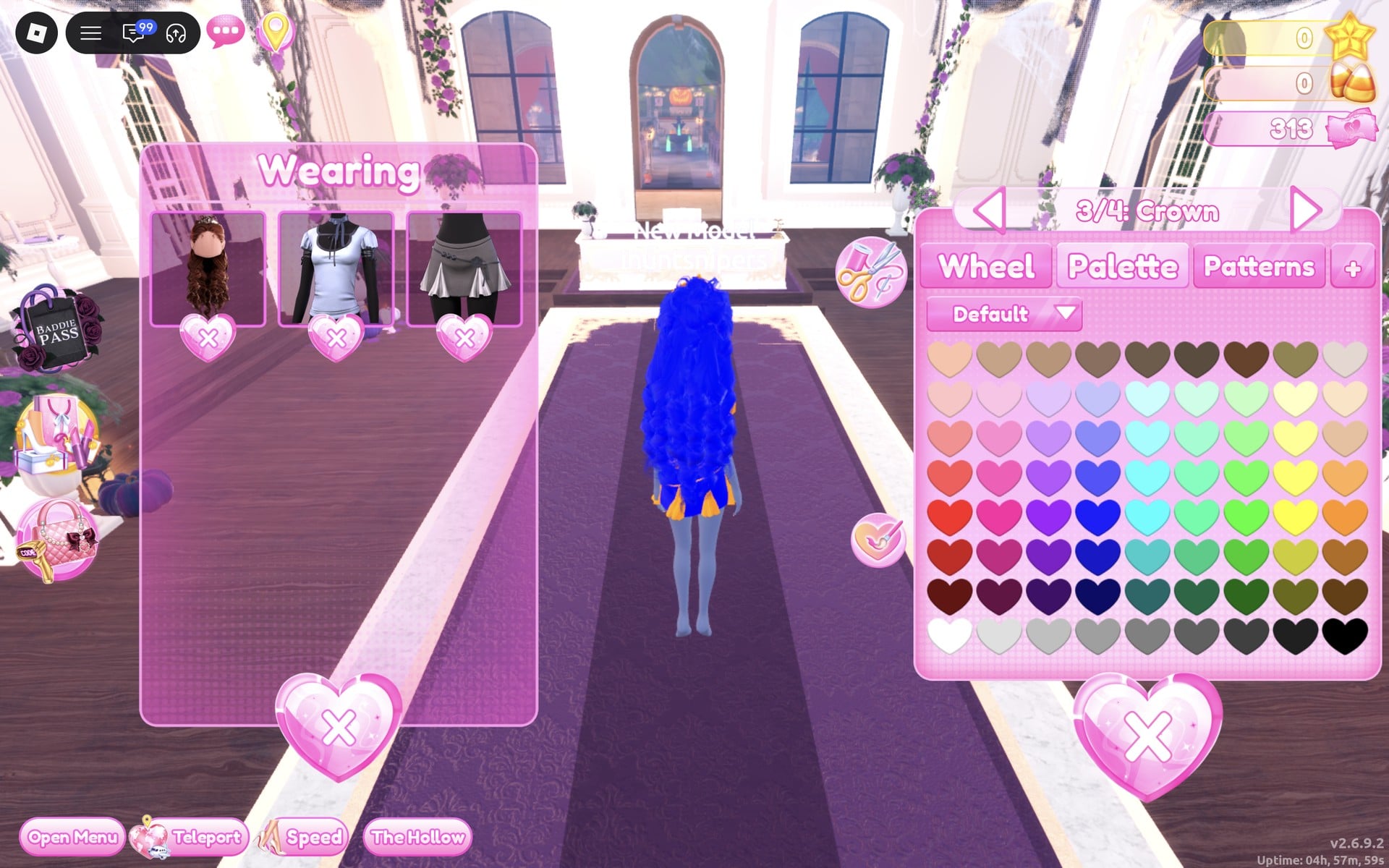
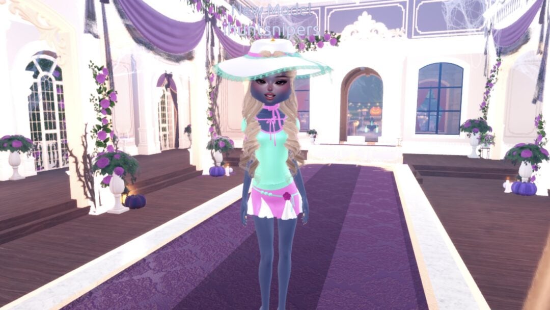
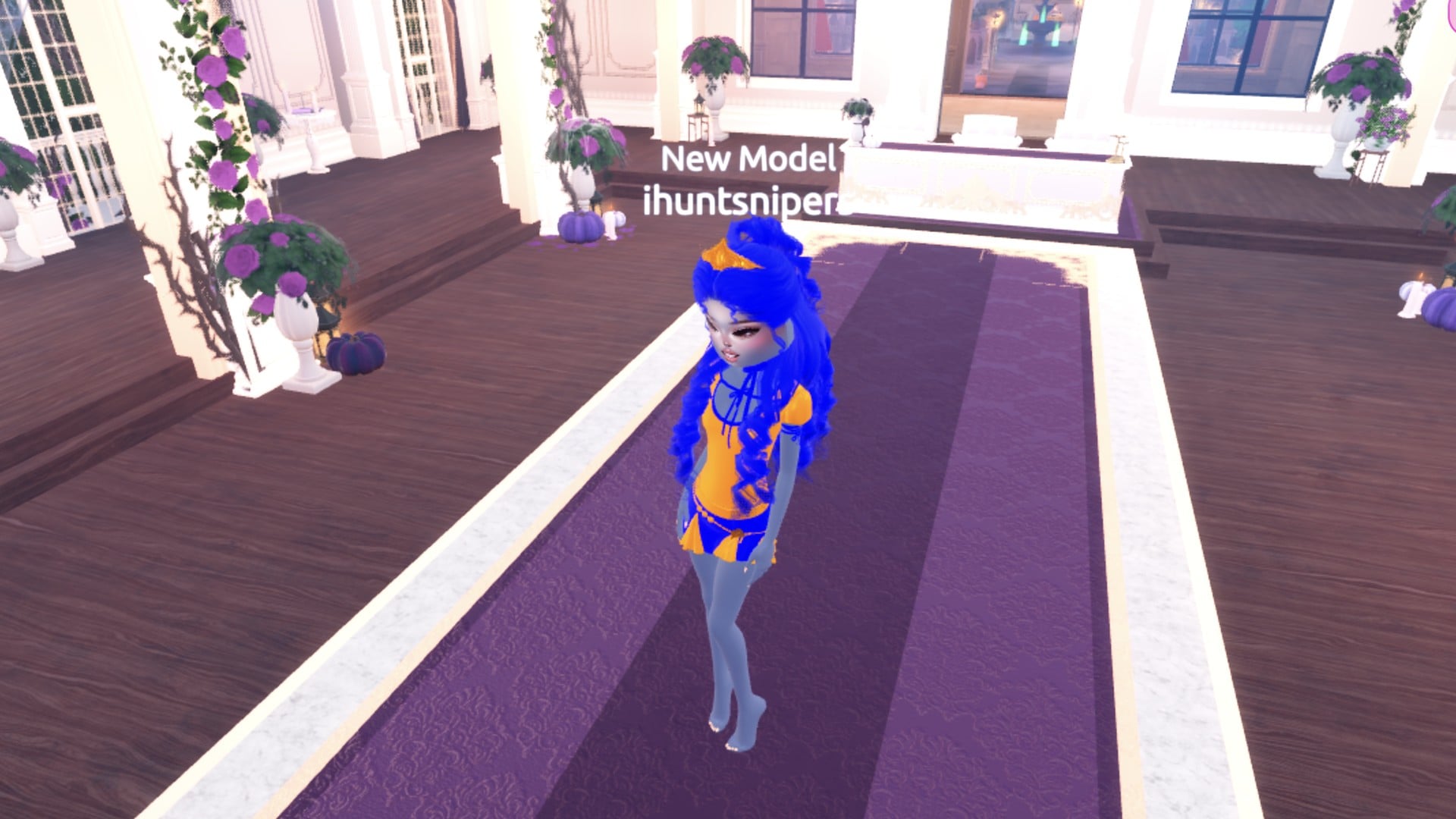
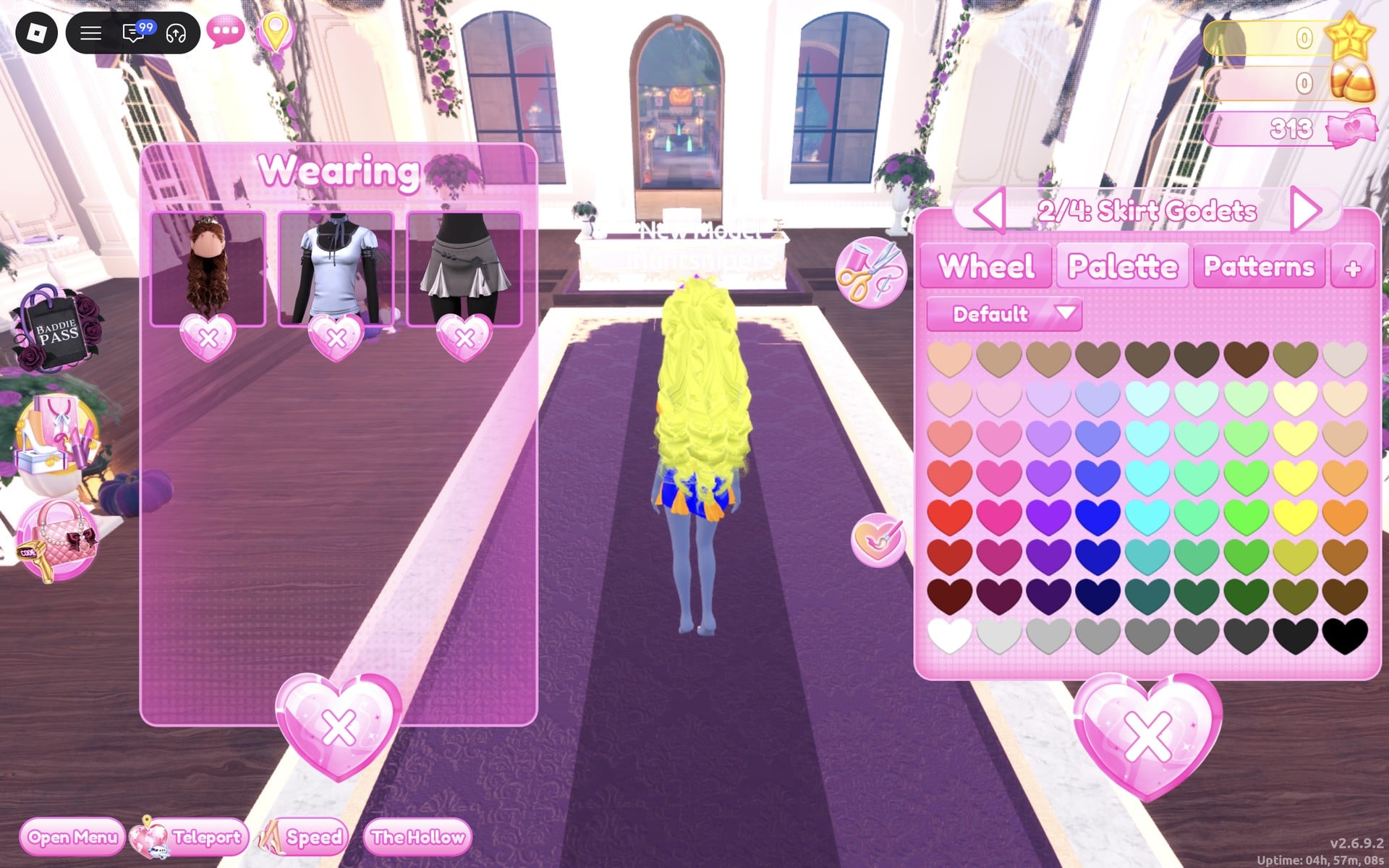
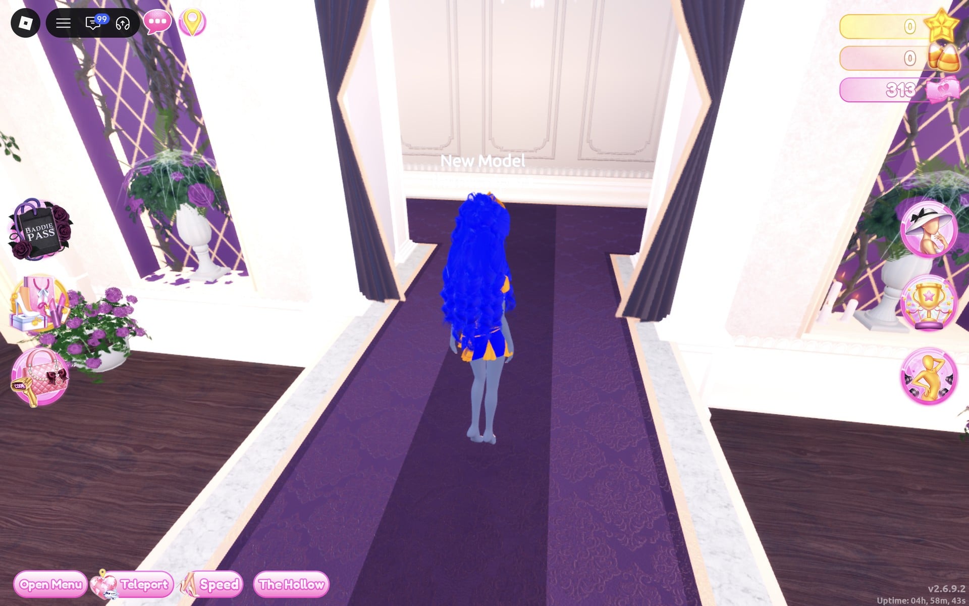
The finished look is an orange shirt with blue ribbons and a blue neck tie, a blue skirt with orange godet panels, an orange belt and an orange flower, long royal blue curls and an orange crown.
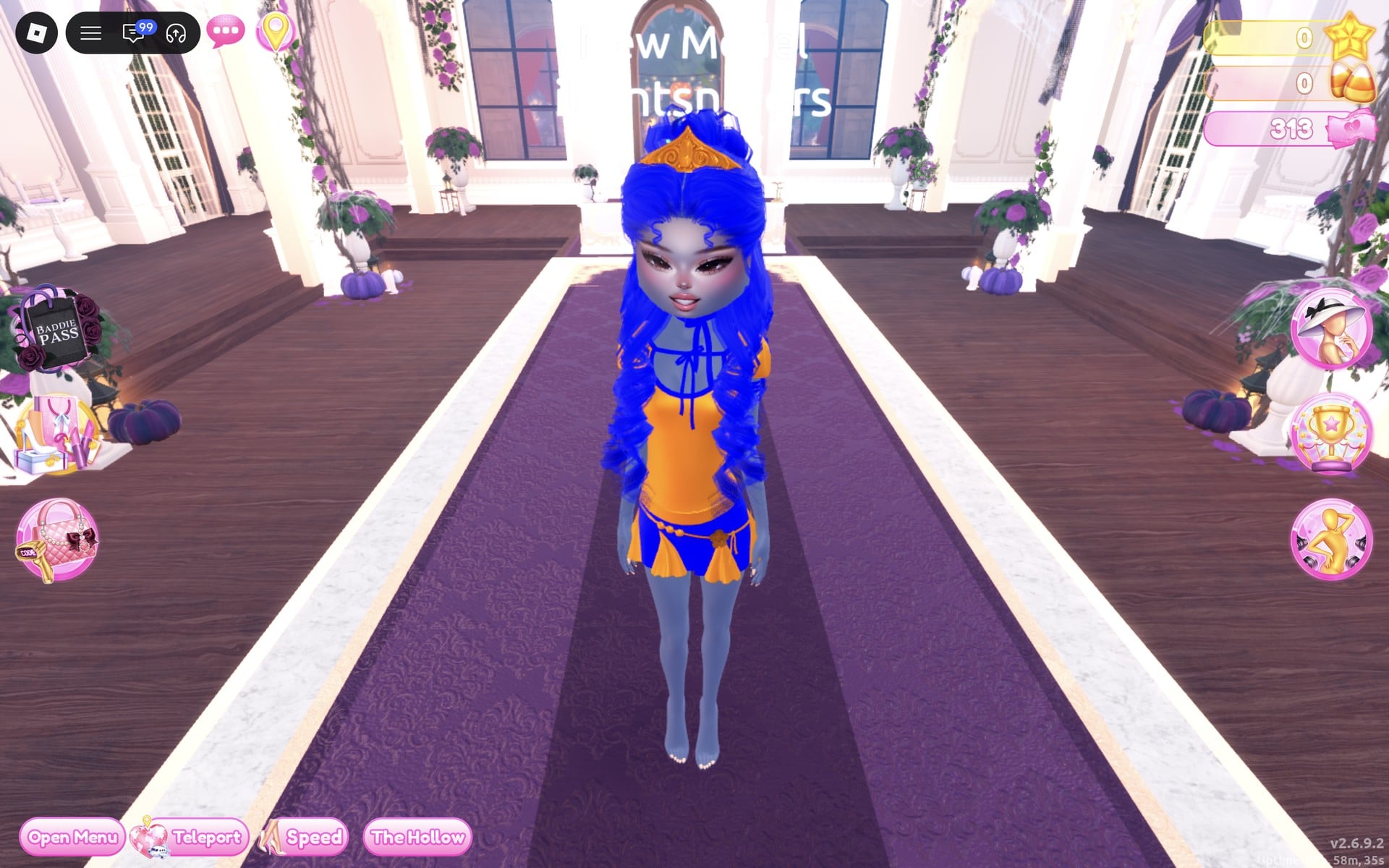
Glow holds the hands together in front with the head lowered, so the orange shirt and the blue skirt show at once.
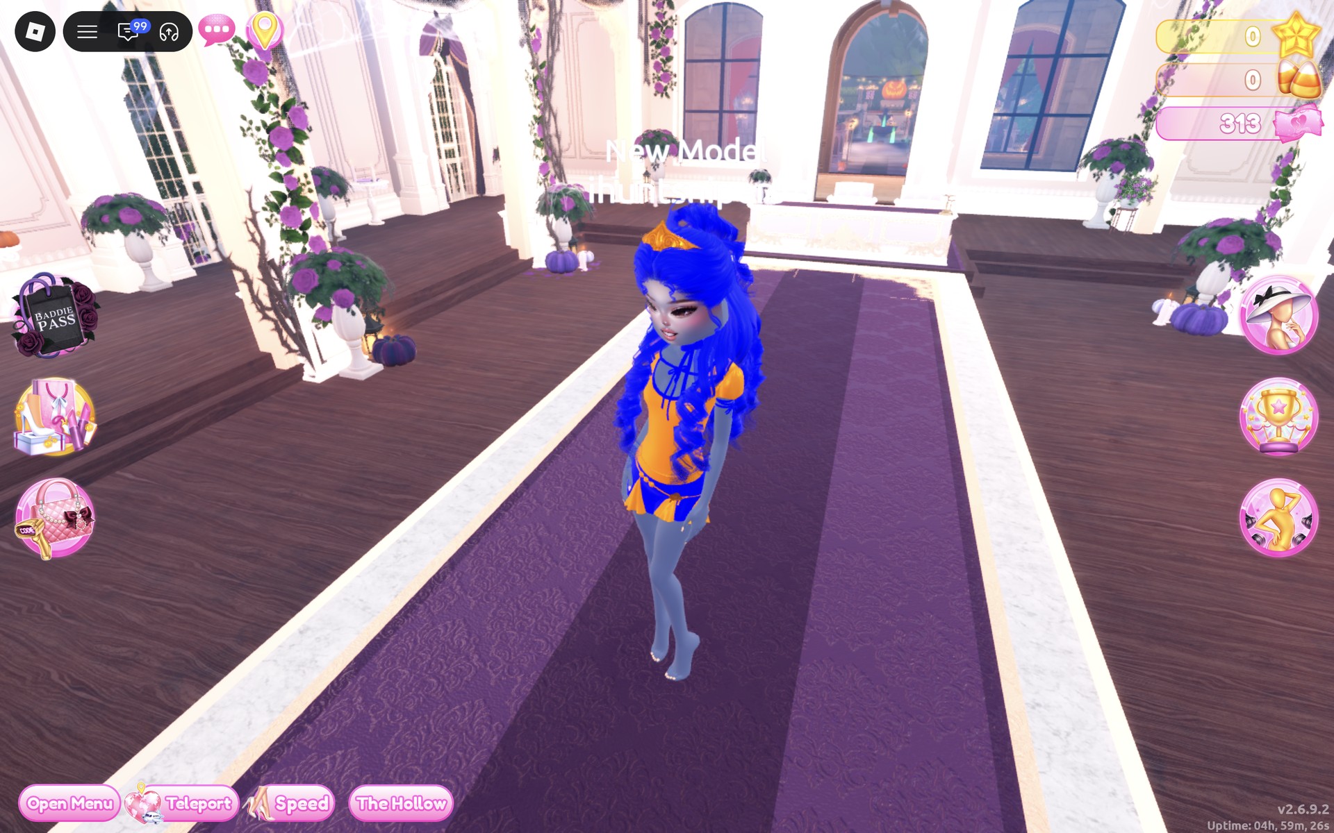
From the back, the blue curls fall over the shirt, and the orange godet panels show at the hem of the blue skirt.
What complementary colours are and which pairs work
Complementary colours are the pairs that face each other across the colour wheel: purple and yellow, orange and blue, and red and green. Next to each other they look brighter than either does alone, which is why the theme works best with only the two colours and nothing else. Give the bigger area to one colour and the trim to the other, and keep both strong: a pale or greyed shade of either loses the contrast. We built purple with yellow and orange with blue; red with green is the third classic pair, and we have not built it. This is plain styling advice; we have not seen how either look scores in a real round.
How to recolour a piece and set its material
- Click the piece on its shelf, then “Put On” when the label shows. Once you wear it, click its picture in the Wearing panel to open its colour panel again.
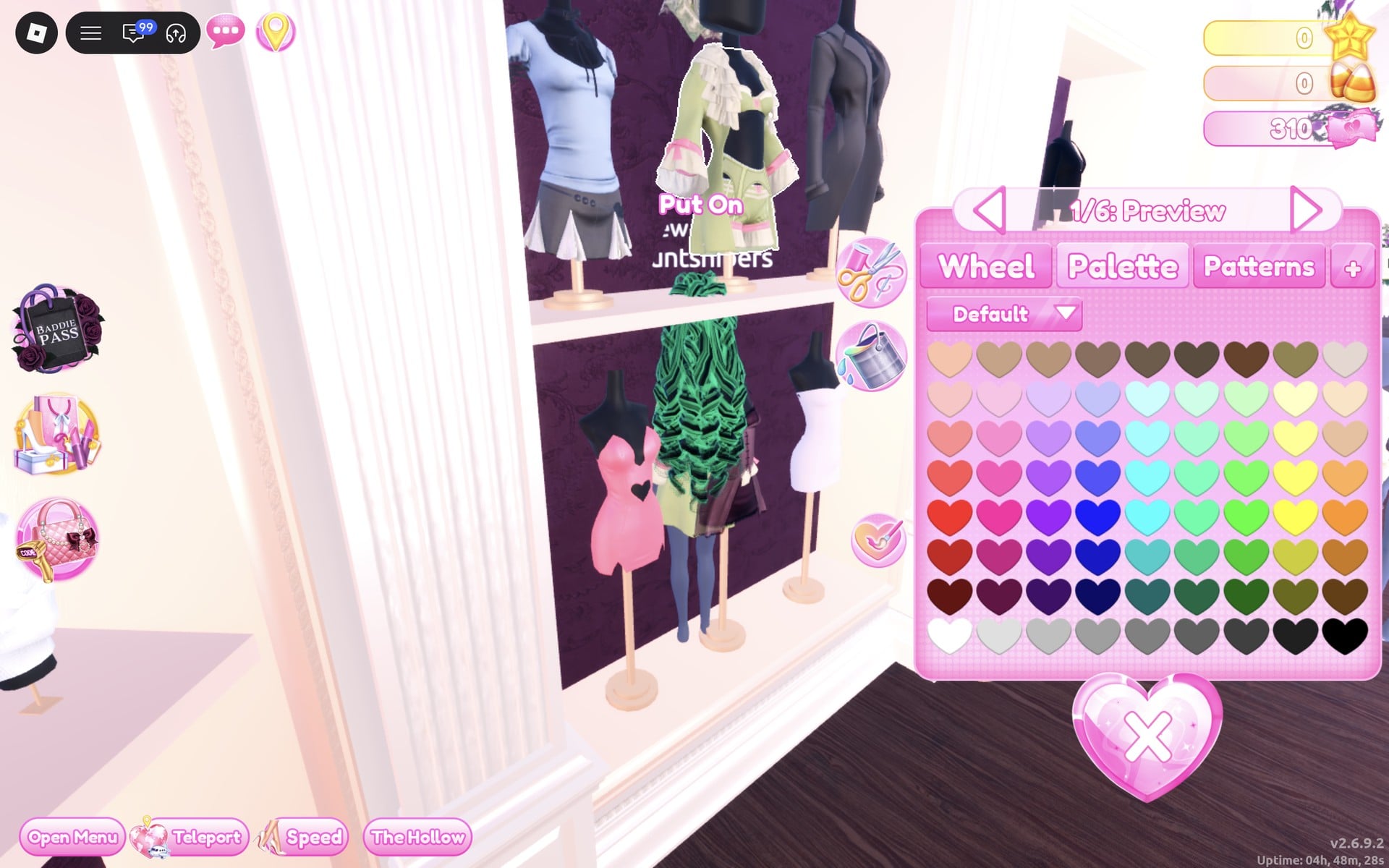
- Pick the part with the arrows beside the part name (“1/6: Preview”, “2/6: Sleeve Bows” and so on). Each part takes its own colour and material.
- Open the “+” tab and click the material. We used Silk on every clothing part, Metallic on the crowns and Glitter on the gems.
- Choose its colour on the Palette tab (the Default palette: columns are hues, rows run light to dark, and the bottom row runs from white to black).
- Repeat for every part. The colours stay on the piece after you close the panel.
To take a piece off, click the heart X under its picture in the Wearing panel. The Patterns tab sits next to Palette; we did not use it for these looks.
Complementary Colors on the Default palette
Rows count from the top of the palette, columns from the left. These are the exact hearts we used; the same material on every part (Silk) keeps the two colours of each pair equally bright.
| Colour | Column | Row | Material | Used for |
|---|---|---|---|---|
| Purple | 3 | 5 | Silk, Metallic, Glitter | Look 1: coat body, crown and gem |
| Deep purple | 3 | 6 | Silk | Look 1: the bandeau top |
| Yellow | 8 | 4 | Silk | Look 1: sleeve bows, ruffles, top ruffles, tiny bows and the curls |
| Orange | 9 | 6 | Silk, Metallic, Glitter | Look 2: shirt, skirt godets, belt, flower, crown and gem |
| Blue | 4 | 6 | Silk | Look 2: shirt ribbons, neck ribbon, skirt and the curls |
Complementary Colors pieces to look for
None of these pieces has a name in the game, so look for them by place and shape. All of them are free and worked on our account with no VIP and 0 stars.
| Piece | Where in the Dressing Room | Colours and materials we used |
|---|---|---|
 Ruffled coat set: an open coat with ruffled cuffs over a bandeau top with a bow (six parts) | Short-dress shelf in the Dressing Room, top row, middle: the sage green coat set | Coat “1/6: Preview” purple (column 3, row 5); “4/6: Top” purple (column 3, row 6); “2/6: Sleeve Bows”, “3/6: Ruffles”, “5/6: Top Ruffles”, “6/6: Top Tiny Bows” yellow (column 8, row 4); all Silk (Look 1) |
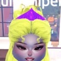 Long curls with a crown and gem, in yellow and purple | The curls we already wore, recoloured from the Wearing panel | Hair 1/4 and 2/4 yellow + Silk, “3/4: Crown” purple + Metallic, “4/4: Gem” purple + Glitter (Look 1) |
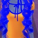 Short-sleeved shirt with ribbons and a neck tie (three parts) | Short-dress shelf, top row, left: the pale blue shirt on the stand | “1/3: Shirt” orange (column 9, row 6), “2/3: Shirt & Sleeves Ribbon” and “3/3: Neck Ribbon” blue (column 4, row 6); all Silk (Look 2) |
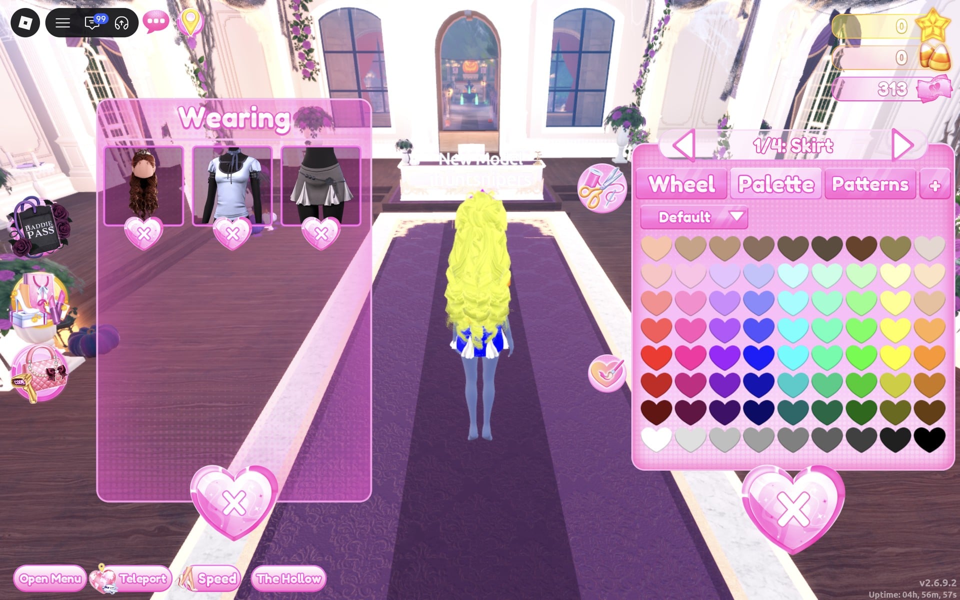
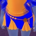 Short skirt with godet panels, a belt and a flower (four parts) | The grey pleated skirt just below that shirt, on the same stand | “1/4: Skirt” blue (column 4, row 6), “2/4: Skirt Godets”, “3/4: Belt” and “4/4: Flower” orange (column 9, row 6); all Silk (Look 2) |
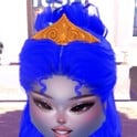 Long curls with a crown and gem, in blue and orange | The same hairstyle, recoloured again from the Wearing panel | Hair 1/4 and 2/4 blue + Silk, “3/4: Crown” orange + Metallic, “4/4: Gem” orange + Glitter (Look 2) |
Pieces with many parts make the split easy: the six-part coat set and the three-part shirt with its four-part skirt let you put the main fabric in one colour and every ruffle, ribbon and bow in the other. The same coat set is red and yellow in our Fast Food Mascot looks, and the same shirt and skirt are light blue in our Wonderland looks. For a look built on three strong colours instead of two, see our Pop Art Princess outfit ideas; for the opposite idea, one colour only, see Monochrome Mood.
Poses for Complementary Colors
We used Prism for the purple and yellow look and Glow for the orange and blue one, both free under Solo in the Poses menu. For the full list with a picture of each, see every free pose in Dress To Impress.
Building it in Freeplay Mode first
Freeplay Mode has no timer, so it is the place to try a pair part by part and check that nothing outside the two colours is left, such as a sage green bloomer or last look’s hair. Once a look works, you know which shelf, which palette spots and which materials to go to when Complementary Colors comes up in a real round. For more themes built the same way, see our Boho, Robot Takeover, Album Cover, Potion Maker, Monochrome Mood, Divine Beings, Drag, Sweet 16, Camouflage, Deserted Island, Summer Cruise, Favorite Show, Fairytale, Cotton Candy Couture, Cyberpunk, Birth Stones, Y2K Popstar, Video Game Character, Top Model, Fast Food Mascot, DJ, Award Show, Drama Queen, Instagram Model, Day of the Dead, Malibu Dream, Stained Glass, Summer Camp, Modern Royalty, Trad Goth, Wonderland, Trip To London, Pop Art Princess, Sugar And Spice, Paranormal Investigator, Cursed Lagoon, Galactic Glam, Dancer, Midnight Circus, Jellyfish and Garden Tea Party outfit ideas.
How a theme round works
We have not had Complementary Colors as a round yet; this is from ordinary server rounds on other themes. On the main lobby, the theme shows in a banner at the top with a timer under it. After dressing, each player walks the runway in turn, about 7 seconds each, while the others vote with five stars along the bottom of the screen, with a “Voting complete!” banner between players. A “Results” card then ranks the players, followed by an “Intermission” countdown.
The “Pick Theme” button next to the intermission timer lets you choose the theme, but only with Theme Props. The panel reads “You have: 0 Theme Props” and offers a “Buy More” button priced at 75 Robux. We bought none and saw no free ones, so without Robux you wait for Complementary Colors to roll.
What we have not checked
No round we joined rolled Complementary Colors, so these looks have not walked a real Complementary Colors round: there is no score, star count or vote for them. We saw no colour-wheel help in the game; the two pairs are our choice. We did not build a red and green look. Both looks were built with 0 stars, and nothing was bought.
FAQ
What are complementary colors in Dress To Impress?
The game gives only the theme’s name. Complementary colours are the pairs opposite each other on the colour wheel: purple and yellow, orange and blue, red and green. For the theme, dress in one of those pairs and nothing else.
Which palette hearts did you use?
On the Default palette: purple in column 3 (rows 5 and 6), yellow in column 8, row 4, orange in column 9, row 6, and blue in column 4, row 6.
Where are the coat set, the shirt and the skirt?
All three are on the top row of the short-dress shelf in the Dressing Room: the sage green ruffled coat set in the middle, and the pale blue shirt over the grey pleated skirt at the left.
Should the hair match the outfit?
Put it in the pair too. We gave the curls one colour and the crown and gem the other: yellow curls with a purple crown, blue curls with an orange crown.
Which pose fits Complementary Colors?
We used the free Solo poses Prism for the purple and yellow look (a hand at the chin, a walking step) and Glow for the orange and blue look (hands together in front, head lowered).